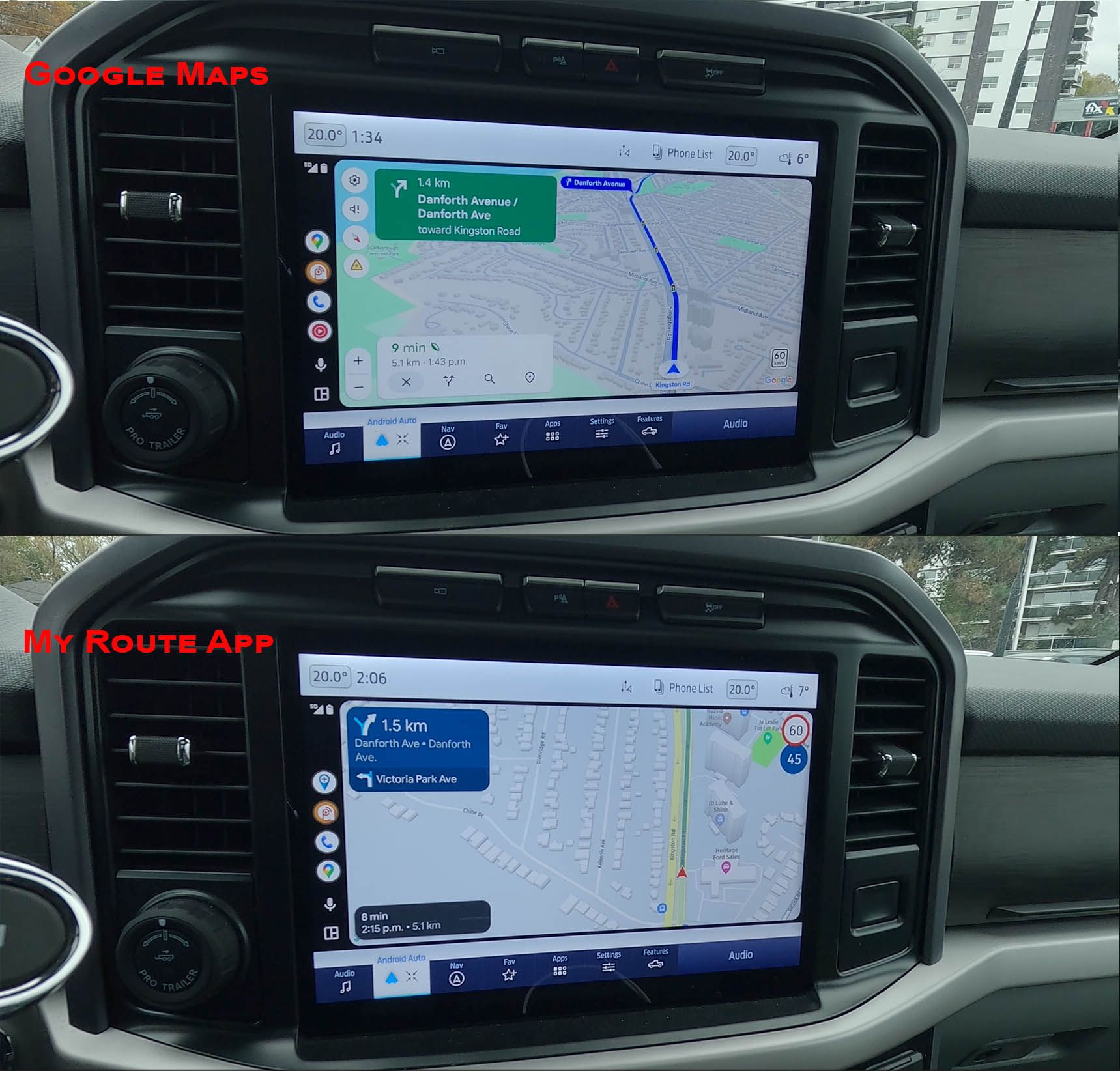
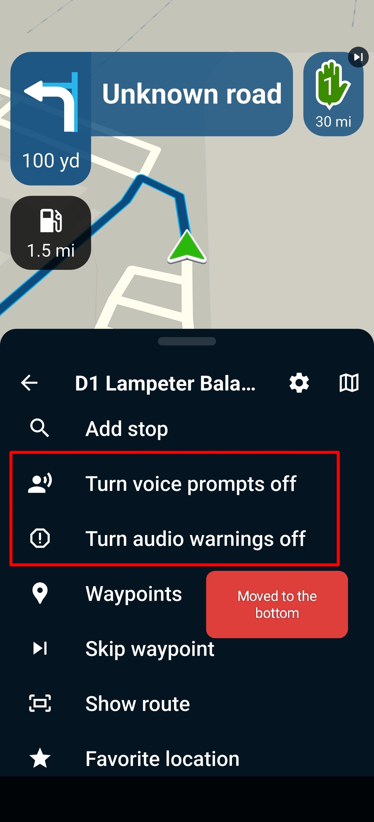
-
-
-
-
-
-
road closed icon
Moved -
-
-
-
-
-
Link to todays update video call
Locked Moved -
-
-
-
-
-
-
-
ACTIVE USERS
 undefined
 undefined
 undefined
 undefined
 undefined
 undefined
 undefined
 undefined
 undefined
 undefined
 undefined
 undefined
 undefined
 undefined
 undefined
POPULAR TOPICS
MY GROUPS
Travellexxie
nomko
Leike Lodiers
Cock van Santen
Maarten v
Guzzist
Corjan Meijerink
superg
Marcel Prinsen 0 0
Jörgen
Dave J 0
Bernd Knigge
Mike Luca 0
Nick Carthew
Skellum

