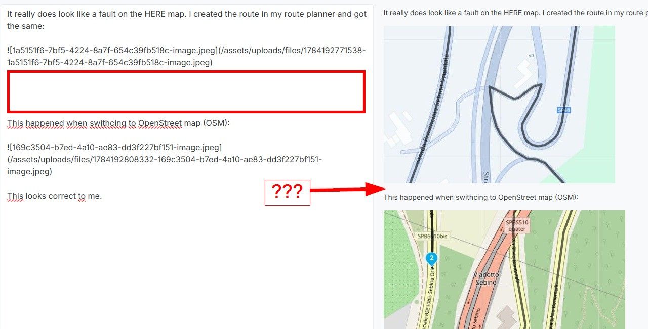
Suggestion(s)/improvements after first-look.


-
Android 11 11.1.2.2
OnePlus 6
Snapdragon 845, 6GB RAM 64GB ROMHi MRA Team / @Corjan-Meijerink ,
Although I have not been able to test the beta app on the motorcycle, I've been using it this week for my very short commutes.
First of all I'd like to say: what a great initial version of this app! Wow. Inevitably many improvements can be made, but as far as I can see on the forum now, most of them are superficial, and not hardcore... as far as I can judge.
My own suggestions below are also falling into the category superficial.
Since I utilize the nav app in landscape mode, most of my comments relate to the usage in this mode, but some of them might be applicable to the portrait use as well.
-
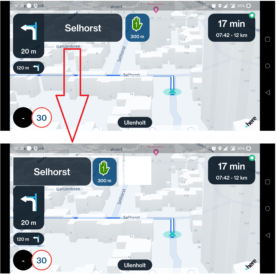
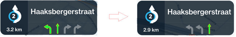
I would really like to see less 'widgets' on the top of the screen, but instead have them at the sides of the screen. Having them at top, makes a lot of sense in portrait, but in landscape one has a different screen area to use. I.e.:
-
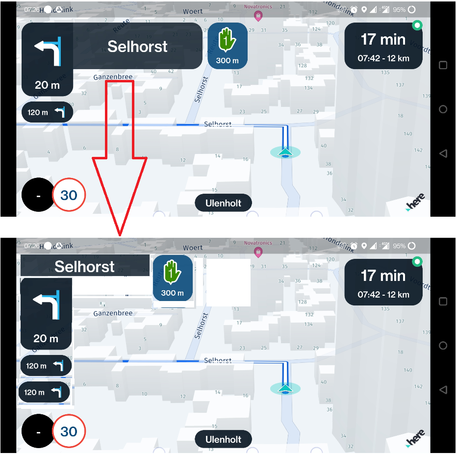
Reduce the 'height' of the grey instruction box. This allows for more screen area to see the road/route at and possibly also provides room for a 'third' next up instruction... especially on very windy backroads this might come in handy
") I.e.:
I.e.:
-
Points 1) and 2) also allow for the actual 'cursor' to be centered in the screen. My brain cannot handle the offcenter behaviour of the cursor. Besides that, it also prevents me from seeing as much on the right side of the route, compared to the left side. In landscape one can very nicely see all the curvy roads up ahead in landscape mode.
-
Adjust the angle of the birds-eye view. The current angle of the birdseye view is not to my liking. Imho the angle is to steep, by which I mean that I'd like to see the nav app emulate what my eyes see when on the bike. The current MRA Nav app has a much better view angle. The best would be if the user can select an angle to his/her liking.
-
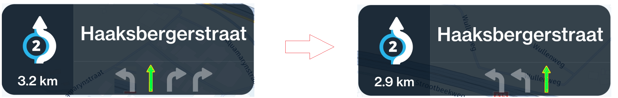
In my opinion the auto-zoom might start a bit earlier. Perhaps relate it to the speed at which the user is driving and determine a certain distance from the piece of road for which a zoomed view is required?
-
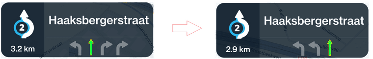
Consider switching the colours in the maneuver instructions to correlate better with the general view of the route? At the moment the drawn route line is a nice blue on greyish roads, while the instructions are shown with a white route-instruction, and a blue road? Switching up the instruction colours so that it looks like this imho correlates a lot better to the rest of the app: i.e.
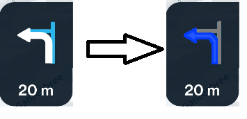
PS* Apologies for my bad painting skills :). @Timo-Martosatiman-MRA is a lot better at this than me. :). -
I would like to see the colour scheme of the lane assistance changed from yellow-grey to green-grey. i.e.
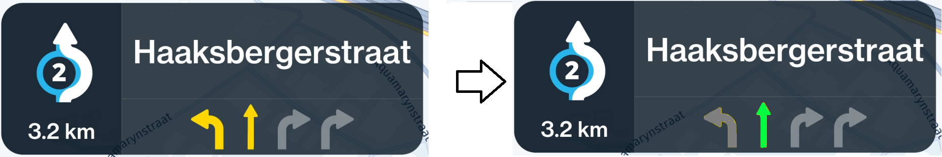
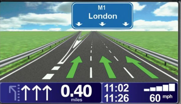
PS* The current nav app shows a very different lane assistance screen that i very much liked, similar to the one by tomtom (can't get a real nav lane assistance screenshot right now). I would definetely vote for bringing back this lane assistance screen or a split screen solution maybe?
-
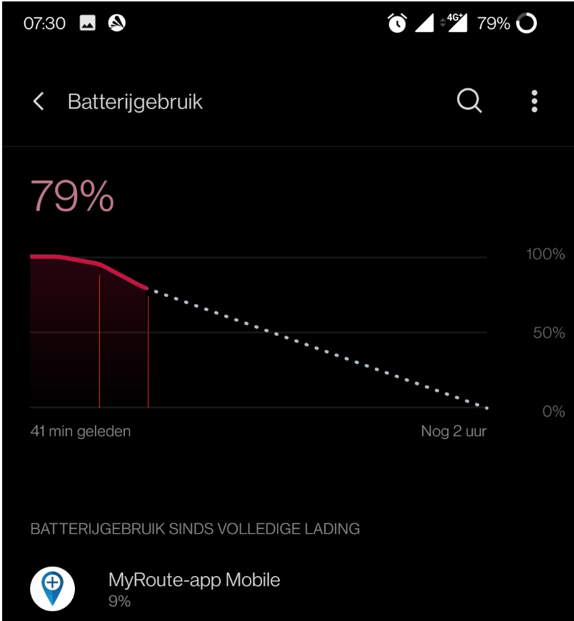
The battery drain can be optimized. On my phone, the beta app consumed about 15% battery life in 22minutes. Normally I have my phone charging while riding, but when one might find him/herself having charging issues, a battery drain of ~45% an hour is a bit much.
-
Optimize the lane assistance instructions. Why does the app allow me to take a exit lane, while it knows I need to tak the only straight lane at the following cross-road?
imho should have been:
-
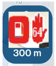
Show the 'pause' icons from the Routeplanner such as 'coffee' or 'fuel'. WARNING: Viewers discretion advised! Bad editing skills ahead:
-
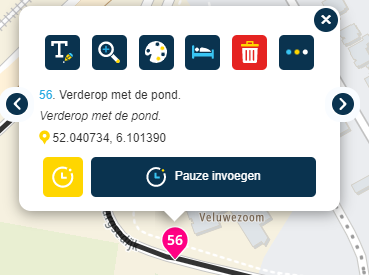
Voice prompt or auto-read the text that is written in the 'notitie' field of a waypoint/viapoint. I.e. "Verderop met de pond" as written in the waypoint:
-
Make the app ask whether you want to start the route from the nearest waypoint ahead in the route, if it notices you're being further away from waypoint 1 than from the nearest waypoint. The current skip option of holding down a waypoint is EXCELLENT, but yet, when starting a route, I would like the app to be smart, and do that for me.
-
Incorporate a similar structure as in the current NAV app regarding POI's/favorites etc. Sure, this is one of the things that the app is lacking on purpose, but I'm just throwing it out here
-
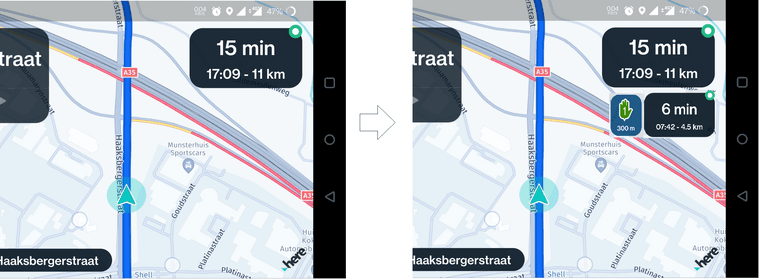
Show the ETA, remaining time and distance to the next via point. Something like:
-
Improve the 'lag' in the navigation a bit. During my testroutes I've noticed that the cursor lags the actual road position by about 2-3 seconds. For my commute that is not an issue, but when cruising my motorcycle, this might be troublesome on windy roads... which offcourse we all look out for.
-
Include the 'offroad' waypoints and show a straight line between them and therefore disable nav between those wp.
-
Include the auto skip of waypoints. That is a critical lifesaving feature haha! The algorithm of the current nav can use some TLC though. It lacks in some situations!
That's all for now.
I'd like to reiterate that I'm very much impressed by this first béta release that has been developed on such short notice. I consider myself as one of the critics that was a little dissapointed when I saw the questionaire for Next a few months back considering the amount of room for improvement on the current nav app, but boy have we been suprised!

A lot more to come from the MRA team, especially @Corjan-Meijerink! Well done my man, more kudo's to ya!
Manks bu'j te bange.
-
-
Android 11 11.1.2.2
OnePlus 6
Snapdragon 845, 6GB RAM 64GB ROMHi MRA Team / @Corjan-Meijerink ,
Although I have not been able to test the beta app on the motorcycle, I've been using it this week for my very short commutes.
First of all I'd like to say: what a great initial version of this app! Wow. Inevitably many improvements can be made, but as far as I can see on the forum now, most of them are superficial, and not hardcore... as far as I can judge.
My own suggestions below are also falling into the category superficial.
Since I utilize the nav app in landscape mode, most of my comments relate to the usage in this mode, but some of them might be applicable to the portrait use as well.
-
I would really like to see less 'widgets' on the top of the screen, but instead have them at the sides of the screen. Having them at top, makes a lot of sense in portrait, but in landscape one has a different screen area to use. I.e.:
-
Reduce the 'height' of the grey instruction box. This allows for more screen area to see the road/route at and possibly also provides room for a 'third' next up instruction... especially on very windy backroads this might come in handy
I.e.:
-
Points 1) and 2) also allow for the actual 'cursor' to be centered in the screen. My brain cannot handle the offcenter behaviour of the cursor. Besides that, it also prevents me from seeing as much on the right side of the route, compared to the left side. In landscape one can very nicely see all the curvy roads up ahead in landscape mode.
-
Adjust the angle of the birds-eye view. The current angle of the birdseye view is not to my liking. Imho the angle is to steep, by which I mean that I'd like to see the nav app emulate what my eyes see when on the bike. The current MRA Nav app has a much better view angle. The best would be if the user can select an angle to his/her liking.
-
In my opinion the auto-zoom might start a bit earlier. Perhaps relate it to the speed at which the user is driving and determine a certain distance from the piece of road for which a zoomed view is required?
-
Consider switching the colours in the maneuver instructions to correlate better with the general view of the route? At the moment the drawn route line is a nice blue on greyish roads, while the instructions are shown with a white route-instruction, and a blue road? Switching up the instruction colours so that it looks like this imho correlates a lot better to the rest of the app: i.e.
PS* Apologies for my bad painting skills :). @Timo-Martosatiman-MRA is a lot better at this than me. :). -
I would like to see the colour scheme of the lane assistance changed from yellow-grey to green-grey. i.e.
PS* The current nav app shows a very different lane assistance screen that i very much liked, similar to the one by tomtom (can't get a real nav lane assistance screenshot right now). I would definetely vote for bringing back this lane assistance screen or a split screen solution maybe?
-
The battery drain can be optimized. On my phone, the beta app consumed about 15% battery life in 22minutes. Normally I have my phone charging while riding, but when one might find him/herself having charging issues, a battery drain of ~45% an hour is a bit much.
-
Optimize the lane assistance instructions. Why does the app allow me to take a exit lane, while it knows I need to tak the only straight lane at the following cross-road?
imho should have been:
-
Show the 'pause' icons from the Routeplanner such as 'coffee' or 'fuel'. WARNING: Viewers discretion advised! Bad editing skills ahead:
-
Voice prompt or auto-read the text that is written in the 'notitie' field of a waypoint/viapoint. I.e. "Verderop met de pond" as written in the waypoint:
-
Make the app ask whether you want to start the route from the nearest waypoint ahead in the route, if it notices you're being further away from waypoint 1 than from the nearest waypoint. The current skip option of holding down a waypoint is EXCELLENT, but yet, when starting a route, I would like the app to be smart, and do that for me.
-
Incorporate a similar structure as in the current NAV app regarding POI's/favorites etc. Sure, this is one of the things that the app is lacking on purpose, but I'm just throwing it out here
-
Show the ETA, remaining time and distance to the next via point. Something like:
-
Improve the 'lag' in the navigation a bit. During my testroutes I've noticed that the cursor lags the actual road position by about 2-3 seconds. For my commute that is not an issue, but when cruising my motorcycle, this might be troublesome on windy roads... which offcourse we all look out for.
-
Include the 'offroad' waypoints and show a straight line between them and therefore disable nav between those wp.
-
Include the auto skip of waypoints. That is a critical lifesaving feature haha! The algorithm of the current nav can use some TLC though. It lacks in some situations!
That's all for now.
I'd like to reiterate that I'm very much impressed by this first béta release that has been developed on such short notice. I consider myself as one of the critics that was a little dissapointed when I saw the questionaire for Next a few months back considering the amount of room for improvement on the current nav app, but boy have we been suprised!
A lot more to come from the MRA team, especially @Corjan-Meijerink! Well done my man, more kudo's to ya!
@StefanHummelink, Great write-up Stefan! judging on the pictures I agree with all of it. But I can't judge for myself since I did not have a working app at all, it crashes on me as soon as a route gets started.
I agree also on the battery drain, but that could perhaps be model-specific also. I think many phones are not able to compensate for 15% power loss in 20 minutes when charging from non-USB-3 specced chargers. And even if they do it generates so much heat that it will become a problem on hot summer days. With my CAT S52 I used to be able to ride almost a whole day without charging. I hope to maintain at least the possibility to do that for half a day.
I am just an enthusiastic MRA user, and hope you will be one too!
Most motorcycle problems are caused by the nut that connects the handlebar to the saddle.
Check out RideSleepRepeat.eu, a biker community for sharing stays across Europe
-
-
@StefanHummelink, Great write-up Stefan! judging on the pictures I agree with all of it. But I can't judge for myself since I did not have a working app at all, it crashes on me as soon as a route gets started.
I agree also on the battery drain, but that could perhaps be model-specific also. I think many phones are not able to compensate for 15% power loss in 20 minutes when charging from non-USB-3 specced chargers. And even if they do it generates so much heat that it will become a problem on hot summer days. With my CAT S52 I used to be able to ride almost a whole day without charging. I hope to maintain at least the possibility to do that for half a day.
@Con-Hennekens My phone did indeed heat up quite significantly. Not badly yet, but definetely noticable and shall be improved for sure.
I myself had a crash when loading a planned route before, but I thought that was due to the fact that my phone was still connected to my wifi network, 15m away from my parked car

After that, no crashes... Hmmm...
-
@StefanHummelink Thank you for the very elaborate explanation of the ideas that you have, and of course for the underhand compliments.

Feedback like this will allow us to actively improve the app even further, I'll leave the technical insights to Corjan, and focus on the User-Experience and User-Interface points you bring forward. Some things to consider:
- I've made and delivered a comprehensive design guide for the developers, if they'd implement everything right away we would have to get a clone-vat and grow a few more Corjans and Joosts. So generally, the designs are aimed to be consistent*. For example, the route lines will get an overhaul.
*except for the places where I, in my unending pedantism, believe inconsistency would lead to a better User Experience for the majority of users.
- "Size" is possibly the biggest ongoing discussion. I like elements smaller, some like elements bigger, for this version we went with something that would suit most people. We'll keep looking at this.
-
@StefanHummelink Happy to hear your enthusiasm!
We aim to make this app very suitable for the short commutes too! With the amount of improvements compared to the previous Navigation app we really hope to compete with all navigation apps. Not just for niche motorcyclists who drive very specific routes.
1-4
I like the general vibe on the forum that most feedback is about suggestions / improvements and not focussing on major issues (as they simply aren't there)
The suggestion about landscape mode improvements: thanks for the level of detail you provided! The choice for the current layout is because it's inspired somewhat on how CarPlay apps look. It is quite common to offset the center like we did. Not saying it's perfect as it definitely comes to personal taste as well.
Positioning more items below each other results in the issue that when the height is even more limited (eg. older phones), it becomes way too crowded. You want the widgets (individual blocks containing information) to breathe a little.
4/5
The angle of the birds-eye-view while navigating and zooming is something we will look into.6/7
Color theming have been chosen to match the style of the app. It should however be more important that it is clear what it means. We will discuss this!PS: full screen lane assist is on our radar. Hope to have that implemented in another Beta version
8 Noted! I use around 8% / 30 minutes on an iPhone 11 Pro Max
9 Lane instructions, something we are definitely aiming to improve!
10 Mentioned before and will see how to fit that in
11 Cool idea, we also thought of that! We want to implement that too in another release
12/13 Already scheduled
14 This can already be achieved! Tap on the ETA widget to cycle through 3 states (distance / duration to): end / next shaping / next via
15-17 Noted before
Very happy to hear how impressed you are! Hope we can continue to improve the app together with our community to make sure we create the best Navigation app!
-
@StefanHummelink Happy to hear your enthusiasm!
We aim to make this app very suitable for the short commutes too! With the amount of improvements compared to the previous Navigation app we really hope to compete with all navigation apps. Not just for niche motorcyclists who drive very specific routes.
1-4
I like the general vibe on the forum that most feedback is about suggestions / improvements and not focussing on major issues (as they simply aren't there)The suggestion about landscape mode improvements: thanks for the level of detail you provided! The choice for the current layout is because it's inspired somewhat on how CarPlay apps look. It is quite common to offset the center like we did. Not saying it's perfect as it definitely comes to personal taste as well.
Positioning more items below each other results in the issue that when the height is even more limited (eg. older phones), it becomes way too crowded. You want the widgets (individual blocks containing information) to breathe a little.
4/5
The angle of the birds-eye-view while navigating and zooming is something we will look into.6/7
Color theming have been chosen to match the style of the app. It should however be more important that it is clear what it means. We will discuss this!PS: full screen lane assist is on our radar. Hope to have that implemented in another Beta version
8 Noted! I use around 8% / 30 minutes on an iPhone 11 Pro Max
9 Lane instructions, something we are definitely aiming to improve!
10 Mentioned before and will see how to fit that in
11 Cool idea, we also thought of that! We want to implement that too in another release
12/13 Already scheduled
14 This can already be achieved! Tap on the ETA widget to cycle through 3 states (distance / duration to): end / next shaping / next via
15-17 Noted before
Very happy to hear how impressed you are! Hope we can continue to improve the app together with our community to make sure we create the best Navigation app!
@Corjan-Meijerink said in Suggestion(s)/improvements after first-look.:
Positioning more items below each other results in the issue that when the height is even more limited (eg. older phones), it becomes way too crowded. You want the widgets (individual blocks containing information) to breathe a little.
That surely makes sense :)! Would it be an possibility to allow the user to customize the size of the widgets/fields accordingly and/or add more fields?
14 This can already be achieved! Tap on the ETA widget to cycle through 3 states (distance / duration to): end / next shaping / next via
Nice! Exactly what I meant, except for the fact that I would like to have an extra field then. I would like to have a field for the entire route, but also one for the next via point. Why should I have to choose, when I can have both :D:D:D:D.
Very curious to test the next béta release
Manks bu'j te bange.
-
 undefined MyRoute-app community moved this topic from [Beta] The MyRoute-app on
-
@StefanHummelink Thank you for the very elaborate explanation of the ideas that you have, and of course for the underhand compliments.
Feedback like this will allow us to actively improve the app even further, I'll leave the technical insights to Corjan, and focus on the User-Experience and User-Interface points you bring forward. Some things to consider:
- I've made and delivered a comprehensive design guide for the developers, if they'd implement everything right away we would have to get a clone-vat and grow a few more Corjans and Joosts. So generally, the designs are aimed to be consistent*. For example, the route lines will get an overhaul.
*except for the places where I, in my unending pedantism, believe inconsistency would lead to a better User Experience for the majority of users.
- "Size" is possibly the biggest ongoing discussion. I like elements smaller, some like elements bigger, for this version we went with something that would suit most people. We'll keep looking at this.
@Timo-Martosatiman-MRA said in Suggestion(s)/improvements after first-look.:
have to get a clone-vat and grow a few more Corjans and Joosts
I think that's a great idea one way or the other...

-
@Corjan-Meijerink said in Suggestion(s)/improvements after first-look.:
Positioning more items below each other results in the issue that when the height is even more limited (eg. older phones), it becomes way too crowded. You want the widgets (individual blocks containing information) to breathe a little.
That surely makes sense :)! Would it be an possibility to allow the user to customize the size of the widgets/fields accordingly and/or add more fields?
14 This can already be achieved! Tap on the ETA widget to cycle through 3 states (distance / duration to): end / next shaping / next via
Nice! Exactly what I meant, except for the fact that I would like to have an extra field then. I would like to have a field for the entire route, but also one for the next via point. Why should I have to choose, when I can have both :D:D:D:D.
Very curious to test the next béta release
@StefanHummelink said in Suggestion(s)/improvements after first-look.:
Would it be an possibility to allow the user to customize
The complexity of this is immense! That really is out of scope for the time being
@StefanHummelink said in Suggestion(s)/improvements after first-look.:
Why should I have to choose, when I can have both
You gotta have something to wish for in the future

-
 undefined Corjan Meijerink referenced this topic on
-
undefined Corjan Meijerink referenced this topic on
Hello! It looks like you're interested in this conversation, but you don't have an account yet.
Getting fed up of having to scroll through the same posts each visit? When you register for an account, you'll always come back to exactly where you were before, and choose to be notified of new replies (either via email, or push notification). You'll also be able to save bookmarks and upvote posts to show your appreciation to other community members.
With your input, this post could be even better 💗
Register Login-
4990
-
615115
-
06140
-
023495
-
0364
-
1957.5k
-
03131
-
018713