New Beta! (v3.2.14)
-
@Stanisław @Ian-foster-0 You could add fuel stops to your route and use a red route point and fuel icon to make them visible.
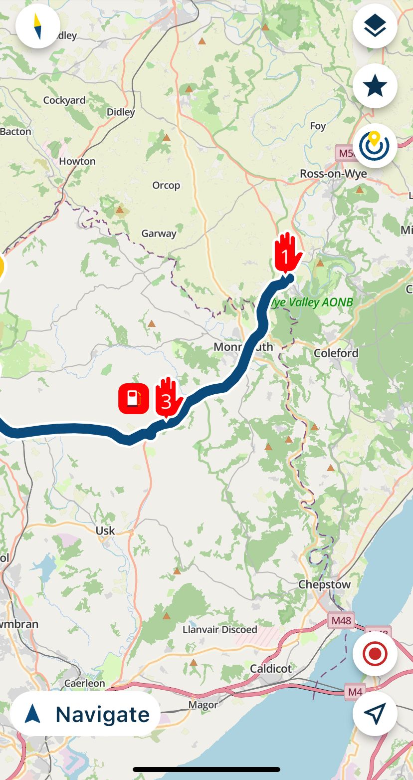
@Nick-Carthew Yes, but this is hard to predict during planning the route when we will need it. That's why adding a via point to the route ad-hoc, during the navigation, would be also good solution - for example to add the nearest gas station.
-
@Stanisław @Ian-foster-0 You could add fuel stops to your route and use a red route point and fuel icon to make them visible.

@Nick-Carthew do they show up on navigation then ? It’s handy having the nearest fuel and mileage to them on the display either on route or not like the original mra navigation app , not the end of the world though

-
We're back everybody!

This week we've got another great update for you!

Lots of cool new features and improvements to the app.Resume navigation
We've all encountered the situation where you stop for a coffee and you stop the navigation / close the app.
When you want to continue driving you then have to go through some steps first. Open the route you were driving, calculate the actual route, skip some waypoints and that's it.
We just want you to focus on driving and leave the smart stuff to us
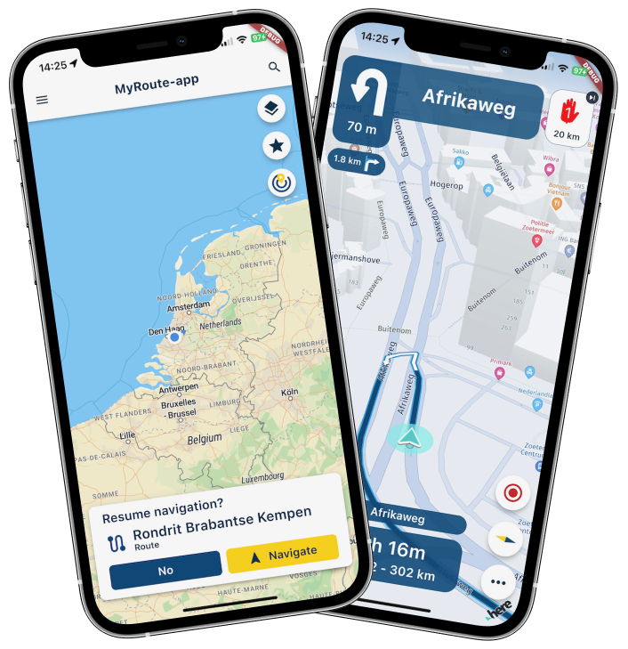
When you stop the Navigation, close the app on purpose or encountered a crash we will simply ask you if you want to continue where you left off!

Easy as that! We will simply resume the last navigation session exactly where you stopped it.Skip waypoints automatically
Finally! One more functional navigation setting has been implemented and unlocked!
When driving a route and you miss a waypoint, you can skip it using multiple options:
- Tap or long press the displayed upcoming waypoint
- Long press the waypoint on the map
- Long press the waypoint in the waypoint list
However, sometimes you just want to continue driving or can't use your phone.
We've now implemented an algorithm to skip those waypoints for you. It's very similar to the one you are used to in MyRoute-app Navigation.
If you don't want waypoints to be skipped automatically, turn it off in Navigation settings > Functional.Note: you might need to turn this setting on first

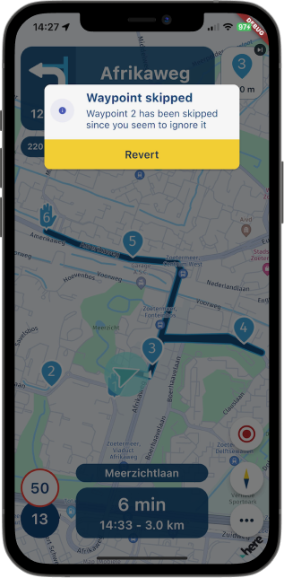
Some factors you as tester have influence over are the parameters of the algorithm. No, we won't make all parameters configurable.
So what can you provide us feedback about?
- The algorithm will always skip a waypoint after more than 4 recalculations (the count resets after you've passed a waypoint, skipped a waypoint or chose a new waypoint to route to).
- The first recalculation won't ever automatically skip a waypoint.
- If you are within 250 meters of a waypoint and you have a recalculation, we will always skip that waypoint (regardless if it is the first recalculation).
Obviously, viapoints are never skipped. Only shapingpoints are allowed to be skipped automatically.
After the app skips a waypoint automatically, it will always inform you about this.
Clicking revert (or anywhere on the popup to be correct) will undo the automatic skip action and the app will reroute you to the original waypoint.Changed landscape UI
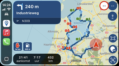
The depth of field and the visual clutter in landscape mode has always been a discussion.We've moved some stuff around, changed the size of some items and improved the alignment of your position in landscape mode.
Please let us know how you like it
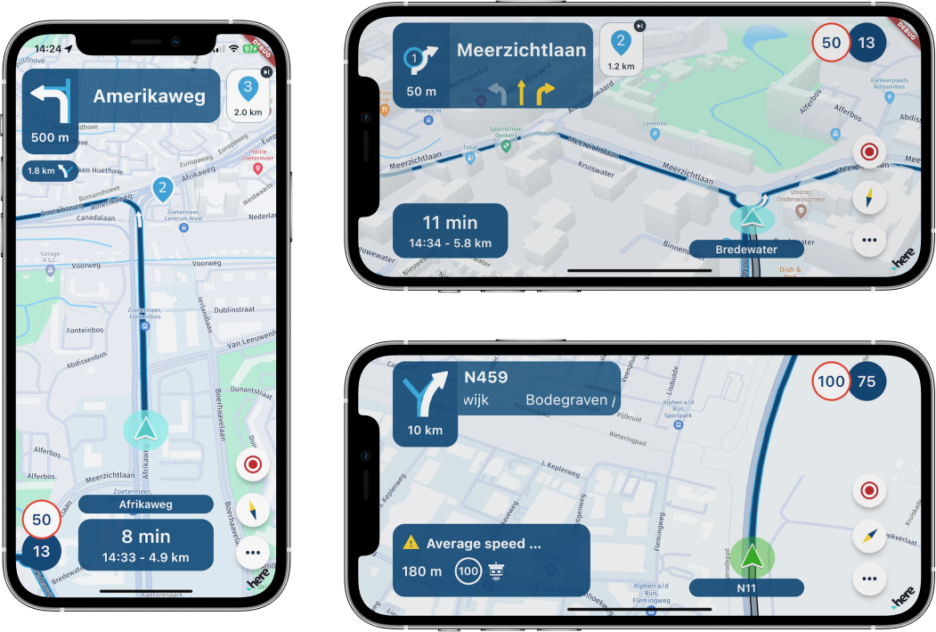
Note: some minor portrait mode UI changes are also visible
Position indicator sizing
There are phones (big & small), tablets (big & enormous) and now also CarPlay displays ranging from small to colossal resolutions.We've attempted to improve the sizing of the position indicator across all resolutions.
Battery usage when app was inactive (iOS)
Some iOS users mentioned that the OS indicated that the app would still use battery even when the app wasn't being used.We've worked on a solution and are curious if you now don't experience this anymore.
Incorrect CarPlay position indicator
Your position indicator in CarPlay would often not work correctly
It wouldn't show at all, not update your position correctly or sometimes CarPlay would even display multiple position indicators! We've resolved this issue.Incorrect location when starting the navigation
Some users would appear to be in Berlin (HERE HQ) when they started the navigation. This should now also be fixed!Android stability
The general stability of the Android app has been an issue for quite some time and was luckily fixed last update!
In this update, we've further improved the stability.Orientation change broken after taking a photo / opening the browser
A very annoying issue. If you were using the app in landscape mode and you would take a photo, the app would not appear in landscape mode anymore. Now it does
What's next?
Well, we got some exciting news for you! Android Auto will be the next update


Not quite sure when that will be exactly but it will be the next one and it will be within the next 2 weeks.Furthermore we will continue working on the known big issues:
- Battery usage navigation
- Position delay
Other critical items:
- Voice instructions stability & configuration
- Offline maps managements (especially related to updates)
And much more community feedback! For which we are very thankful

That's it for now. We're looking forward to all your feedback already.
Best,
Team MRA@Corjan-Meijerink With the info in the left corner, the m, km designation is always visible on the iPhone SE 2020

-
@Corjan-Meijerink With the info in the left corner, the m, km designation is always visible on the iPhone SE 2020

@Koen-VH great! One of the reasons we made this change

-
@Nick-Carthew Yes, but this is hard to predict during planning the route when we will need it. That's why adding a via point to the route ad-hoc, during the navigation, would be also good solution - for example to add the nearest gas station.
@Stanisław When I am touring I usually fill the tank at either the start of a day's ride or at the end (for tomorrow's ride). If the ride is further than my tank range (200 miles) I will plan another fuel stop. This is easily done in the planning stage.
-
@Stanisław When I am touring I usually fill the tank at either the start of a day's ride or at the end (for tomorrow's ride). If the ride is further than my tank range (200 miles) I will plan another fuel stop. This is easily done in the planning stage.
@Nick-Carthew
Who doesn't? -
@Nick-Carthew do they show up on navigation then ? It’s handy having the nearest fuel and mileage to them on the display either on route or not like the original mra navigation app , not the end of the world though

@Ian-foster-0 said in New Beta! (v3.2.14):
@Nick-Carthew do they show up on navigation then ? It’s handy having the nearest fuel and mileage to them on the display either on route or not like the original mra navigation app , not the end of the world though

Yes, they are visible when navigating. If you name them as Fuel Stop you will also see this on the screen.
-
@Stanisław When I am touring I usually fill the tank at either the start of a day's ride or at the end (for tomorrow's ride). If the ride is further than my tank range (200 miles) I will plan another fuel stop. This is easily done in the planning stage.
@Nick-Carthew I use to do my planning quite precisely but no so much
 Usually there are some stations on the way and we can rest our legs every 2 hours.
 -
Wow, great work, well done team.
-
We're back everybody!

This week we've got another great update for you!

Lots of cool new features and improvements to the app.Resume navigation
We've all encountered the situation where you stop for a coffee and you stop the navigation / close the app.
When you want to continue driving you then have to go through some steps first. Open the route you were driving, calculate the actual route, skip some waypoints and that's it.
We just want you to focus on driving and leave the smart stuff to us

When you stop the Navigation, close the app on purpose or encountered a crash we will simply ask you if you want to continue where you left off!

Easy as that! We will simply resume the last navigation session exactly where you stopped it.Skip waypoints automatically
Finally! One more functional navigation setting has been implemented and unlocked!
When driving a route and you miss a waypoint, you can skip it using multiple options:
- Tap or long press the displayed upcoming waypoint
- Long press the waypoint on the map
- Long press the waypoint in the waypoint list
However, sometimes you just want to continue driving or can't use your phone.
We've now implemented an algorithm to skip those waypoints for you. It's very similar to the one you are used to in MyRoute-app Navigation.
If you don't want waypoints to be skipped automatically, turn it off in Navigation settings > Functional.Note: you might need to turn this setting on first


Some factors you as tester have influence over are the parameters of the algorithm. No, we won't make all parameters configurable.
So what can you provide us feedback about?
- The algorithm will always skip a waypoint after more than 4 recalculations (the count resets after you've passed a waypoint, skipped a waypoint or chose a new waypoint to route to).
- The first recalculation won't ever automatically skip a waypoint.
- If you are within 250 meters of a waypoint and you have a recalculation, we will always skip that waypoint (regardless if it is the first recalculation).
Obviously, viapoints are never skipped. Only shapingpoints are allowed to be skipped automatically.
After the app skips a waypoint automatically, it will always inform you about this.
Clicking revert (or anywhere on the popup to be correct) will undo the automatic skip action and the app will reroute you to the original waypoint.Changed landscape UI
The depth of field and the visual clutter in landscape mode has always been a discussion.We've moved some stuff around, changed the size of some items and improved the alignment of your position in landscape mode.
Please let us know how you like it

Note: some minor portrait mode UI changes are also visible
Position indicator sizing
There are phones (big & small), tablets (big & enormous) and now also CarPlay displays ranging from small to colossal resolutions.We've attempted to improve the sizing of the position indicator across all resolutions.
Battery usage when app was inactive (iOS)
Some iOS users mentioned that the OS indicated that the app would still use battery even when the app wasn't being used.We've worked on a solution and are curious if you now don't experience this anymore.
Incorrect CarPlay position indicator
Your position indicator in CarPlay would often not work correctly
It wouldn't show at all, not update your position correctly or sometimes CarPlay would even display multiple position indicators! We've resolved this issue.Incorrect location when starting the navigation
Some users would appear to be in Berlin (HERE HQ) when they started the navigation. This should now also be fixed!Android stability
The general stability of the Android app has been an issue for quite some time and was luckily fixed last update!
In this update, we've further improved the stability.Orientation change broken after taking a photo / opening the browser
A very annoying issue. If you were using the app in landscape mode and you would take a photo, the app would not appear in landscape mode anymore. Now it does
What's next?
Well, we got some exciting news for you! Android Auto will be the next update


Not quite sure when that will be exactly but it will be the next one and it will be within the next 2 weeks.Furthermore we will continue working on the known big issues:
- Battery usage navigation
- Position delay
Other critical items:
- Voice instructions stability & configuration
- Offline maps managements (especially related to updates)
And much more community feedback! For which we are very thankful

That's it for now. We're looking forward to all your feedback already.
Best,
Team MRA@Corjan-Meijerink said in New Beta! (v3.2.14):
Changed landscape UI
The depth of field and the visual clutter in landscape mode has always been a discussion.
We've moved some stuff around, changed the size of some items and improved the alignment of your position in landscape mode.
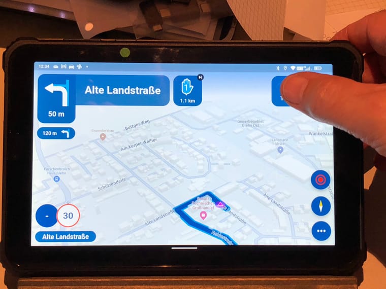
Please let us know how you like itI prefer the former version, because you need to click sometimes on the (time/km) button for a change of time to destination or time to next WP.
As a right-hander, I have to cross the screen, because the button is now on the left. On top right you can also use the thumb, that is quicker. JM2C.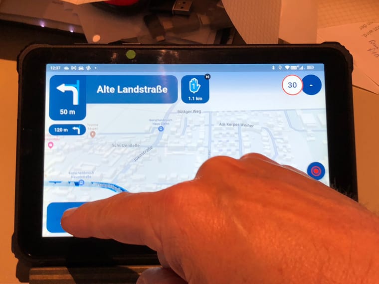
-
Awesome! With every release the app just keeps getting better & better!
Great work MRA Team! -
@Corjan-Meijerink said in New Beta! (v3.2.14):
Changed landscape UI
The depth of field and the visual clutter in landscape mode has always been a discussion.
We've moved some stuff around, changed the size of some items and improved the alignment of your position in landscape mode.
Please let us know how you like itI prefer the former version, because you need to click sometimes on the (time/km) button for a change of time to destination or time to next WP.
As a right-hander, I have to cross the screen, because the button is now on the left. On top right you can also use the thumb, that is quicker. JM2C.

@Jörgen, I disagree with you on the point of using your right hand. My right hand is on the gas and the brake, so I am quite happy to use my left hand. That's improvement. On the other side however, I don't understand what improvement it brings to switch the positions of the speed symbol and this skip Waypoint tile.
@Corjan-Meijerink
This is how it looks on my screen: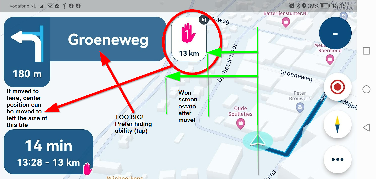
The area where "Groeneweg" is shown is still MUCH too big in my view, it takes up almost half the screen width (!) while it bears no value in scenic tours. I would VERY much like the ability to hide it.
To be honest I don't see an improvement in the division of screen estate. It would improve if the WP tile got moved to the far left of the screen, or when it replaces the streetname area when that one gets hidden.
The flyer could then be placed MUCH more to the middle of the screen, not only showing curves to the left anymore

small thing: The three buttons on the right carry some shading, to indicate they are pressable I presume. Following that thought it would make sense to give the skip WP tile and the WP distance tile the same shading, since they are also pressable.
Another small thing: The blue info tiles seem to have a really small amount of transparency. Almost not noticeable. Maybe a bit more transparency gives better view on the map. but that really is only needed when the flyer gets centered more to the middle.
For the rest, awfully great update again!

In all honesty, I think my Huawei has a bit strange screen aspect that causes this. I'll check my CAT, with which I really navigate, how that looks tonight. -
@Stanisław @Ian-foster-0 You could add fuel stops to your route and use a red route point and fuel icon to make them visible.

@Nick-Carthew how do you change the colour of icons /waypoints ?
-
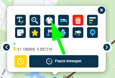
@Nick-Carthew how do you change the colour of icons /waypoints ?
@Ian-foster-0, you can do that in the planner, just click a waypoint and there's a plethora of options

-
hoe krijg ik de app zoals de fotos hierboven, ja ik ben beta tester en heb versie 3.2.4-144
krijg het niet voor elkaar zoals de app van de navigatie hierboven getoond worden.
-
@Jörgen, I disagree with you on the point of using your right hand. My right hand is on the gas and the brake, so I am quite happy to use my left hand. That's improvement. On the other side however, I don't understand what improvement it brings to switch the positions of the speed symbol and this skip Waypoint tile.
@Corjan-Meijerink
This is how it looks on my screen:
The area where "Groeneweg" is shown is still MUCH too big in my view, it takes up almost half the screen width (!) while it bears no value in scenic tours. I would VERY much like the ability to hide it.
To be honest I don't see an improvement in the division of screen estate. It would improve if the WP tile got moved to the far left of the screen, or when it replaces the streetname area when that one gets hidden.
The flyer could then be placed MUCH more to the middle of the screen, not only showing curves to the left anymore

small thing: The three buttons on the right carry some shading, to indicate they are pressable I presume. Following that thought it would make sense to give the skip WP tile and the WP distance tile the same shading, since they are also pressable.
Another small thing: The blue info tiles seem to have a really small amount of transparency. Almost not noticeable. Maybe a bit more transparency gives better view on the map. but that really is only needed when the flyer gets centered more to the middle.
For the rest, awfully great update again!

In all honesty, I think my Huawei has a bit strange screen aspect that causes this. I'll check my CAT, with which I really navigate, how that looks tonight.@Con-Hennekens thanks for the feedback

-
 undefined Corjan Meijerink referenced this topic on
-
@Jörgen, I disagree with you on the point of using your right hand. My right hand is on the gas and the brake, so I am quite happy to use my left hand. That's improvement. On the other side however, I don't understand what improvement it brings to switch the positions of the speed symbol and this skip Waypoint tile.
@Corjan-Meijerink
This is how it looks on my screen:
The area where "Groeneweg" is shown is still MUCH too big in my view, it takes up almost half the screen width (!) while it bears no value in scenic tours. I would VERY much like the ability to hide it.
To be honest I don't see an improvement in the division of screen estate. It would improve if the WP tile got moved to the far left of the screen, or when it replaces the streetname area when that one gets hidden.
The flyer could then be placed MUCH more to the middle of the screen, not only showing curves to the left anymore

small thing: The three buttons on the right carry some shading, to indicate they are pressable I presume. Following that thought it would make sense to give the skip WP tile and the WP distance tile the same shading, since they are also pressable.
Another small thing: The blue info tiles seem to have a really small amount of transparency. Almost not noticeable. Maybe a bit more transparency gives better view on the map. but that really is only needed when the flyer gets centered more to the middle.
For the rest, awfully great update again!

In all honesty, I think my Huawei has a bit strange screen aspect that causes this. I'll check my CAT, with which I really navigate, how that looks tonight.@Con-Hennekens you beat me to it. Agree with all your comments having done a ride today. My only question would be where are the zoom buttons going given the size of some the tile areas or how is zoom enabled?
-
hoe krijg ik de app zoals de fotos hierboven, ja ik ben beta tester en heb versie 3.2.4-144
krijg het niet voor elkaar zoals de app van de navigatie hierboven getoond worden.
@willem-l said in New Beta! (v3.2.14):
hoe krijg ik de app zoals de fotos hierboven, ja ik ben beta tester en heb versie 3.2.4-144
krijg het niet voor elkaar zoals de app van de navigatie hierboven getoond worden.
If you have the latest version you should see the same as above. Please provide a screenshot.
-
We're back everybody!

This week we've got another great update for you!

Lots of cool new features and improvements to the app.Resume navigation
We've all encountered the situation where you stop for a coffee and you stop the navigation / close the app.
When you want to continue driving you then have to go through some steps first. Open the route you were driving, calculate the actual route, skip some waypoints and that's it.
We just want you to focus on driving and leave the smart stuff to us

When you stop the Navigation, close the app on purpose or encountered a crash we will simply ask you if you want to continue where you left off!

Easy as that! We will simply resume the last navigation session exactly where you stopped it.Skip waypoints automatically
Finally! One more functional navigation setting has been implemented and unlocked!
When driving a route and you miss a waypoint, you can skip it using multiple options:
- Tap or long press the displayed upcoming waypoint
- Long press the waypoint on the map
- Long press the waypoint in the waypoint list
However, sometimes you just want to continue driving or can't use your phone.
We've now implemented an algorithm to skip those waypoints for you. It's very similar to the one you are used to in MyRoute-app Navigation.
If you don't want waypoints to be skipped automatically, turn it off in Navigation settings > Functional.Note: you might need to turn this setting on first


Some factors you as tester have influence over are the parameters of the algorithm. No, we won't make all parameters configurable.
So what can you provide us feedback about?
- The algorithm will always skip a waypoint after more than 4 recalculations (the count resets after you've passed a waypoint, skipped a waypoint or chose a new waypoint to route to).
- The first recalculation won't ever automatically skip a waypoint.
- If you are within 250 meters of a waypoint and you have a recalculation, we will always skip that waypoint (regardless if it is the first recalculation).
Obviously, viapoints are never skipped. Only shapingpoints are allowed to be skipped automatically.
After the app skips a waypoint automatically, it will always inform you about this.
Clicking revert (or anywhere on the popup to be correct) will undo the automatic skip action and the app will reroute you to the original waypoint.Changed landscape UI
The depth of field and the visual clutter in landscape mode has always been a discussion.We've moved some stuff around, changed the size of some items and improved the alignment of your position in landscape mode.
Please let us know how you like it

Note: some minor portrait mode UI changes are also visible
Position indicator sizing
There are phones (big & small), tablets (big & enormous) and now also CarPlay displays ranging from small to colossal resolutions.We've attempted to improve the sizing of the position indicator across all resolutions.
Battery usage when app was inactive (iOS)
Some iOS users mentioned that the OS indicated that the app would still use battery even when the app wasn't being used.We've worked on a solution and are curious if you now don't experience this anymore.
Incorrect CarPlay position indicator
Your position indicator in CarPlay would often not work correctly
It wouldn't show at all, not update your position correctly or sometimes CarPlay would even display multiple position indicators! We've resolved this issue.Incorrect location when starting the navigation
Some users would appear to be in Berlin (HERE HQ) when they started the navigation. This should now also be fixed!Android stability
The general stability of the Android app has been an issue for quite some time and was luckily fixed last update!
In this update, we've further improved the stability.Orientation change broken after taking a photo / opening the browser
A very annoying issue. If you were using the app in landscape mode and you would take a photo, the app would not appear in landscape mode anymore. Now it does
What's next?
Well, we got some exciting news for you! Android Auto will be the next update


Not quite sure when that will be exactly but it will be the next one and it will be within the next 2 weeks.Furthermore we will continue working on the known big issues:
- Battery usage navigation
- Position delay
Other critical items:
- Voice instructions stability & configuration
- Offline maps managements (especially related to updates)
And much more community feedback! For which we are very thankful

That's it for now. We're looking forward to all your feedback already.
Best,
Team MRA@Corjan-Meijerink Any idea within what timeframe the position delay can be resolved?
-
@Corjan-Meijerink Any idea within what timeframe the position delay can be resolved?
@Bart-DM no, but before release. Requires cooperation with HERE

Hello! It looks like you're interested in this conversation, but you don't have an account yet.
Getting fed up of having to scroll through the same posts each visit? When you register for an account, you'll always come back to exactly where you were before, and choose to be notified of new replies (either via email, or push notification). You'll also be able to save bookmarks and upvote posts to show your appreciation to other community members.
With your input, this post could be even better 💗
Register Login
