Some questions about the options
-
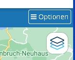
1 - If the full screen of a created route is reduced to a window, the 5 menu buttons of the options disappear and a single menu item "Options" appears. When you call this up, the 5 points of the menu appear again, but in a different graphic representation: previously black writing on a white button, then white writing on a blue background. A different appearance for the same content is confusing. Can't a uniform display for full screen and window be implemented here?
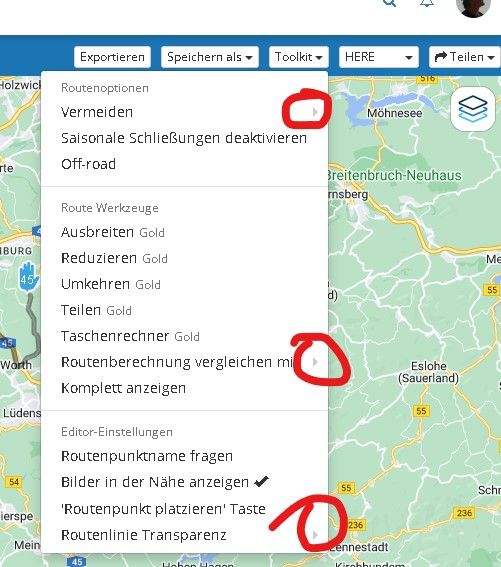
2 - Why are e.g. in the menu item "Toolkit - Routenoptionen - Vermeiden" the further information triangles on the far right? They are so small that you can hardly see them and the position is not in the user's field of vision. It's not very ergonomic. Can't these triangular symbols appear right after the text?
3 - The following behavior in the reduced representation of the window (white writing on a blue background) is very exhausting: You open the "Toolkit" menu item and then you want to select the "Saisonale Schließungen deaktivieren" item. So you move the cursor down and as soon as you reach the "Vermeiden" item, the sub-items, like toll roads, etc. open automatically. The desired menu item jumps down from the field of view that you have just fixed. If you now reach the menu item with the cursor, the selection items which were just opened, close again and the desired item jumps back up to where it was before. The eyes have to constantly wander on the screen, which is exhausting. (Same behavior for "Routenberechnung vergeichen mit"). Isn't it possible to make the sub-items appear by clicking on them? The two menu items could then get a symbol directly after the text, which indicates that there are still sub-items to choose. e.g. a down arrow.
Greetings
Ronni


-
 undefined Corjan Meijerink moved this topic from [Beta] Suggestions and Discussions on
