MRA Navigation Next first video!
-
Oh dear...
Waaaayyy too cluttered, too much information/interaction scattered all over the screen. Please note that we are driving/riding on public roads while using navigation, not playing a navigation game on our phone. The screen should show the essentials for navigation only. Interactivity should be severely limited. Quite a few of those buttons should not appear while moving or at all on this view.
In contrast, a screenshot from the TomTom Go app (personally not a fan of the 3D buildings, see-through or not, but still much cleaner):
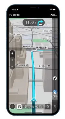
Notice how the route takes center stage, along with the next turn. Everything else is secondary/tertiary or not even there/hidden behind the triple-dots button. -
Significantly less information buttons can be seen in the landscape screen than in the portrait screen. I very much hope that those sources of information can be turned on and off because I don't want to use them all.
The amount of info fields in the portrait screen do disturb me.
I am an old fashioned biker.")
By the way, one with an R1250RT with TFT screen where you can get a lot of information
-
Whaha @Herko-ter-Horst we were thinking the same.
-
@Herko-ter-Horst @Jack-van-Tilburg You are completely correct about the cluttering. With a single tap on the screen, all irrelevant information is removed from the screen. The only information that remains is that what you really want to see (landscape mode example). We might also make some visuals optional such as displaying current / max speed or the street you are currently driving on.
Similar to the Mobile app now. If you tap the screen, practically everything is removed from the screen.
@Corjan-Meijerink
That's information I like -
@Herko-ter-Horst @Jack-van-Tilburg You are completely correct about the cluttering. With a single tap on the screen, all irrelevant information is removed from the screen. The only information that remains is that what you really want to see (landscape mode example). We might also make some visuals optional such as displaying current / max speed or the street you are currently driving on.
Similar to the Mobile app now. If you tap the screen, practically everything is removed from the screen.
@Corjan-Meijerink said in MRA Navigation Next first video!:
@Herko-ter-Horst @Jack-van-Tilburg You are completely correct about the cluttering. With a single tap on the screen, all irrelevant information is removed from the screen. The only information that remains is that what you really want to see (landscape mode example). We might also make some visuals optional such as displaying current / max speed or the street you are currently driving on.
Similar to the Mobile app now. If you tap the screen, practically everything is removed from the screen.
I like having options to configure things to my liking - including display elements.
As a general note... I might refrain from over analyzing what can be seen from such a short little snippet (advice I'll probably be ignoring any second now). Better to wait until one has this thing in their hands, can play around with settings, and give it good test run or two before drawing any conclusions/formulating opinions about the UI, function, etc.
My 2 cents.
-
@Corjan-Meijerink said in MRA Navigation Next first video!:
@Herko-ter-Horst @Jack-van-Tilburg You are completely correct about the cluttering. With a single tap on the screen, all irrelevant information is removed from the screen. The only information that remains is that what you really want to see (landscape mode example). We might also make some visuals optional such as displaying current / max speed or the street you are currently driving on.
Similar to the Mobile app now. If you tap the screen, practically everything is removed from the screen.
I like having options to configure things to my liking - including display elements.
As a general note... I might refrain from over analyzing what can be seen from such a short little snippet (advice I'll probably be ignoring any second now). Better to wait until one has this thing in their hands, can play around with settings, and give it good test run or two before drawing any conclusions/formulating opinions about the UI, function, etc.
My 2 cents.
@Tim-Thompson You will all be given access to the first beta
Hope to get that fixed in a few weeks. Below an example of the screen with minimal information. Same disclaimer as mentioned before applies ")
-
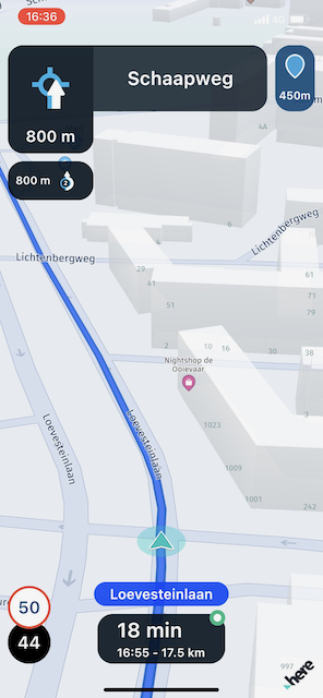
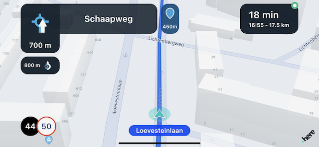
Ok. Already breaking my own rules here... Can't help myself...
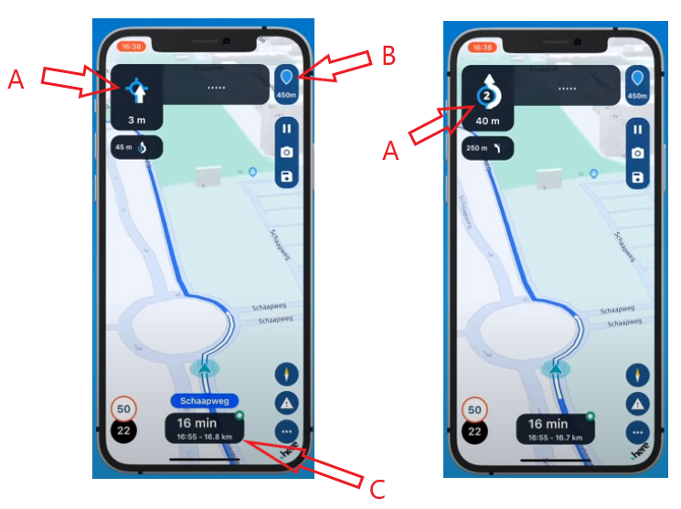
A) What's up with that upcoming roundabout symbol (on the left)? It seems off somehow. Cluttered. Like the white arrow should be below the roundabout. Or perhaps it shouldn't exist at all. Why not just show the roundabout symbol on the right the whole time? The symbol didn't change to the one on the right until entering the roundabout, which seems way late to me. I'd like to see the symbol on the right way in advance of reaching the roundabout. If I get to see the symbol on the right way in advance, then the symbol on the left may not be needed.
B) What is this telling me? Distance to the next shaping point? Some will like this, but I hope there's an option to turn it off.
C) I'm presuming this is showing me time/distance info to the next via (stop). No? Hopefully this field will be configurable to show this information for the next via (stop), final destination, etc.
-
@Tim-Thompson You will all be given access to the first beta
Hope to get that fixed in a few weeks. Below an example of the screen with minimal information. Same disclaimer as mentioned before applies @Corjan-Meijerink can you get rid of the housenumbers? They are of no use when riding a route and they distract me... The only time they are of use is when I'm navigating from A to B and I'm almost at point B.
BMW K1600GT-P (2013) | Nolan N100-5 with Sena 30K
iOS on iPhone 13 & 16 (mounted on Quadlock or AliExpress extention on BMW-cradle)
Apple CarPlay in VW T-Roc
Routelab on MacBook Air & iMac (Tahoe & Ventura) -
@Tim-Thompson You will all be given access to the first beta
Hope to get that fixed in a few weeks. Below an example of the screen with minimal information. Same disclaimer as mentioned before applies @Corjan-Meijerink Looks a bit better like this, but the big dark boxes obscure too much of the route IMO, especially those at the top of the screen (where the route line is most useful to see what's coming up ahead).
-
Ok. Already breaking my own rules here... Can't help myself...
A) What's up with that upcoming roundabout symbol (on the left)? It seems off somehow. Cluttered. Like the white arrow should be below the roundabout. Or perhaps it shouldn't exist at all. Why not just show the roundabout symbol on the right the whole time? The symbol didn't change to the one on the right until entering the roundabout, which seems way late to me. I'd like to see the symbol on the right way in advance of reaching the roundabout. If I get to see the symbol on the right way in advance, then the symbol on the left may not be needed.
B) What is this telling me? Distance to the next shaping point? Some will like this, but I hope there's an option to turn it off.
C) I'm presuming this is showing me time/distance info to the next via (stop). No? Hopefully this field will be configurable to show this information for the next via (stop), final destination, etc.
@Tim-Thompson Thanks for your input!
A) You are correct, the first icon wouldn't be shown in general. When we know which exit you should actually take, we show that one (like the second image). The first image is a general fallback "drive onto a roundabout of which we do not yet know the exit"
B) Correct again. Yes, you can turn this off.
C) Correct, same as above. -
@Corjan-Meijerink can you get rid of the housenumbers? They are of no use when riding a route and they distract me... The only time they are of use is when I'm navigating from A to B and I'm almost at point B.
@Rob-Verhoeff They are only visible because we are on a very high zoom level. Meaning the housenumbers are only visible when driving very slow / standing still. When actually driving, you won't be able to see them.
The demo doesn't zoom in / out at all based on your speed so it stays on that very high zoom level giving a slightly wacky experience.
-
@Rob-Verhoeff They are only visible because we are on a very high zoom level. Meaning the housenumbers are only visible when driving very slow / standing still. When actually driving, you won't be able to see them.
The demo doesn't zoom in / out at all based on your speed so it stays on that very high zoom level giving a slightly wacky experience.
@Corjan-Meijerink OK, I understand that, but even then showing the housenumbers is annoying when you drive slowly through a village during a route. Even then they are of no value.
-
Thanks everyone for the good feedback on our designs, with this in mind we can continue re-iterating until it's perfect. Next week a new internal design delivery is planned, if you can all get your feedback out of the way that would be great. Things that help us:
-
clear ideas formatted like @Con-Hennekens and @Tim-Thompson did.
-
Examples of who does what right like @Herko-ter-Horst , providing TomTom Go as an example (including what we do better
-
Please, do tell us which elements you do like. It's always easier to criticize than to think "hey this is nice". I'm not saying this because I'm fragile like that, but for practical purposes: when (re)designing you also need to know what is a strong element.
-
-
Thanks everyone for the good feedback on our designs, with this in mind we can continue re-iterating until it's perfect. Next week a new internal design delivery is planned, if you can all get your feedback out of the way that would be great. Things that help us:
-
clear ideas formatted like @Con-Hennekens and @Tim-Thompson did.
-
Examples of who does what right like @Herko-ter-Horst , providing TomTom Go as an example (including what we do better
-
Please, do tell us which elements you do like. It's always easier to criticize than to think "hey this is nice". I'm not saying this because I'm fragile like that, but for practical purposes: when (re)designing you also need to know what is a strong element.
@Timo-Martosatiman-MRA
What I'm missing on the main screen is the skip button "viapoint" (only visible if you miss a viapoint). Normal (formation) points are automatically skipped. -
-
@Tim-Thompson Thanks for your input!
A) You are correct, the first icon wouldn't be shown in general. When we know which exit you should actually take, we show that one (like the second image). The first image is a general fallback "drive onto a roundabout of which we do not yet know the exit"
B) Correct again. Yes, you can turn this off.
C) Correct, same as above.@Corjan-Meijerink said in MRA Navigation Next first video!:
The first image is a general fallback "drive onto a roundabout of which we do not yet know the exit"
I am not sure if I understand this correctly, but if my navigation does not now yet where I should leave the roundabout, I and it will have a problem...

-
Thanks everyone for the good feedback on our designs, with this in mind we can continue re-iterating until it's perfect. Next week a new internal design delivery is planned, if you can all get your feedback out of the way that would be great. Things that help us:
-
clear ideas formatted like @Con-Hennekens and @Tim-Thompson did.
-
Examples of who does what right like @Herko-ter-Horst , providing TomTom Go as an example (including what we do better
-
Please, do tell us which elements you do like. It's always easier to criticize than to think "hey this is nice". I'm not saying this because I'm fragile like that, but for practical purposes: when (re)designing you also need to know what is a strong element.
@Timo-Martosatiman-MRA said in [MRA Navigation Next first video!]
- Examples of who does what right like @Herko-ter-Horst , providing TomTom Go as an example (including what we do better
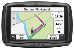
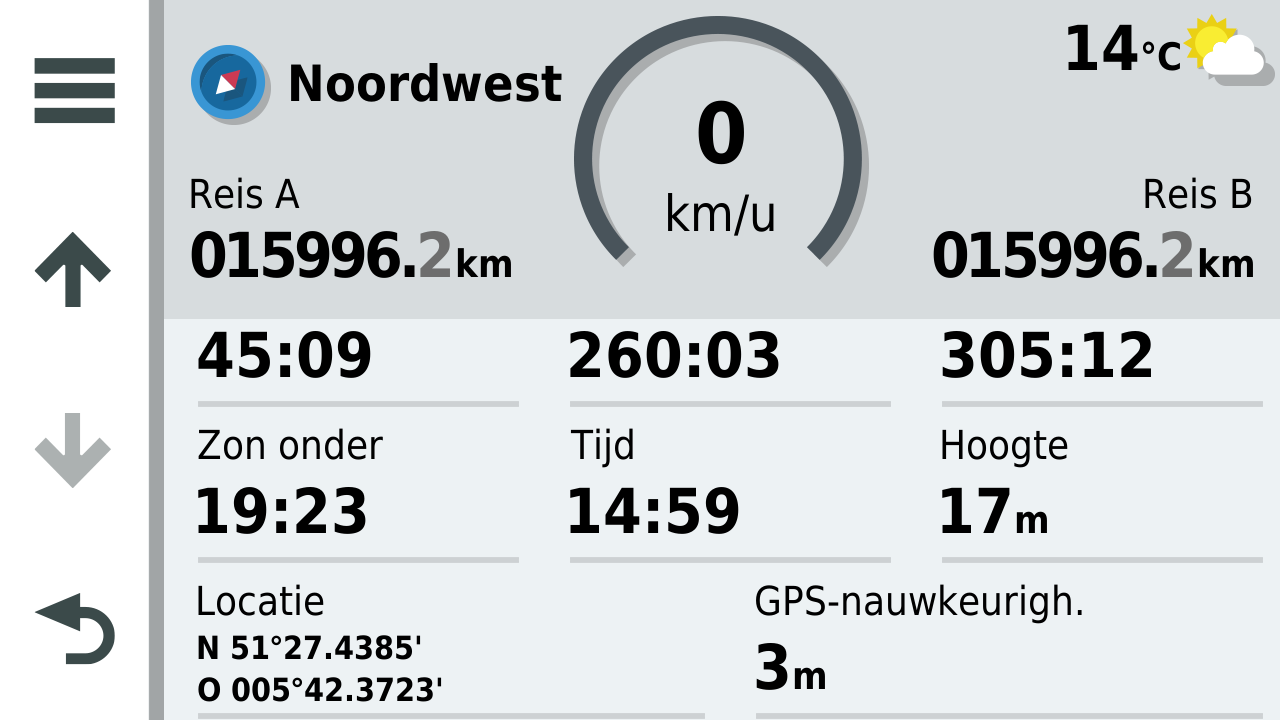
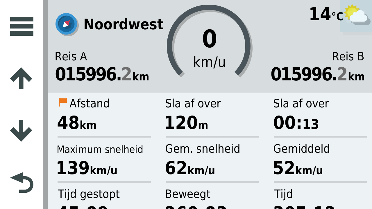
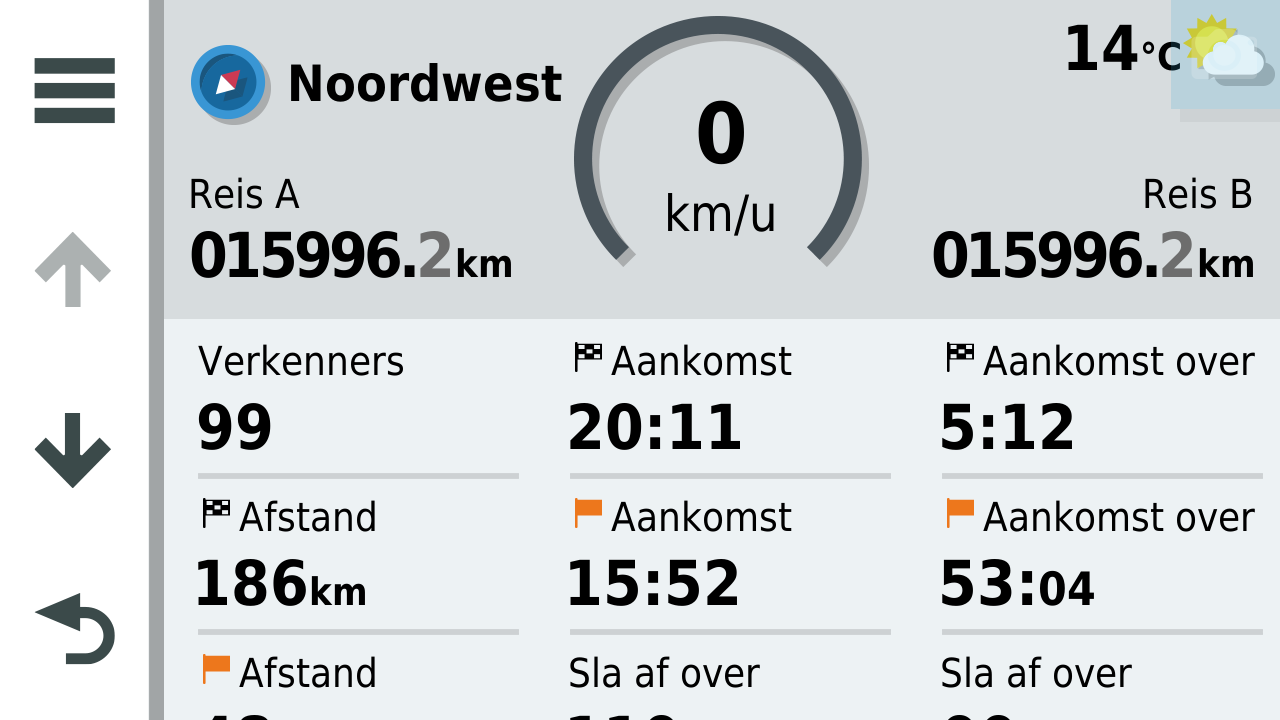
I have no screenshot like Herko, but what I realy liked about my Zumo are the configurable datafields. As a fact, my suggestion to place all datafields at one side of the screen comes from there. If I remember correctly the Zumo offers 6 datafields that can filled in as wished with about 12 options like Speed, Time, Time to destination, Time to next guidance, and some other. One of them I really appreciated was Height (from GPS data), always nice when riding twisties in mountain areas.
I really like the idea of a tap to hide all that!
EDIT: actualy I do have a screenshot, just not my own
Of course I do not want to have that same look, but the user definable dashboards are certainly a nice gimmick.I am just an enthusiastic MRA user, and hope you will be one too!
Most motorcycle problems are caused by the nut that connects the handlebar to the saddle.
Check out RideSleepRepeat.eu, a biker community for sharing stays across Europe
-
-
@Timo-Martosatiman-MRA said in [MRA Navigation Next first video!]
- Examples of who does what right like @Herko-ter-Horst , providing TomTom Go as an example (including what we do better
I have no screenshot like Herko, but what I realy liked about my Zumo are the configurable datafields. As a fact, my suggestion to place all datafields at one side of the screen comes from there. If I remember correctly the Zumo offers 6 datafields that can filled in as wished with about 12 options like Speed, Time, Time to destination, Time to next guidance, and some other. One of them I really appreciated was Height (from GPS data), always nice when riding twisties in mountain areas.
I really like the idea of a tap to hide all that!
EDIT: actualy I do have a screenshot, just not my own
Of course I do not want to have that same look, but the user definable dashboards are certainly a nice gimmick.Totally agree, that tap to remove all notifications is a great option.
-
@Timo-Martosatiman-MRA said in [MRA Navigation Next first video!]
- Examples of who does what right like @Herko-ter-Horst , providing TomTom Go as an example (including what we do better
I have no screenshot like Herko, but what I realy liked about my Zumo are the configurable datafields. As a fact, my suggestion to place all datafields at one side of the screen comes from there. If I remember correctly the Zumo offers 6 datafields that can filled in as wished with about 12 options like Speed, Time, Time to destination, Time to next guidance, and some other. One of them I really appreciated was Height (from GPS data), always nice when riding twisties in mountain areas.
I really like the idea of a tap to hide all that!
EDIT: actualy I do have a screenshot, just not my own
Of course I do not want to have that same look, but the user definable dashboards are certainly a nice gimmick.And which options would you like to be able to turn on or off?
In the Zumo XT you have 20 options that you can display on the main screen.
Honestly, I only use 2, and that's the arrival time at a viapoint and the speed.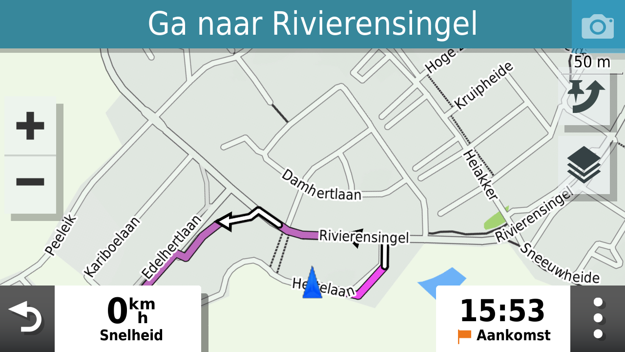
Garmin Zumo XT3/XT2/XT/BMW Connected Ride Navigator/MyRouteapp (The App)/...
Een dag niet gelachen is een dag niet geleefd / Een route is net zo goed als deze uitgezet is. -
And which options would you like to be able to turn on or off?
In the Zumo XT you have 20 options that you can display on the main screen.
Honestly, I only use 2, and that's the arrival time at a viapoint and the speed. @Hans-van-de-Ven-MRA-Master
On the XT the only info I use is the data below.
All of which will probably be available in MRA Next anyway.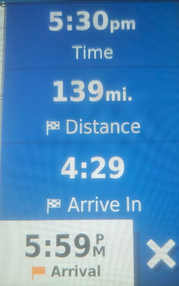
Hello! It looks like you're interested in this conversation, but you don't have an account yet.
Getting fed up of having to scroll through the same posts each visit? When you register for an account, you'll always come back to exactly where you were before, and choose to be notified of new replies (either via email, or push notification). You'll also be able to save bookmarks and upvote posts to show your appreciation to other community members.
With your input, this post could be even better 💗
Register Login-
0487
-
07271
-
0343
-
09377
-
0319
-
0323
-
0229
-
0313.2k