Waypoints before route instructions
-
I think this may have been discussed in Beta previously but couldn’t find it. When planning a route I use expand function to place more shaping points to ensure route follows the path I choose.
When navigating these ‘shaping points’ end up being counted down as in image below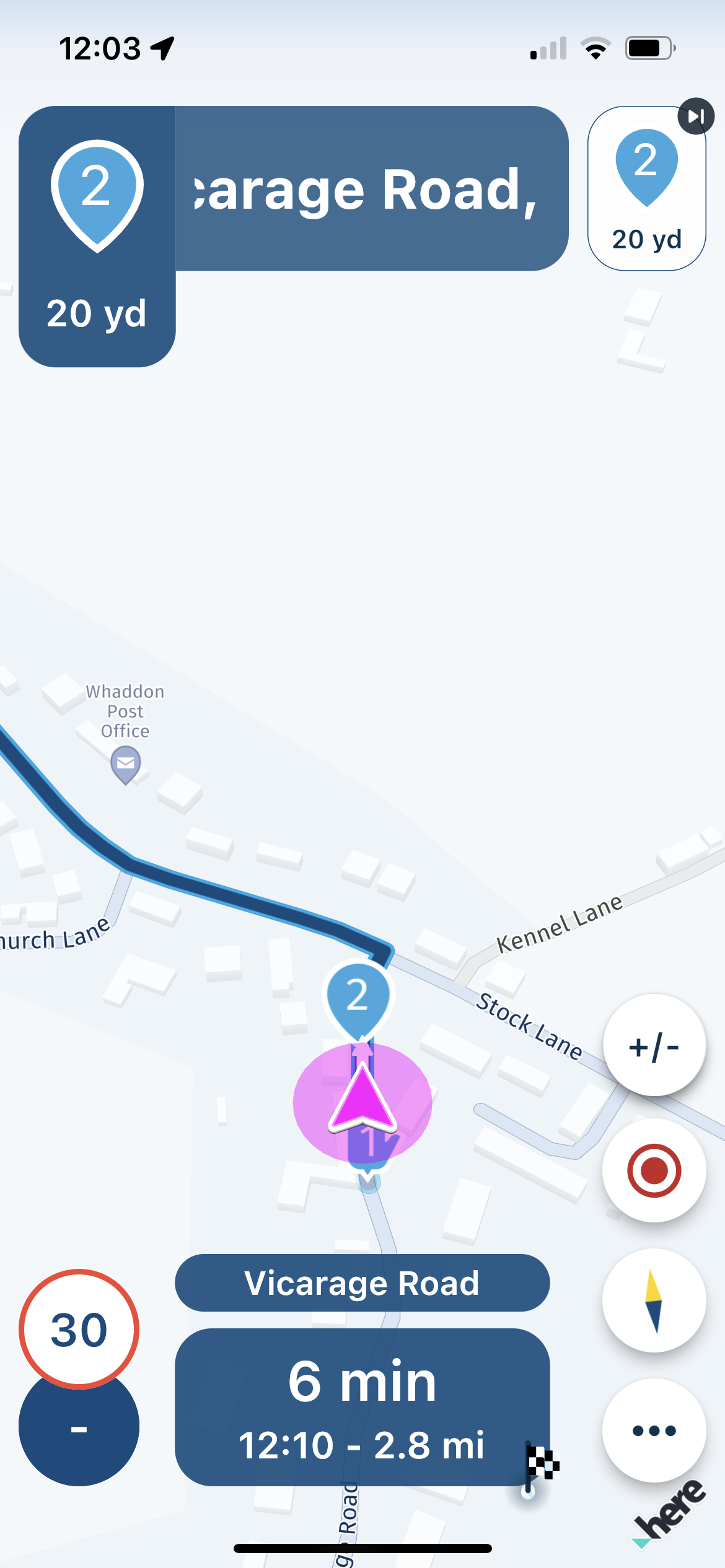
Happy with the waypoint countdown top right but in my opinion the top left route instruction should be just that - showing the next (first) turn I need to make. So if that turn is in 25 miles and there are 2 shaping points before the turn I’d still know when the turn is / should be as that turn would be displayed as the next instruction. (As it is on Garmin etc)
Am I missing something in settings or is it intended to be like this?
Most shaping points are just that to me and really need to just be in the background. If I want to know more I’d use a via point and text etc within.
-
I think this may have been discussed in Beta previously but couldn’t find it. When planning a route I use expand function to place more shaping points to ensure route follows the path I choose.
When navigating these ‘shaping points’ end up being counted down as in image below
Happy with the waypoint countdown top right but in my opinion the top left route instruction should be just that - showing the next (first) turn I need to make. So if that turn is in 25 miles and there are 2 shaping points before the turn I’d still know when the turn is / should be as that turn would be displayed as the next instruction. (As it is on Garmin etc)
Am I missing something in settings or is it intended to be like this?
Most shaping points are just that to me and really need to just be in the background. If I want to know more I’d use a via point and text etc within.
@Mark-Hamilton-0 I agree, we need an option to remove waypoints from the navigation instructions top left and only show the next two navigation instructions.
-
@Mark-Hamilton-0 I agree, we need an option to remove waypoints from the navigation instructions top left and only show the next two navigation instructions.
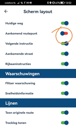
@Doug-Robinson, Isn't this exactly that?
-
This issue is not limited to MRA Navigation.
When I import a (MRA) route on the BMW Connected App (TomTom) and use the waypoints to let the nav calculate the route, I experience the same thing.
My solution to this is to make sure, when planning the route, that waypoints are not to close to an intersection where a left-right turn command is taking place.
Disabling the announcements is not a good option for me. -
@Doug-Robinson, Isn't this exactly that?

@Con-Hennekens no, that only turns off the next waypoint info at the top right of the screen. I'm talking sbout the waypoint info top left side of the screen.
-
@Con-Hennekens no, that only turns off the next waypoint info at the top right of the screen. I'm talking sbout the waypoint info top left side of the screen.
@Doug-Robinson
You can disable the announcements in the audio settings.
But that applies to all waypoints.
I choose to plan the location of the waypoint in such a way that it does not come shortly before a left-right turn command. -
@Doug-Robinson
You can disable the announcements in the audio settings.
But that applies to all waypoints.
I choose to plan the location of the waypoint in such a way that it does not come shortly before a left-right turn command.@Jack-van-Tilburg we don’t want to disable the announcements, it’s just that the distance to the next 1,2,3 etc shaping points is masking the actual next turn instructions- be that in 2km or 200km. Likelihood is if you use shaping points they will at some points in the route leave you blind on where the next actual turn will be.
My Garmin XT knows and shows the shaping points but I always know where the next turn is at it is always displayed in the navigation instruction area no matter where the shaping point is - not so with MRA navigation (next)
-
Yeah - that’s still on our list

-
@Jack-van-Tilburg we don’t want to disable the announcements, it’s just that the distance to the next 1,2,3 etc shaping points is masking the actual next turn instructions- be that in 2km or 200km. Likelihood is if you use shaping points they will at some points in the route leave you blind on where the next actual turn will be.
My Garmin XT knows and shows the shaping points but I always know where the next turn is at it is always displayed in the navigation instruction area no matter where the shaping point is - not so with MRA navigation (next)
@Mark-Hamilton-0
Yes and that's is why I choose to plan the location of the waypoint in such a way that it does not come shortly before a left-right turn command. -
I think this may have been discussed in Beta previously but couldn’t find it. When planning a route I use expand function to place more shaping points to ensure route follows the path I choose.
When navigating these ‘shaping points’ end up being counted down as in image below
Happy with the waypoint countdown top right but in my opinion the top left route instruction should be just that - showing the next (first) turn I need to make. So if that turn is in 25 miles and there are 2 shaping points before the turn I’d still know when the turn is / should be as that turn would be displayed as the next instruction. (As it is on Garmin etc)
Am I missing something in settings or is it intended to be like this?
Most shaping points are just that to me and really need to just be in the background. If I want to know more I’d use a via point and text etc within.
@Mark-Hamilton-0 fully agree!
-
This issue is not limited to MRA Navigation.
When I import a (MRA) route on the BMW Connected App (TomTom) and use the waypoints to let the nav calculate the route, I experience the same thing.
My solution to this is to make sure, when planning the route, that waypoints are not to close to an intersection where a left-right turn command is taking place.
Disabling the announcements is not a good option for me.@Jack-van-Tilburg, Yes, maybe it would make sense to NOT have announcements in the left tile, but only in the right tile. A waypoint is no routing instruction after all.
-
There is nothing wrong with keeping some human thinking
In any case, it does not hurt to check the route before you drive it.
And what is the purpose of the waypoint so close to a left-right turn point? Probably meant to guarantee the direction. And then it makes more sense to place the point after the intersection.
The more solutions offered by technology, the more complex the software (technically) becomes. -
@Mark-Hamilton-0 fully agree!
@GT-JWR Second that! The top left information box should display what to do at the next turning, nothing else. This is a fundamental pre-requisite of a navigation system and should not be compromised.
-
There is nothing wrong with keeping some human thinking
In any case, it does not hurt to check the route before you drive it.
And what is the purpose of the waypoint so close to a left-right turn point? Probably meant to guarantee the direction. And then it makes more sense to place the point after the intersection.
The more solutions offered by technology, the more complex the software (technically) becomes.@Jack-van-Tilburg fully understand the need for good planning and placement of route points but the expand function would be redundant in effect if we have to move them all to places where they don’t affect the Nav instructions. There will be situations where you have to have numerous route points to ensure that between point a-b that the route stays as you require and these route points can’t then go after the turn so they would mask the next instruction.
-
Yeah - that’s still on our list

@Corjan-Meijerink great - keep up the top work.
-
@Jack-van-Tilburg fully understand the need for good planning and placement of route points but the expand function would be redundant in effect if we have to move them all to places where they don’t affect the Nav instructions. There will be situations where you have to have numerous route points to ensure that between point a-b that the route stays as you require and these route points can’t then go after the turn so they would mask the next instruction.
@Mark-Hamilton-0, The expand function is just a quick way to add shaping points. The placement is still your own responsibility.
@David-Bonner, That is too bold a statement. Often waypoints have a specific meaning, by color, by pause or pause symbol, by POI manual entered name or whatever. The right tile was initial only meant as button for skipping. While I mildly agree with you, in the end it is the developers choice about what is fundamental in their application. But hey... The MRA developers actually listen in on the forum

-
@Mark-Hamilton-0, The expand function is just a quick way to add shaping points. The placement is still your own responsibility.
@David-Bonner, That is too bold a statement. Often waypoints have a specific meaning, by color, by pause or pause symbol, by POI manual entered name or whatever. The right tile was initial only meant as button for skipping. While I mildly agree with you, in the end it is the developers choice about what is fundamental in their application. But hey... The MRA developers actually listen in on the forum

@Con-Hennekens yes agreed but if eg ‘expand’ puts 3 on a 20 km stretch of road (which may be needed to stop route variation by nav device) then I should only be making sure that they are on the route and not at junctions, overpasses, wrong side of carriageway - not removing them so I can see when the next turn is. Again in this example if I remove them the Nav device may vary the route.
Happy Corjan sees the need and it’s on the list. -
Hi, I think top left information must include only next instruction, because you have the waypoint/shaping point information in the top right button.
Other thing I think is very important is to have on the screen the name of the next waypoint, this is a important information on a planned route
-
For me, waypoint title/colour (together with notes sometimes) are key to how I plot with the planner for these aspects to then show up in the top left. It is one of the reasons I like the new nav aspect of MRA as I can see 'consideration' comments at coloured shaping points as well as my definite via points for must stops. Never had a problem with turn masking as shaping points are always placed after junctions/turns (even when I have used the 'expand' tool occasionally). However, I do see that what may work for one person is an annoyance for another and vice versa
The key point is configurability as we all use the planning tool to compile routes in our own way and want this information displayed in a way that works for us individually. The MRA team do listen carefully to feedback but they have to balance these requests against their want to not complicate their vision for the app in line with the planning tool. Neither do they, I believe, want to replicate other apps or devices' ways of working. For me this is the strength of what MRA are trying to do with this app.
The new nav element in the app is now my main app for all my motorcycle navigation as is the planning tool for route construction. Yes, I want some additions to what can be done and configured with the app as the app develops from this first release but not changes in the way that the app fundamentally works in line with the planning tool's features and strengths.
-
I thought I would just revisit this subject as while on a weeks riding holiday it became very irritating not being able to see the next turn in the top left box due to the way point being in front of it. I understand that these way points can be moved to after a turn but on a big route with lots of turns that can be very time consuming. for the main part the app worked really well and the MRA teem should be very proud of themselves for a great product.
