Departure and arrival symbol
-
I have just understood the meaning of the info in the lower left panel and I would like to make a suggestion for improvement.
1-the first bubble gives the time, the hour the distance before the next waypoint
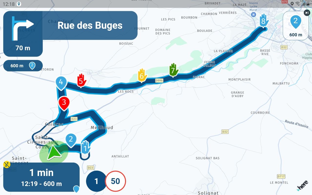
2-the second bubble gives the time, the time the distance before the next viapoint

3- the third bubble gives the time, the time the distance before the arrival

it would be necessary to add in the bubble a symbol of departure and a symbol of arrival, it would be great

-
I have just understood the meaning of the info in the lower left panel and I would like to make a suggestion for improvement.
1-the first bubble gives the time, the hour the distance before the next waypoint

2-the second bubble gives the time, the time the distance before the next viapoint

3- the third bubble gives the time, the time the distance before the arrival

it would be necessary to add in the bubble a symbol of departure and a symbol of arrival, it would be great


@Calibos Thanks for the idea

Another user also suggested it but myself (and others) are quite happy with the default being no icon for two main reasons:- No icons = default = end of route
- Less icons = less clutter
Adding such an icon for sure has little impact and yes it's small but we shouldn't just keep adding icons

But I do completely understand the suggestion.
-
@Calibos Thanks for the idea

Another user also suggested it but myself (and others) are quite happy with the default being no icon for two main reasons:- No icons = default = end of route
- Less icons = less clutter
Adding such an icon for sure has little impact and yes it's small but we shouldn't just keep adding icons

But I do completely understand the suggestion.
@Corjan-Meijerink, besides the "necessary"
 I think it is not a bad idea. The app indicates 2 of three functions. Likely having a these extra icons it makes the intuitive assumption that it can be toggled bigger. But I understand the lower priority.
 -
@Calibos Thanks for the idea

Another user also suggested it but myself (and others) are quite happy with the default being no icon for two main reasons:- No icons = default = end of route
- Less icons = less clutter
Adding such an icon for sure has little impact and yes it's small but we shouldn't just keep adding icons

But I do completely understand the suggestion.
@Corjan-Meijerink said in Departure and arrival symbol:
No icons = default = end of route
I hate to disagree with you, but I would also upvote the start/finish symbols in the current "no symbol" view.

-
In fact, I only use MRA navigation when driving a motorcycle and I always prefer a symbol to a reflection on a quick glance in the navigation screen. But I understand your vision No icon = par default = end of route But there is also the start which is represented as a Viapoint identical to the others, I could possibly change its color...but a small symbol...honestly
Let's say it's a detail but every little detail makes an application that comes a little closer to perfection
-
I have just understood the meaning of the info in the lower left panel and I would like to make a suggestion for improvement.
1-the first bubble gives the time, the hour the distance before the next waypoint

2-the second bubble gives the time, the time the distance before the next viapoint

3- the third bubble gives the time, the time the distance before the arrival

it would be necessary to add in the bubble a symbol of departure and a symbol of arrival, it would be great


@Calibos I’m beginning to like the idea! I can live with it as how it is now, but it certainly had a value. Upvote+
-
And so I’ve begun the Development!
-
And so I’ve begun the Development!

@Corjan-Meijerink
yes ! -
And so I’ve begun the Development!

@Corjan-Meijerink I’m not bothered about extra symbols.
RP 1 is the start point and I change the name of the last RP to The End which I see on screen.
K.I.S.S.
-
@Corjan-Meijerink I’m not bothered about extra symbols.
RP 1 is the start point and I change the name of the last RP to The End which I see on screen.
K.I.S.S.
@Nick-Carthew Yup, #metoo. "Start route" and "Einde route". But, this small gesture is welcome.
-
@Corjan-Meijerink I’m not bothered about extra symbols.
RP 1 is the start point and I change the name of the last RP to The End which I see on screen.
K.I.S.S.
@Nick-Carthew forgive me Nick, but I really don't see how naming the start and end WP relates to showing a "finish flag" or "destination" symbol in the ETA widget field which this thread is about...

-
In fact, I only use MRA navigation when driving a motorcycle and I always prefer a symbol to a reflection on a quick glance in the navigation screen. But I understand your vision No icon = par default = end of route But there is also the start which is represented as a Viapoint identical to the others, I could possibly change its color...but a small symbol...honestly
Let's say it's a detail but every little detail makes an application that comes a little closer to perfection
Personally I have no problem with the Start and Finish remaining as Numbered waypoints.
However, if this is implemented, for consistency, the icons should remain similar to the Icons used for Route-Tracks as shown below, IMO.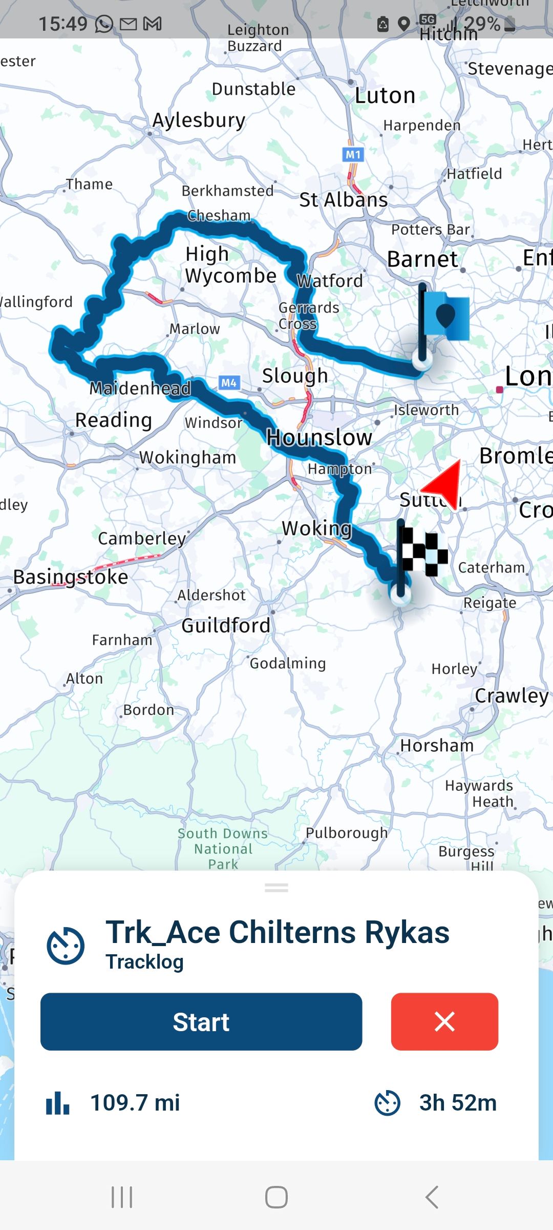
-
Personally I have no problem with the Start and Finish remaining as Numbered waypoints.
However, if this is implemented, for consistency, the icons should remain similar to the Icons used for Route-Tracks as shown below, IMO.
@Nick-Carthew and @Lynchy67, TS is actually talking about the ETA widget/field/bubble:
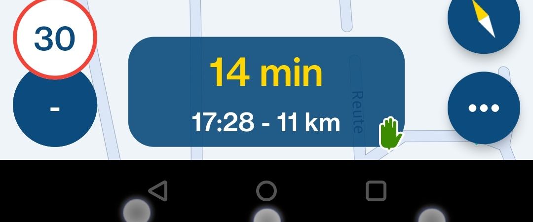
His request has nothing to do with the actual waypoint symbols or visual representation.
-
@Nick-Carthew and @Lynchy67, TS is actually talking about the ETA widget/field/bubble:

His request has nothing to do with the actual waypoint symbols or visual representation.
@StefanHummelink
Apologies, I’ll get my coat, again.
-
Personally I have no problem with the Start and Finish remaining as Numbered waypoints.
However, if this is implemented, for consistency, the icons should remain similar to the Icons used for Route-Tracks as shown below, IMO.
@Lynchy67, SPOILER ALERT!
It will be the finish flag
-
@Con-Hennekens
Makes sense to use it methinks. -
@Nick-Carthew and @Lynchy67, TS is actually talking about the ETA widget/field/bubble:

His request has nothing to do with the actual waypoint symbols or visual representation.
@StefanHummelink said in Departure and arrival symbol:
@Nick-Carthew and @Lynchy67, TS is actually talking about the ETA widget/field/bubble:

His request has nothing to do with the actual waypoint symbols or visual representation.
Whoops
 my mistake.
