Bigger navigation arrow in app
-
Hi,
By request, a separate topic

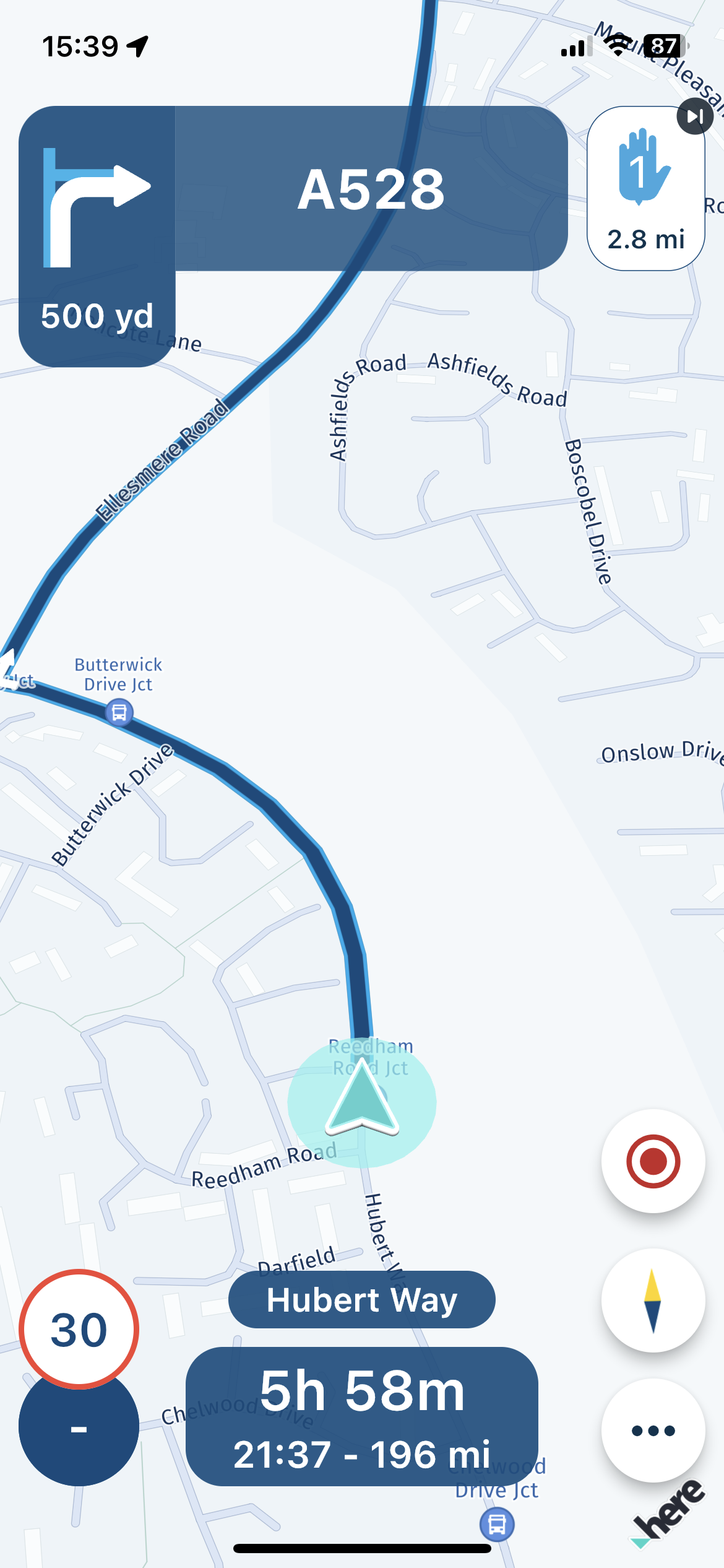
Can the navigation arrow in the app (not in CarPlay) be made a bit bigger? In CarPlay it's perfect, but in the app I really think it's a bit too small.
Here some screenshots... Just ignore the white blocks

It might be best to open the image in a separate window by clicking on it so you can see it in true size.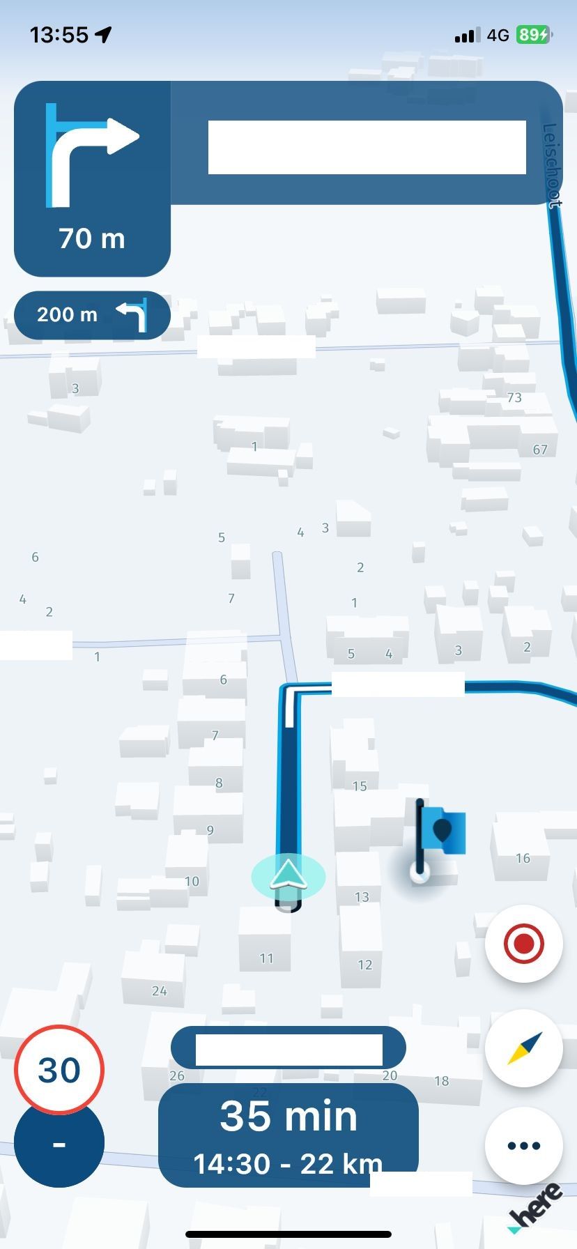
-
Hi,
By request, a separate topic

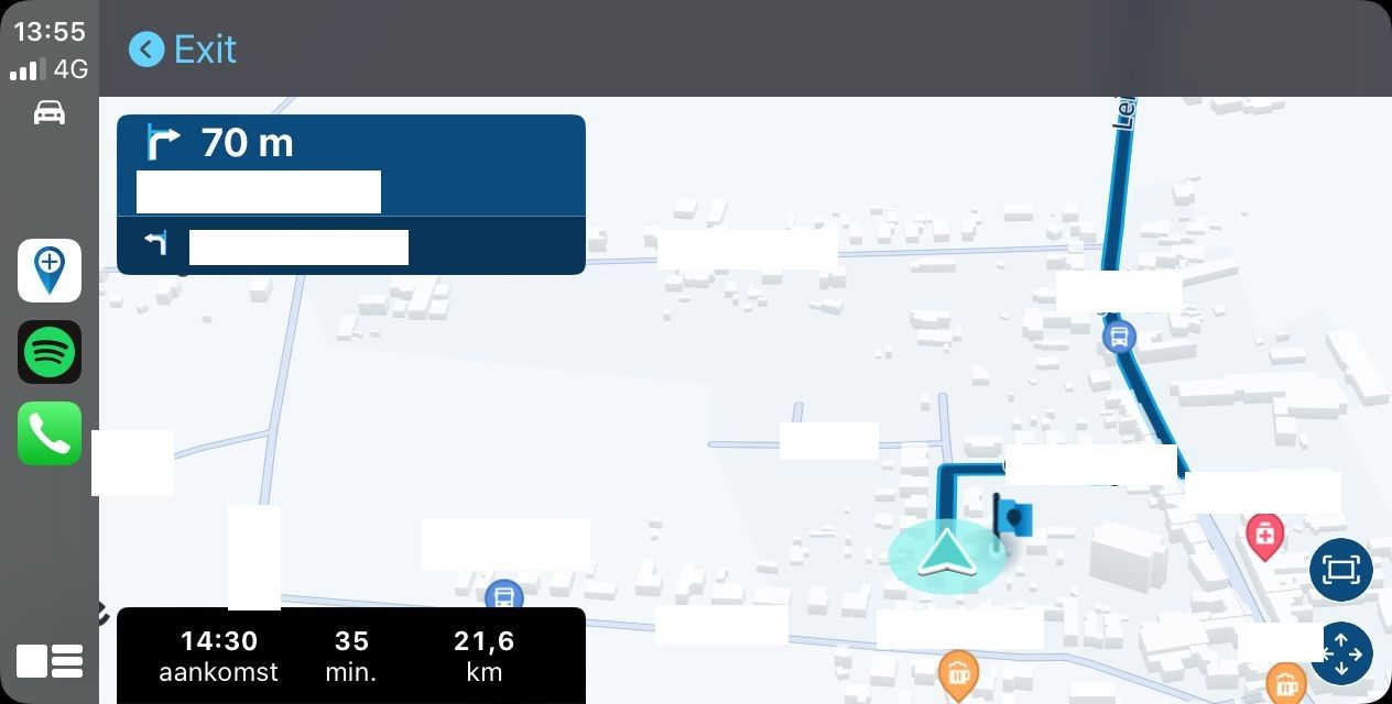
Can the navigation arrow in the app (not in CarPlay) be made a bit bigger? In CarPlay it's perfect, but in the app I really think it's a bit too small.
Here some screenshots... Just ignore the white blocks

It might be best to open the image in a separate window by clicking on it so you can see it in true size.

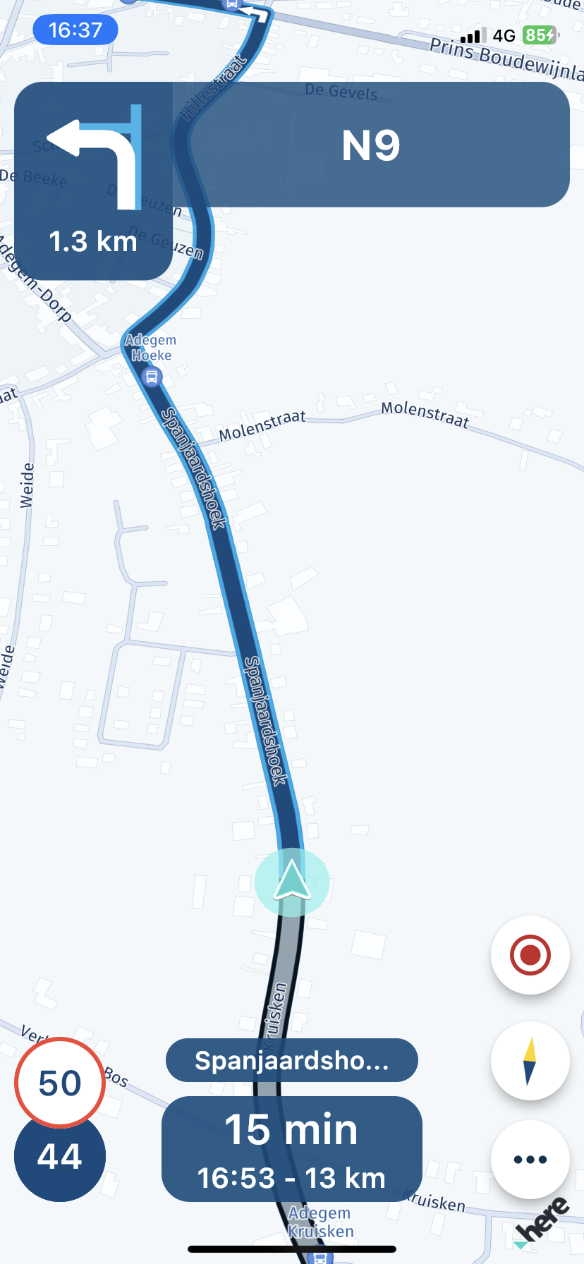
You can clearly see that the two bottom corners of the triangle in carplay come a lot further over the navigation line.
-
You can clearly see that the two bottom corners of the triangle in carplay come a lot further over the navigation line.

@Bart-DM on my Pixel 6 Pro and iPhone 12 Pro the size of the arrow is just right. I would not want the arrow any bigger.
Android:
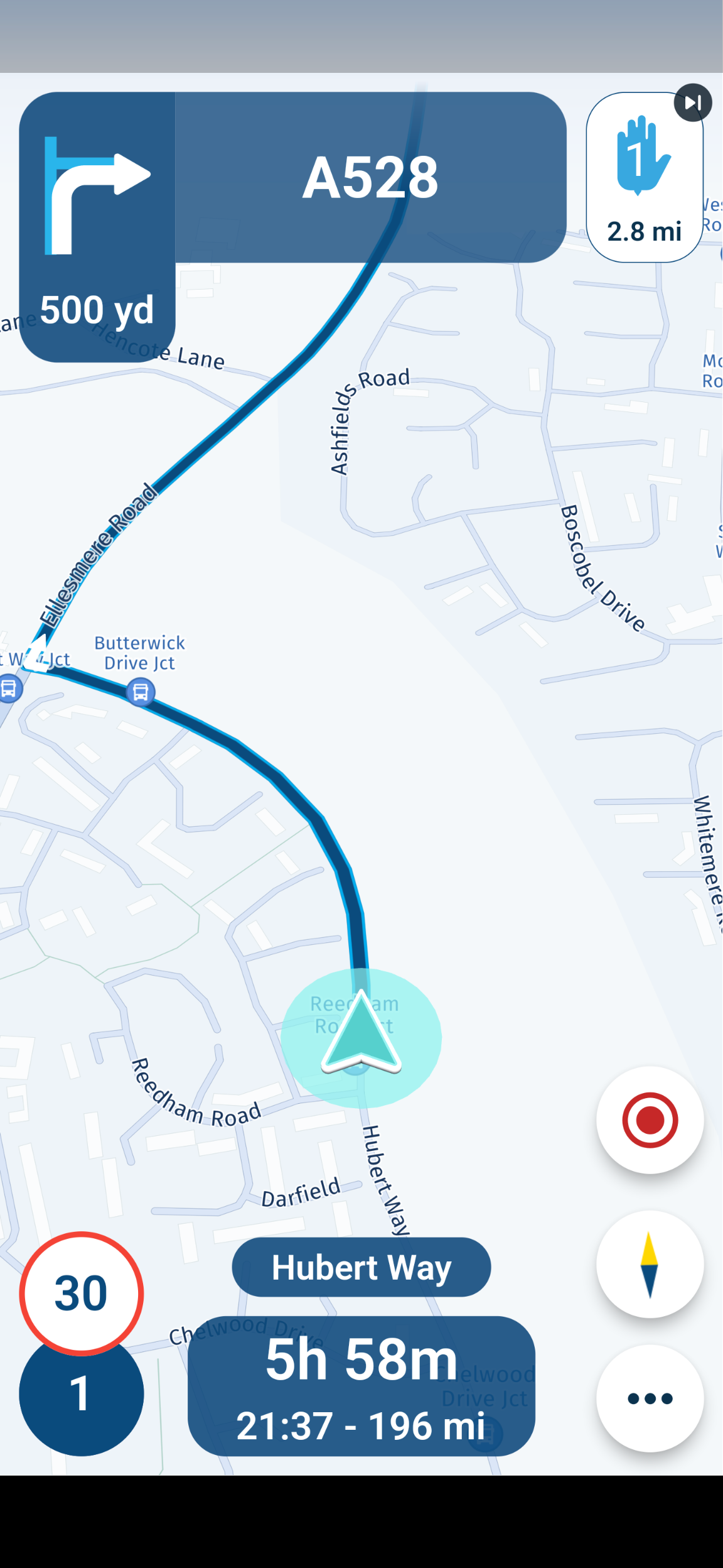
iOS
-
@Bart-DM on my Pixel 6 Pro and iPhone 12 Pro the size of the arrow is just right. I would not want the arrow any bigger.
Android:

iOS

@Dave-J-0 There is a big difference between your arrow and mine. Your size is perfect. My arrow is always small, whether I use CarPlay or not makes no difference.
-
Thanks for the input!

-
@Dave-J-0 There is a big difference between your arrow and mine. Your size is perfect. My arrow is always small, whether I use CarPlay or not makes no difference.
@Bart-DM yes. I was surprised to see the picture of your app arrow which is why I posted my pictures. I am sure that @Corjan-Meijerink will get to the bottom of it and it is probably to do with each phone’s resolution and the way it handles the app. Way beyond me but he will sort I am sure.

-
@Bart-DM yes. I was surprised to see the picture of your app arrow which is why I posted my pictures. I am sure that @Corjan-Meijerink will get to the bottom of it and it is probably to do with each phone’s resolution and the way it handles the app. Way beyond me but he will sort I am sure.

@Dave-J-0 thx for your post!
@Corjan-Meijerink : can this be fixed?
-
@Dave-J-0 thx for your post!
@Corjan-Meijerink : can this be fixed?
@Bart-DM ofcourse! Not sure where the priority lies and this won’t be the top
 But it is a detail we will take into consideration for the coming updates!
Typically these are the category: “we got 4 hours left, what is the quick win?”

-
@Bart-DM ofcourse! Not sure where the priority lies and this won’t be the top
 But it is a detail we will take into consideration for the coming updates!
Typically these are the category: “we got 4 hours left, what is the quick win?”

@Corjan-Meijerink Ok I understand that. I do hope you will soon have 4 hours to spare

-
@Corjan-Meijerink Ok I understand that. I do hope you will soon have 4 hours to spare

@Bart-DM, guys, I am so glad this is about... arrows...

I assessed my own, and I think it is too small too. I know there has been some fuss about the white circle too, but as it stands, the half transparent white circle takes away the contrast of the arrow against the background (the map). It makes it less visible instead of more visible. I won't be sad if it get's cancelled. -
@Bart-DM, guys, I am so glad this is about... arrows...

I assessed my own, and I think it is too small too. I know there has been some fuss about the white circle too, but as it stands, the half transparent white circle takes away the contrast of the arrow against the background (the map). It makes it less visible instead of more visible. I won't be sad if it get's cancelled.@Con-Hennekens I do like the new style, especially in dark mode, the arrow is just too small.

-
@Bart-DM, guys, I am so glad this is about... arrows...

I assessed my own, and I think it is too small too. I know there has been some fuss about the white circle too, but as it stands, the half transparent white circle takes away the contrast of the arrow against the background (the map). It makes it less visible instead of more visible. I won't be sad if it get's cancelled.@Con-Hennekens like you, I am not a fan of the circle! We each have a preference but a big arrow is a must. Even on CarPlay, the arrow is a good size for me. I am sure it will be resolved by @Corjan-Meijerink when he finds a quick 4 hours.
 Really impressed with the pace of development by the two guys. Great they listen to feedback.
