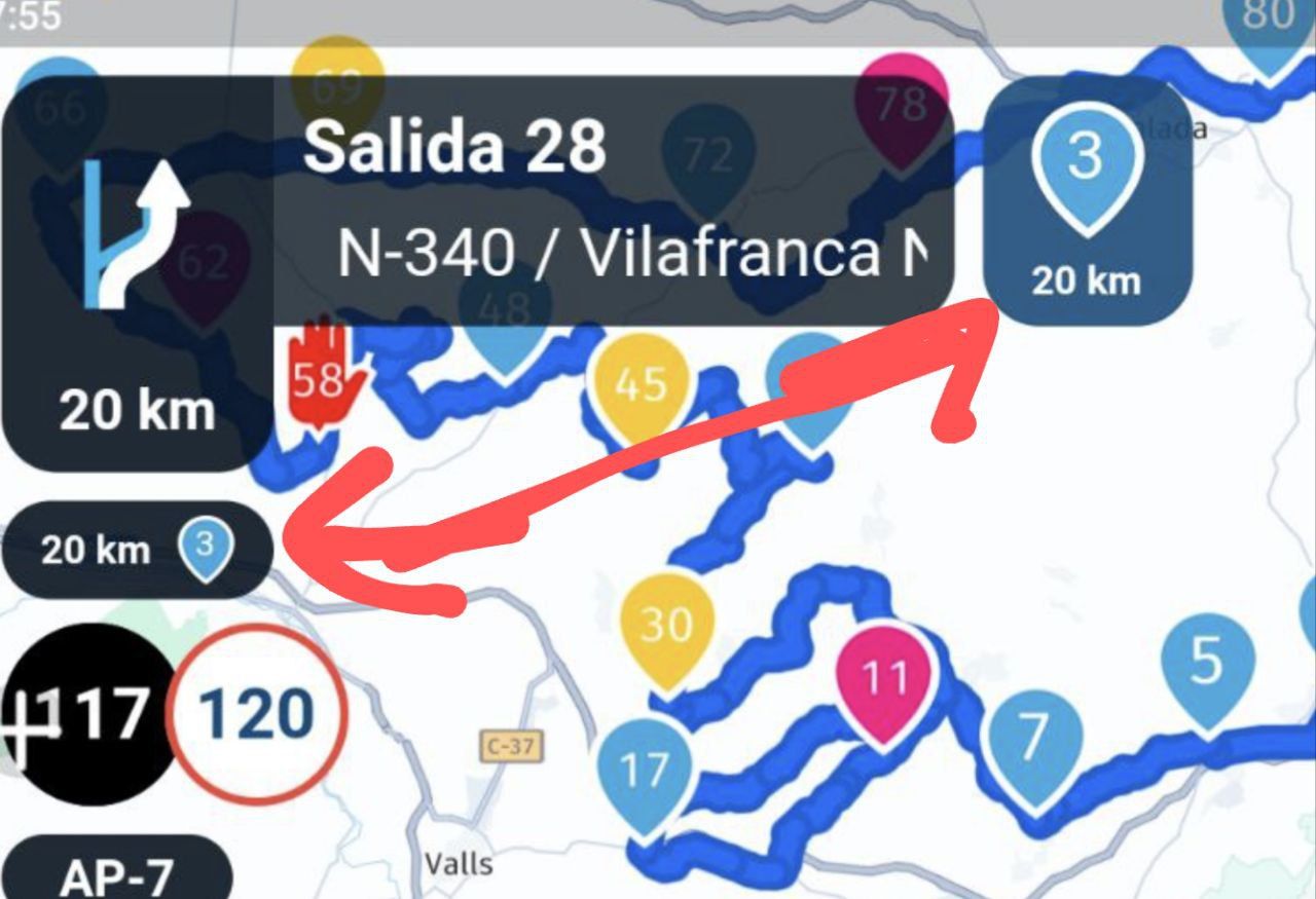
Redundant information and colour of the information signs
-
Another test on a great route. Impressed with the improvements. See distance to the end of the route, next wp or next stop...see name and custom colors, see full map...all are impressive improvements.
But since we are here to try to improve...here are my doubts...is this information redundant? Wouldn't it be better if one of them (perhaps the one on the left) displayed the name of the following wp and not the duplicate kms information?And couldn't the color of the information signs be more transparent? It would gain in visual information

@b0hd1 Happy to hear that you are impressed with all the made changes!


Putting the Waypoint name is the widgets you highlight is really challenging. I think nobody will be able to read them. It now is a little duplicate information but given the road you are now driving on, there simply is no more interesting information to provide then this. After 20km you take the exit off the highway and then you reach a waypoint.
We will attempt to improve this information regardless

Please note: both the blocks of information you highlight can be turned off using the Navigation preference. So if one is turned you would like to see it in the other (or the other way around).
Regardless, thanks for your feedback!
-
@b0hd1 Happy to hear that you are impressed with all the made changes!


Putting the Waypoint name is the widgets you highlight is really challenging. I think nobody will be able to read them. It now is a little duplicate information but given the road you are now driving on, there simply is no more interesting information to provide then this. After 20km you take the exit off the highway and then you reach a waypoint.
We will attempt to improve this information regardless

Please note: both the blocks of information you highlight can be turned off using the Navigation preference. So if one is turned you would like to see it in the other (or the other way around).
Regardless, thanks for your feedback!
@Corjan-Meijerink Thank you for this incredible gift and your endless hours of work!!
-
I discussed this here...
As I noted, I don't think the Upcoming waypoint and Next instruction fields/widgets are redundant. They serve different purposes. It's only when those purposes converge that you get this kind of scenario. Plus - as @Corjan-Meijerink noted - those fields are user configurable - can be turned off/on based on preference. Right now, I like both on.
-
@b0hd1 Happy to hear that you are impressed with all the made changes!


Putting the Waypoint name is the widgets you highlight is really challenging. I think nobody will be able to read them. It now is a little duplicate information but given the road you are now driving on, there simply is no more interesting information to provide then this. After 20km you take the exit off the highway and then you reach a waypoint.
We will attempt to improve this information regardless

Please note: both the blocks of information you highlight can be turned off using the Navigation preference. So if one is turned you would like to see it in the other (or the other way around).
Regardless, thanks for your feedback!
@Corjan-Meijerink "I think nobody will be able to read them."
Hello.
Forgive me for being so bold, I may be making a mistake.
Although the colours of the waypoints can help to identify a stop, I think that the name of the waypoint, if you know how to name it well or, at least, the user uses a striking code -for example, with the TomTom I named the waypoint starting with three arrobas if it was a place with a nice view-, can help the user a lot.
But, I insist, with the colour code you have done us a great favour.
-
@Corjan-Meijerink "I think nobody will be able to read them."
Hello.
Forgive me for being so bold, I may be making a mistake.
Although the colours of the waypoints can help to identify a stop, I think that the name of the waypoint, if you know how to name it well or, at least, the user uses a striking code -for example, with the TomTom I named the waypoint starting with three arrobas if it was a place with a nice view-, can help the user a lot.
But, I insist, with the colour code you have done us a great favour.
@Maicro Happy to hear that! We will see if this can be improved over upcoming updates.
