Suggestion: user defined navigation screen
-
possibility to store several preferred navigation screen set-ups with several options (ETA, Time, Speed, ...) visible or not, and a user defined name.
Like this we could have a bicycle screen, an open road screen, a city screen... all looking like each individual user would like it
-
@Drabslab Thank you for your suggestion. I strongly believe that based on where and what you are doing you should only be presented with information that is relevant to you at that time. Indeed, someone on a bicycle will probably want to see different information than someone on a motorcycle. Someone in a camper is likely to use a bigger navigation device than someone going for a jog.
Keeping all that in mind, User-generated screen setups are pretty complex to build and don't neccecarily improve the User Experience in my opinion. I know too many people who will skip using software if it gives them too much configurability (and yes, that argument works the other way too. I know that
 , though that is a far less populous group).
I think the sweet spot would be to have some setups in the long run that adequately provide what a large amount of people like. When we reach that point, then that's the moment we might consider giving more advanced options to configure the screen set-up.
-
@Drabslab, Oh, so now you are running away with my idea...
 (just joking)
I agree with @Timo-Martosatiman-MRA that only relevant info should be displayed. Problem is everyone has different ideas about relevance. Thats where user-configurability comes in. The on/off switching of data fields should above all be easy. We don't want to turn Navigation into some geek-thing like a Zumo
-
@Con-Hennekens said in Suggestion: user defined navigation screen:
Oh, so now you are running away with my idea... (just joking)
Damn, you noticed


All true what you and Timo say, and yes definitively this is not part of a first viable product, but postponing is often leading to "never"

-
Looking at CoPilotGPS, it does a pretty good job of maintaining a minimalist display - presenting only relevant/necessary information...
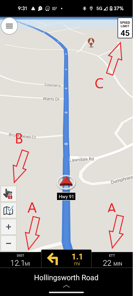
The display is also dated. I haven't seen an update to their UI since the beginning. I'm just throwing it out there as an example of a different approach.
The two top buttons by the B arrow can be disabled/removed from the display, leaving only the zoom buttons. Same for the speed limit (arrow C). What's left is pretty basic.
The two fields marked by arrow A are user configurable. Currently they are showing distance and estimated time remaining to the next via (stop). This is generally my preferred configuration - an option not currently in MRA Navigation. Other options for these fields...
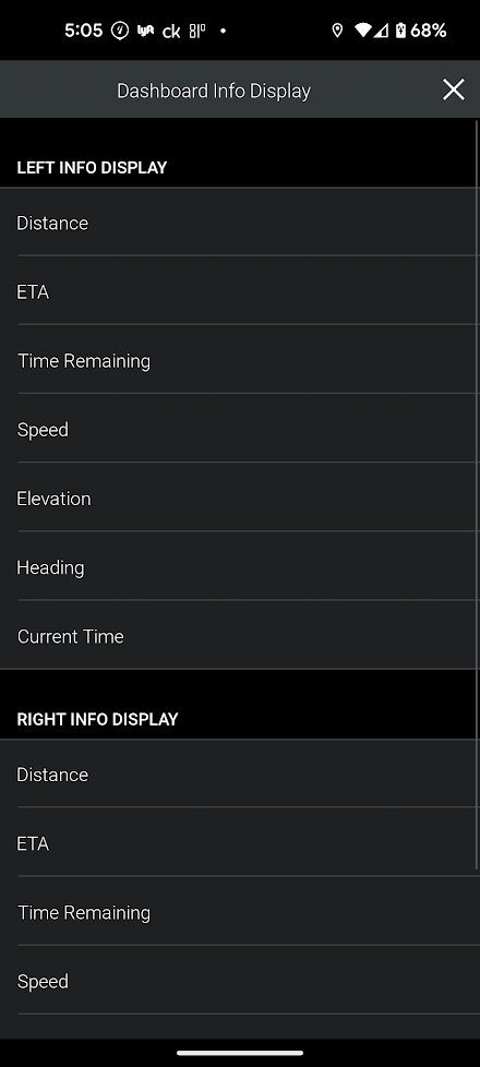
I should also note that those two fields are user selectable/configurable on the fly. You simply touch the field and the options display shown above pops up. It might be handy to be able to display ETA to final destination momentarily.
What MRA calls full screen lane guidance is a user selectable option. However, it's either on or off...
CoPilotGPS calls it ClearTurn. In addition to being able to turn it on/off, they give you configuration options on how it actually works...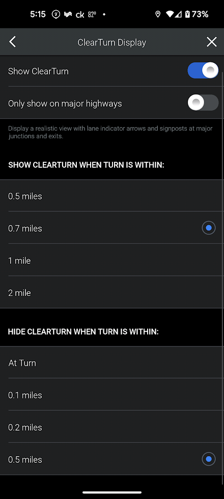
I've got it set to 0.7/0.5 miles, which seems to work well. It pops up and grabs your attention, but doesn't persist long enough to get in the way.
MRA has an option to "Alert me when I'm speeding". It's either on or off. There's no option to turn speed limits off etc. CoPilotGPS on the other hand...
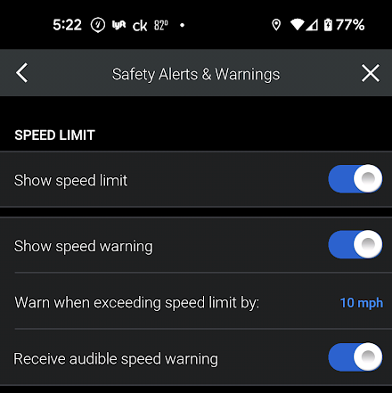
I'm not sure why I'd ever turn the speed limit display off. But maybe being able to set how many mph over before you get a warning might be useful.
Perhaps less useful, but mentioning anyway... CoPilotGPS will display "places"/POIs on the map. I'm not sure how handy that would be. But, what POIs categories get displayed is user selectable. IDK, gas stations or food might be handy. They can also be configured to display only when stopped. Maybe more useful is the "places"/POI alerts. These alerts are also user configurable. Perhaps getting alerted to nearby gas stations, restaurants or parking/rest stops for example may be handy.
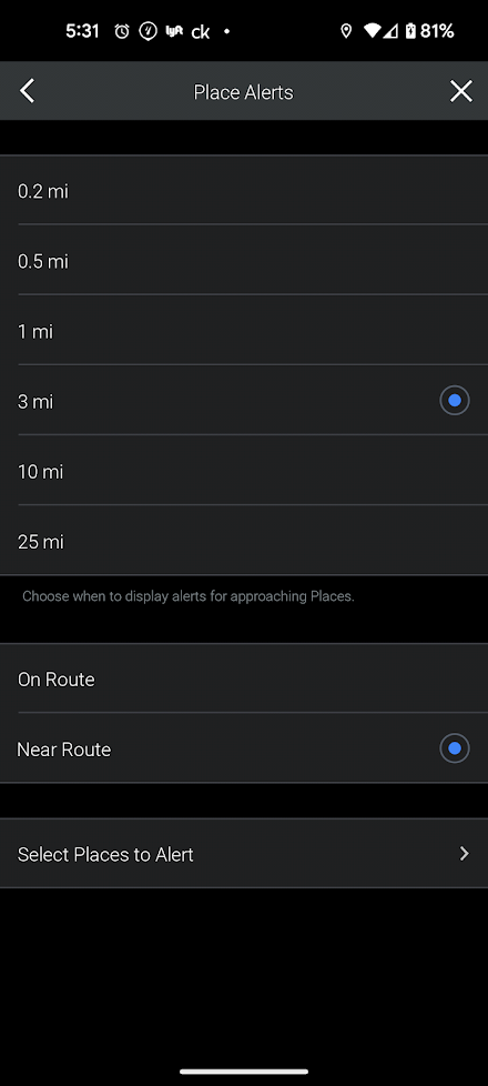
Anyway... My main point is that I think maybe there should be room made for some user configurable fields. Especially the time/distance to the next via (stop) as shown by arrow A above.
-
Moved from [Beta] The MyRoute-app by
 MyRoute-app community