Font for the distance to the next turn to smal
-

Last weekend, I rode several routes using the myRoute app—comparing it against my Rider 400 and the Calimoto app—in order to determine the best navigation method for my needs. I navigated solely by following the on-screen instructions, without using headphones inside my helmet.
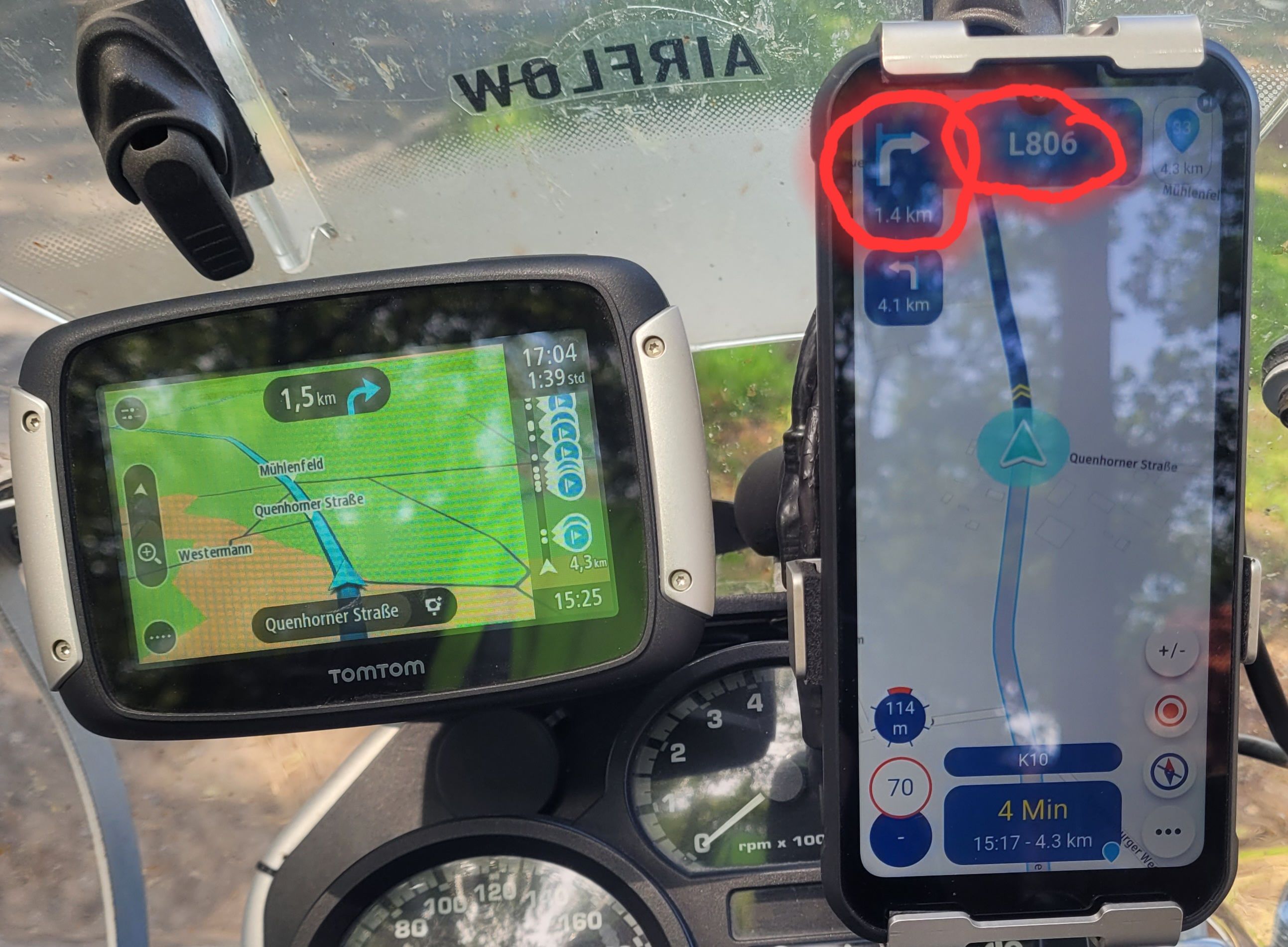
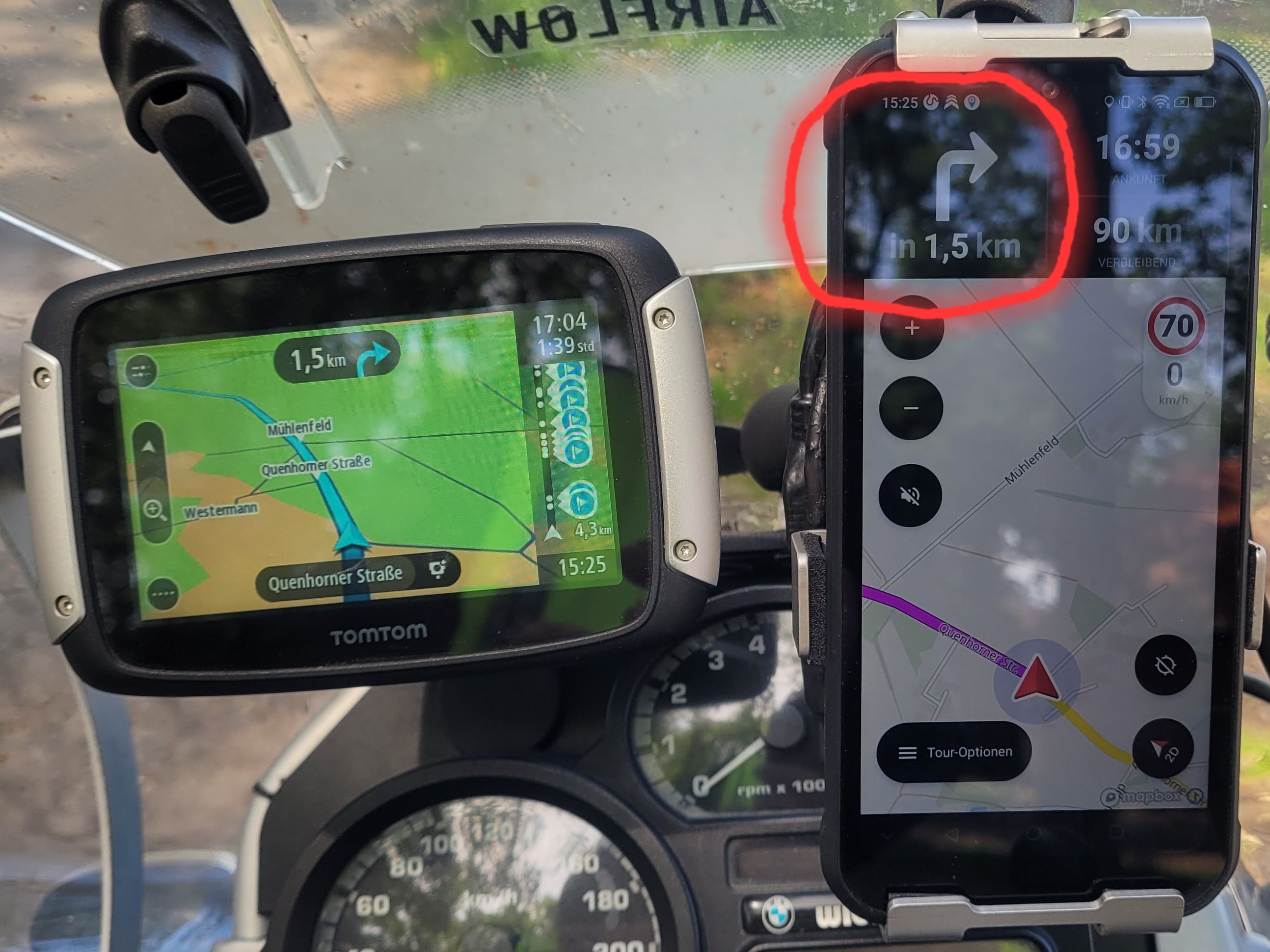
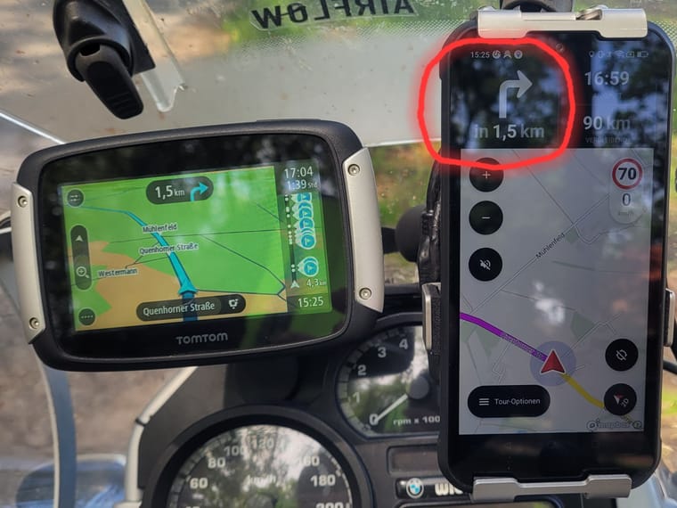
In doing so, I found that the font size for the "next turn" indication in the myRoute app is simply too small. On a mobile phone screen, it is almost impossible to make out. Calimoto handles this much better; their turn-by-turn prompts are significantly larger, and I experienced no issues with visibility.
My request is this: Please adjust the font size for the "next turn" indication—making it at least as large as the street name.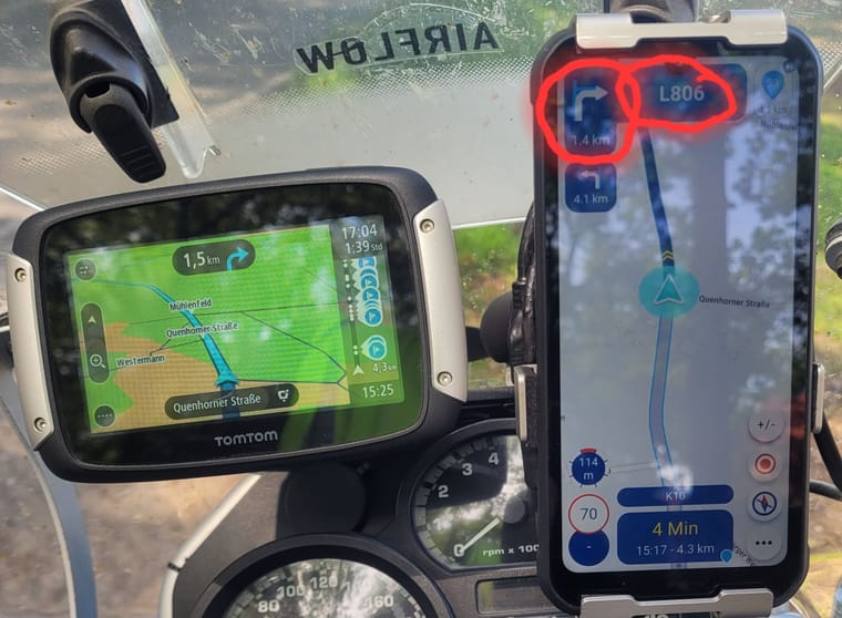
Here is the comparison... much easier to see on Calimoto.
-
To be quit honnest. The difference between the 2 is not tghat great. Yes Calimoto is a tat bigger, but just a tad. If toy compair the rest of screen you'll the advantage of MRA. But yes I would support your wish to make a few thing a bitt bigger
-
Last weekend, I rode several routes using the myRoute app—comparing it against my Rider 400 and the Calimoto app—in order to determine the best navigation method for my needs. I navigated solely by following the on-screen instructions, without using headphones inside my helmet.
In doing so, I found that the font size for the "next turn" indication in the myRoute app is simply too small. On a mobile phone screen, it is almost impossible to make out. Calimoto handles this much better; their turn-by-turn prompts are significantly larger, and I experienced no issues with visibility.
My request is this: Please adjust the font size for the "next turn" indication—making it at least as large as the street name.Here is the comparison... much easier to see on Calimoto.
-

@daniel-7 I completely agree with your request. As far as I’m concerned, both the distance indicator and the arrow could be much larger and more prominent on the screen.
I find the map useful around the current navigation instruction. Other than that, I mainly just want to know when the next instruction is coming up. The road layout and how sharp the upcoming bends are (an argument I see mentioned from time to time) are things I’d rather, and much more easily, get from the real world.

-
... Or maybe we’re just at the age where we need reading glasses.

-
That’s why I now drive with multifocal glasses that have photochromic lenses. But I don’t have a problem with that at all!
-
My solution, bought a bigger tablet
-
Yes, I do have reading glasses, but I still try to ride my motorcycle without them. Over the last 30 years, I haven't had any issues with various navigation devices; however, with the myRoute app, the most critical information—specifically "when do I need to make the next turn, and in which direction?"—appears far too small. As Calimoto demonstrates, it is certainly possible to do this differently. Please, dear myRoute Team, make this change—ideally in the very next update. I have also come across older posts indicating that this exact issue bothers other users as well. Something really needs to be changed in this area.
-
Yes, I do have reading glasses, but I still try to ride my motorcycle without them. Over the last 30 years, I haven't had any issues with various navigation devices; however, with the myRoute app, the most critical information—specifically "when do I need to make the next turn, and in which direction?"—appears far too small. As Calimoto demonstrates, it is certainly possible to do this differently. Please, dear myRoute Team, make this change—ideally in the very next update. I have also come across older posts indicating that this exact issue bothers other users as well. Something really needs to be changed in this area.
Yes, I do have reading glasses, but I still try to ride my motorcycle without them. Over the last 30 years, I haven't had any issues with various navigation devices; however, with the myRoute app, the most critical information—specifically "when do I need to make the next turn, and in which direction?"—appears far too small. As Calimoto demonstrates, it is certainly possible to do this differently. Please, dear myRoute Team, make this change—ideally in the very next update. I have also come across older posts indicating that this exact issue bothers other users as well. Something really needs to be changed in this area.
Personally, I like the size as it is now and I do not need a big arrow and font like Calimoto has. No idea what your age is, but the older you get the more bad your eyes usually get. Have had progressive glasses for 6 years and thats work very well, even during motorcycling. If I see your example picture, you have no problems with the tomtom size and font?
But as indicated, screen space is limited of course. I also do not know if the developer(s) can make the font individually customizable, that could be a solution for everyone. -
Yes, I do have reading glasses, but I still try to ride my motorcycle without them. Over the last 30 years, I haven't had any issues with various navigation devices; however, with the myRoute app, the most critical information—specifically "when do I need to make the next turn, and in which direction?"—appears far too small. As Calimoto demonstrates, it is certainly possible to do this differently. Please, dear myRoute Team, make this change—ideally in the very next update. I have also come across older posts indicating that this exact issue bothers other users as well. Something really needs to be changed in this area.
Personally, I like the size as it is now and I do not need a big arrow and font like Calimoto has. No idea what your age is, but the older you get the more bad your eyes usually get. Have had progressive glasses for 6 years and thats work very well, even during motorcycling. If I see your example picture, you have no problems with the tomtom size and font?
But as indicated, screen space is limited of course. I also do not know if the developer(s) can make the font individually customizable, that could be a solution for everyone.
But as indicated, screen space is limited of course. I also do not know if the developer(s) can make the font individually customizable, that could be a solution for everyone.
I think that has been asked before and came back not possible (yet)
If it's gonna be possible sometimes in the future I would welcome that -
... Or maybe we’re just at the age where we need reading glasses.
... Or maybe we’re just at the age where we need reading glasses.
Nice point to raise and it shouldn't matter. Reading glasses are for when the focusing muscles in the eyes weaken, which highlights a concern often dismissed by interface designers; you should not need to use refocusing muscles in a vehicle anyway. They are too slow.
Large font is not just for old people - it's for speed. This is why fighter jets and airliners have Heads-up-displays optically focused at infinity, so the muscles are not needed.
UI designers want to make the best of available screen space, naturally, but they are usually designing sitting at a desk, not doing 120kph, and it can result in the wrong priorities.
-
I am also aware that space is limited; nevertheless, I still see room for improvement. After all, the street name can apparently be displayed in a large font—something that isn't particularly important to me while riding my motorcycle. I am judging this solely based on my specific use case on a mobile phone, where, as things stand, it is not easy to read. I have only been wearing glasses for two years, and I need them absolutely only for reading. Of course, everyone is entitled to their own opinion, but personally, I don't think this has been handled well.
-
In my opinion, this also has something to do with road safety. How long do I have to look at the display before I can make out the instructions? With larger text, recognizing them happens much faster.
Is anyone from the myRoute app team actually reading along here?
A statement from myRoute regarding whether we can expect anything in this regard would be appreciated. -
... Or maybe we’re just at the age where we need reading glasses.
Nice point to raise and it shouldn't matter. Reading glasses are for when the focusing muscles in the eyes weaken, which highlights a concern often dismissed by interface designers; you should not need to use refocusing muscles in a vehicle anyway. They are too slow.
Large font is not just for old people - it's for speed. This is why fighter jets and airliners have Heads-up-displays optically focused at infinity, so the muscles are not needed.
UI designers want to make the best of available screen space, naturally, but they are usually designing sitting at a desk, not doing 120kph, and it can result in the wrong priorities.
... Or maybe we’re just at the age where we need reading glasses.
Nice point to raise and it shouldn't matter. Reading glasses are for when the focusing muscles in the eyes weaken, which highlights a concern often dismissed by interface designers; you should not need to use refocusing muscles in a vehicle anyway. They are too slow.
Large font is not just for old people - it's for speed. This is why fighter jets and airliners have Heads-up-displays optically focused at infinity, so the muscles are not needed.
UI designers want to make the best of available screen space, naturally, but they are usually designing sitting at a desk, not doing 120kph, and it can result in the wrong priorities.
Most healthy young people will not have a problem with this.
If your eyes have trouble focusing near or far, it is time for glasses, and that is one of the reasons glasses exist. We can also hardly ask the government to provide all traffic signs with a larger font. Furthermore, some people find a font large enough and others do not; it remains a matter of personal preference.
HUD is a dream for motorcyclists; I recently read an article that they are actually working on HUD in helmets.
-
I think some people here have misunderstood me. My focus is on practicality and on suggesting improvements for the myRoute app. If myRoute doesn't make these changes in the future, there are, after all, alternative routing apps available. I don't need any lectures about glasses.
-

I am 64 years old wearing glasses and I can read it easily.
BMW R 1250 GS
MRA Navigation & SilverFox C1 Controller
DMD-NOR7E 7"
SPC Universal mount
Motorola Edge 40 "offline"
Sena SLR 3
Sena 50 R -
I am 64 years old wearing glasses and I can read it easily.
I am 64 years old wearing glasses and I can read it easily.
I'm delighted for you

-
I think some people here have misunderstood me. My focus is on practicality and on suggesting improvements for the myRoute app. If myRoute doesn't make these changes in the future, there are, after all, alternative routing apps available. I don't need any lectures about glasses.
there are, after all, alternative routing apps available
That’s true, of course; I’ve used a few of them myself......
But personally, when you take all the features into account, I definitely think MRA comes out on top.
The fact that the next turn-off instruction is displayed in a slightly smaller font than on rival devices isn’t a deal-breaker for me.
What’s more, the turn-off instructions are also announced via audio at the same time.
-
I think some people here have misunderstood me. My focus is on practicality and on suggesting improvements for the myRoute app. If myRoute doesn't make these changes in the future, there are, after all, alternative routing apps available. I don't need any lectures about glasses.

I don't need any lectures about glasses.
I won't lecture you on glasses, but on mounts instead

A more stable mount could help. Vibrations make text reading more difficult.
This might be worth exploring for you.Making the fontsize customizable is VERY finicky, since we already have to cope with SOOO many different screen sizes, aspects and resolutions. Believe me, it is a bigger puzzle than it sounds...

Hello! It looks like you're interested in this conversation, but you don't have an account yet.
Getting fed up of having to scroll through the same posts each visit? When you register for an account, you'll always come back to exactly where you were before, and choose to be notified of new replies (either via email, or push notification). You'll also be able to save bookmarks and upvote posts to show your appreciation to other community members.
With your input, this post could be even better 💗
Register Login

-
 0521
0521
-
 08204
08204
-
 0746
0746
-
 0314
0314
-
0311
-
0311
-
 022
022
-
0212