Search enhancement, Direction Arrows
-
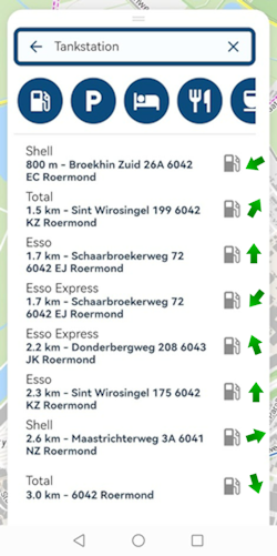
When searching for something, for example Fuel Stations, it would help if there was a column showing the Direction of that position from your current location. When looking for a category position part of the decision about which one to select is direction. Is it better to go 5 km behind or 50km along your route.
Garmin does this really well by having direct arrows displayed for each position in the search list.
As a second comment; I have not worked out why I am having trouble with this, but MRA's item list is harder to read in the search page than my Garmin or Apple Maps. Perhaps what I mean is that its harder to scan between each item and select one as it just scans like a long text block with paragraphs rather than a clear list. It takes more concentration and brain power to find the one you want. Perhaps the team could look at this?
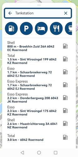
@Neil-Bartlett, I looked at a gas station list. What is it you would like to change it to? Only thing I notice is that it is perhaps a bit strange to have the title regular and the address in bold typeface. I feel it would be more logical to have that opposite. What would you suggest? separator lines between them or such?
-
@Neil-Bartlett, I looked at a gas station list. What is it you would like to change it to? Only thing I notice is that it is perhaps a bit strange to have the title regular and the address in bold typeface. I feel it would be more logical to have that opposite. What would you suggest? separator lines between them or such?

@Con-Hennekens Maybe like this?
-
The problem with the search results are the distances are taken as the crow flies, a straight line from your location.
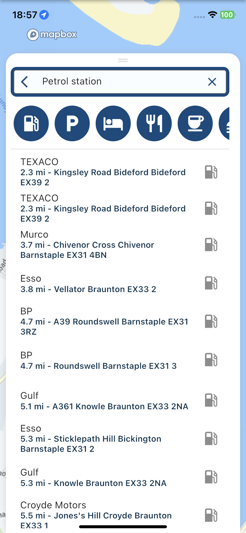
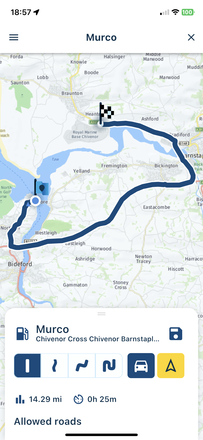
On the whole this isn’t too bad but if you live near a river estuary like me, then a fuel station listed as 3.7 miles away is actually over 14 miles away.
An arrow indicating the direction doesn’t solve this problem.
I believe that other navigation apps use a similar algorithm for calculating distance so MRA are not alone.Take the third option as an example in my screenshot, the Murco fuel station, listed as 3.7 miles.
After choosing the Murco fuel station you see that it is actually 14.29 miles away.
-
@Con-Hennekens Maybe like this?

@richtea999, I was referring to the readability issue. The arrows would be a nice touch indeed. Even better would it be to see a number of the distance it deviates from the route (however a lot more complicated I suppose).
and like @Nick-Carthew, says, the total distance calculated over the road would be ideal. The combination of those figures would take the guesswork out of the choice completely.
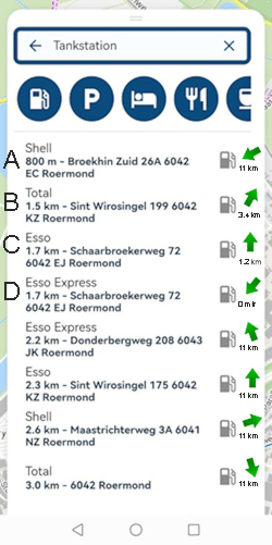
Station A would say: Probably on the other side of a river (Nick's example)
Station B would say: Distance (over the road) is very nearby but the deviation from the route is substantial
Station C would say: A little bit farther from where you are but much closer to the route
Station D would say: A little bit farther but exactly on the route, no deviation necessaryA lot of calculation going on for such an overview. But if you are in need of a gas station, probably only the 5 closest ones will have your interest. That could limit the options. Perhaps with a button "search for more".
-
@richtea999, I was referring to the readability issue. The arrows would be a nice touch indeed. Even better would it be to see a number of the distance it deviates from the route (however a lot more complicated I suppose).
and like @Nick-Carthew, says, the total distance calculated over the road would be ideal. The combination of those figures would take the guesswork out of the choice completely.

Station A would say: Probably on the other side of a river (Nick's example)
Station B would say: Distance (over the road) is very nearby but the deviation from the route is substantial
Station C would say: A little bit farther from where you are but much closer to the route
Station D would say: A little bit farther but exactly on the route, no deviation necessaryA lot of calculation going on for such an overview. But if you are in need of a gas station, probably only the 5 closest ones will have your interest. That could limit the options. Perhaps with a button "search for more".
@Con-Hennekens I think it would be more useful to have an option to display a map with the closest X gas stations displayed. If this was done over your displayed route, even better.
-
@Con-Hennekens I think it would be more useful to have an option to display a map with the closest X gas stations displayed. If this was done over your displayed route, even better.
@Doug-Robinson Showing fuel stations as POIs on the map is on the list for a future update.
-
Calculating routes to each individual search result is not really an option as that will take quite some time
 So yes, the direct (straight line) distance as displayed is the best educated guess you can get.
Not sure how I feel about adding such arrows.
We are currently working on nearby fuel stations (and searching other locations along the route). I'll make sure this post is in the back of my head while working on that

