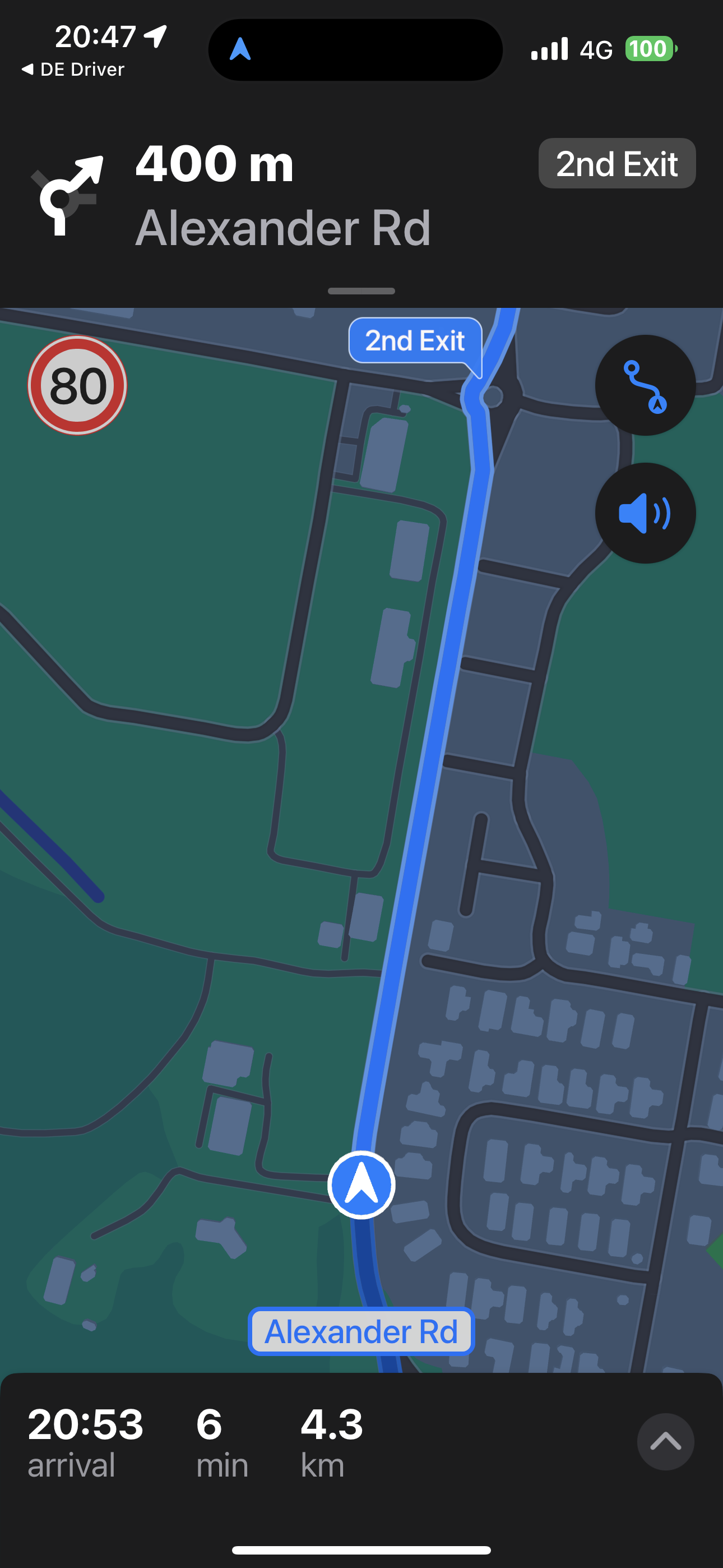
Should 'current speed' be at the top of the screen?
-
My situation is that the iPhone is mounted fairly low, on the handlebars, like a lot of (perhaps older) bikes. Its mounted vertical. I know in an ideal world the mount would be higher, snugging behind the windshield above the dials.
I've noticed that when going towards and from my route, the highway part, I pay far more attention to my actual speed on the app and the traffic cam indicators. Which are both located at the very bottom of the screen.
Just a thought... -
My situation is that the iPhone is mounted fairly low, on the handlebars, like a lot of (perhaps older) bikes. Its mounted vertical. I know in an ideal world the mount would be higher, snugging behind the windshield above the dials.
I've noticed that when going towards and from my route, the highway part, I pay far more attention to my actual speed on the app and the traffic cam indicators. Which are both located at the very bottom of the screen.
Just a thought...@Bert-2v thanks for sharing.
I am however quite certain this won’t be changed in the near future. -
@Bert-2v thanks for sharing.
I am however quite certain this won’t be changed in the near future.@Corjan-Meijerink I understand there is a lot to do before this change but I agree that its a problem wherever the phone is mounted. Because the natural scan is from top to bottom we need important info to be at the top. This should be priority information and from a UI point of view, "at the top" is the place it should be. It saves fines to have ability for a quick speed limit and actual speed check.Both together as currently is important. Thanks for doing that.
-
@Neil-Bartlett
Make it draggable.
(Corjan won't thank me for that suggestion! )
) -
It really won’t change in the near future

Besides, speed indication is displayed somewhere else too! Rather big actually.If you are speeding, stuff turns red and you might even get an audio notification. I do not see the need to change this currently.
-
It really won’t change in the near future

Besides, speed indication is displayed somewhere else too! Rather big actually.If you are speeding, stuff turns red and you might even get an audio notification. I do not see the need to change this currently.
@Corjan-Meijerink I prefer it where it is.
-
Prefer where it is at the bottom. Same as Tomtom and Garmin Zumo. Please keep where it is.
-
@Corjan-Meijerink I understand there is a lot to do before this change but I agree that its a problem wherever the phone is mounted. Because the natural scan is from top to bottom we need important info to be at the top. This should be priority information and from a UI point of view, "at the top" is the place it should be. It saves fines to have ability for a quick speed limit and actual speed check.Both together as currently is important. Thanks for doing that.
@Neil-Bartlett said in Should 'current speed' be at the top of the screen?:
Because the natural scan is from top to bottom we need important info to be at the top.
I have never seen ANY navigation app showing that info at the top (I have seen many). The route and navigation instructions are important, the speed is not. The speed is already shown in your dashboard somewhere I guess.
@richtea999 said in Should 'current speed' be at the top of the screen?:
Make it draggable.
(Corjan won't thank me for that suggestion! )Haha, I guess not no

Can you point to another navigation app that uses floating info tiles? I would hate raindrops messing up my meticulously arranged tiles... -
I think the team have worked hard to remove information boxes from the top of the screen so we can see more of the route to start putting info boxes back there would feel like a backwards move.
-
@Corjan-Meijerink I understand there is a lot to do before this change but I agree that its a problem wherever the phone is mounted. Because the natural scan is from top to bottom we need important info to be at the top. This should be priority information and from a UI point of view, "at the top" is the place it should be. It saves fines to have ability for a quick speed limit and actual speed check.Both together as currently is important. Thanks for doing that.
@Neil-Bartlett Well you perhaps have not used Apple Maps for a while
 if you have never seen the speed display at the top.
See my screen shot from work the other night and note the speed roundel at the top;

