Performance when tracking
-
Over the past couple of days I was on a group ride as a member. I turned on tracking. Battery usage was much lower and I could run all day without charging. The tracking also kept up and was quite accurate. I found the OSM overlay to provide the best information. The Tomtom was fairly good as well. Perhaps not having to deal with the Here maps is what reduced battery usage.
@Doug-Robinson When not navigating at all - the app is pretty battery efficient

Most battery usage is caused by drawing the HERE map while navigating. -
@Corjan-Meijerink Ah! So a 2D birdseye view built with tiled maps (rotated according to the users heading), and overlaid with just current position and travelled track might save a lot of battery?
Some users might appreciate that option if it was available. -
@Corjan-Meijerink Ah! So a 2D birdseye view built with tiled maps (rotated according to the users heading), and overlaid with just current position and travelled track might save a lot of battery?
Some users might appreciate that option if it was available.@richtea999 if you mean a kind of “freedrive” mode with upcoming streetinfo etc. then that suggestion is already been noted. I guess that this feature has no priority right now.
-
@Rob-Verhoeff said in Performance when tracking:
@richtea999 if you mean a kind of “freedrive” mode with upcoming streetinfo etc. then that suggestion is already been noted. I guess that this feature has no priority right now.
Ah, no. I should have been more accurate: '2D tiled maps overlaid with future route, current position and travelled track'. In other words I was suggesting a simpler way of rendering the live route map. If you use tiled areas of maps (prefetched, since you know where the route is going) then the processing power may be less than drawing the current pseudo-3D vector views, which I suspect are heavy on processing power. 'Tiling' is what most games would use and it's heavily optimised for speed and power in mobile APIs. Just a thought, but probably quite tricky for MRA to offer as an option to the current 3D view.
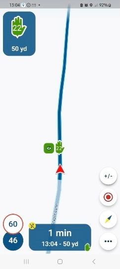
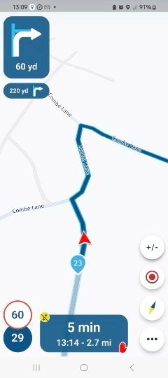
I have been trying out some simplified options for when I ride alone.
I like the simplicity of the examples below.
All screenshots are from a route recorded last weekend.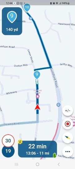
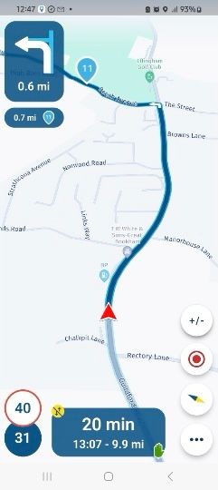
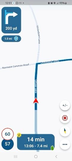
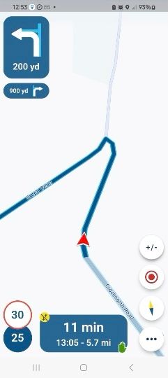
-
I have been trying out some simplified options for when I ride alone.
I like the simplicity of the examples below.
All screenshots are from a route recorded last weekend.


@Lynchy67 I prefer to see the name and route # of the upcoming turn. I would prefer not to see upcoming waypoints in place of the next navigation instruction. In your first example, waypoint 9 is hiding the upcoming right turn.
-
@Corjan-Meijerink Ah! So a 2D birdseye view built with tiled maps (rotated according to the users heading), and overlaid with just current position and travelled track might save a lot of battery?
Some users might appreciate that option if it was available.@richtea999, these scenarios have all been testet, and however unthinkable, it all made no difference... Even lowering the frequency did not change anything substantial. It's the drawing engine consuming the energy, no matter what gets drawn... HERE is stepping in for assistance, but they are not as quick like we are used to from the MRA dev team

-
@Lynchy67 I prefer to see the name and route # of the upcoming turn. I would prefer not to see upcoming waypoints in place of the next navigation instruction. In your first example, waypoint 9 is hiding the upcoming right turn.
@Doug-Robinson
Yes I agree waypoint 9 was a bad choice to make.
Still getting my head around the best way to get just the turn notifications and no Waypoints visible. -
@Lynchy67 said in Performance when tracking:
@Doug-Robinson
Yes I agree waypoint 9 was a bad choice to make.
Still getting my head around the best way to get just the turn notifications and no Waypoints visible.Put the waypoint just after the turn - then you'll see the turn notification first and the waypoint notification second.
