Innovative Motorcycle / Cycle UI
-
I'm wondering in MRA Next is the opportunity to provide motorcyclists / cyclists with an innovative navigation display. I am a partial fan of the Beeline navigation device - except their UI is poor, unoptimised and the display graphics are too small for those whose eyesight is not perfect.
I flew military jets for many years and the graphical display of navigation information in a head up display was intuitive and quick to read at a glance. I have always wondered why navigation apps have not adopted some of the tricks used to present navigation information in an easily assimilated format. I think the Beeline device has the right idea but hasn't really hit the mark in achieving simple but clear navigation. Therefore I am wondering if MRA might be interested in the following..... I have mocked up a display that uses some of the HUD navigation display graphics as a demonstration.... And hopefully to provoke some discussion.
What I am proposing would be just an optional mode for MRA users. The primary mode would still use a map graphical display as current. But this mode would be of use to motorcyclist and cyclists who need navigation information at a glance and are not using audio (although audio would still be available). It is less distracting and easily assimilated than a map display.
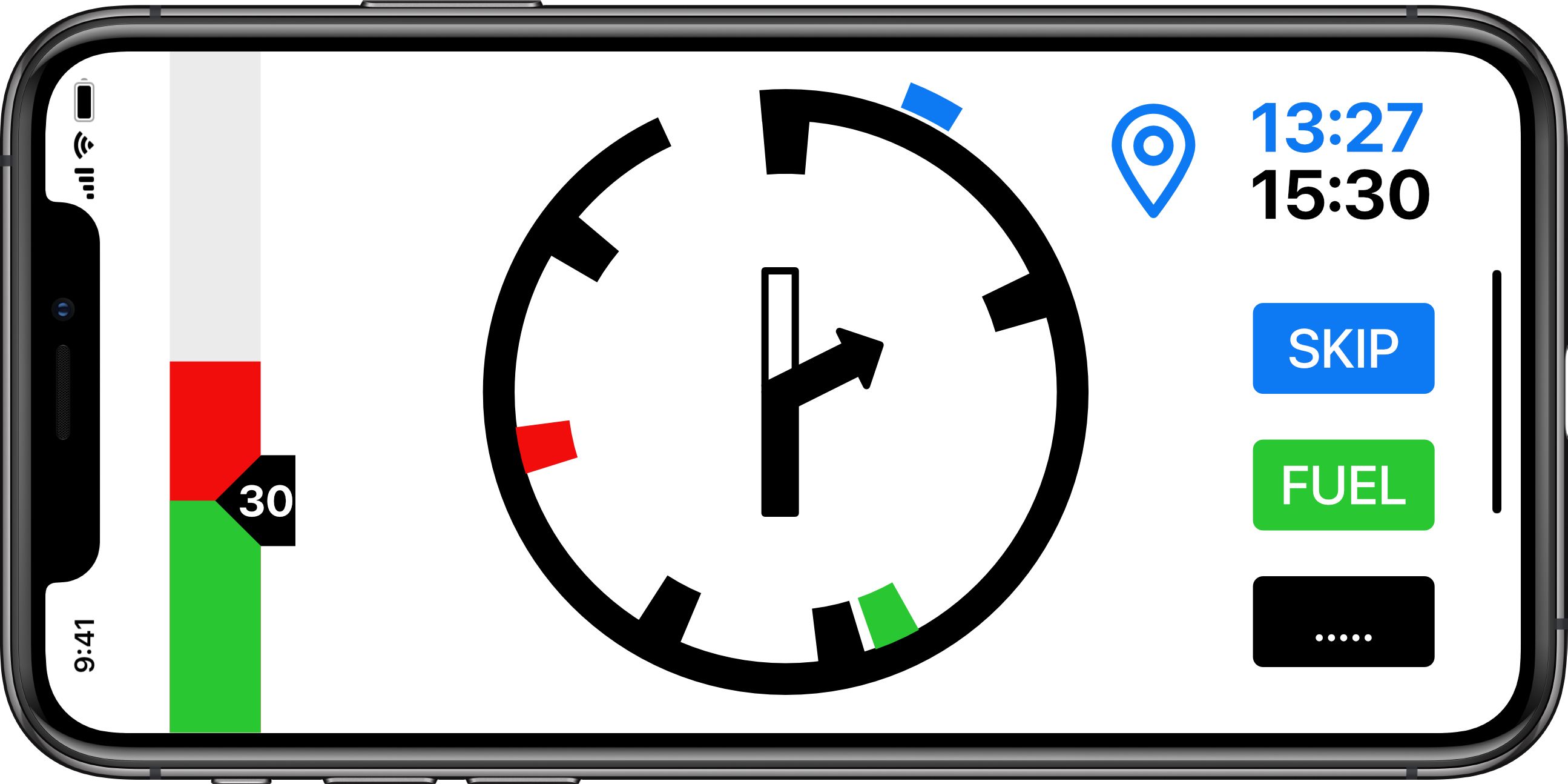
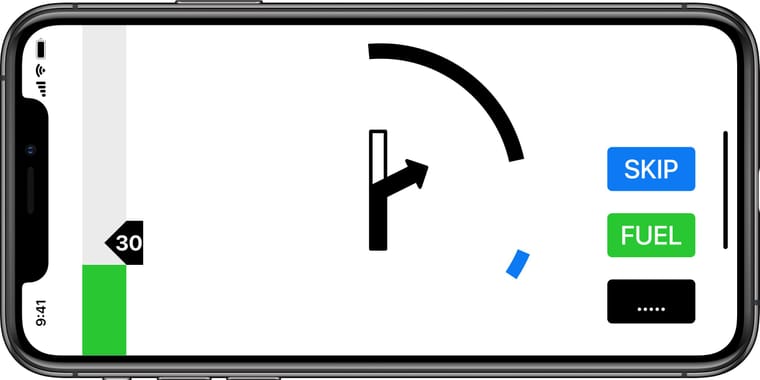
The primary screen when travelling is shown below (General Navigation Mode).
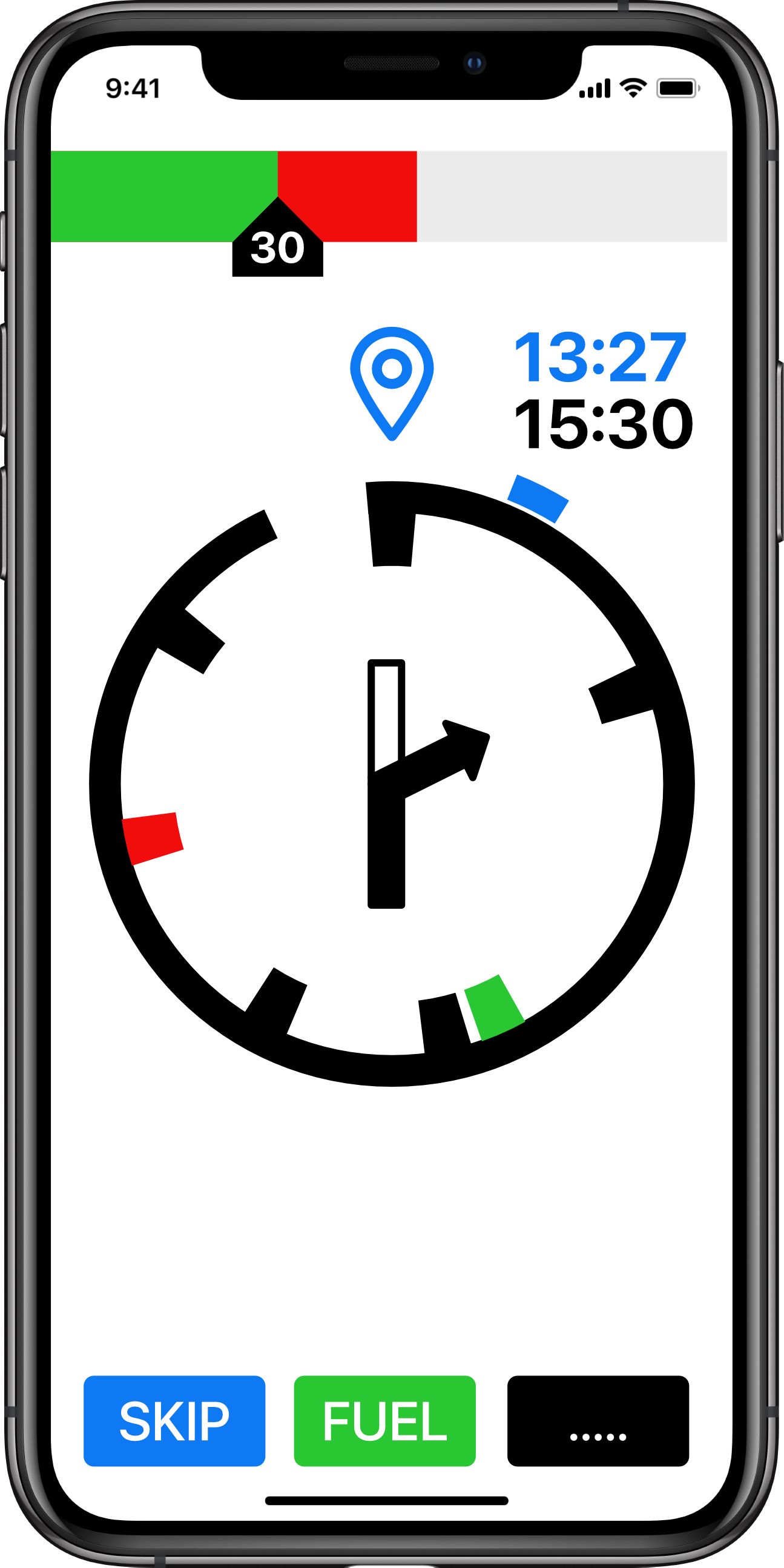
At the top is a speed strip showing the speed limit as carat with inset text. This user is traveling at approx 42mph and is therefore showing a red strip in excess of the speed limit.
The navigation display is a circular distance to go graphic (DTG). In this case showing a graphical representation of the distance to the next waypoint (hence the waypoint symbol). The blue time shows the time at the next waypoint. The black time is the time at the destination.
The check marks inside the circle show events (Black - Turns. Red - Hazards. Green - Fuel stops). The center of the circle is showing the next turn in graphic form. The Blue check mark on the outside of the circle is the relative direction (heading) to the next waypoint.
At the bottom are three buttons (skip next waypoint (route recalculation), fuel (direct navigation to nearest fuel station or fuel station along route (by submenu)) menu functions (stop nav, reroute etc)).
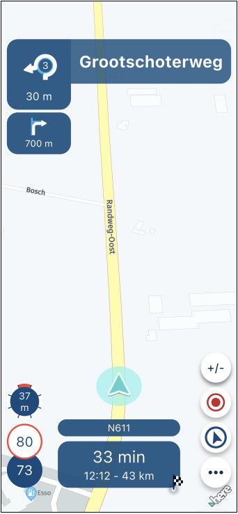
If the user wants more information they could swap to 'map' mode via the options button.
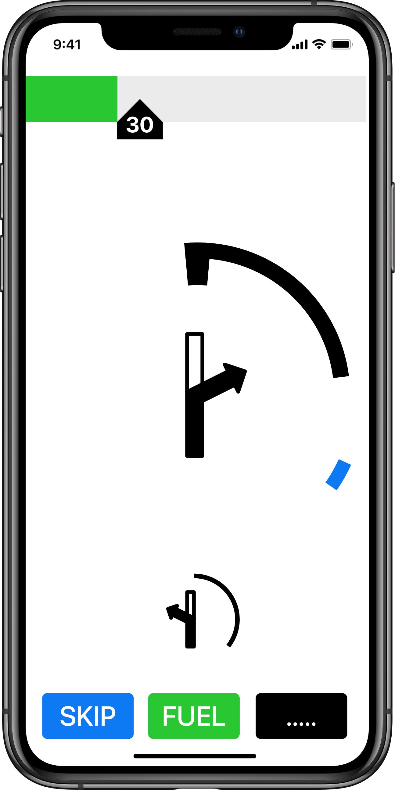
And in landscape:
And showing the final leg (to destination)
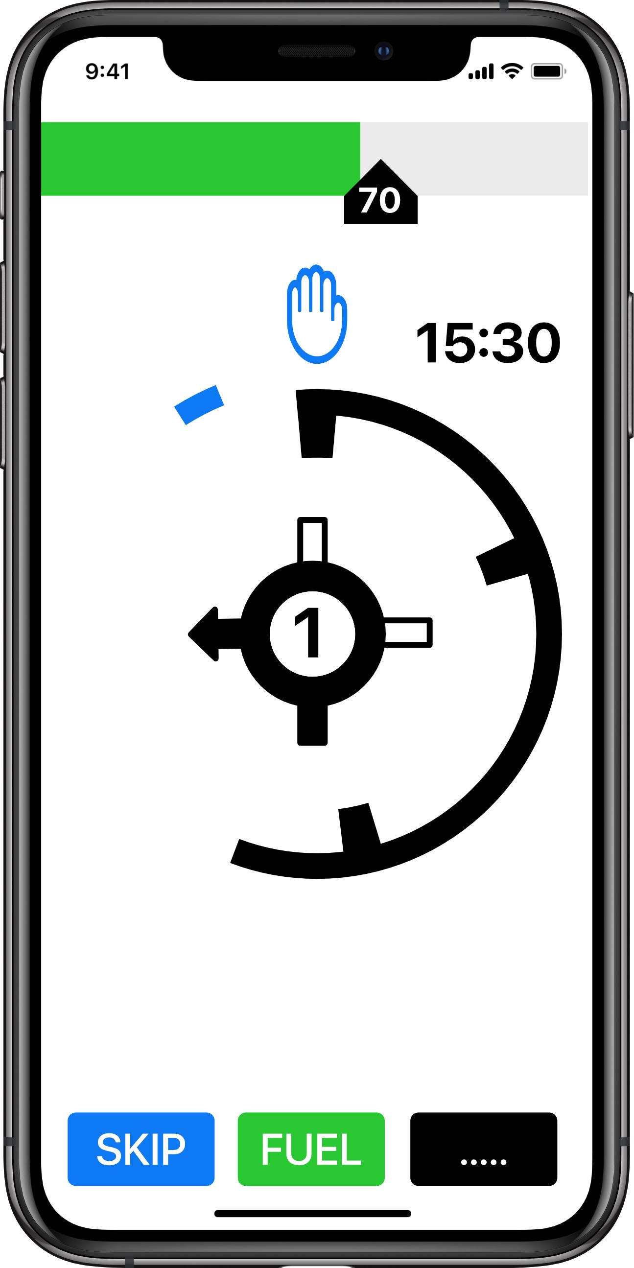
The DTG circle has unwound to display that the user is nearly half way between the last waypoint (or start point) and the destination. The circle will continue to 'unwind' and the rate of 'unwinding' will give a visual reference of how quickly the next event is approaching (see later for specific event navigation display).
Note: the waypoint time has disappeared and a final destination graphic is used. The speed tape is showing a 70mph limit with the user at approximately 65mph (in the green).
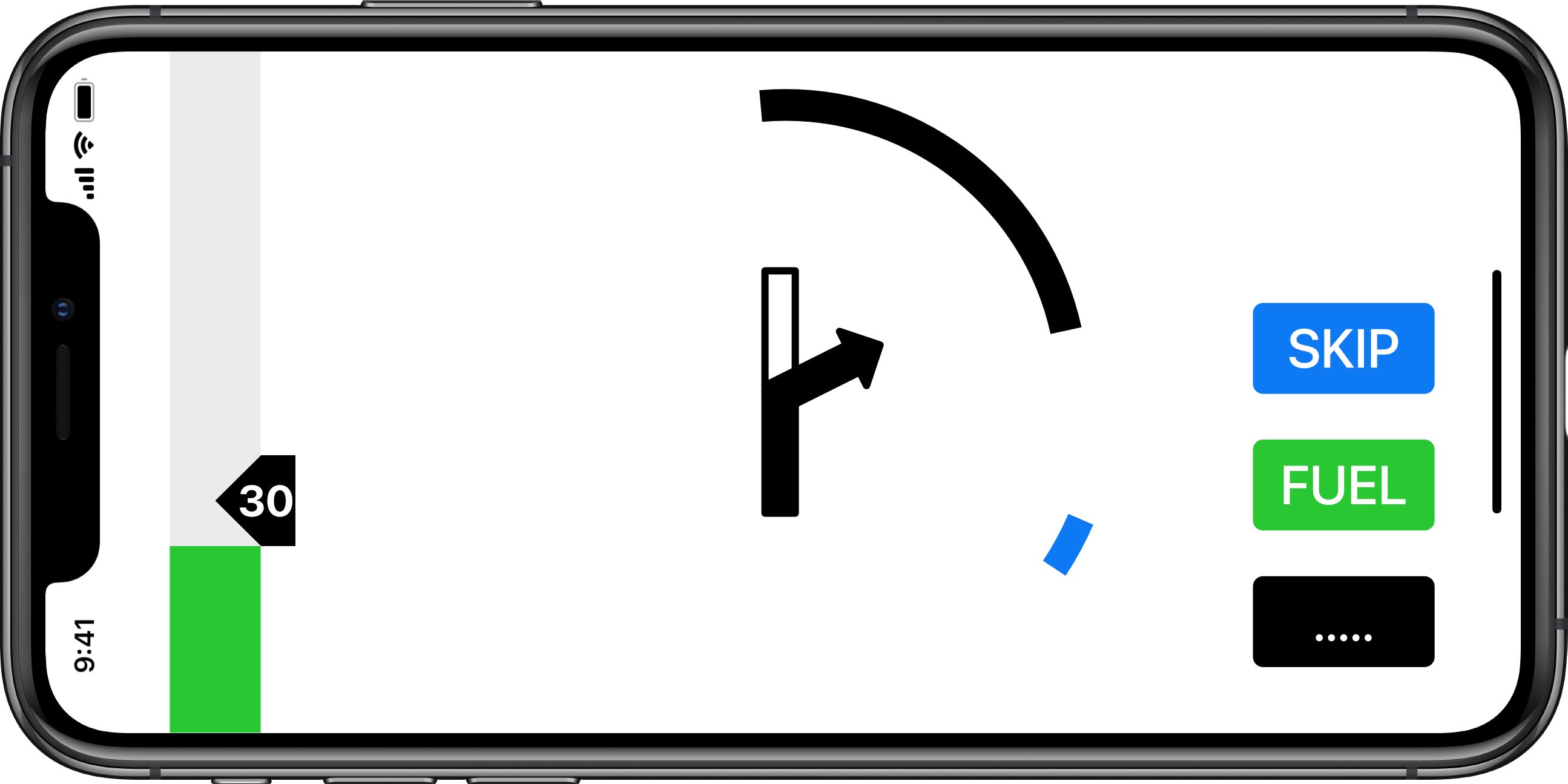
The next turn event is a roundabout exiting left (1st exit in the UK).
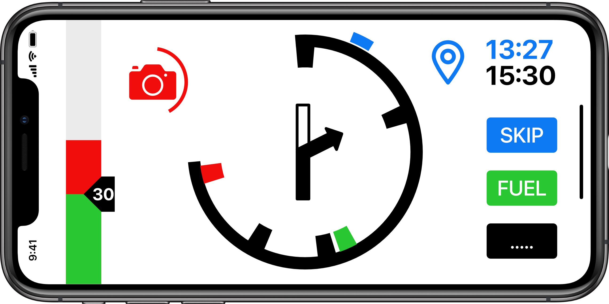
If approaching a hazard (speed camera) the display will show:
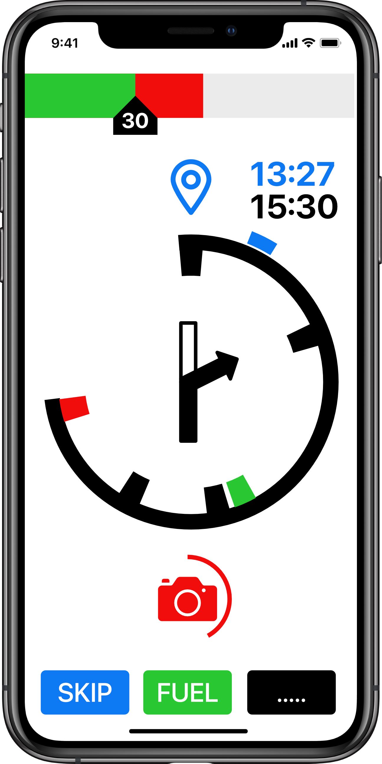
The circle around the camera symbol unwinds as the user approaches. The full circle is 1 minute. And therefore the circle is a speed dependent time to go indications (TTG). If travelling a 60mph the full circle is 1 mile. At 30mph the full circle is 1/2 mile. The advantage of a TTG is the user receives early notification (1 min) whatever speed he is travelling at. The rate the TTG circle unwinds makes if very easy to judge the rate of approach of the hazard.
Hazard display in landscape.

Approaching a turn event (at 1 minute to go) the display switches to a 'cleaner' display (Waypoint navigation). Again the display uses a TTG (time to go) circle which always give 1 minutes warning whatever speed the user is traveling. It unwinds giving a graphical indication of how fast the event is approaching. With 40 seconds to go to the turn.
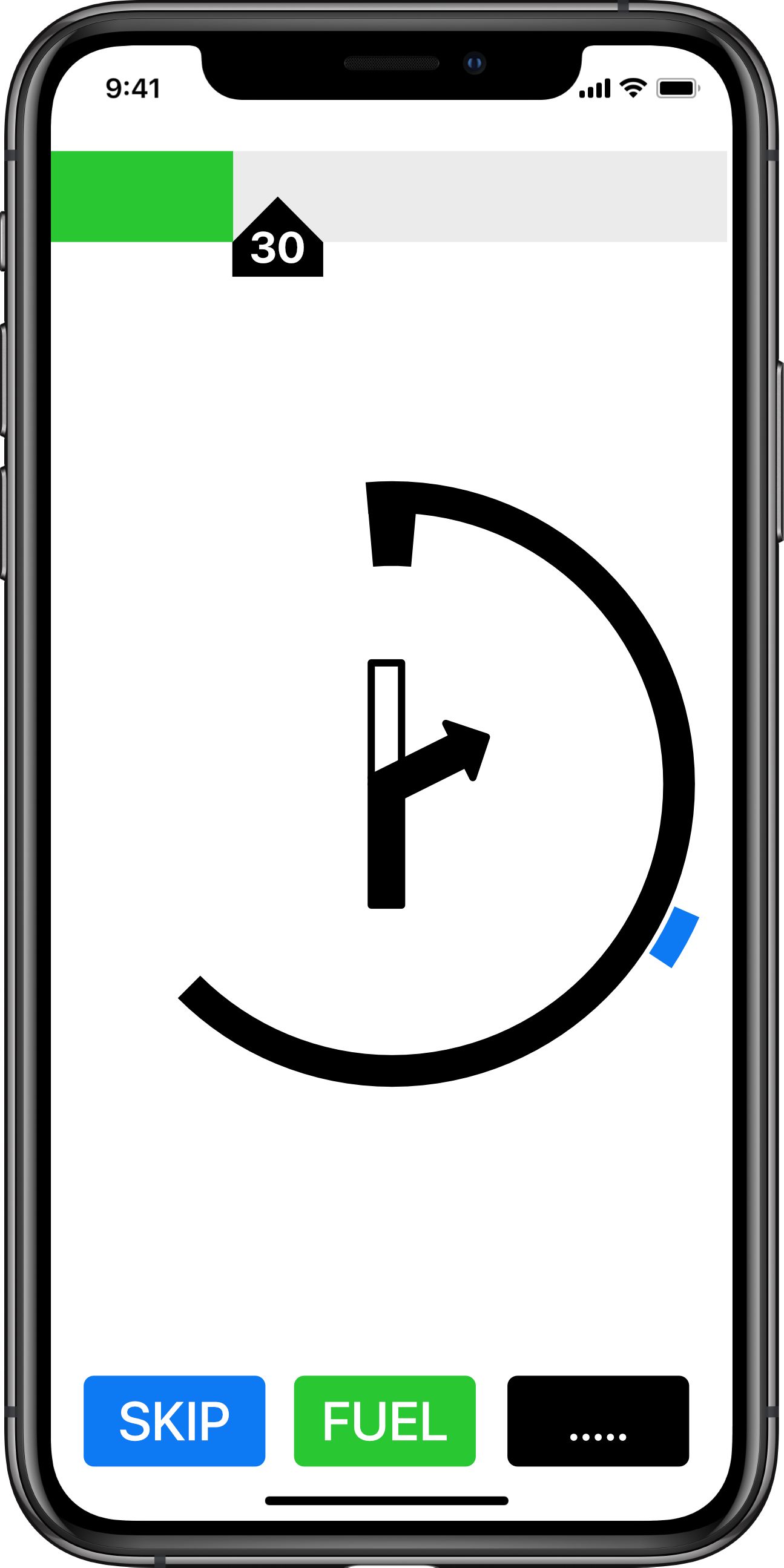
Note the relative heading of the next point is still shown. Speed is below 30mph in a 30 mph limit area.
With 14 seconds to go (landscape):
If there are turn events close together (less than 1 minute) then the second event would be shown with a TTG circle to indicate how close the event is to the first.
In this case a first turn to the right in 14 seconds. With a second turn to the left in in 22 seconds.
Note: that as you slow for the turn the TTG circle might actually wind out showing more time until the turn. As you then approach the turn at a constant but slower speed the TTG circle will then unwind again giving a visual rate of approach.
I hope this gives some food for thought. Having used this type of HUD navigation symbology for 30 years whilst flying military jets I would love to see it incorporated in a navigation app. None of the information required to make it work is new. It is simply a new UI that should make navigation information easily and quickly available to the user.
Regards.
@Jabp I think there are some things that we could adopt in the MRA Next. I think we have a Skip pretty well defined already. The circle around the camera is what caught my eye. We could use something like that to display the distance to the next maneuver or - in this case - speed camera (turn, runabout, etc.) It could be a circle or a small vertical bar at the edge of the display showing approximate distance to the maneuver (if I am not mistaken, Nissan navigation system has something like that.) The bar could be displayed a mile before the maneuver, and slowly decrease in height while you get closer ("Right turn in 600 yards", "Right turn in 350 yards", etc.)
Also, in the old navigation there was an icon for the fuel station somewhere on the left side of the display showing the distance to the fuel station (decreasing or increasing.) There might be something that could be utilized here; little button listing the nearest fuel stations with directional arrow (I think Garmin had something like that.) Once station is selected, it could be on the fly (no pun intended) added to the route. -
Personally I prefer seeing the road ahead. On curvy roads I like seeing what the next curve looks like, it helps to adjust speed heading into the curve. I don't think MRAM can be all things to all people.
2010 GL1800 Goldwing using Samsung Galaxy S20 5G Android 13.
-
Seeing the road with actual resemblance to the real situation is ultimately what makes navigation worthwhile in my view. A thing like beeline in my vie does not offer much more that a roadbook on those rolls you need to turn (except you don't need to turn...)
-
Personally on all my tours, I don't care about voice prompts or even instructions. I just want to see the map with a line
")
During my 2022 UK tour, I navigated all the way with the Mobile app "follow the line" navigation. In 2017, when MRA Navigation was still developed, I even did another UK tour completely with the old Mobile app

Voice prompts are distracting from conversations with my significant other / pillion or the music I'm listening to. Instructions are rather pointless as there really only is one suitable road in the routes I tend to make. And well...driving a wrong road is only more adventure!

That said: these functionalities do need to function perfectly in our app and when driving somewhere I don't know the way or around busy roads it is a vital function of the app.
Just felt like sharing my own personaal opinion on this matter. Not speaking as the developer here
-
Personally I prefer seeing the road ahead. On curvy roads I like seeing what the next curve looks like, it helps to adjust speed heading into the curve. I don't think MRAM can be all things to all people.
@Doug-Robinson said in Innovative Motorcycle / Cycle UI:
Personally I prefer seeing the road ahead. On curvy roads I like seeing what the next curve looks like, it helps to adjust speed heading into the curve. I don't think MRAM can be all things to all people.
@Con-Hennekens said in Innovative Motorcycle / Cycle UI:
Seeing the road with actual resemblance to the real situation is ultimately what makes navigation worthwhile in my view. A thing like beeline in my vie does not offer much more that a roadbook on those rolls you need to turn (except you don't need to turn...)
I can certainly understand these views. I think it's a tradeoff between what information is actually needed, how fast it can be accessed, and how to minimize tech distractions. I too often appreciate advanced warning about the road ahead. But I also consider the notion/question - How did we managed before we had all this tech? Plus, if one is riding appropriately for the roads and conditions, one shouldn't really need the additional eye candy provided by the tech.
I too was initially really skeptical about the utility/viability of the GUI originally suggested in this thread and the simple Beeline GUI. However, my skepticism has diminished more and more as I continue to test the Beeline display in their app. I believe you got to keep in mind the main purpose of this tech - and that is navigation. Simply put - does it get me where I want to go and guide me via the route I want to use to get there? I think in the vast majority of scenarios, the simple Beeline display may fulfill that mission. Yes, there may be cases where complex navigation scenarios might trip the Beeline display up a bit. However, such scenarios may actually be more rare than I initially envisioned. Plus, if the Beeline recovers (rerouting etc.) well in the rare case when it happens, is it really that big of a deal?
I can definitely see the Beeline being a solution for my Nightster. I don't care for large devices and mounts being installed on that bike. The Beeline would give me an acceptable navigation solution/GUI on the Nightster, whereas today, I don't really have one.
Could the Beeline become my primary navigation solution (say touring on my Heritage)? IDK. I think it would require a fair amount of testing to answer that question. Right now, I'm much less skeptical about that possibility than when I first started looking at the device.
-
I like this idea honestly.
I would expand to say that this could actually be a HUD for people wanting to use it in a car (something like Sygic and a few others do)
But for my Adv and off-road riding, this would be killer.
-
I like this idea honestly.
I would expand to say that this could actually be a HUD for people wanting to use it in a car (something like Sygic and a few others do)
But for my Adv and off-road riding, this would be killer.
@Matt-Flaming bery nice and minimalistic design. As an option - because majority of drivers rely to see road infra to make correct action
This is actualy cery close to what Triumph tiger has built in (yes I said Tiger again) and its very usefullP.S. where is the ‘pull up - terrain’ warning
Very nice work in deed. Maybe it could trigger part of MRA team to allow own artwork for the skins?
-
Personally on all my tours, I don't care about voice prompts or even instructions. I just want to see the map with a line
During my 2022 UK tour, I navigated all the way with the Mobile app "follow the line" navigation. In 2017, when MRA Navigation was still developed, I even did another UK tour completely with the old Mobile app
Voice prompts are distracting from conversations with my significant other / pillion or the music I'm listening to. Instructions are rather pointless as there really only is one suitable road in the routes I tend to make. And well...driving a wrong road is only more adventure!
That said: these functionalities do need to function perfectly in our app and when driving somewhere I don't know the way or around busy roads it is a vital function of the app.
Just felt like sharing my own personaal opinion on this matter. Not speaking as the developer here
@Corjan-Meijerink said in Innovative Motorcycle / Cycle UI:
Personally on all my tours, I don't care about voice prompts or even instructions. I just want to see the map with a line
Voice prompts are distracting from conversations with my significant other / pillion or the music I'm listening to. Instructions are rather pointless as there really only is one suitable road in the routes I tend to make. And well...driving a wrong road is only more adventure!
I agree 100% although the camera warnings are useful
-
I like this idea honestly.
I would expand to say that this could actually be a HUD for people wanting to use it in a car (something like Sygic and a few others do)
But for my Adv and off-road riding, this would be killer.
@Matt-Flaming said in Innovative Motorcycle / Cycle UI:
I like this idea honestly.
I would expand to say that this could actually be a HUD for people wanting to use it in a car (something like Sygic and a few others do)
But for my Adv and off-road riding, this would be killer.
I'm not too familiar with Sygic's HUD solution. However, if it's just sitting a smartphone on a dash facing up... Beeline's app will produce their simplified arrow display. I wonder if that would work. For S&Gs, I might play with that on the drive home tonight.
I'm not sure what you meant for the ADV/offroad application. Are you talking about using a phone to produce a HUD on the ADV windscreen? Or using something like Beeline Moto (or it's app on a phone) on an ADV? I might be skeptical about using a phone offroad on a ADV. But a Beeline Moto would likely work well. Especially because of all the versatile mounting options and it's diminutive size. You could easily mount it so it's practically in your line of sight. You would likely be able to see it clearly in your peripheral vision without moving your head or eyes.
HUDs for helmet visors might also be cool.
-
Personally on all my tours, I don't care about voice prompts or even instructions. I just want to see the map with a line
During my 2022 UK tour, I navigated all the way with the Mobile app "follow the line" navigation. In 2017, when MRA Navigation was still developed, I even did another UK tour completely with the old Mobile app
Voice prompts are distracting from conversations with my significant other / pillion or the music I'm listening to. Instructions are rather pointless as there really only is one suitable road in the routes I tend to make. And well...driving a wrong road is only more adventure!
That said: these functionalities do need to function perfectly in our app and when driving somewhere I don't know the way or around busy roads it is a vital function of the app.
Just felt like sharing my own personaal opinion on this matter. Not speaking as the developer here
@Corjan-Meijerink said in Innovative Motorcycle / Cycle UI:
Personally on all my tours, I don't care about voice prompts or even instructions. I just want to see the map with a line
During my 2022 UK tour, I navigated all the way with the Mobile app "follow the line" navigation. In 2017, when MRA Navigation was still developed, I even did another UK tour completely with the old Mobile app
Voice prompts are distracting from conversations with my significant other / pillion or the music I'm listening to. Instructions are rather pointless as there really only is one suitable road in the routes I tend to make. And well...driving a wrong road is only more adventure!
That said: these functionalities do need to function perfectly in our app and when driving somewhere I don't know the way or around busy roads it is a vital function of the app.
Just felt like sharing my own personaal opinion on this matter. Not speaking as the developer here
Same fore me visual only + prompt for radars only. Many devices and apps have this setting now seperated - guidance volume and alert volume
-
@Doug-Robinson said in Innovative Motorcycle / Cycle UI:
Personally I prefer seeing the road ahead. On curvy roads I like seeing what the next curve looks like, it helps to adjust speed heading into the curve. I don't think MRAM can be all things to all people.
@Con-Hennekens said in Innovative Motorcycle / Cycle UI:
Seeing the road with actual resemblance to the real situation is ultimately what makes navigation worthwhile in my view. A thing like beeline in my vie does not offer much more that a roadbook on those rolls you need to turn (except you don't need to turn...)
I can certainly understand these views. I think it's a tradeoff between what information is actually needed, how fast it can be accessed, and how to minimize tech distractions. I too often appreciate advanced warning about the road ahead. But I also consider the notion/question - How did we managed before we had all this tech? Plus, if one is riding appropriately for the roads and conditions, one shouldn't really need the additional eye candy provided by the tech.
I too was initially really skeptical about the utility/viability of the GUI originally suggested in this thread and the simple Beeline GUI. However, my skepticism has diminished more and more as I continue to test the Beeline display in their app. I believe you got to keep in mind the main purpose of this tech - and that is navigation. Simply put - does it get me where I want to go and guide me via the route I want to use to get there? I think in the vast majority of scenarios, the simple Beeline display may fulfill that mission. Yes, there may be cases where complex navigation scenarios might trip the Beeline display up a bit. However, such scenarios may actually be more rare than I initially envisioned. Plus, if the Beeline recovers (rerouting etc.) well in the rare case when it happens, is it really that big of a deal?
I can definitely see the Beeline being a solution for my Nightster. I don't care for large devices and mounts being installed on that bike. The Beeline would give me an acceptable navigation solution/GUI on the Nightster, whereas today, I don't really have one.
Could the Beeline become my primary navigation solution (say touring on my Heritage)? IDK. I think it would require a fair amount of testing to answer that question. Right now, I'm much less skeptical about that possibility than when I first started looking at the device.
@Tim-Thompson said in Innovative Motorcycle / Cycle UI:
I'm much less skeptical about that possibility than when I first started looking at the device.
That's great. I can understand the wish to minimalize tech on a bike. However I am riding a lot in Belgium Ardennes and German Eifel area (since for me that is as mountainesque as it get's within an hour or 2
), and I see SO MANY Y junctions where it is unclear if a road is considered straight-on or keep left or right. NOT seeing a map with the actual situation would create SO MUCH uncertainty that I'd rather navigate A2B to destination instead of endlessly trying to follow a predetermined route.How did we managed before we had all this tech?
That's simple: I didn't. I tried a roadbook once and ever since I consider that a form of harakiri. Before the satnav era we drove without a predetermined route, or routes that were signed with shields. Nowadays people get frantic over little route differences between the Here and the TomTom maps. That was unheard back then.
-
Personally on all my tours, I don't care about voice prompts or even instructions. I just want to see the map with a line
During my 2022 UK tour, I navigated all the way with the Mobile app "follow the line" navigation. In 2017, when MRA Navigation was still developed, I even did another UK tour completely with the old Mobile app
Voice prompts are distracting from conversations with my significant other / pillion or the music I'm listening to. Instructions are rather pointless as there really only is one suitable road in the routes I tend to make. And well...driving a wrong road is only more adventure!
That said: these functionalities do need to function perfectly in our app and when driving somewhere I don't know the way or around busy roads it is a vital function of the app.
Just felt like sharing my own personaal opinion on this matter. Not speaking as the developer here
@Corjan-Meijerink said in Innovative Motorcycle / Cycle UI:
Voice prompts are distracting from conversations with my significant other / pillion
I am lucky enough for my better half to have her own bike, and NO comm set...

(however the BarButton is yelling for a P2T option! Want to look for a decent app for that)I am just an enthusiastic MRA user, and hope you will be one too!
Most motorcycle problems are caused by the nut that connects the handlebar to the saddle.
Check out RideSleepRepeat.eu, a biker community for sharing stays across Europe
-
@Corjan-Meijerink said in Innovative Motorcycle / Cycle UI:
Voice prompts are distracting from conversations with my significant other / pillion
I am lucky enough for my better half to have her own bike, and NO comm set...
(however the BarButton is yelling for a P2T option! Want to look for a decent app for that)@Con-Hennekens Does she have no comm set, or did you turn it off / not inform her about it?
-
@Con-Hennekens Does she have no comm set, or did you turn it off / not inform her about it?
@Corjan-Meijerink, no, we don't have comm sets. She does not even have a headset in her helmet. So we have no problems, like you do
But when I ride with my friend, he does have a headset too (no comm). So a Push-to-Talk app could fill in that incidental wish to say something. My thoughts are wandering off: it might be a nice feature to integrate with the group-ride feature that is being worked on...?I am just an enthusiastic MRA user, and hope you will be one too!
Most motorcycle problems are caused by the nut that connects the handlebar to the saddle.
Check out RideSleepRepeat.eu, a biker community for sharing stays across Europe
-
@Corjan-Meijerink, no, we don't have comm sets. She does not even have a headset in her helmet. So we have no problems, like you do
But when I ride with my friend, he does have a headset too (no comm). So a Push-to-Talk app could fill in that incidental wish to say something. My thoughts are wandering off: it might be a nice feature to integrate with the group-ride feature that is being worked on...?@Con-Hennekens group ride is a feature we wish to implement but is very complex so it's not scheduled yet
-
@Con-Hennekens group ride is a feature we wish to implement but is very complex so it's not scheduled yet
@Corjan-Meijerink, I know, just a thought
-
@Matt-Flaming said in Innovative Motorcycle / Cycle UI:
I like this idea honestly.
I would expand to say that this could actually be a HUD for people wanting to use it in a car (something like Sygic and a few others do)
But for my Adv and off-road riding, this would be killer.
I'm not too familiar with Sygic's HUD solution. However, if it's just sitting a smartphone on a dash facing up... Beeline's app will produce their simplified arrow display. I wonder if that would work. For S&Gs, I might play with that on the drive home tonight.
I'm not sure what you meant for the ADV/offroad application. Are you talking about using a phone to produce a HUD on the ADV windscreen? Or using something like Beeline Moto (or it's app on a phone) on an ADV? I might be skeptical about using a phone offroad on a ADV. But a Beeline Moto would likely work well. Especially because of all the versatile mounting options and it's diminutive size. You could easily mount it so it's practically in your line of sight. You would likely be able to see it clearly in your peripheral vision without moving your head or eyes.
HUDs for helmet visors might also be cool.
@Tim-Thompson said in Innovative Motorcycle / Cycle UI:
'm not sure what you meant for the ADV/offroad application. Are you talking about using a phone to produce a HUD on the ADV windscreen?
Literally talking about the feature proposed. HUD would be applicable for only in the car.
@Tim-Thompson said in Innovative Motorcycle / Cycle UI:
I might be skeptical about using a phone offroad on a ADV.
Been doing it that way for 7 years. Get a rugged Android device and toss it on the bike. I use the Carpe Iter tablet though these days.
-
@Alain-Spronck said in Innovative Motorcycle / Cycle UI:
It's super efficient as a system.
Pfff, it doesn't even allow for loopings, never mind Immelman turns.
but, repeating myself, introducing the HUD idea does not exclude having a map view aside, certainly not on larger screens.
@Drabslab
@Jabp
I also an advanced Tripy user and use the Tripy for trips and events with the oldtimer club. The roadbooks, the Tripy can make are great.
The idea from @Jabp is just marvelous. Option for "no map" and the possibility to print a roadbook would be great. Hopfully they put it some where on the roadmap of Next Navigation app.
Hello! It looks like you're interested in this conversation, but you don't have an account yet.
Getting fed up of having to scroll through the same posts each visit? When you register for an account, you'll always come back to exactly where you were before, and choose to be notified of new replies (either via email, or push notification). You'll also be able to save bookmarks and upvote posts to show your appreciation to other community members.
With your input, this post could be even better 💗
Register Login-
010130
-
0388
-
316540
-
09242
-
015318
-
05239
-
0131
-
12205.1k