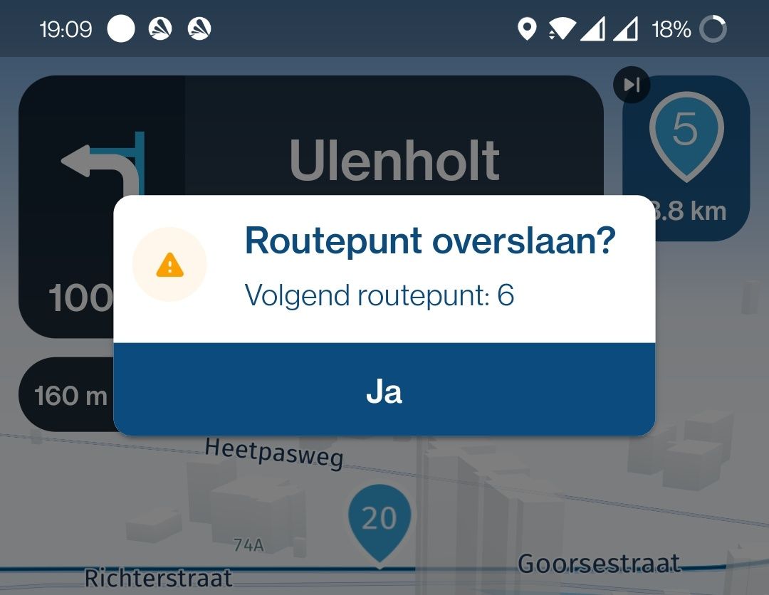
Skip Waypoint confirmation field/button (3.2.8)
-
I notice that in the latest beta release, one has to very accurately click the "ja" button to confirm a skip waypoint request.
I recall that in previous releases a user input inside the borders of the entire button (including the white area) confirmed the skip. That makes total sense since the button automatically fades away after 2 /3 sec if user input is not present. No need for very accurate user input...

@StefanHummelink This has been in the Beta already for a couple of versions. A long press doesn’t ask for the confirmation. We made the popup prettier as people did not realise they could click everywhere on the popup to confirm which led to confused users. This as you experience now has been received better by the community

-
@StefanHummelink This has been in the Beta already for a couple of versions. A long press doesn’t ask for the confirmation. We made the popup prettier as people did not realise they could click everywhere on the popup to confirm which led to confused users. This as you experience now has been received better by the community

@Corjan-Meijerink If the only option is to click Ja/Yes or do nothing, the confusion could be removed entirely by just styling the entire pop-up like a button (and don't display the Ja/Yes at all). So it's just a big button that says "(Click to) Skip waypoint 5".
-
@StefanHummelink This has been in the Beta already for a couple of versions. A long press doesn’t ask for the confirmation. We made the popup prettier as people did not realise they could click everywhere on the popup to confirm which led to confused users. This as you experience now has been received better by the community

@Corjan-Meijerink Hmmm, I feel like practically "longpressing" isn't the best solution. I would really prefer to have the previous "confirm by clicking anywhere" option, since that only requires the rider to take their eyes of the road for short instances in contrary to the "longpressing" case.
If the community likes it better this way, I can only move along, but hey, "niet geschoten is altijd mis", right?

-
@Corjan-Meijerink Hmmm, I feel like practically "longpressing" isn't the best solution. I would really prefer to have the previous "confirm by clicking anywhere" option, since that only requires the rider to take their eyes of the road for short instances in contrary to the "longpressing" case.
If the community likes it better this way, I can only move along, but hey, "niet geschoten is altijd mis", right?

@StefanHummelink Definitely! We’ll keep improving and I’lll keep an eye on this thread

-
 undefined Corjan Meijerink referenced this topic on
-
 undefined Tim Thompson referenced this topic on
