Test Over now What to do.
-
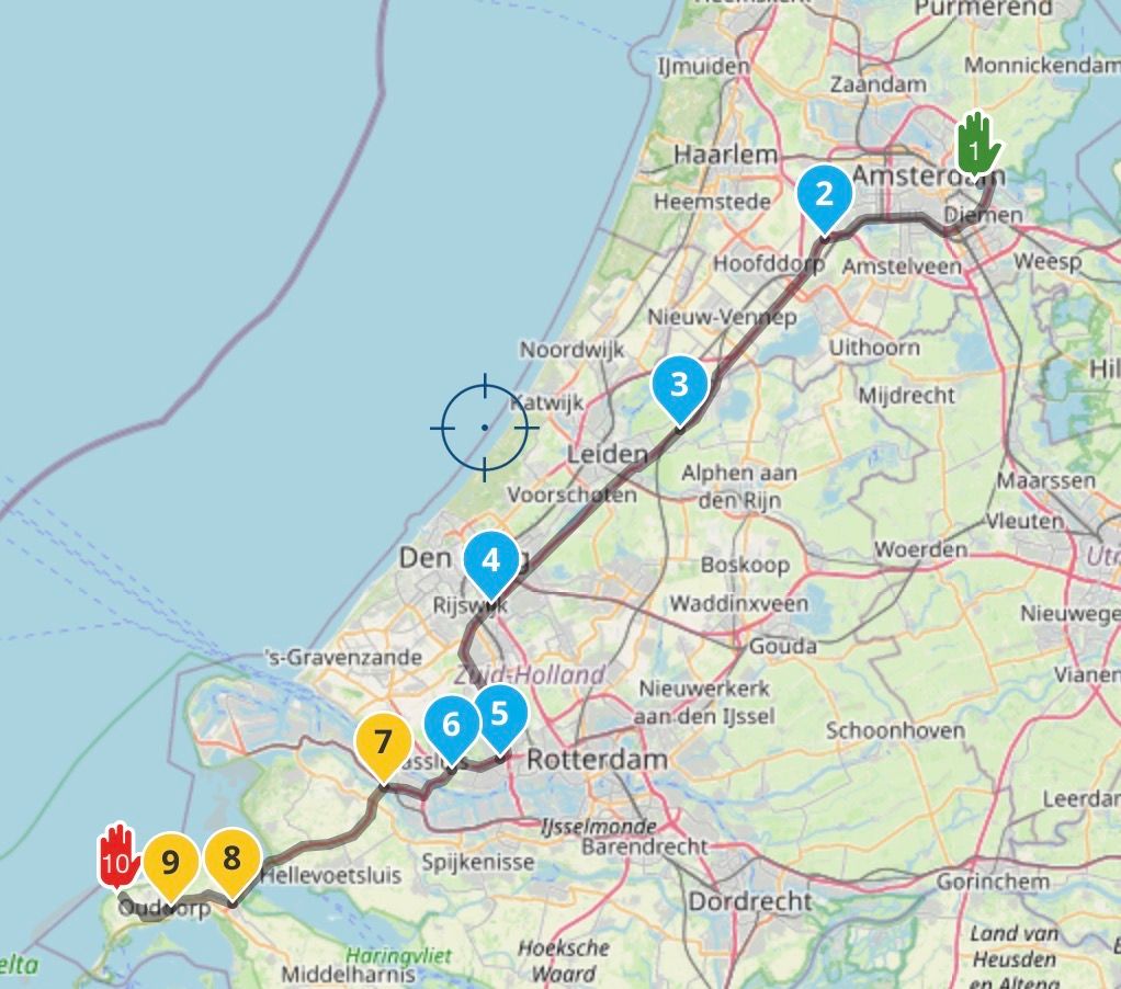
Yesterday I rode for 6.5 hours to catch up with a mate. Rode on all types of roads the UK has to offer from B roads to Motorways. Weather dry with blinding low sun to overcast and rain. So a good test. The route and destination was also one I was not familiar with. So how did MyRoute do ?
Planning.
- Planning the route both on the web and app was a pleasure. Big
thumbs up. 10/10
Navigation App.
- Very stable all day. No shutdowns or glitches.
- Computed ride time accurate. Planned route 3:20 hours when loaded to navigate 3:00 hours. Actually took 3:10.
- Map colours good. Could easily see side roads going through
villages and other information etc. - Map accuracy fine on par with all the rest.
- At the end of a long days riding my phone was still on 100% charge.
However the biggest problem I had was the font size for the next turn direction and the size of the roundabout symbol with the tiny exit number inside of it. I stopped a couple of times to alter zoom and tilt so I could get an earlier view of roundabouts so I could plan ahead. This I think is going to be a deal breaker for me. This app is so nearly perfect for me. So what do I do ?
- Go back to Calimoto use MRA for planning. This has some issues.
- Buy a BT headset for comms.
- Buy an Apple CarPlay unit like Chigee AIO5 which looks like it will give me the information I need in a more readable format. If anyone has one of these I would really appreciate your feedback.
My previous post post got nearly 500 views and only one supporting comment. So I guess I'm alone thinking this information is too hard to read. So whats the secret.
Supporting information I'm using an old iphone XR no sim card with downloadable maps. It's mounted on a SP Connect wireless charger up high inline of sight. No comms.
- Planning the route both on the web and app was a pleasure. Big
-
@Hubert-Thoring I have deleted your reply for two reasons. The original post is written in English, you have been asked on several occasions to reply in the language of the original post. The second reason for deleting your reply is because it does not answer the question that the original post is asking.
Please think before replying to forum posts. -
Yesterday I rode for 6.5 hours to catch up with a mate. Rode on all types of roads the UK has to offer from B roads to Motorways. Weather dry with blinding low sun to overcast and rain. So a good test. The route and destination was also one I was not familiar with. So how did MyRoute do ?
Planning.
- Planning the route both on the web and app was a pleasure. Big
thumbs up. 10/10
Navigation App.
- Very stable all day. No shutdowns or glitches.
- Computed ride time accurate. Planned route 3:20 hours when loaded to navigate 3:00 hours. Actually took 3:10.
- Map colours good. Could easily see side roads going through
villages and other information etc. - Map accuracy fine on par with all the rest.
- At the end of a long days riding my phone was still on 100% charge.
However the biggest problem I had was the font size for the next turn direction and the size of the roundabout symbol with the tiny exit number inside of it. I stopped a couple of times to alter zoom and tilt so I could get an earlier view of roundabouts so I could plan ahead. This I think is going to be a deal breaker for me. This app is so nearly perfect for me. So what do I do ?
- Go back to Calimoto use MRA for planning. This has some issues.
- Buy a BT headset for comms.
- Buy an Apple CarPlay unit like Chigee AIO5 which looks like it will give me the information I need in a more readable format. If anyone has one of these I would really appreciate your feedback.
My previous post post got nearly 500 views and only one supporting comment. So I guess I'm alone thinking this information is too hard to read. So whats the secret.
Supporting information I'm using an old iphone XR no sim card with downloadable maps. It's mounted on a SP Connect wireless charger up high inline of sight. No comms.
Hey then I'll do the beginning, plus my hardware and software:
Hardware:
Navi mobile phone
- iPhone Xr without Sim for it via hotspot to the web mobile network
- iPhone Xr has all maps also offline in memory
- iPhone Xr paired to the TFT of the R1250GS
- iPhone holder and charge is the BMW cradle
BT Headset
- BT headset is recommended, a cost-effective
- BT Headset SENA 3S PLUS I use the predecessor 6 J
- BT headset coupled with TFT
BT keyboard Remote-One for +/- zooming
- Remotek-One read my posts
- Remotek One is paired with the iPhone Xr
- I only use Remotek One for quick +/- zooming
- Remotek One here the possibility depending on the application
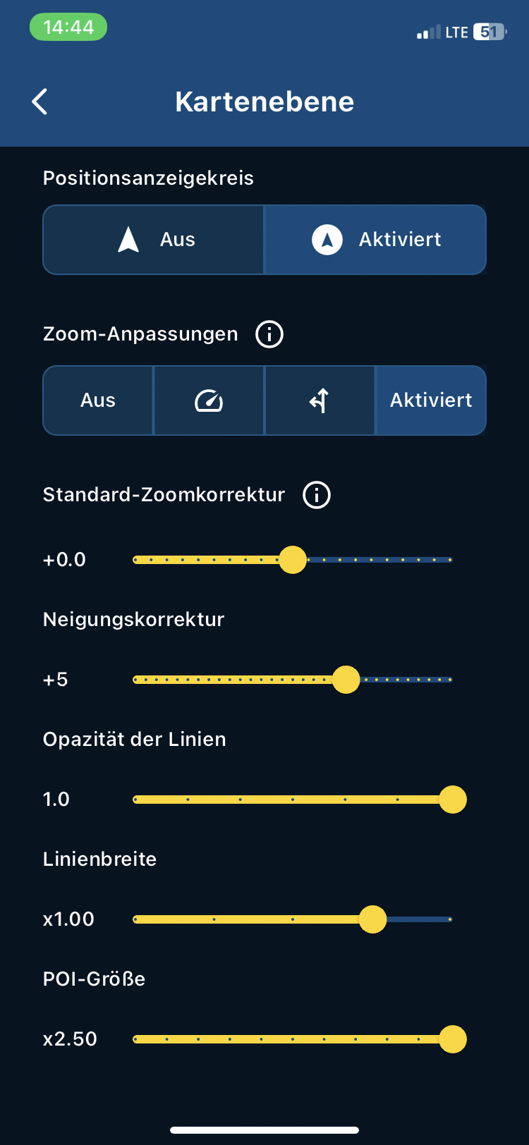
MRA with my settings including zooming when driving
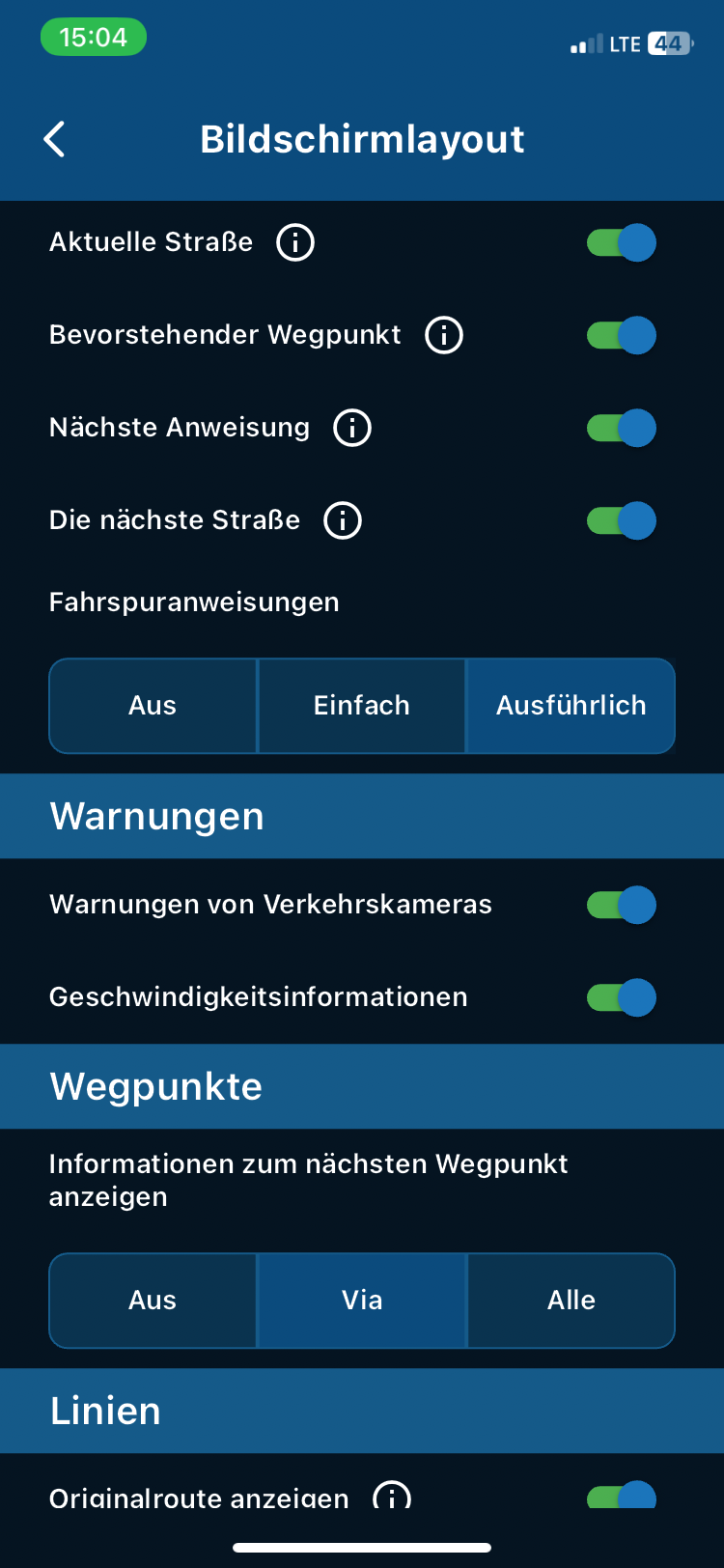
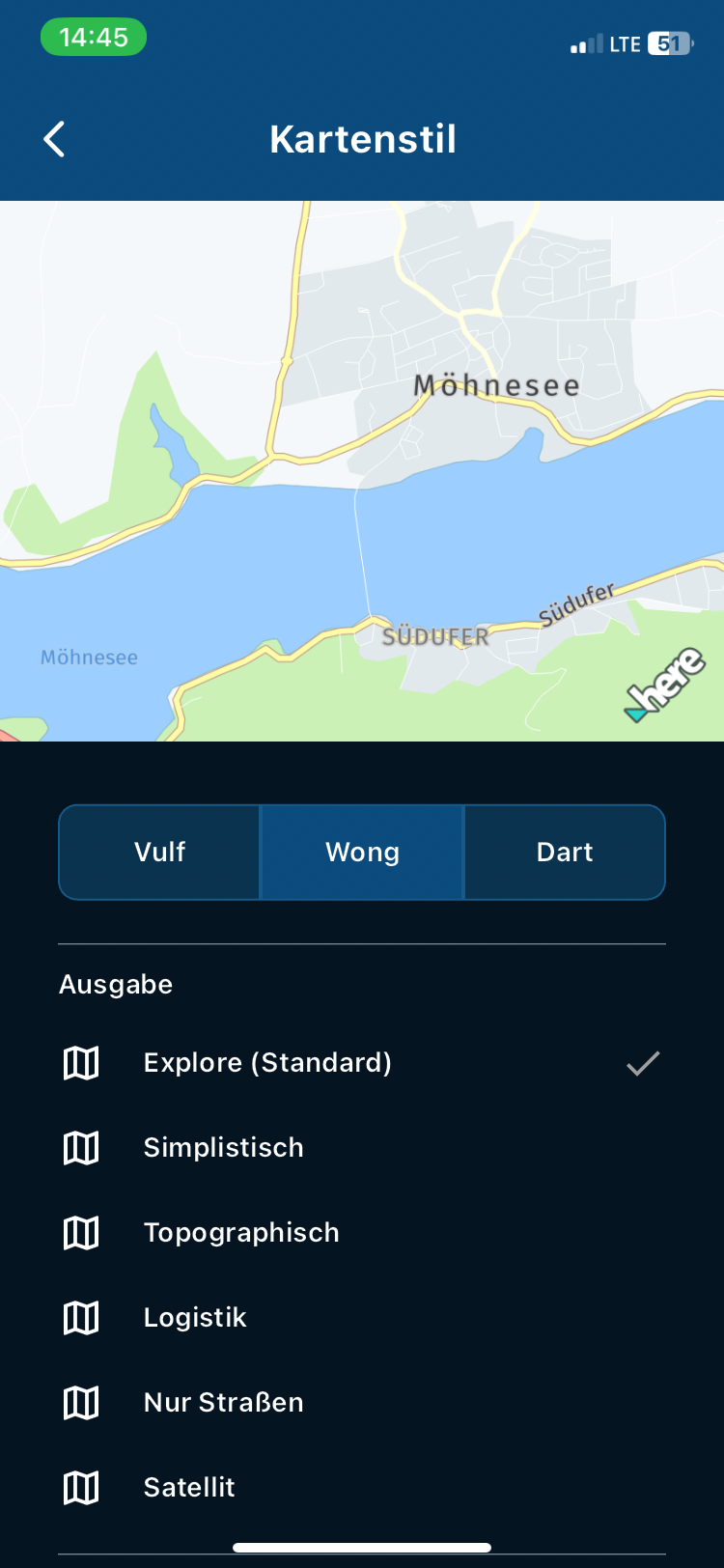
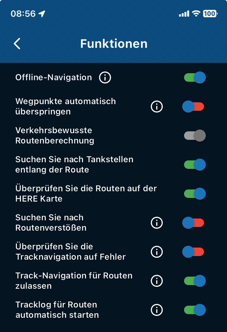
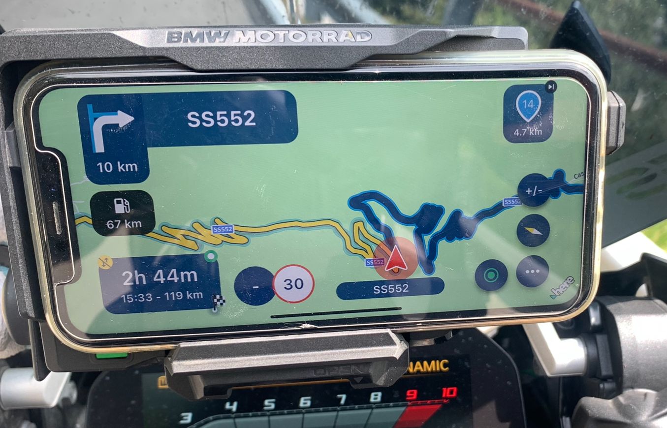
- Planning the route both on the web and app was a pleasure. Big
-
@Hubert-Thoring I have deleted your reply for two reasons. The original post is written in English, you have been asked on several occasions to reply in the language of the original post. The second reason for deleting your reply is because it does not answer the question that the original post is asking.
Please think before replying to forum posts.I write it laboriously on the mobile phone in German and then look at it including the pictures in peace only then I translate it into the desired language, sorry I was not ready yet.
I think that my answers at least in parts answer questions...
VG

Ich schreibe es mühsam auf dem Handy in Deutsch und schau es mir dann inkl. der Bilder in Ruhe an erst dann übersetze ich es in die erwünschte Sprache, sorry ich war also noch nicht so weit.
Ich denke schon das meine Antworten zumindest in Teilen Fragen beantwortet…
VG

-
@Peter-Levis It's nice to read a post where most things are great

When you say next turn direction, I presume you mean the next instruction after the current instruction. You're not alone with your thoughts that it is a little on the small size, but there is only so much screen available.
Even though I have a BT headset, I tend not to use the audible instructions, yes I would like the instruction boxes a little larger, but I have kind of got used to them now, I certainly would not switch to a CarPlay screen as I enjoy all of the functions that the phone screen offers. -
Yesterday I rode for 6.5 hours to catch up with a mate. Rode on all types of roads the UK has to offer from B roads to Motorways. Weather dry with blinding low sun to overcast and rain. So a good test. The route and destination was also one I was not familiar with. So how did MyRoute do ?
Planning.
- Planning the route both on the web and app was a pleasure. Big
thumbs up. 10/10
Navigation App.
- Very stable all day. No shutdowns or glitches.
- Computed ride time accurate. Planned route 3:20 hours when loaded to navigate 3:00 hours. Actually took 3:10.
- Map colours good. Could easily see side roads going through
villages and other information etc. - Map accuracy fine on par with all the rest.
- At the end of a long days riding my phone was still on 100% charge.
However the biggest problem I had was the font size for the next turn direction and the size of the roundabout symbol with the tiny exit number inside of it. I stopped a couple of times to alter zoom and tilt so I could get an earlier view of roundabouts so I could plan ahead. This I think is going to be a deal breaker for me. This app is so nearly perfect for me. So what do I do ?
- Go back to Calimoto use MRA for planning. This has some issues.
- Buy a BT headset for comms.
- Buy an Apple CarPlay unit like Chigee AIO5 which looks like it will give me the information I need in a more readable format. If anyone has one of these I would really appreciate your feedback.
My previous post post got nearly 500 views and only one supporting comment. So I guess I'm alone thinking this information is too hard to read. So whats the secret.
Supporting information I'm using an old iphone XR no sim card with downloadable maps. It's mounted on a SP Connect wireless charger up high inline of sight. No comms.
@Peter-Levis I have a Chigee AIO5 Play (one without the cameras) and the unit is very good. However, if you have problems with the font size, the AIO5 will probably not solve the problem for you as the current 5” unit may be too small for you. That said, Chigee is expected to release a 6” version in Spring 2025 and I will probably buy this slightly bigger unit as I have been very impressed with the current version.
There are the Capuride versions and I have seen some colleagues with the 7” version but I feel this too big for my bike - my personal opinion though.
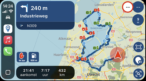
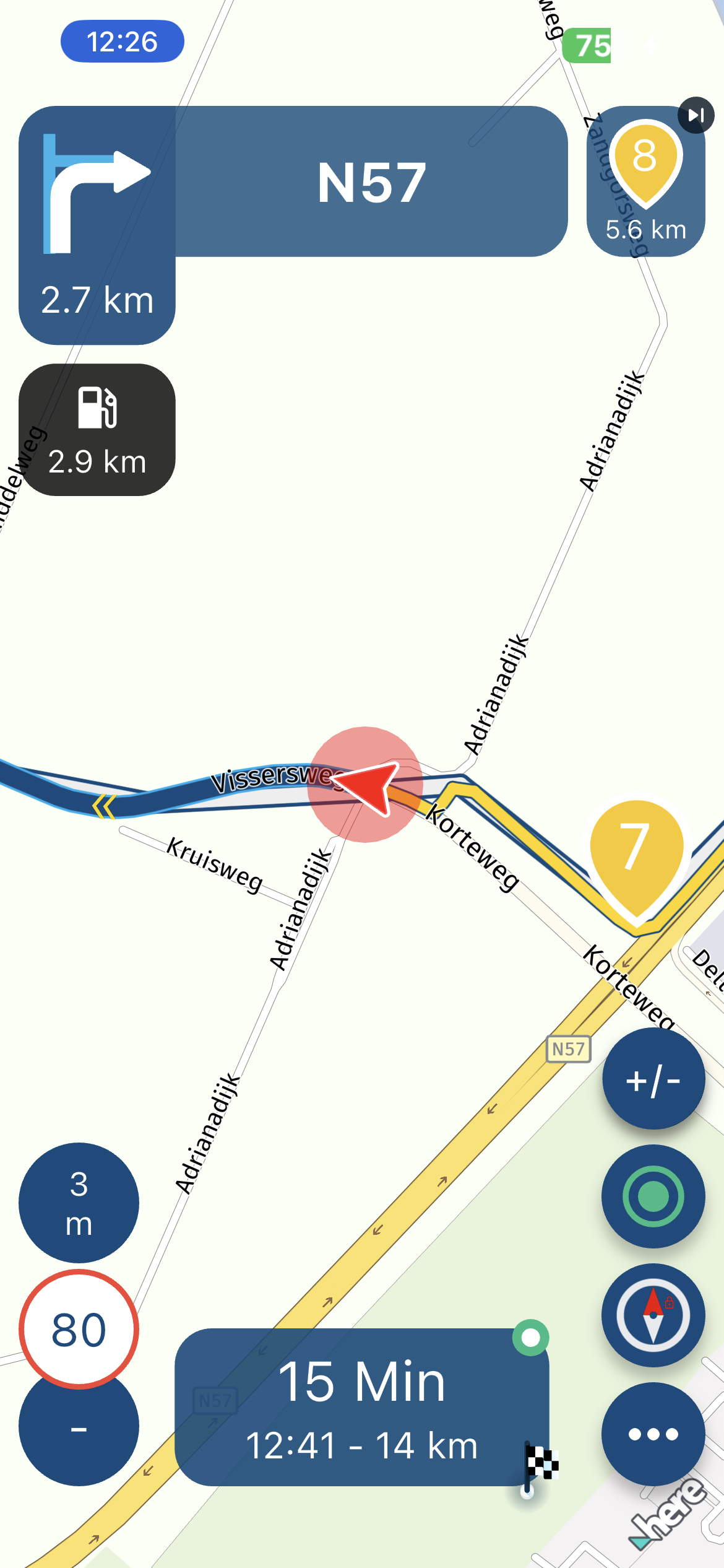
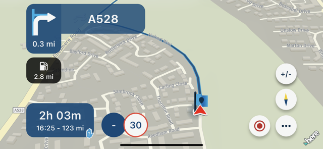
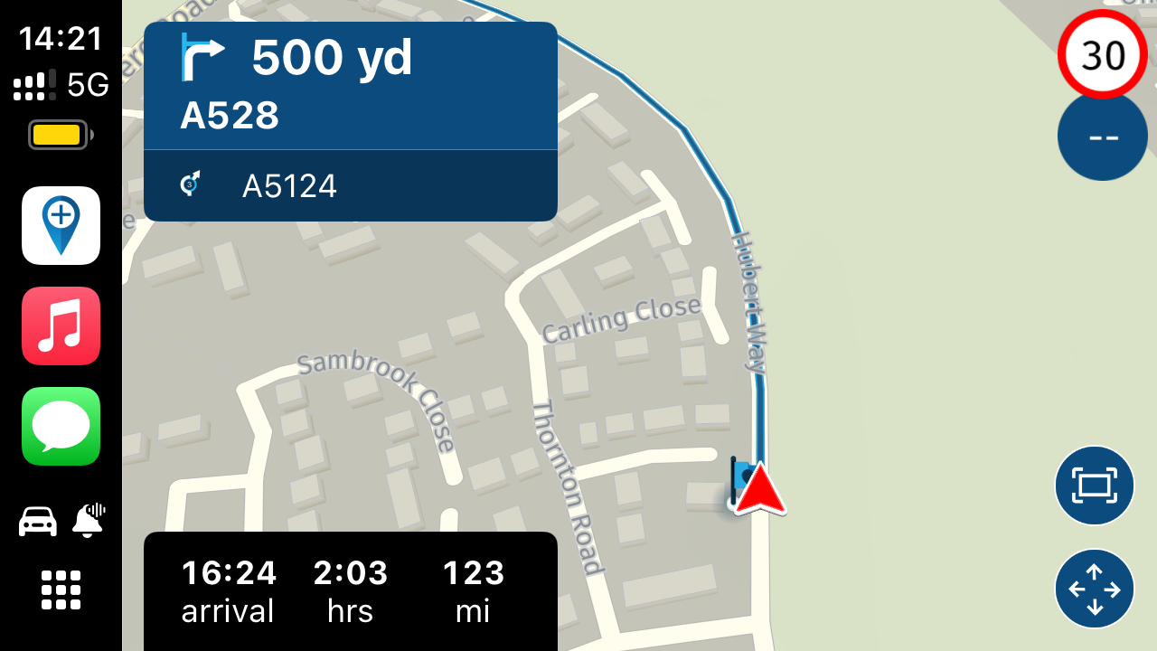
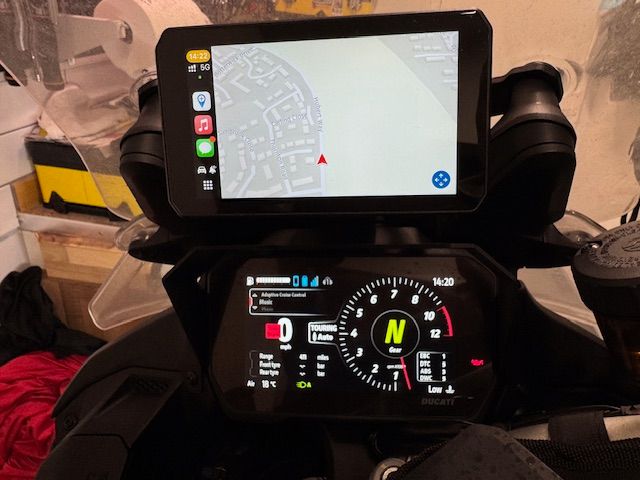
Some screenshots of MRA on the Chigee and one of the device with MAR running.
iPhone Screenshot:
Chigee Screenshot
Device With MRA Running (on Ducati Multistrada V4):. Sorry but I had cancelled the route from the screen
Hope this helps.
- Planning the route both on the web and app was a pleasure. Big
-
@Peter-Levis I have a Chigee AIO5 Play (one without the cameras) and the unit is very good. However, if you have problems with the font size, the AIO5 will probably not solve the problem for you as the current 5” unit may be too small for you. That said, Chigee is expected to release a 6” version in Spring 2025 and I will probably buy this slightly bigger unit as I have been very impressed with the current version.
There are the Capuride versions and I have seen some colleagues with the 7” version but I feel this too big for my bike - my personal opinion though.
Some screenshots of MRA on the Chigee and one of the device with MAR running.
iPhone Screenshot:

Chigee Screenshot

Device With MRA Running (on Ducati Multistrada V4):. Sorry but I had cancelled the route from the screen

Hope this helps.
@Dave-J-0
Just for clarity when I say next turn instruction I mean the current one. Sorry. The one after I'm not bothered about.The post above shows perfectly what I mean.
phone
Turn right 0.3 mi A528
Compared to the CarPlay
Turn right 500 yd
A528.It is the distance that is on the phone (0.3 mi) that is far too small.
Also CarPlay shows the arrival time and distance to go clearer.
I have heard that Chigee are going to launch a 6 inch unit so if I go down that route will wait.
The font size difference between 0.3 mi and 500 yd is huge.
-
@Dave-J-0
Just for clarity when I say next turn instruction I mean the current one. Sorry. The one after I'm not bothered about.The post above shows perfectly what I mean.
phone
Turn right 0.3 mi A528
Compared to the CarPlay
Turn right 500 yd
A528.It is the distance that is on the phone (0.3 mi) that is far too small.
Also CarPlay shows the arrival time and distance to go clearer.
I have heard that Chigee are going to launch a 6 inch unit so if I go down that route will wait.
The font size difference between 0.3 mi and 500 yd is huge.
@Peter-Levis this seems to be a common complaint. I don't have an issue reading the information. I guess age / eye sight, phone size and phone location have a lot to do with it.
-
@Dave-J-0
Just for clarity when I say next turn instruction I mean the current one. Sorry. The one after I'm not bothered about.The post above shows perfectly what I mean.
phone
Turn right 0.3 mi A528
Compared to the CarPlay
Turn right 500 yd
A528.It is the distance that is on the phone (0.3 mi) that is far too small.
Also CarPlay shows the arrival time and distance to go clearer.
I have heard that Chigee are going to launch a 6 inch unit so if I go down that route will wait.
The font size difference between 0.3 mi and 500 yd is huge.
@Peter-Levis I really like CarPlay and use this in the car (wired) and on the bike (wireless). The current 5” version is very good but would suggest waiting for the 6” version - buy the screen protector as well as this has reduced the amount of screen glare for me with where the device has been mounted.
You also need to be aware that there is quite a difference in functionality between the iPhone app and CarPlay app due to Apple constraints with CarPlay. That said, I have had no issues with quite complex routes and with adding stops etc. A couple of further points I would add though:
-
Waiting on Waypoint List and Skip waypoint to reflect the iPhone app but this is planned for a future update according to the Devs - see this forum entry.
-
As far as screen colour, the auto balance has been improved with a recent firmware update from the problem I reported here although you can see different app appearances on iPhone and CarPlay compared.
-
-
Hey then I'll do the beginning, plus my hardware and software:
Hardware:
Navi mobile phone
- iPhone Xr without Sim for it via hotspot to the web mobile network
- iPhone Xr has all maps also offline in memory
- iPhone Xr paired to the TFT of the R1250GS
- iPhone holder and charge is the BMW cradle
BT Headset
- BT headset is recommended, a cost-effective
- BT Headset SENA 3S PLUS I use the predecessor 6 J
- BT headset coupled with TFT
BT keyboard Remote-One for +/- zooming
- Remotek-One read my posts
- Remotek One is paired with the iPhone Xr
- I only use Remotek One for quick +/- zooming
- Remotek One here the possibility depending on the application
MRA with my settings including zooming when driving


@Hubert-Thoring, Again your very elaborate post that looks a lot like wallpaper does not answer the question in any way. The question is about a too small font. How does anything you write change that. Besides that, settings for zoom, tilt, routeline width etc. have different impact on different phones.
-
Yesterday I rode for 6.5 hours to catch up with a mate. Rode on all types of roads the UK has to offer from B roads to Motorways. Weather dry with blinding low sun to overcast and rain. So a good test. The route and destination was also one I was not familiar with. So how did MyRoute do ?
Planning.
- Planning the route both on the web and app was a pleasure. Big
thumbs up. 10/10
Navigation App.
- Very stable all day. No shutdowns or glitches.
- Computed ride time accurate. Planned route 3:20 hours when loaded to navigate 3:00 hours. Actually took 3:10.
- Map colours good. Could easily see side roads going through
villages and other information etc. - Map accuracy fine on par with all the rest.
- At the end of a long days riding my phone was still on 100% charge.
However the biggest problem I had was the font size for the next turn direction and the size of the roundabout symbol with the tiny exit number inside of it. I stopped a couple of times to alter zoom and tilt so I could get an earlier view of roundabouts so I could plan ahead. This I think is going to be a deal breaker for me. This app is so nearly perfect for me. So what do I do ?
- Go back to Calimoto use MRA for planning. This has some issues.
- Buy a BT headset for comms.
- Buy an Apple CarPlay unit like Chigee AIO5 which looks like it will give me the information I need in a more readable format. If anyone has one of these I would really appreciate your feedback.
My previous post post got nearly 500 views and only one supporting comment. So I guess I'm alone thinking this information is too hard to read. So whats the secret.
Supporting information I'm using an old iphone XR no sim card with downloadable maps. It's mounted on a SP Connect wireless charger up high inline of sight. No comms.
@Peter-Levis, yes the font size seems to be rather small for some people. I believe this is already in consideration by the devs. Personally I look more at the route line and less at the turn tiles. playing a little with tilt and zoom factors could make that easier. I think you can get used to that method, and in the meantime hope for the developers to adjust the font size. Probably the tiles have to be resized for that too..
- Planning the route both on the web and app was a pleasure. Big
-
@Peter-Levis I really like CarPlay and use this in the car (wired) and on the bike (wireless). The current 5” version is very good but would suggest waiting for the 6” version - buy the screen protector as well as this has reduced the amount of screen glare for me with where the device has been mounted.
You also need to be aware that there is quite a difference in functionality between the iPhone app and CarPlay app due to Apple constraints with CarPlay. That said, I have had no issues with quite complex routes and with adding stops etc. A couple of further points I would add though:
-
Waiting on Waypoint List and Skip waypoint to reflect the iPhone app but this is planned for a future update according to the Devs - see this forum entry.
-
As far as screen colour, the auto balance has been improved with a recent firmware update from the problem I reported here although you can see different app appearances on iPhone and CarPlay compared.
@Dave-J-0 thank you so much for your input. Very useful. Think I will wait for Chigee to launch their 6 in device. I have heard only good things about the AIO5. For me 7 in screens I think are too big.
Your screen shots make my point perfectly. I also disagree that changing the font size is hard to do. There is plenty of screen space.
A one second glance at the screen at 60 mph you travel 88 feet.
-
-
@Peter-Levis, yes the font size seems to be rather small for some people. I believe this is already in consideration by the devs. Personally I look more at the route line and less at the turn tiles. playing a little with tilt and zoom factors could make that easier. I think you can get used to that method, and in the meantime hope for the developers to adjust the font size. Probably the tiles have to be resized for that too..
@Con-Hennekens said in Test Over now What to do.:
@Peter-Levis, yes the font size seems to be rather small for some people. I believe this is already in consideration by the devs. Personally I look more at the route line and less at the turn tiles. playing a little with tilt and zoom factors could make that easier. I think you can get used to that method, and in the meantime hope for the developers to adjust the font size. Probably the tiles have to be resized for that too..
Thanks for your reply. Yes I did play with tilt and zoom which helps but that distance font size just bugs me. Silly maybe.
-
@Con-Hennekens said in Test Over now What to do.:
@Peter-Levis, yes the font size seems to be rather small for some people. I believe this is already in consideration by the devs. Personally I look more at the route line and less at the turn tiles. playing a little with tilt and zoom factors could make that easier. I think you can get used to that method, and in the meantime hope for the developers to adjust the font size. Probably the tiles have to be resized for that too..
Thanks for your reply. Yes I did play with tilt and zoom which helps but that distance font size just bugs me. Silly maybe.
A BT headset helps a lot

A 6" is apparently in the making, I find the justification against a 7" strange ...
What do you think?
So click Link zum Web
The iPhone Xr has 6"
-
A BT headset helps a lot

A 6" is apparently in the making, I find the justification against a 7" strange ...
What do you think?
So click Link zum Web
The iPhone Xr has 6"
@Hubert-Thoring said in Test Over now What to do.:
A BT headset helps a lot

A 6" is apparently in the making, I find the justification against a 7" strange ...
What do you think?
So click Link zum Web
The iPhone Xr has 6"
Yes I saw that post from Chigee. I use an iphone XR and I think the size seems good to me. Bigger screens are harder to fit on the bike without interfering with the bikes instruments. Also the bigger the screen the harder it is to stop unwanted vibrations. The mounts need to be stronger too. All depends on the bike. It is all a compromise.
Ideally I just want to stay with what I have as it works and the SP Connect wireless vibration mount works well and is very neat.
One reason to go Chigee not mentioned is the 1000 nits screen brightness. Thats better than both my phones. Again it all comes back to making the device easy to read in all weather conditions. Motorcycles are so much more demanding on display performance than phones inside cars. Its a harsh environment. I ride all year and do about 12000 miles / year. So I'm a bit fussy.
-
@Hubert-Thoring said in Test Over now What to do.:
A BT headset helps a lot

A 6" is apparently in the making, I find the justification against a 7" strange ...
What do you think?
So click Link zum Web
The iPhone Xr has 6"
Yes I saw that post from Chigee. I use an iphone XR and I think the size seems good to me. Bigger screens are harder to fit on the bike without interfering with the bikes instruments. Also the bigger the screen the harder it is to stop unwanted vibrations. The mounts need to be stronger too. All depends on the bike. It is all a compromise.
Ideally I just want to stay with what I have as it works and the SP Connect wireless vibration mount works well and is very neat.
One reason to go Chigee not mentioned is the 1000 nits screen brightness. Thats better than both my phones. Again it all comes back to making the device easy to read in all weather conditions. Motorcycles are so much more demanding on display performance than phones inside cars. Its a harsh environment. I ride all year and do about 12000 miles / year. So I'm a bit fussy.
So what I wrote at the beginning about the head and software is enough for any weather
The iPhone Xr has 6" and is robust for this use, MRA can be locked so no raindrop makes a problem and you arrive well at your destination ...
I also drive with it approx. 20,000km /a
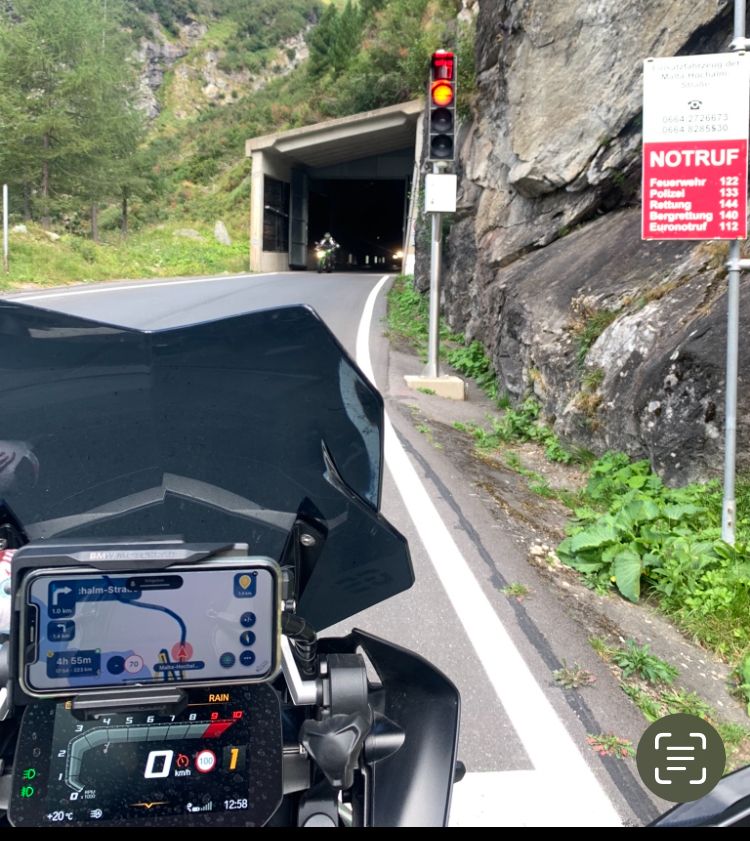
-
So what I wrote at the beginning about the head and software is enough for any weather
The iPhone Xr has 6" and is robust for this use, MRA can be locked so no raindrop makes a problem and you arrive well at your destination ...
I also drive with it approx. 20,000km /a

@Hubert-Thoring
Yes thats all fine but it does not resolve the fact that what I am complaining about is the font size of the turn direction. I have not criticised any other part of the interface. The screen layout, colours, and displayed information all work. Its just the font size I find hard to read both for turn distance and exit number in the roundabout symbol. Hope this now makes it clear. In your photo the 1.0 km under the right turn symbol. Too small. Everything else is good. -
@Con-Hennekens said in Test Over now What to do.:
@Peter-Levis, yes the font size seems to be rather small for some people. I believe this is already in consideration by the devs. Personally I look more at the route line and less at the turn tiles. playing a little with tilt and zoom factors could make that easier. I think you can get used to that method, and in the meantime hope for the developers to adjust the font size. Probably the tiles have to be resized for that too..
Thanks for your reply. Yes I did play with tilt and zoom which helps but that distance font size just bugs me. Silly maybe.
@Peter-Levis, it's quite obvious you are not alone in that

-
@Hubert-Thoring
Yes thats all fine but it does not resolve the fact that what I am complaining about is the font size of the turn direction. I have not criticised any other part of the interface. The screen layout, colours, and displayed information all work. Its just the font size I find hard to read both for turn distance and exit number in the roundabout symbol. Hope this now makes it clear. In your photo the 1.0 km under the right turn symbol. Too small. Everything else is good.Good morning, yes I already understood that, that's why the headset, the MRA announcement speaks loudly and clearly so that reading becomes superfluous, I zoom in or out briefly in or out if necessary to see it ...
Therefore also the list of the hardware above here.
The font even larger, is probably a wish that one wish will remain because the other, the use of the headset actually makes this superfluous.
-
Good morning, yes I already understood that, that's why the headset, the MRA announcement speaks loudly and clearly so that reading becomes superfluous, I zoom in or out briefly in or out if necessary to see it ...
Therefore also the list of the hardware above here.
The font even larger, is probably a wish that one wish will remain because the other, the use of the headset actually makes this superfluous.
@Hubert-Thoring You have your way but that does not mean that everyone should copy you or your set up. @Peter-Levis has his way and what he would like to see as development with the app and other options he has thought about. What I like about MRA is that there are a number of different ways I can use the app and indeed, I quite often turn off voice prompts because I want no voice intrusion and happy to follow the map. Stop telling people how they should be using MRA and reiterating your setup!
Hello! It looks like you're interested in this conversation, but you don't have an account yet.
Getting fed up of having to scroll through the same posts each visit? When you register for an account, you'll always come back to exactly where you were before, and choose to be notified of new replies (either via email, or push notification). You'll also be able to save bookmarks and upvote posts to show your appreciation to other community members.
With your input, this post could be even better 💗
Register Login
