Display of waypoints in the top left window
-

I am not sure if this post should be in 'Suggestions' or 'Problems', so admin please do move it if appropriate.
I have tried out the latest release 3.2.9 on a few journeys now. Overall it is a good progression, but there is in my opinion one major issue that has not been addressed in this release. I have other comments and suggestions, which I will write about separately, but I think this issue warrants a discussion of its own.
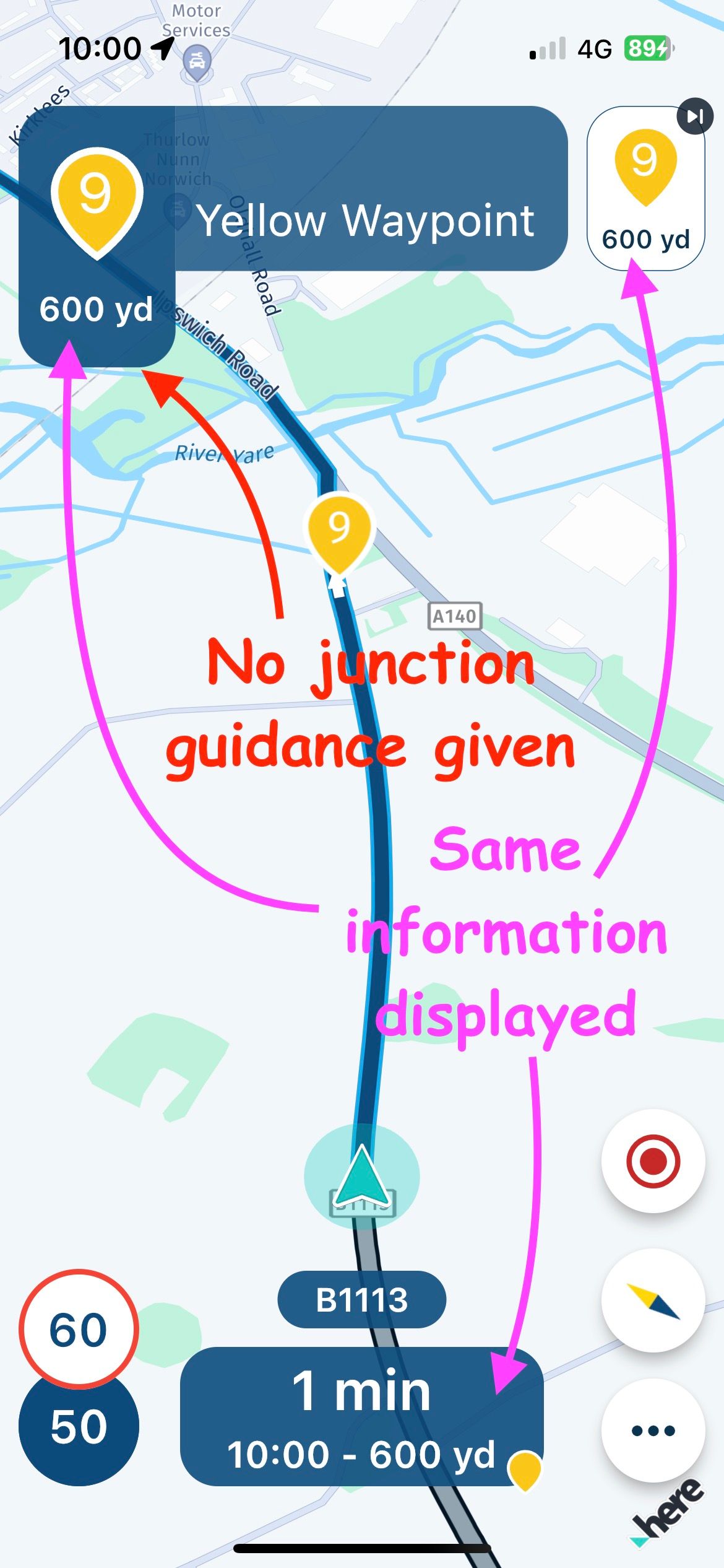
This is the display of waypoints in the top left window. See attached screenshot.
This feature prevents junction & roundabout guidance being displayed in this window. It also prevents voice guidance being given. I question the need for waypoints to be displayed other than on the line of the route, but if required upcoming waypoints can be shown in the top right window (upcoming waypoint), and/or at the bottom of the screen. So there is no point in having the same information shown three times.
Displaying accurate and timely guidance on what direction to take at the next turning is a fundamental tenet of a navigation system and this single issue detracts from what is otherwise an excellent app and I believe it should be addressed as a priority.
-
@David-Bonner no need to move it, absolutely fine here!

We had quite some feedback about this and are still discussing how to improve it! You can rest assured that it will be better in a future update but not sure which one yet.
Thanks a lot for your view on this matter and input.
-
@Corjan-Meijerink
Thanks Corjan, I am sure you will come up with an elegant solution - you usually do!
-
@Corjan-Meijerink I agree with the point about the junction not being seen because of the waypoint but I also like having the waypoint information text scrolling for the title and the note information. I really want this waypoint text and note info feature to stay so I will be interested to see the solution. Keep up the great work.
-
@Dave-J-0 Definitely! Waypoint information won't be removed. Will however look into the possibility to show a different image (that of the upcoming maneuver)

-
@Corjan-Meijerink Brill. Great work
-
Isn't this an issue of just poor shaping point placement? If the shaping point was placed just beyond the junction or roundabout, wouldn't this problem go away?
-
This may be just because I’m used to how Garmin devices operate, but I don’t understand why we need to know when we’re approaching waypoints.
I can understand being notified about via points (hand icon that we must pass through), but I thought waypoints were just like Garmin’s shaping points and are used to shape the route rather than let you know when you arrive at them.
I’m probably missing something and just need to recalibrate my brain, but thought it worth asking the question anyway.
-
@Dae-0 said in Display of waypoints in the top left window:
This may be just because I’m used to how Garmin devices operate, but I don’t understand why we need to know when we’re approaching waypoints.
I can understand being notified about via points (hand icon that we must pass through), but I thought waypoints were just like Garmin’s shaping points and are used to shape the route rather than let you know when you arrive at them.
I’m probably missing something and just need to recalibrate my brain, but thought it worth asking the question anyway.
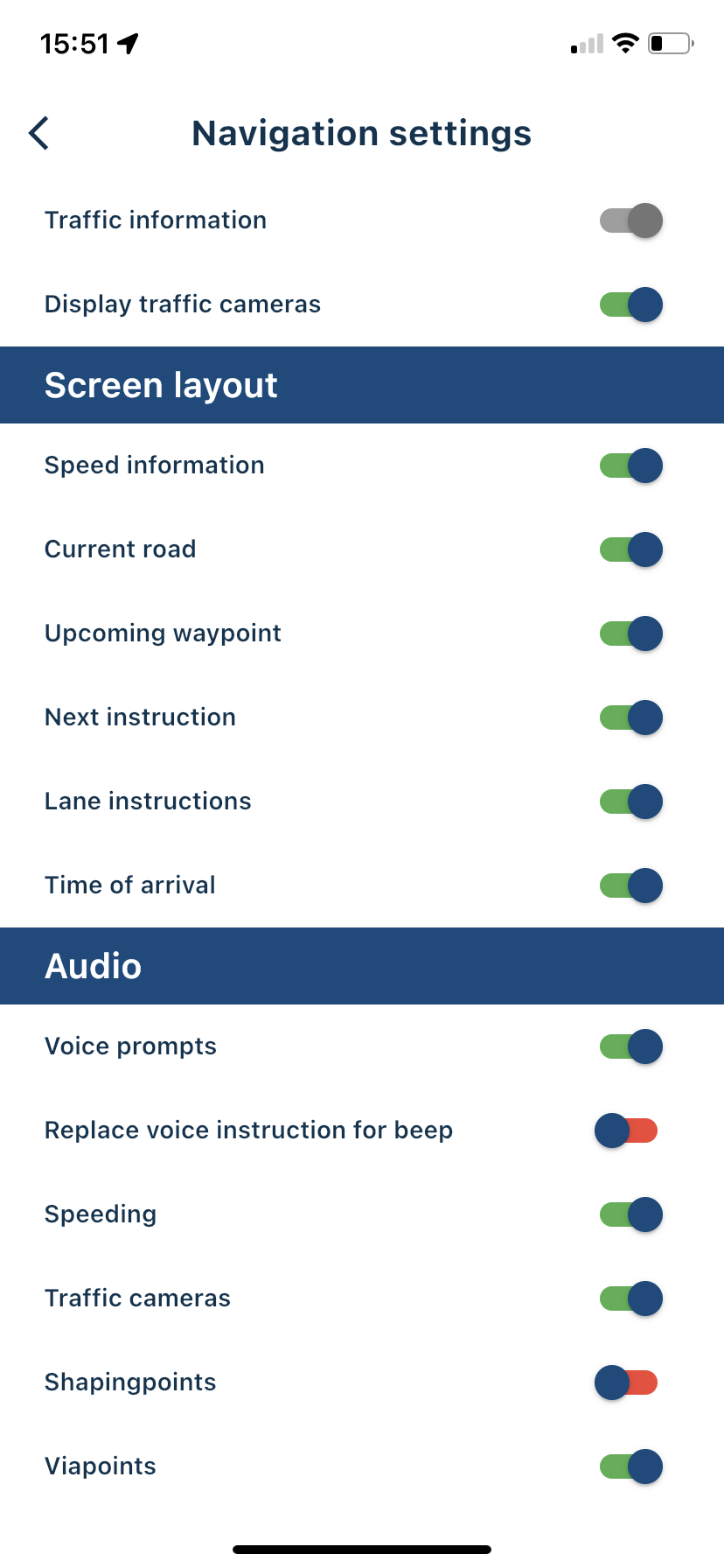
You can choose which audible notifications you receive in settings. Just turn the shaping points off.

-
@Nick-Carthew said in Display of waypoints in the top left window:
You can choose which audible notifications you receive in settings. Just turn the shaping points off.
I understand the setting you’re referring to (although I was on about the visual indication rather that the audible notification), but if you turn off the display of upcoming waypoints you lose visibility of both waypoints (for shaping only) AND via points (places I must visit, like a cafe). You also lose the quick tap to skip the next point.
I’d like the option to be able to see the display of distance/ETA to via points only in the top right corner - I’m not interested in the distance/ETA to shaping points. That way I could have the quick tap to skip the next via point (and all the shaping points between my current position and that via point).
-
@Dae-0 said in Display of waypoints in the top left window:
@Nick-Carthew said in Display of waypoints in the top left window:
You can choose which audible notifications you receive in settings. Just turn the shaping points off.
I understand the setting you’re referring to (although I was on about the visual indication rather that the audible notification), but if you turn off the display of upcoming waypoints you lose visibility of both waypoints (for shaping only) AND via points (places I must visit, like a cafe). You also lose the quick tap to skip the next point.
I’d like the option to be able to see the display of distance/ETA to via points only in the top right corner - I’m not interested in the distance/ETA to shaping points. That way I could have the quick tap to skip the next via point (and all the shaping points between my current position and that via point).
I generally agree... Once the shaping points have served their purpose to force the routing engine to faithfully recreate the desired route, I don't really care or need to see them anymore. However, others have indicated they want the ability to use (for whatever reason), see and navigate them.
I still wonder if the problem noted in this thread essentially goes away if the shaping points are more appropriately placed beyond the intersections, roundabouts, etc. in question.
-
@Tim-Thompson Yes, you can avoid the waypoint display obscuring junction guidance by placing it beyond the upcoming junction. Normally you would do this anyway. The problem is it will then obscure guidance for the next junction, as will any intermediate waypoints, until passed. Showing distance & time to Via points I can understand, but I really don’t need to see this display for every shaping point.
-
I’m sure there are valid reasons why people want to see the information about each waypoint, I just can’t imagine what they are.
Imagine the following scenario, which often happens with me and my wife:
It’s early afternoon and we’re on the way back home via a cafe or some other stop. There may be many waypoints between where we are and the via point of the cafe. After the café there’s many waypoints and a final via point of home. We decide to skip the cafe as they may be closed when we get there (or some other reason).
With our current Garmin based systems we can both hit the skip option with a single touch and it will skip the via point of the cafe and all the waypoints between our current position and the cafe. We can even use the BMW handlebar wheel so we don’t have to touch the screen. We can then continue the route from the next shaping point or cut into the route a bit further on and the system will realise what we’ve done.
How does that scenario work with MRA and it displaying every waypoint? How many touches are required? I feel I’d have to go into the menu and select a number of points to skip. That’s going to mean stopping as I’d have to work out how many I’d need to skip before telling MRA what to do. That could be annoying if it’s not just our two bikes, but instead a day when we’re leading a group of 15 bikes.
We could have 10, 20 or even 50 waypoints between via points. We really don’t need to be told about every one of them, but turning off their display in the top right makes skipping no longer a one touch operation.
I appreciate everyone’s requirements are different, so maybe it could be a configurable option.
-
@Dae-0 said in Display of waypoints in the top left window:
How does that scenario work with MRA and it displaying every waypoint?
Simply longpress the waypoint or via point you want to proceed the navigation at, and click Yes. Done. Skipped up to that wp. Easy as that.
-
@StefanHummelink
That still means messing about zooming and panning the map to be able to see the correct point to long press on. Much more involved that the single touch of the Garmin and not something you could do without having eyes off the road for too long.

-
@Dae-0
In my opinion it should be the case that if you miss a viapoint (hand in MRA/Flag in the Zumo), you get a pop-up that you missed it and the question: skip this viapoint? OK! If you press OK (1x) the viapoint will be skipped! Your route is calculated to the next shaping or viapoint.
If you don't press OK, your route will be recalculated to the missed viapoint.
(That's how it works in the Garmin Zumo XT too) -
@Dae-0 I would always stop at the side of the road if I need to skip multiple waypoints for distinct reasons, but yea you are right. The longpress method involves more interaction, but yet is very fast
-
@StefanHummelink said in Display of waypoints in the top left window:
@Dae-0 I would always stop at the side of the road if I need to skip multiple waypoints for distinct reasons, but yea you are right. The longpress method involves more interaction, but yet is very fast
I would too, but on the Garmin a single “skip via point” tap on the screen, or a flick of the BMW wheel, will skip the next via point and all the waypoints between my position and that via point so it’s not necessary. With MRA I think stopping will be my only choice.
Hopefully people don’t interpret my posts incorrectly. I’m not trying to be awkward, just suggesting how other systems offer a safer and more user friendly way of doing things. It’s only with all our constructive feedback and ideas that MRA Next can become the truly awesome product that it’s shaping up to be.
I’d be quite happy if there was a toggle so the top right hand corner either displayed via and way points or just via points (hands) and changed the skip function accordingly.