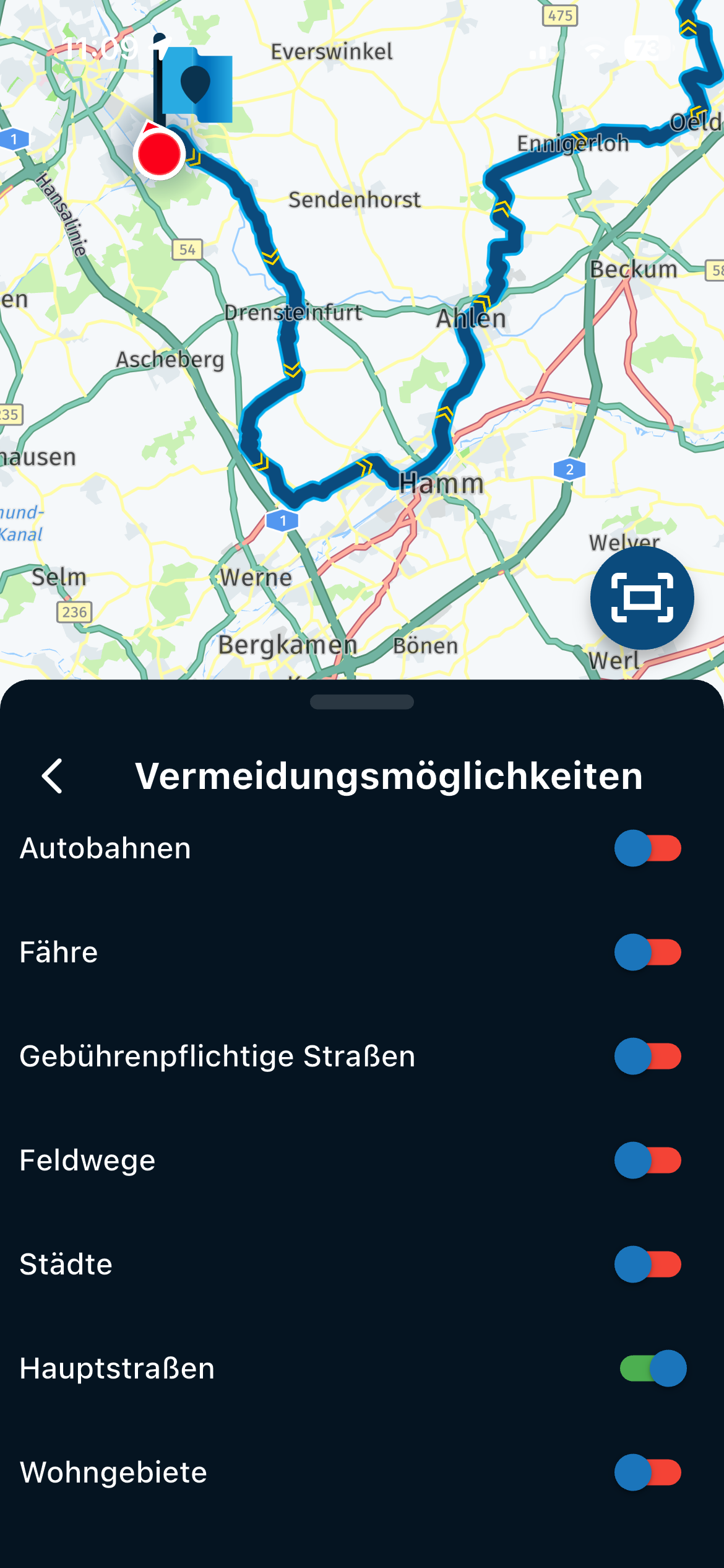
MRA 6.0.0 (514) Stop navigation should be directly on the display /// Stopp Navigation sollte direkt auf dem Display sein
-

Hey MRA Team,
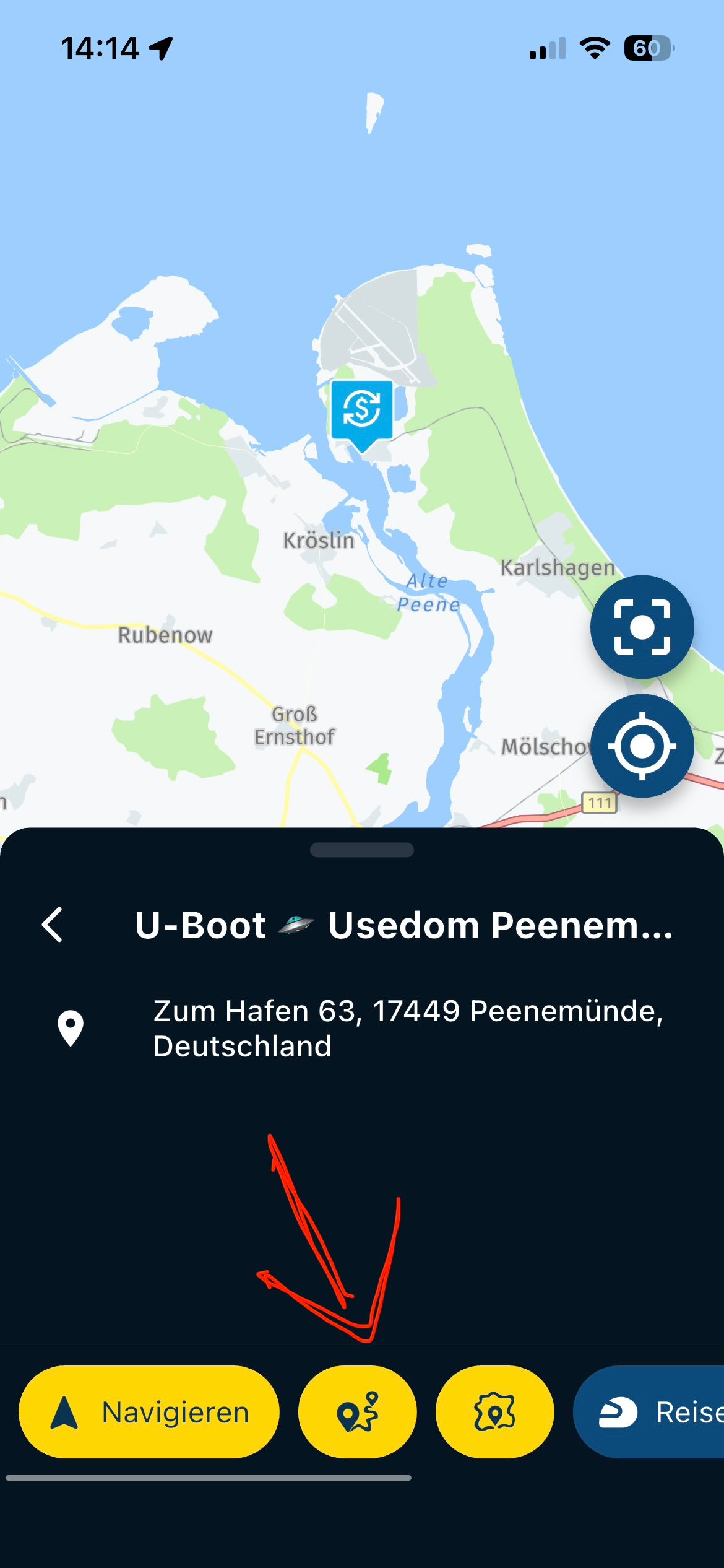
The simple stop of the navigation should be possible directly on the display, the one with the menu item is now somehow confusing and therefore cumbersome, at least I think.
- In the old version it was the three "..." points and then a text and thus at least "red" and thus more striking.
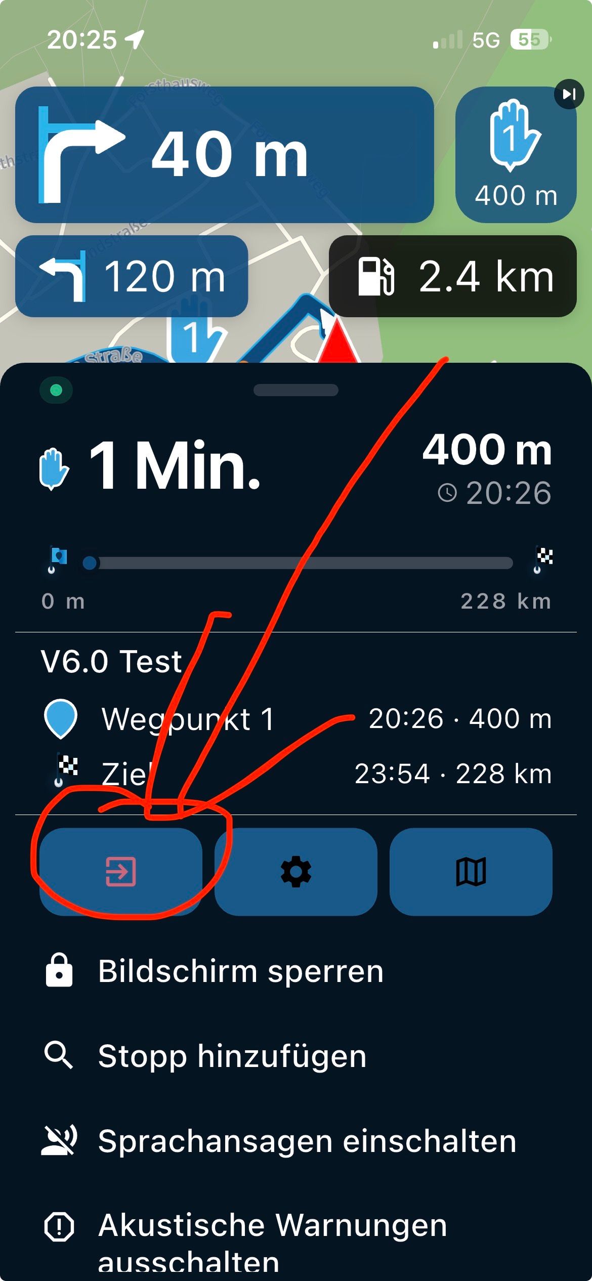
Better would be the symbol s. Image, on the main screen, so the display of the navigation to be able to stop directly.
—-###—-
Hey MRA Team,
der einfache Stopp der Navigation sollte direkt auf dem Display möglich sein, das mit dem Menüpunkt ist jetzt irgendwie unübersichtlich und damit umständlich, funde ich zumindest.- In der alten Version waren es die drei „…“ Punkte und dann ein Text und damit zumindest „rot“ und damit auffälliger.
Besser wäre das Symbol s. Bild, auf dem Hauptbildschirm zu finden, also dem Display der Navigation um direkt stoppen zu können.
-

So it got a lot more easier, but it is still not enough for you?
Why would you want to waste screen estate for a function typically used when you reached your destination... -
So maybe, just an idea. Because sometimes you want to get out of the navigation quickly.
—-###—-
So vielleicht, nur eine Idee. Denn manchmal möchte man schnell raus aus der Navigation.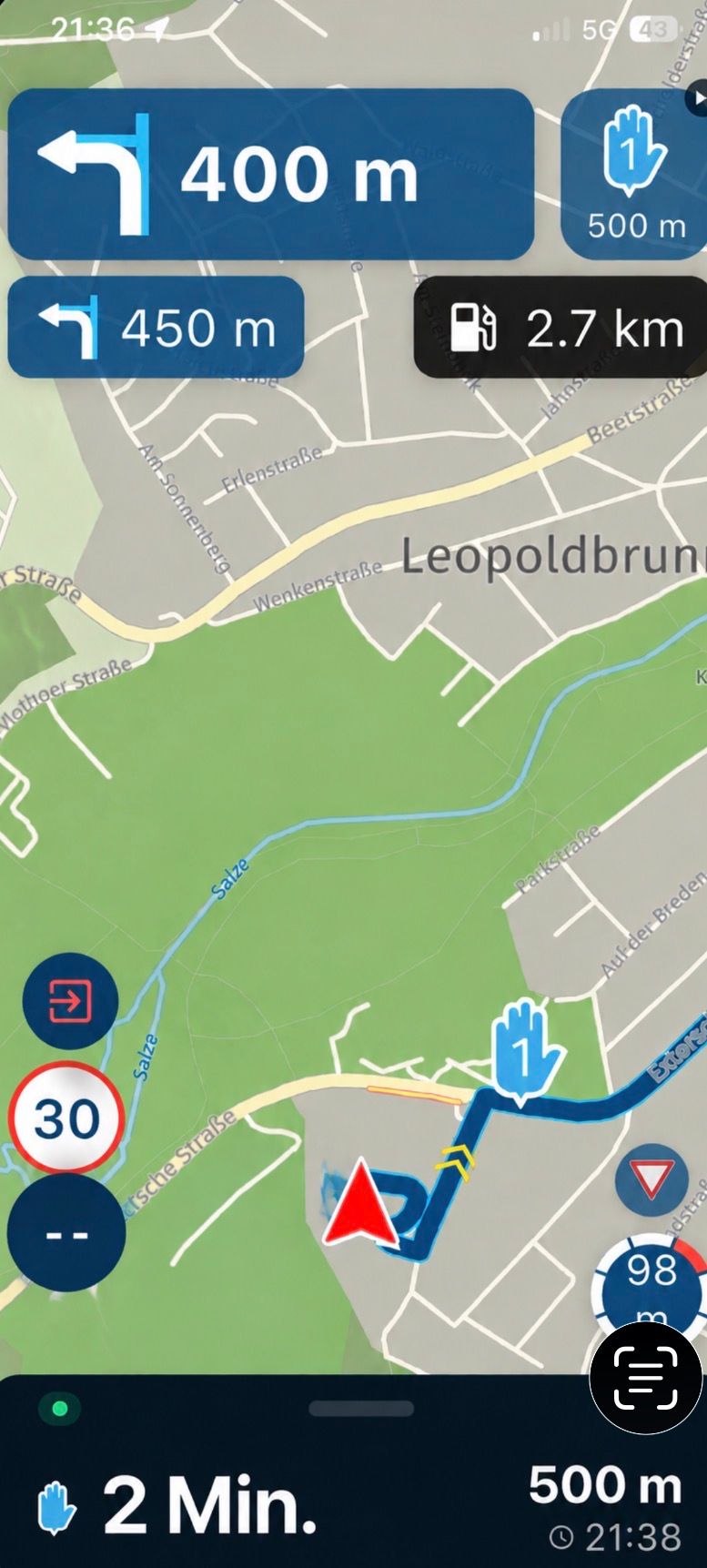
-

I like the new Stop Navigation icon and location for the app. Quick and easy.
-

I also absolutely see no reason to change this.
It’s just as accessible as before.
Hello! It looks like you're interested in this conversation, but you don't have an account yet.
Getting fed up of having to scroll through the same posts each visit? When you register for an account, you'll always come back to exactly where you were before, and choose to be notified of new replies (either via email, or push notification). You'll also be able to save bookmarks and upvote posts to show your appreciation to other community members.
With your input, this post could be even better 💗
Register Login-
 1121148
-
0612
-
 0551
0551
-
0523
-
18161.6k
-
 0413
0413
-
0875
-
0574