Icon size
-
I've been wanting to ask for a while now but I've always forgotten, I don't know if I'm the first to complain about something like this but it seems to me that the POI icons are very small, you can hardly tell what they are about it concerns, if a petrol station, a restaurant, a speed camera or something else, isn't it possible to think of slightly larger icons?
@Aiello-antonino Daar ben ik het wel mee eens. Ik moet soms inderdaad goed kijken wat het is.
-
@Aiello-antonino Daar ben ik het wel mee eens. Ik moet soms inderdaad goed kijken wat het is.
@Huibertus think if someone needs to use glasses to read but not to drive…
-
I've been wanting to ask for a while now but I've always forgotten, I don't know if I'm the first to complain about something like this but it seems to me that the POI icons are very small, you can hardly tell what they are about it concerns, if a petrol station, a restaurant, a speed camera or something else, isn't it possible to think of slightly larger icons?
@Aiello-antonino not the first by any means...hopefully it is no the developers list of improvements.

-
indeed. The icons are too small
-
Message: Feedback on MyRoute Beta Test:
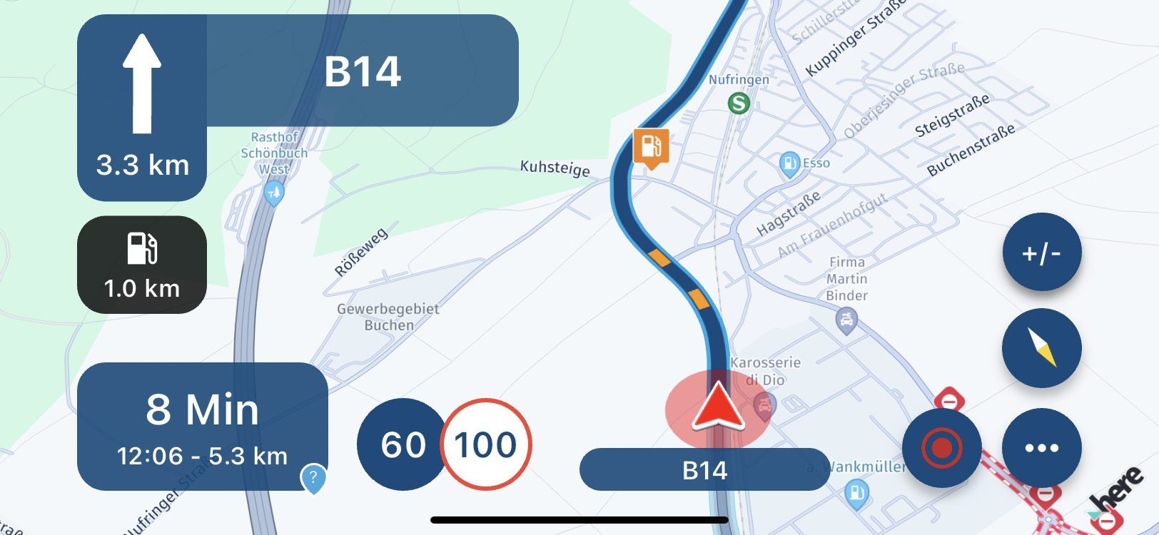
Hello, when using MyRoute, the streets are well highlighted. However, the overlays for designations (e.g. designations such as <A81>, parking lots, yellow designations of federal highways, etc.) are much too small to be read quickly. They are not enlarged even when zooming in. The petrol station sign is easier to recognize, but could also be larger. If it is the initial size, then it should be a factor of 3 larger. The petrol station sign is about twice the size of the sign. It should then be larger by a factor of 1.5. Good legibility is important so that you have to look at the display for too long. It would be nice if this could be taken into account during development.
At the screen shot you can see the size e.g. of a gasstation. But also the signs for "Roadwork", blocked road, etc. are the same size and hard to identify during a ride. The size of half the speed limit or a third would be great
Best regards Guido

-
Another vote here for the option to increase icon sizes. Using MRA with the Chigee via Android Auto I literally can't tell what the icons are at all!
-
Another vote here for the option to increase icon sizes. Using MRA with the Chigee via Android Auto I literally can't tell what the icons are at all!
@Tim-Watson has been previously requested, hopefully with more requests, it will move up the list. Same with the extra large blue route/track line - it is excessively large and covers up info underneath..IMO
