Option to route to nearest waypoint instead of point 1
-
I did search and browse several pages of the forum, I also looked in the online manual and there is no mention of this, although it's currently possible, it's just not advertised or documented.
I am recently back from an 8 day trip in Europe and used the app almost exclusively, as did a friend on his bike. But one "quirk" caused us both problems until I realised how to work around it.
On one of the days I had loaded in the route as soon as we started and we set off, whereas he forgot and opened the app midway through the route and was annoyed to find that despite being between waypoints 38 and 39, the app was trying to route him via point number 1 (he had calculate from current location enabled) and he had to manually skip the first 37 waypoints in order to get it correct.
I also had this issue and then it dawned on me to try zooming into the map close to where my location was and long pressing on the next nearest waypoint and boom it set this as the next waypoint.
As I said I have checked the online manual and can see no mention of it but I think in my humble opinion this is not a particularly good user experience and certainly isn't obvious. I am a software tester for my job and it took me a while to think to try it.
Although the app has the option to route from the current location, it always tries to take you to point 1 first and I think an option to "navigate to next nearest waypoint" option would be awesome.
@Paul-41 A long press on the route point that you want to start from disables all previous points. Or open the waypoint list and select your chosen start point.
-
@Paul-41 A long press on the route point that you want to start from disables all previous points. Or open the waypoint list and select your chosen start point.
Yeah I said that in my original post. My point is it’s not blatantly obvious that you can do this and it would be good if it offered it as an option. Especially since zooming in can often be laggy loading the map.
-
I did search and browse several pages of the forum, I also looked in the online manual and there is no mention of this, although it's currently possible, it's just not advertised or documented.
I am recently back from an 8 day trip in Europe and used the app almost exclusively, as did a friend on his bike. But one "quirk" caused us both problems until I realised how to work around it.
On one of the days I had loaded in the route as soon as we started and we set off, whereas he forgot and opened the app midway through the route and was annoyed to find that despite being between waypoints 38 and 39, the app was trying to route him via point number 1 (he had calculate from current location enabled) and he had to manually skip the first 37 waypoints in order to get it correct.
I also had this issue and then it dawned on me to try zooming into the map close to where my location was and long pressing on the next nearest waypoint and boom it set this as the next waypoint.
As I said I have checked the online manual and can see no mention of it but I think in my humble opinion this is not a particularly good user experience and certainly isn't obvious. I am a software tester for my job and it took me a while to think to try it.
Although the app has the option to route from the current location, it always tries to take you to point 1 first and I think an option to "navigate to next nearest waypoint" option would be awesome.
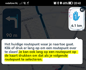
@Paul-41, I guess you and your friend played hooky on the mandatory introduction in the app?

-
@Paul-41, I guess you and your friend played hooky on the mandatory introduction in the app?


@Con-Hennekens I don’t remember seeing that, but I still think it’s not very intuitive and a simple option or popup would be much more user friendly.
-
@Paul-41, I guess you and your friend played hooky on the mandatory introduction in the app?


@Con-Hennekens also it should be in the documentation. Assuming I haven’t also missed that….
-
@Con-Hennekens also it should be in the documentation. Assuming I haven’t also missed that….
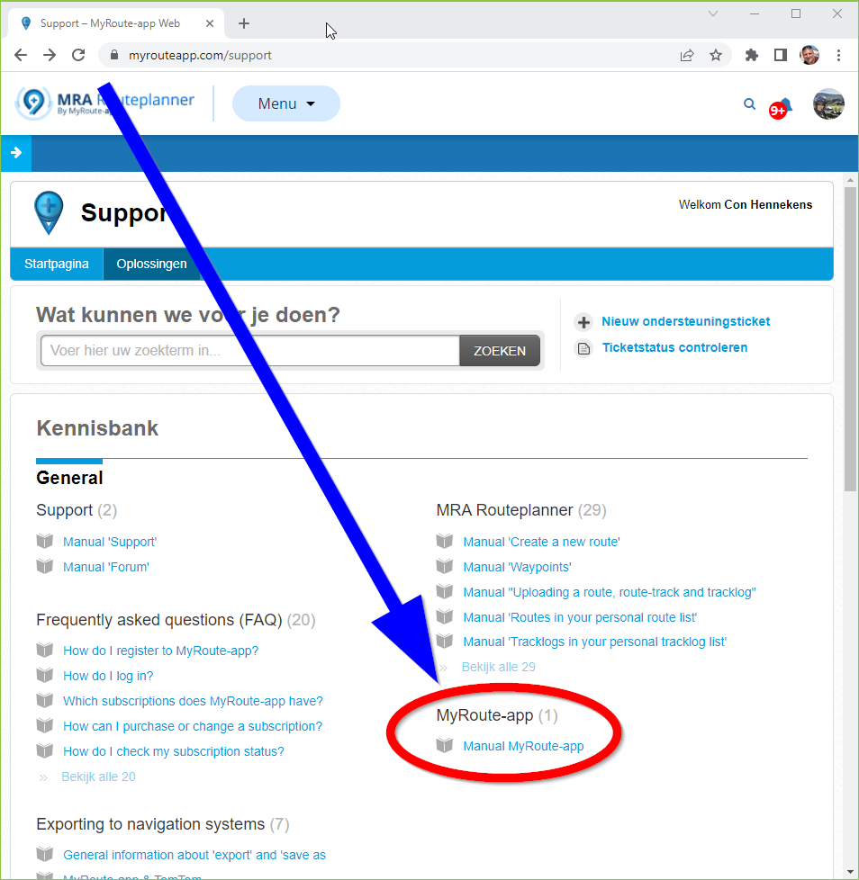
@Paul-41, I think it is pretty intuitive: short tap reveals info, long press does action. But you are right, it's easy once you know
 . The option using a popup or a list of waypoints is in the menu of the app, under the three dots. And a manual showing all the beauty is in the support section of myrouteapp.com.
-
@Paul-41, I think it is pretty intuitive: short tap reveals info, long press does action. But you are right, it's easy once you know
 . The option using a popup or a list of waypoints is in the menu of the app, under the three dots. And a manual showing all the beauty is in the support section of myrouteapp.com.
@Con-Hennekens I’m aware of where the manual is, as I’ve said I couldn’t find any reference to it but I’ll have another look, thanks.
I still think a popup asking if you want to route to the next closest point would be very useful.
I was merely providing feedback as the workaround still doesn’t provide the best user experience that’s consistent with other devices.
-
@Con-Hennekens I’m aware of where the manual is, as I’ve said I couldn’t find any reference to it but I’ll have another look, thanks.
I still think a popup asking if you want to route to the next closest point would be very useful.
I was merely providing feedback as the workaround still doesn’t provide the best user experience that’s consistent with other devices.
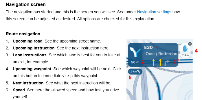
@Paul-41 English manual page 25 (point 4)

-
@Jörgen that screenshot has nothing to do with what I’m talking about.
Do people not like feedback? I thought the creators wanted the app to succeed and get honest feedback, sheesh.
-
So I’ve spotted in page 28 of the manual it does mention the long press on the list of waypoints, obviously I should have spotted this sooner, although I still think the app could make this much slicker if it prompted you to do this rather than have to go through several steps to select the correct waypoint you continue the route from.
-
@Jörgen that screenshot has nothing to do with what I’m talking about.
Do people not like feedback? I thought the creators wanted the app to succeed and get honest feedback, sheesh.
@Paul-41 said in Option to route to nearest waypoint instead of point 1:
@Jörgen that screenshot has nothing to do with what I’m talking about.
Do people not like feedback? I thought the creators wanted the app to succeed and get honest feedback, sheesh.
Sorry, just wanted to help and may misunderstand the question.

-
@Jörgen that screenshot has nothing to do with what I’m talking about.
Do people not like feedback? I thought the creators wanted the app to succeed and get honest feedback, sheesh.
@Paul-41 said in Option to route to nearest waypoint instead of point 1:
Do people not like feedback? I thought the creators wanted the app to succeed and get honest feedback, sheesh.
People do like feedback. It seems though that some people do not like feedback on their feedback.
I think you are right, it would be handy to get a popup on tapping a waypoint, with an option to skip to that point. But it also might deliberately not be so by thoughtful design. If you are panning the screen and constantly get popups when you accidentally touch a waypoint. Most of the time there are multiple possible viewpoints.
