Prachtig nieuw Startmenu
-
Allereerst de complimenten voor het ontwikkelteam. Zoveel feedback en dan daar de juiste dingen mee doen
 ! Daar hou ik van.
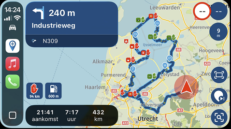
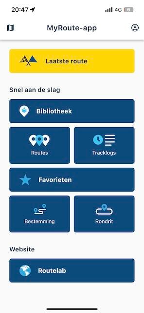
Als ik nu naar het menu kijk (zie foto hieronder), dan zou dat voor mij best het startmenu mogen zijn als je de app opent. Nu is mijn eerste actie als ik de app open, klikken op de menubutton linksboven (drie streepjes) en dan meestal het zoeken van een route uit mijn voorraad, of het kiezen van een A-B route. Nu is daar de knop "Bestemming" voor in de plaats gekomen en heb je het zoekscherm zoals het vergrootglas rechtsboven op het kaartscherm ook toont. Of wellicht nu een eerste klik op de nieuwe Favorieten-button om direct naar één van jouw favoriete locaties te navigeren? Eigenlijk komt het er op neer dat ik de aangeboden kaart altijd oversla om naar mijn routes te gaan of één van de andere keuzes uit het nieuwe scherm.
Ik ben benieuwd naar jullie meningen. Zou het bijv. een optie zijn om de grootte of het soort device te laten bepalen hoe je landt in de app? Of wil je altijd starten met dit vernieuwde scherm? Of wil je gewoon starten in de kaart?
-
Smartphone -> nieuwe menu zoals in deze versie.
-
Tablet -> de kaart of toch het menu?
-
PC -> de kaart omdat je negen van de tien keer toch een nieuwe route zal willen maken.
Deze post geeft vast stof tot nadenken. Veel plezier in het gebruik van de app en met testen

For the international readers:
First of all, compliments to the development team. So much feedback and then actually doing the right things with it
! That's what I love.Now, looking at the menu (see photo below), for me, it could very well be the start menu when you open the app. Currently, my first action upon opening the app is clicking on the menu button in the top left corner (three lines) and usually either searching for a route from my saved ones or choosing an A-B route. Now, that has been replaced by the "Destination" button, which takes you to the search screen, just like the magnifying glass on the top right corner of the map screen. Alternatively, maybe the first click could be on the new Favorites button to navigate directly to one of your favorite locations? Essentially, what it comes down to is that I always skip the presented map to go to my routes or one of the other options in the new screen.
I'm curious about your opinions. Would it be an option, for example, to let the size or type of device determine how you land in the app? Or do you always want to start with this redesigned screen? Or do you simply want to start with the map?
Smartphone -> new menu like in this version.
Tablet -> the map or maybe the menu?
PC -> the map because nine out of ten times you'll probably want to create a new route.
This post certainly gives food for thought. Enjoy using the app and testing it!
BMW K1600GT-P (2013) | Nolan N100-5 with Sena 30K
iOS on iPhone 13 & 16 (mounted on Quadlock or AliExpress extention on BMW-cradle)
Apple CarPlay in VW T-Roc
Routelab on MacBook Air & iMac (Tahoe & Ventura) -
-
Allereerst de complimenten voor het ontwikkelteam. Zoveel feedback en dan daar de juiste dingen mee doen
! Daar hou ik van.Als ik nu naar het menu kijk (zie foto hieronder), dan zou dat voor mij best het startmenu mogen zijn als je de app opent. Nu is mijn eerste actie als ik de app open, klikken op de menubutton linksboven (drie streepjes) en dan meestal het zoeken van een route uit mijn voorraad, of het kiezen van een A-B route. Nu is daar de knop "Bestemming" voor in de plaats gekomen en heb je het zoekscherm zoals het vergrootglas rechtsboven op het kaartscherm ook toont. Of wellicht nu een eerste klik op de nieuwe Favorieten-button om direct naar één van jouw favoriete locaties te navigeren? Eigenlijk komt het er op neer dat ik de aangeboden kaart altijd oversla om naar mijn routes te gaan of één van de andere keuzes uit het nieuwe scherm.
Ik ben benieuwd naar jullie meningen. Zou het bijv. een optie zijn om de grootte of het soort device te laten bepalen hoe je landt in de app? Of wil je altijd starten met dit vernieuwde scherm? Of wil je gewoon starten in de kaart?
-
Smartphone -> nieuwe menu zoals in deze versie.
-
Tablet -> de kaart of toch het menu?
-
PC -> de kaart omdat je negen van de tien keer toch een nieuwe route zal willen maken.
Deze post geeft vast stof tot nadenken. Veel plezier in het gebruik van de app en met testen
For the international readers:
First of all, compliments to the development team. So much feedback and then actually doing the right things with it
! That's what I love.Now, looking at the menu (see photo below), for me, it could very well be the start menu when you open the app. Currently, my first action upon opening the app is clicking on the menu button in the top left corner (three lines) and usually either searching for a route from my saved ones or choosing an A-B route. Now, that has been replaced by the "Destination" button, which takes you to the search screen, just like the magnifying glass on the top right corner of the map screen. Alternatively, maybe the first click could be on the new Favorites button to navigate directly to one of your favorite locations? Essentially, what it comes down to is that I always skip the presented map to go to my routes or one of the other options in the new screen.
I'm curious about your opinions. Would it be an option, for example, to let the size or type of device determine how you land in the app? Or do you always want to start with this redesigned screen? Or do you simply want to start with the map?
Smartphone -> new menu like in this version.
Tablet -> the map or maybe the menu?
PC -> the map because nine out of ten times you'll probably want to create a new route.
This post certainly gives food for thought. Enjoy using the app and testing it!
@Rob-Verhoeff Kan het alleen maar met je eens zijn. Ikzelf gebruik de getoonde kaart bij openen van de app nooit en te nimmer. Wat mij betreft het menu als startpagina, en de kaart onder het kaart-knopje.

Mooiste zou zijn dat dit instelbaar is, maar dat durf ik bijna niet meer te schrijven.

Manks bu'j te bange.
-
-
@Rob-Verhoeff Kan het alleen maar met je eens zijn. Ikzelf gebruik de getoonde kaart bij openen van de app nooit en te nimmer. Wat mij betreft het menu als startpagina, en de kaart onder het kaart-knopje.
Mooiste zou zijn dat dit instelbaar is, maar dat durf ik bijna niet meer te schrijven.
@StefanHummelink, Ik weet niet of dat van je toestel moet afhangen, of meer van je abonnementen. Geen Navigation abonnement, dan naar de kaart, anders naar het menu? Of wellicht van een kuchTogglekuch in het menu...

-
Vind het een goed idee @Rob-Verhoeff ! Ziet er dan gelijk strak uit. Gebruik die kaart eigenlijk nooit, maar wel de zoekfunctie voor A > B navigatie.
-
Ik ben geneigd het met je eens te zijn om het menu als opstartscherm te hebben wanneer je de app op de telefoon opent. Mijn normale eerste reactie is om het menu te selecteren en het komt zelden voor dat ik de kaart gebruik bij het starten van de app. Excuseer de Nederlanders - vertaler gebruiken.
-
Allereerst de complimenten voor het ontwikkelteam. Zoveel feedback en dan daar de juiste dingen mee doen
! Daar hou ik van.Als ik nu naar het menu kijk (zie foto hieronder), dan zou dat voor mij best het startmenu mogen zijn als je de app opent. Nu is mijn eerste actie als ik de app open, klikken op de menubutton linksboven (drie streepjes) en dan meestal het zoeken van een route uit mijn voorraad, of het kiezen van een A-B route. Nu is daar de knop "Bestemming" voor in de plaats gekomen en heb je het zoekscherm zoals het vergrootglas rechtsboven op het kaartscherm ook toont. Of wellicht nu een eerste klik op de nieuwe Favorieten-button om direct naar één van jouw favoriete locaties te navigeren? Eigenlijk komt het er op neer dat ik de aangeboden kaart altijd oversla om naar mijn routes te gaan of één van de andere keuzes uit het nieuwe scherm.
Ik ben benieuwd naar jullie meningen. Zou het bijv. een optie zijn om de grootte of het soort device te laten bepalen hoe je landt in de app? Of wil je altijd starten met dit vernieuwde scherm? Of wil je gewoon starten in de kaart?
-
Smartphone -> nieuwe menu zoals in deze versie.
-
Tablet -> de kaart of toch het menu?
-
PC -> de kaart omdat je negen van de tien keer toch een nieuwe route zal willen maken.
Deze post geeft vast stof tot nadenken. Veel plezier in het gebruik van de app en met testen
For the international readers:
First of all, compliments to the development team. So much feedback and then actually doing the right things with it
! That's what I love.Now, looking at the menu (see photo below), for me, it could very well be the start menu when you open the app. Currently, my first action upon opening the app is clicking on the menu button in the top left corner (three lines) and usually either searching for a route from my saved ones or choosing an A-B route. Now, that has been replaced by the "Destination" button, which takes you to the search screen, just like the magnifying glass on the top right corner of the map screen. Alternatively, maybe the first click could be on the new Favorites button to navigate directly to one of your favorite locations? Essentially, what it comes down to is that I always skip the presented map to go to my routes or one of the other options in the new screen.
I'm curious about your opinions. Would it be an option, for example, to let the size or type of device determine how you land in the app? Or do you always want to start with this redesigned screen? Or do you simply want to start with the map?
Smartphone -> new menu like in this version.
Tablet -> the map or maybe the menu?
PC -> the map because nine out of ten times you'll probably want to create a new route.
This post certainly gives food for thought. Enjoy using the app and testing it!
@Rob-Verhoeff Ik sluit me helemaal bij je aan. Zou fijn zijn als je op de telefoon iet meteen op de 3 streepjes linksboven hoeft te drukken.
-
-
Allereerst de complimenten voor het ontwikkelteam. Zoveel feedback en dan daar de juiste dingen mee doen
! Daar hou ik van.Als ik nu naar het menu kijk (zie foto hieronder), dan zou dat voor mij best het startmenu mogen zijn als je de app opent. Nu is mijn eerste actie als ik de app open, klikken op de menubutton linksboven (drie streepjes) en dan meestal het zoeken van een route uit mijn voorraad, of het kiezen van een A-B route. Nu is daar de knop "Bestemming" voor in de plaats gekomen en heb je het zoekscherm zoals het vergrootglas rechtsboven op het kaartscherm ook toont. Of wellicht nu een eerste klik op de nieuwe Favorieten-button om direct naar één van jouw favoriete locaties te navigeren? Eigenlijk komt het er op neer dat ik de aangeboden kaart altijd oversla om naar mijn routes te gaan of één van de andere keuzes uit het nieuwe scherm.
Ik ben benieuwd naar jullie meningen. Zou het bijv. een optie zijn om de grootte of het soort device te laten bepalen hoe je landt in de app? Of wil je altijd starten met dit vernieuwde scherm? Of wil je gewoon starten in de kaart?
-
Smartphone -> nieuwe menu zoals in deze versie.
-
Tablet -> de kaart of toch het menu?
-
PC -> de kaart omdat je negen van de tien keer toch een nieuwe route zal willen maken.
Deze post geeft vast stof tot nadenken. Veel plezier in het gebruik van de app en met testen
For the international readers:
First of all, compliments to the development team. So much feedback and then actually doing the right things with it
! That's what I love.Now, looking at the menu (see photo below), for me, it could very well be the start menu when you open the app. Currently, my first action upon opening the app is clicking on the menu button in the top left corner (three lines) and usually either searching for a route from my saved ones or choosing an A-B route. Now, that has been replaced by the "Destination" button, which takes you to the search screen, just like the magnifying glass on the top right corner of the map screen. Alternatively, maybe the first click could be on the new Favorites button to navigate directly to one of your favorite locations? Essentially, what it comes down to is that I always skip the presented map to go to my routes or one of the other options in the new screen.
I'm curious about your opinions. Would it be an option, for example, to let the size or type of device determine how you land in the app? Or do you always want to start with this redesigned screen? Or do you simply want to start with the map?
Smartphone -> new menu like in this version.
Tablet -> the map or maybe the menu?
PC -> the map because nine out of ten times you'll probably want to create a new route.
This post certainly gives food for thought. Enjoy using the app and testing it!
@Rob-Verhoeff Ik ben ook voor het idee te vinden.
-
-
Bij toeval kwam ik erachter dat je zowel op Android als iOS het menu ook te zien krijgt als je van uiterst links naar rechts swiped
 . Het menu laten verdwijnen werkt vergelijkbaar door van uiterst rechts naar link te swipen. Dit is iets makkelijker dan de drie streepjes.
 -
Bij toeval kwam ik erachter dat je zowel op Android als iOS het menu ook te zien krijgt als je van uiterst links naar rechts swiped
. Het menu laten verdwijnen werkt vergelijkbaar door van uiterst rechts naar link te swipen. Dit is iets makkelijker dan de drie streepjes.@Arno-0, Goede vondst!
Dat soort dingen kom je alleen per toeval achter...
Bij mij werkt dat alleen als ik vlak onder de balk met de MyRoute-app naam swipe. Op andere plekken zitten al allerhande andere systeem menuutjes van Android/Huawei, maar het werkt inderdaad wel zoals je zegt. -
Bij toeval kwam ik erachter dat je zowel op Android als iOS het menu ook te zien krijgt als je van uiterst links naar rechts swiped
. Het menu laten verdwijnen werkt vergelijkbaar door van uiterst rechts naar link te swipen. Dit is iets makkelijker dan de drie streepjes.@Arno-0 geniale vondst
(maar nog steeds een handeling teveel  )
)
Hello! It looks like you're interested in this conversation, but you don't have an account yet.
Getting fed up of having to scroll through the same posts each visit? When you register for an account, you'll always come back to exactly where you were before, and choose to be notified of new replies (either via email, or push notification). You'll also be able to save bookmarks and upvote posts to show your appreciation to other community members.
With your input, this post could be even better 💗
Register Login-
1326772
-
0293.1k
-
0430
-
0344
-
0367
-
0210
-
02120
-
0111.7k