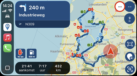
Problems/Bugs/Enhancement
-
Pros & Cons Feedback – 9 day, 3330mi motorcycle trip. Decied to put it into the Suggestions and Discussions Forum, however, some easily could be in the Problems, Bugs and other Issues.
PROS
• Offline Navigation – pleasantly surprised at how well this worked! When out of cell phone range, app asked to switch offline. It did this a couple of times, and then stayed offline, which was ok as all the routes had been downloaded for use in such instances.• Skip Waypoint – skipping waypoints was known beforehand, so it was useful when needed. This generally occurred when the group had stopped, and for one reason or another, the route was stopped.
• Restart from specific Waypoint – while this was not so intuitive, once I discovered that long pausing on the specific waypoint wanted, the route would then start from that point onwards
• Zoom In/Out – glad to see this function added. It is also a Con, outlined in Cons.
• Spoken Navigation – worked very well. This trip occurred prior to the release of the software, so it was the last beta version. See comments in Cons about this after the official release.
• Exporting Route/Track – worked well. Each days route was exported to both a Garmin XT and a TomTom GO app. Feedback from the individuals using these nav systems were – Garmin XT: handled the route/track pretty good, provided enough via points were used (routes were exported as 1.1 (route, track, POI). The TomTom GO app strictly imported the route as a track.
All in all, a positive experience! I was the leader of the group this year, and I had to put a lot of faith into MRA to get it done – I’d give it a solid 8 out of 10 rating. Only reason it is not higher is some of the Cons are, well, Cons.Cons – these seem more because I am trying to also explain why each was a negative.
• Ability to add Waypoint while in a route navigation. From time to time, for various reasons such as weather (go around an impending rain storm, for example), or simply wanting to readjust on the fly, occurred. The ability to add a waypoint to the existing route without having to stop and totally reconfigure (or build new) a route would be a great feature.
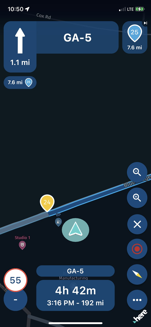
• Map Icons – such as gas stations and even Highway numbers/names are way too small. Waypoint icons are much larger!! They are unreadable..PERIOD. Even in a perfect situation such as sitting in a chair and looking at a route, the highway numbers (and by default, any other icon that appears) are just unreadable/undistinguishable. These icons could easily be 2-3x larger and not interfere with the navigation itself. If the example pic was in ‘light’ mode, the icon would almost look like a dot!
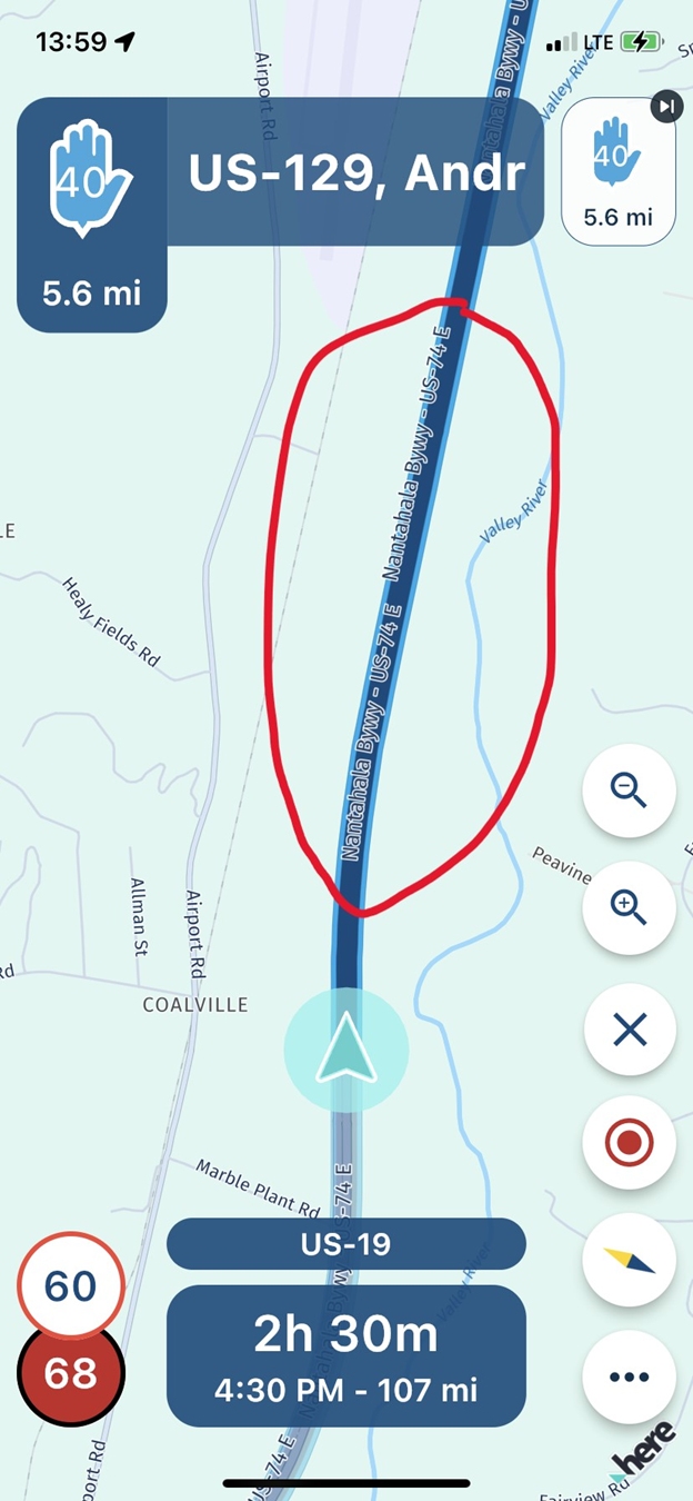
• Zoom In/Out – by default, the distance from the direction pointer that the app saw ahead was perhaps 0.2 – 0.3mi ahead. EXTREMELY inconvenient and dangerous in not being able to see upcoming turn, intersection or other important info to know. Being able to zoom out did help this out somewhat, however, not knowing the distance each click zoomed, was trial and error – and not something that should be done while navigating, especially if the road is curvy. To add more misery to this, the app did not automatically zoom in to the upcoming turns (ie: when in a city and about to come upon the next turn) as does Google Maps, TomTom and Garmin XT, all of which were on the trip. This should be an automatic feature.This also ties to the Gas Station icons being so small – if you are zoomed out far enough (1 – 1.5 mi ahead), you might see an upcoming station….on the default distance, by time the station appears on the app, the off ramp is either upon you or you have passed it. As an example, the Garmin XT does a fantastic job at showing upcoming areas of interest, well in advance.
• Route Overlapping – a bit difficult to explain, but here it goes…on a couple of planned routes, the way the highway system was, meant that going over (or under) a previously used portion of the route was necessary. This caused confusion to the app where it did not seem to know which portion of the route to take, even though enough waypoints were placed in an attempt to keep on track. I can send this particular route to whomever if you wish to see what I am referring to.
• Spoken Navigation – to sum it up…it sucks. 100% of the time so far, it has NEVER completed the instructions. At least 30% of that time, there was no spoken instruction what so ever. In all fairness, this was in Apple CarPlay, which I have since learned, there are issues and being worked on.
• Imperial Measure – the only reason this is in here is that having the app default to ‘yds’ for the smaller distances is less than ideal…specifically speaking in the US (don’t believe any European countries use Imperial measure?), everything is in miles, even the shortest distances, and display could easily be in tenths of a mile (0.1, 0.2, 0.3, etc) and round off what is turning out to be a pretty good nav app!
-
Pros & Cons Feedback – 9 day, 3330mi motorcycle trip. Decied to put it into the Suggestions and Discussions Forum, however, some easily could be in the Problems, Bugs and other Issues.
PROS
• Offline Navigation – pleasantly surprised at how well this worked! When out of cell phone range, app asked to switch offline. It did this a couple of times, and then stayed offline, which was ok as all the routes had been downloaded for use in such instances.• Skip Waypoint – skipping waypoints was known beforehand, so it was useful when needed. This generally occurred when the group had stopped, and for one reason or another, the route was stopped.
• Restart from specific Waypoint – while this was not so intuitive, once I discovered that long pausing on the specific waypoint wanted, the route would then start from that point onwards
• Zoom In/Out – glad to see this function added. It is also a Con, outlined in Cons.
• Spoken Navigation – worked very well. This trip occurred prior to the release of the software, so it was the last beta version. See comments in Cons about this after the official release.
• Exporting Route/Track – worked well. Each days route was exported to both a Garmin XT and a TomTom GO app. Feedback from the individuals using these nav systems were – Garmin XT: handled the route/track pretty good, provided enough via points were used (routes were exported as 1.1 (route, track, POI). The TomTom GO app strictly imported the route as a track.
All in all, a positive experience! I was the leader of the group this year, and I had to put a lot of faith into MRA to get it done – I’d give it a solid 8 out of 10 rating. Only reason it is not higher is some of the Cons are, well, Cons.Cons – these seem more because I am trying to also explain why each was a negative.
• Ability to add Waypoint while in a route navigation. From time to time, for various reasons such as weather (go around an impending rain storm, for example), or simply wanting to readjust on the fly, occurred. The ability to add a waypoint to the existing route without having to stop and totally reconfigure (or build new) a route would be a great feature.
• Map Icons – such as gas stations and even Highway numbers/names are way too small. Waypoint icons are much larger!! They are unreadable..PERIOD. Even in a perfect situation such as sitting in a chair and looking at a route, the highway numbers (and by default, any other icon that appears) are just unreadable/undistinguishable. These icons could easily be 2-3x larger and not interfere with the navigation itself. If the example pic was in ‘light’ mode, the icon would almost look like a dot!


• Zoom In/Out – by default, the distance from the direction pointer that the app saw ahead was perhaps 0.2 – 0.3mi ahead. EXTREMELY inconvenient and dangerous in not being able to see upcoming turn, intersection or other important info to know. Being able to zoom out did help this out somewhat, however, not knowing the distance each click zoomed, was trial and error – and not something that should be done while navigating, especially if the road is curvy. To add more misery to this, the app did not automatically zoom in to the upcoming turns (ie: when in a city and about to come upon the next turn) as does Google Maps, TomTom and Garmin XT, all of which were on the trip. This should be an automatic feature.This also ties to the Gas Station icons being so small – if you are zoomed out far enough (1 – 1.5 mi ahead), you might see an upcoming station….on the default distance, by time the station appears on the app, the off ramp is either upon you or you have passed it. As an example, the Garmin XT does a fantastic job at showing upcoming areas of interest, well in advance.
• Route Overlapping – a bit difficult to explain, but here it goes…on a couple of planned routes, the way the highway system was, meant that going over (or under) a previously used portion of the route was necessary. This caused confusion to the app where it did not seem to know which portion of the route to take, even though enough waypoints were placed in an attempt to keep on track. I can send this particular route to whomever if you wish to see what I am referring to.
• Spoken Navigation – to sum it up…it sucks. 100% of the time so far, it has NEVER completed the instructions. At least 30% of that time, there was no spoken instruction what so ever. In all fairness, this was in Apple CarPlay, which I have since learned, there are issues and being worked on.
• Imperial Measure – the only reason this is in here is that having the app default to ‘yds’ for the smaller distances is less than ideal…specifically speaking in the US (don’t believe any European countries use Imperial measure?), everything is in miles, even the shortest distances, and display could easily be in tenths of a mile (0.1, 0.2, 0.3, etc) and round off what is turning out to be a pretty good nav app!
@GT-JWR, Glad SOME of your experience was positive

I have nothing to add to the Pro's Despite my name I do like to comment on the cons
Adding Waypoints is a planner feature and should not be done while riding at all. With exception of automatic insertion of nearest gas station perhaps (which I understand will be fixed soon). The POI icons are way to small indeed and already a known fact. They are part of the HERE platform, so I think MRA needs their help to change anything about it.
Streetnames are not very sensible to make bigger, because most of the time it does not give you any needful information at all. For the same reason I toggled off the option to show the upcoming streetname. Who searches for streetname signpost while driving... Also in your example the name in a 2 point larger font would entirely not fit on screen. Streetnames can in my view only be interesting if you are walking or standing still when you can move the screen closer to your eyes. Streetnames are also always very small on paper maps.
Auto zoom already works as it is. Only when you decide to zoom in yourself it is assumed you don't want the auto zoom to be functioning (why else would you zoom manually?) I feel a toggle in the settings coming up

I have no clue as to what you are saying about Route overlapping. I have driven multiple routes with loops in it, and that never was a problem. Please share the route, the devvers have an option to simulate driving it. Please try to explain where it goes wrong.
Speech on all my devices is really great and much better than it was in the previous app. Important to know is that the app leaves the speech synthesis to the OS of your device. So results my vary. Most navigation aps I know had their own built in speech synthesis, I believe also the old Navigation app worked that way. I have heard more complaints like yours, but am not sure it is carplay related. could be indeed. Try how it sounds native in the app, without carplay?
About the measures I can only say: It's about time you go metric!

Just kidding, work is being done on it. -
@GT-JWR, Glad SOME of your experience was positive

I have nothing to add to the Pro's Despite my name I do like to comment on the cons
Adding Waypoints is a planner feature and should not be done while riding at all. With exception of automatic insertion of nearest gas station perhaps (which I understand will be fixed soon). The POI icons are way to small indeed and already a known fact. They are part of the HERE platform, so I think MRA needs their help to change anything about it.
Streetnames are not very sensible to make bigger, because most of the time it does not give you any needful information at all. For the same reason I toggled off the option to show the upcoming streetname. Who searches for streetname signpost while driving... Also in your example the name in a 2 point larger font would entirely not fit on screen. Streetnames can in my view only be interesting if you are walking or standing still when you can move the screen closer to your eyes. Streetnames are also always very small on paper maps.
Auto zoom already works as it is. Only when you decide to zoom in yourself it is assumed you don't want the auto zoom to be functioning (why else would you zoom manually?) I feel a toggle in the settings coming up

I have no clue as to what you are saying about Route overlapping. I have driven multiple routes with loops in it, and that never was a problem. Please share the route, the devvers have an option to simulate driving it. Please try to explain where it goes wrong.
Speech on all my devices is really great and much better than it was in the previous app. Important to know is that the app leaves the speech synthesis to the OS of your device. So results my vary. Most navigation aps I know had their own built in speech synthesis, I believe also the old Navigation app worked that way. I have heard more complaints like yours, but am not sure it is carplay related. could be indeed. Try how it sounds native in the app, without carplay?
About the measures I can only say: It's about time you go metric!

Just kidding, work is being done on it.@Con-Hennekens thanks for the feedback, even the 'con'

Hopefully MRA will have success with the icon size - as it is, it adds zero value to the app, IMO.
Auto Zoom - what is the 'default' distance when a route is started? I believe it is 0.2-0.3mi only, and this is simply not enough. As stated before, by time a POI/turn/exit shows, if you are in the incorrect lane, you have missed the exit ramp (relates directly to multi lane highways/freeways). And before someone says that is what the planner is for - I'm talking about instances when plans change on the fly, such as a gas stop - whether it be for gas or just to get off the bike after a 150mi stretch of riding. There would be value in making this distance at least 0.5mi lookahead, or even 1.0mi. However, I'm not the developer and this is just my opinion - so if it will never be entertained, I guess I'll either have to get used to it or switch apps - which I do not want to do!
Route overlapping - happy to share the route, https://www.myrouteapp.com/en/social/route/7007988?mode=share
The issues came in on waypoints 20, 21, 28 and 29. It may be that the waypoints were too close and the spoken navigation could not keep up, or operator error...don't know. While we did miss a nice portion of road between 21 & 22 because of it, the overall route was fantastic anyway!
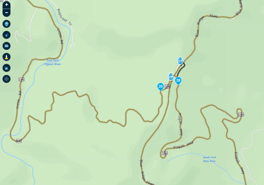
I grew up in the metric system (Canada), much easier to use for eveything! But, I've lived in the US for a couple decades now...so I'm stuck with Imperail .. lol
Appreciate your feedback.
-
@Con-Hennekens said in Problems/Bugs/Enhancement:
Adding Waypoints is a planner feature and should not be done while riding at all.
Be careful not to decide what users should and should not want!
Even if HERE may not easily allow it, many users may still want it.
I too would like the ability to alter the live route on the fly. It's a perfectly sensible thing to wish for.
Example: I've hit a closed road, and I can see HERE is re-routing me off my original route. I don't like the alternative that the HERE router has suggested - maybe it uses a motorway that I don't want to go on today.
I park up to have a think, and then I decide I want to add a waypoint (a 'via' point actually) with a tap. Yes, I may get the waypoint position slightly wrong initially, but zooming in & adjusting it can fix that new waypoint.
Having added my new waypoint, I hit a 'Re-calc' button, and HERE re-calculates the route, and off we go again.
That's a valid use case.
The tricky UI bit is how to go from live navigation into an editing mode. Possibly a popup of options: - Pause / Navigate / Edit?
-
Thanks for the very detailed feedback

Most things are stuff that we are working on or are on our backlog already

I completely understand the need for adjusting the route on the fly but it's also quite complex to facilitate. Given the harsh separation of planning in the online Routeplanner and navigating with the app. Yet, we do want to support (offline) planning in the app natively --- will however take quite some time before we are there. Currently you can skip waypoints if they are causing issues but you indeed cannot reorder / move / add new.
Within not too long we can add POI's along the route (starting with petrol stations). Obviously when this feature is added, it will be the foundation of adding other points to your route.
We will keep improving

-
Thanks for the very detailed feedback

Most things are stuff that we are working on or are on our backlog already

I completely understand the need for adjusting the route on the fly but it's also quite complex to facilitate. Given the harsh separation of planning in the online Routeplanner and navigating with the app. Yet, we do want to support (offline) planning in the app natively --- will however take quite some time before we are there. Currently you can skip waypoints if they are causing issues but you indeed cannot reorder / move / add new.
Within not too long we can add POI's along the route (starting with petrol stations). Obviously when this feature is added, it will be the foundation of adding other points to your route.
We will keep improving

But that was possible in the old Navigation app. You could , while navigating a route, add another destination and useful things like petrol stations were offered as a choice.
It would also be useful to choose to go to say, a petrol station either “near me’ or “near a town or map location” or most useful, “along the route” - to avoid having to go off route.Garmin devices do this well.
-
But that was possible in the old Navigation app. You could , while navigating a route, add another destination and useful things like petrol stations were offered as a choice.
It would also be useful to choose to go to say, a petrol station either “near me’ or “near a town or map location” or most useful, “along the route” - to avoid having to go off route.Garmin devices do this well.
@Berin yes, that’s why we will add that too
-
@Con-Hennekens thanks for the feedback, even the 'con'

Hopefully MRA will have success with the icon size - as it is, it adds zero value to the app, IMO.
Auto Zoom - what is the 'default' distance when a route is started? I believe it is 0.2-0.3mi only, and this is simply not enough. As stated before, by time a POI/turn/exit shows, if you are in the incorrect lane, you have missed the exit ramp (relates directly to multi lane highways/freeways). And before someone says that is what the planner is for - I'm talking about instances when plans change on the fly, such as a gas stop - whether it be for gas or just to get off the bike after a 150mi stretch of riding. There would be value in making this distance at least 0.5mi lookahead, or even 1.0mi. However, I'm not the developer and this is just my opinion - so if it will never be entertained, I guess I'll either have to get used to it or switch apps - which I do not want to do!
Route overlapping - happy to share the route, https://www.myrouteapp.com/en/social/route/7007988?mode=share
The issues came in on waypoints 20, 21, 28 and 29. It may be that the waypoints were too close and the spoken navigation could not keep up, or operator error...don't know. While we did miss a nice portion of road between 21 & 22 because of it, the overall route was fantastic anyway!

I grew up in the metric system (Canada), much easier to use for eveything! But, I've lived in the US for a couple decades now...so I'm stuck with Imperail .. lol
Appreciate your feedback.
@GT-JWR, Thats very curious on first site. But looking at the satellite view it looks perfectly sensible (this piece of the route anyway).
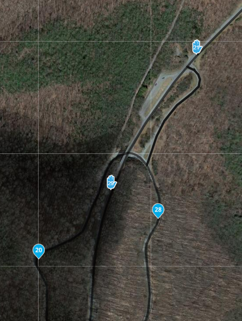
From 20 to 21 (what could you have missed there?) 21 is only reachable by taking the tunnel and go left. From 28 to 29 that is als only reachable by taking that same road into the direction of 21. This looks perfectly logical. I see you have some via-points on locations that are no stops or elseway must-be points. I can imagine that if some point is skipped, it keeps going to the via-points because those will NOT be skipped automagically. Best to stick with shaping points except for placed where you MUST be (food stops, gas station, photo moments, things like that)
Quite a long ride for a day! looks great!
-
@GT-JWR, Thats very curious on first site. But looking at the satellite view it looks perfectly sensible (this piece of the route anyway).

From 20 to 21 (what could you have missed there?) 21 is only reachable by taking the tunnel and go left. From 28 to 29 that is als only reachable by taking that same road into the direction of 21. This looks perfectly logical. I see you have some via-points on locations that are no stops or elseway must-be points. I can imagine that if some point is skipped, it keeps going to the via-points because those will NOT be skipped automagically. Best to stick with shaping points except for placed where you MUST be (food stops, gas station, photo moments, things like that)
Quite a long ride for a day! looks great!
@Con-Hennekens thanks for taking a look. Your observations could well be correct - being as this was my first 'real' test of MyRoute-app navigation, I had a Garmin XT as backup, and in order for it to follow the route, I needed to make sure I had enough via points for the XT so it would stick to the route.
Yes, very interesting routes we had on this trip - this was only 1 of 3 that was very full of Appalacian Mountain curves/elevation changes - this was perhaps the route with the fewest changes, believe it or not!
Hello! It looks like you're interested in this conversation, but you don't have an account yet.
Getting fed up of having to scroll through the same posts each visit? When you register for an account, you'll always come back to exactly where you were before, and choose to be notified of new replies (either via email, or push notification). You'll also be able to save bookmarks and upvote posts to show your appreciation to other community members.
With your input, this post could be even better 💗
Register Login
