Too much possibilities
-
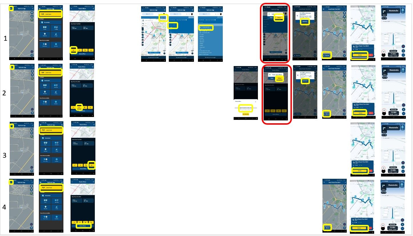
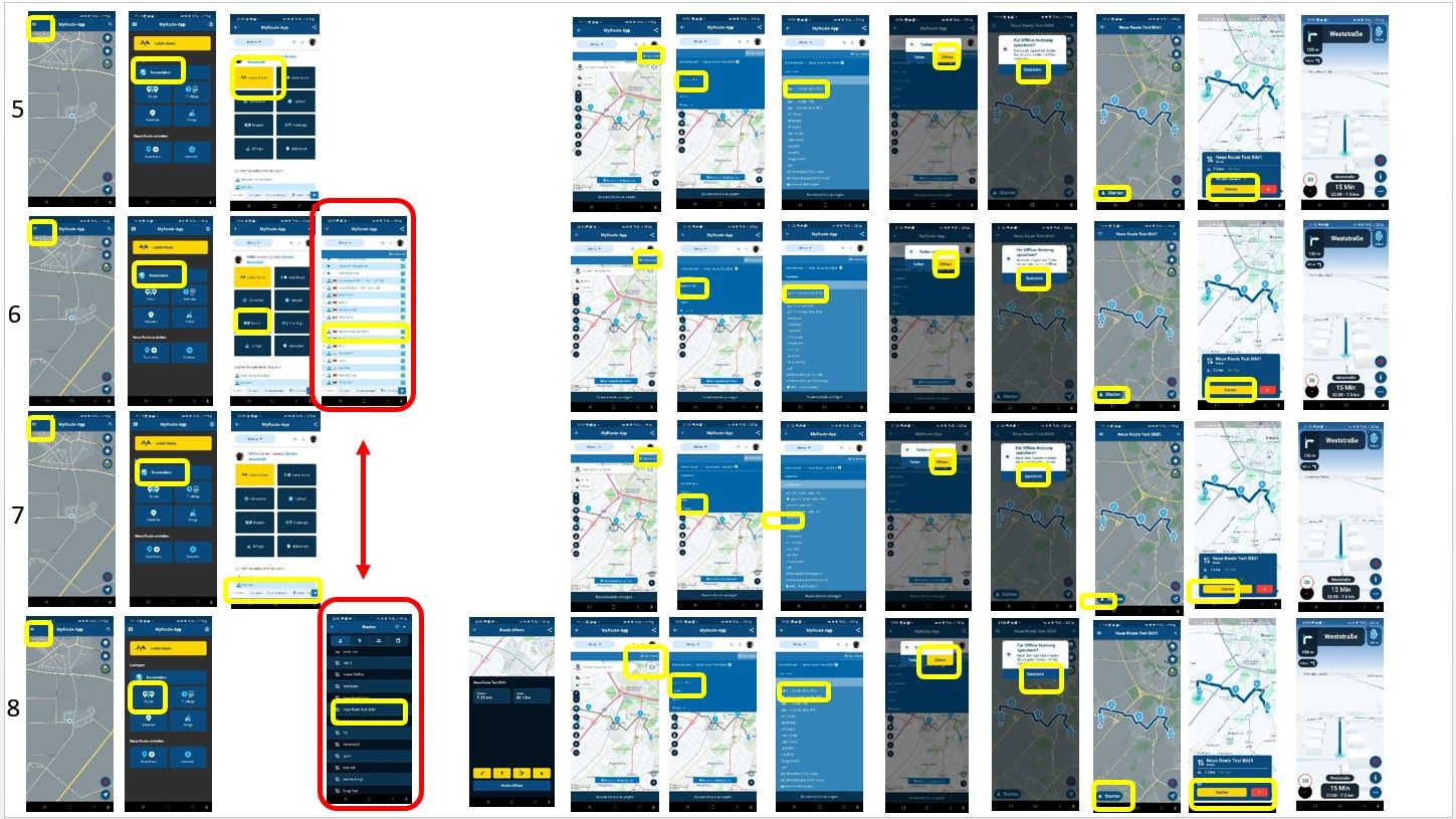
After Creating a tour and testing it with MRA, I had some difficulties after the tour, to recognize, how i created the tour. Sometimes the menu items looked the same, then I had the impression, that I had never been in this menu path before. So I wrote down the individual menu paths and recorded them in pictures until the point where I could start navigating. I came up with a total of 11 possibilities! Isn't it a littlebit too much? Yes, it's great to offer all options in the software, but maybe it's possible to do some optimization. It is confusing, for example, that the content of the route lab is graphically displayed differently. I'm sure that will be corrected in a future update. (3rd card in line 8 and 4th in line 6) Also that the same query (share or open) is made in different areas. (7th in line 1 and 5th in 2). I attached 2 pics with the cards. Using the software on an smartphone its easy to recognize the menue.I said, i identified 11 variants, but there are only 8 in the graphic because for line 8 the variants 2, 3 and 4 had to be inserted. But I don't have time to explain that now, I have to go sleeping. I hope you can understand what I mean. Greetings Ronni


@Ronni Wow! What an impressive level of detailed feedback

This is definitely something that will be improved over the course of months / years. No, this is just something that cannot be done in days (or even weeks).
The issue here is that routeplanning is completely done in the website. It seems like you're still in the app but actually you are just using the browser
This is the exact reason why so many extra steps are needed. We will eventually have everything that's possible in the website, available in the app but that is a very exhaustive process.
Besides that, as you are running the Beta version of the app, there are some extra (temporary) buttons. Before the eventual release, the flow between using the app as Mobile app or as Navigation app will be drastically improved.
How I personally use the app is:
- Create a route on my pc
- Open app
- Click "Last route"
- Click "Start" (or the Beta icon now)
The above process is really fast and intuitive. But indeed, if you want to do more complex stuff with the app, way more (too many actually) steps are now needed.
Really appreciate this level of feedback!

-
@Ronni Wow! What an impressive level of detailed feedback

This is definitely something that will be improved over the course of months / years. No, this is just something that cannot be done in days (or even weeks).
The issue here is that routeplanning is completely done in the website. It seems like you're still in the app but actually you are just using the browser
This is the exact reason why so many extra steps are needed. We will eventually have everything that's possible in the website, available in the app but that is a very exhaustive process.
Besides that, as you are running the Beta version of the app, there are some extra (temporary) buttons. Before the eventual release, the flow between using the app as Mobile app or as Navigation app will be drastically improved.
How I personally use the app is:
- Create a route on my pc
- Open app
- Click "Last route"
- Click "Start" (or the Beta icon now)
The above process is really fast and intuitive. But indeed, if you want to do more complex stuff with the app, way more (too many actually) steps are now needed.
Really appreciate this level of feedback!

@Corjan-Meijerink If I were you/MRA, with such a small team, I really wouldn't bother duplicating planning functionality natively in the app. IMO, the app should only do A to B "planning". I would focus on making the app the best navigation and tracking app and separately develop the website to be the best routeplanner, which includes optimising it for mobile use.
I would not include the routeplanner website embedded in the app either, just open a separate browser, so users know they're using a browser and not a native app, so there is no confusion.
-
@Corjan-Meijerink If I were you/MRA, with such a small team, I really wouldn't bother duplicating planning functionality natively in the app. IMO, the app should only do A to B "planning". I would focus on making the app the best navigation and tracking app and separately develop the website to be the best routeplanner, which includes optimising it for mobile use.
I would not include the routeplanner website embedded in the app either, just open a separate browser, so users know they're using a browser and not a native app, so there is no confusion.
@Herko-ter-Horst, many people were very disappointed in a previous Mobile update in which the native planning was left out. They temporarily fixed it with an embedded webbrowser (like it is now) and added a promise to return that functionality natively.
I agree with you in that the website (for me, for us) is leading as a planner tool, but I also hope MRA keeps their promise to the disappointed users (of which I am not one). Personally I can't think of drawing routes on my phone. A tablet probably works a bit better though. But I prefer a big screen and a mouse

-
@Herko-ter-Horst, many people were very disappointed in a previous Mobile update in which the native planning was left out. They temporarily fixed it with an embedded webbrowser (like it is now) and added a promise to return that functionality natively.
I agree with you in that the website (for me, for us) is leading as a planner tool, but I also hope MRA keeps their promise to the disappointed users (of which I am not one). Personally I can't think of drawing routes on my phone. A tablet probably works a bit better though. But I prefer a big screen and a mouse

@Con-Hennekens I just feel it would be a lot of (duplicate) effort for what is going to be a pretty sub-par experience compared to planning on a larger screen. I feel that time would be much better spent on improving the website for mobile use and providing the best distinct functionality for both the tracking/navigation app and the planner.
-
@Con-Hennekens I just feel it would be a lot of (duplicate) effort for what is going to be a pretty sub-par experience compared to planning on a larger screen. I feel that time would be much better spent on improving the website for mobile use and providing the best distinct functionality for both the tracking/navigation app and the planner.
@Corjan-Meijerink Many thanks for the detailed explanations.
The route planner is one of the best, I've been using it since it was the successor to TYRE. And, @Con-Hennekens of course I plan my routes on the PC. But it was interesting to try out everything that can be planned on the cell phone and how it looks and works. I didn't think it was that easy. Planning a tour on my cell phone while on a tour is great and now practicable.
But of course it's true: if I build an app that doesn't implement the functionalities of a super PC planning program 100%, there can be a risk in the end, that you might lose more than you win. Because the "professional PC planning users" are of course looking for the functionalities in the app that they know from the PC. If something is missing or works differently or not at all, then acceptance becomes difficult. And I want this app to win because the idea behind it is great.
The big goal at the end of the road, to optimize the website for mobile use and to build the world's best navigation and tracking app, is completely ok. But it doesn't have to be this year. Rather, I would agree with @Herko-ter-Horst and start with a planning part from A to B. And here the app must now be able to do everything 100 percent, it must run without errors, be intuitive to use and be lightning fast. And then offer the functionality that the competitors don't have, so users have a reason to switch. e.g. track log and the freely definable waypoints. Maybe you have to pick good solutions from the competitors, perhaps e.g. rain information on the tour or at the destination. When that's achieved, and that's hard enough, you can improve or expand the app. In any case, the MRA team is on the right track and it's fun to be part of it.
Go ahead,
For the end the wording of a discussion with some friends of mine what really happend:
Hey, I'm testing a new navigation software.
OK. What can this thing do that my navi can't
I can name waypoints by myself
Real? Not bad
I can color them
Cool. Can you show me?
and I can deposit custom text at the Waypoint
WOW, it keeps getting better.
And i can see everything on the display of my navigation system. while driving!
.... speechlessGreetings Ronni
-
@Corjan-Meijerink Many thanks for the detailed explanations.
The route planner is one of the best, I've been using it since it was the successor to TYRE. And, @Con-Hennekens of course I plan my routes on the PC. But it was interesting to try out everything that can be planned on the cell phone and how it looks and works. I didn't think it was that easy. Planning a tour on my cell phone while on a tour is great and now practicable.
But of course it's true: if I build an app that doesn't implement the functionalities of a super PC planning program 100%, there can be a risk in the end, that you might lose more than you win. Because the "professional PC planning users" are of course looking for the functionalities in the app that they know from the PC. If something is missing or works differently or not at all, then acceptance becomes difficult. And I want this app to win because the idea behind it is great.
The big goal at the end of the road, to optimize the website for mobile use and to build the world's best navigation and tracking app, is completely ok. But it doesn't have to be this year. Rather, I would agree with @Herko-ter-Horst and start with a planning part from A to B. And here the app must now be able to do everything 100 percent, it must run without errors, be intuitive to use and be lightning fast. And then offer the functionality that the competitors don't have, so users have a reason to switch. e.g. track log and the freely definable waypoints. Maybe you have to pick good solutions from the competitors, perhaps e.g. rain information on the tour or at the destination. When that's achieved, and that's hard enough, you can improve or expand the app. In any case, the MRA team is on the right track and it's fun to be part of it.
Go ahead,
For the end the wording of a discussion with some friends of mine what really happend:
Hey, I'm testing a new navigation software.
OK. What can this thing do that my navi can't
I can name waypoints by myself
Real? Not bad
I can color them
Cool. Can you show me?
and I can deposit custom text at the Waypoint
WOW, it keeps getting better.
And i can see everything on the display of my navigation system. while driving!
.... speechlessGreetings Ronni
@Ronni Agree with all that you say. Solid foundation that equates to the web version but one that can be used easily ‘on the road’ on my phone when needed on multi-day trips. Like you, I have used MRA’s planning software for years and find it the best I have used (there have been many). Keep the excellent work going MRA.
-
@Corjan-Meijerink Many thanks for the detailed explanations.
The route planner is one of the best, I've been using it since it was the successor to TYRE. And, @Con-Hennekens of course I plan my routes on the PC. But it was interesting to try out everything that can be planned on the cell phone and how it looks and works. I didn't think it was that easy. Planning a tour on my cell phone while on a tour is great and now practicable.
But of course it's true: if I build an app that doesn't implement the functionalities of a super PC planning program 100%, there can be a risk in the end, that you might lose more than you win. Because the "professional PC planning users" are of course looking for the functionalities in the app that they know from the PC. If something is missing or works differently or not at all, then acceptance becomes difficult. And I want this app to win because the idea behind it is great.
The big goal at the end of the road, to optimize the website for mobile use and to build the world's best navigation and tracking app, is completely ok. But it doesn't have to be this year. Rather, I would agree with @Herko-ter-Horst and start with a planning part from A to B. And here the app must now be able to do everything 100 percent, it must run without errors, be intuitive to use and be lightning fast. And then offer the functionality that the competitors don't have, so users have a reason to switch. e.g. track log and the freely definable waypoints. Maybe you have to pick good solutions from the competitors, perhaps e.g. rain information on the tour or at the destination. When that's achieved, and that's hard enough, you can improve or expand the app. In any case, the MRA team is on the right track and it's fun to be part of it.
Go ahead,
For the end the wording of a discussion with some friends of mine what really happend:
Hey, I'm testing a new navigation software.
OK. What can this thing do that my navi can't
I can name waypoints by myself
Real? Not bad
I can color them
Cool. Can you show me?
and I can deposit custom text at the Waypoint
WOW, it keeps getting better.
And i can see everything on the display of my navigation system. while driving!
.... speechlessGreetings Ronni
@Ronni And so many more upsides to the Beta app Vs hardware nav systems you have not even mentioned yet.
 I expect we will see some new members joining soon? Haha!
 -
as one of those upset when the planning disappeared from the app, it is an important function for me.
No, when I have PC available I will always use the web app.
But when I am out on on a tour and only have a phone, I want to have easy access to planning to change my routes.
But still, good work guys for great tool!
