Innovative Motorcycle / Cycle UI
-
I'm wondering in MRA Next is the opportunity to provide motorcyclists / cyclists with an innovative navigation display. I am a partial fan of the Beeline navigation device - except their UI is poor, unoptimised and the display graphics are too small for those whose eyesight is not perfect.
I flew military jets for many years and the graphical display of navigation information in a head up display was intuitive and quick to read at a glance. I have always wondered why navigation apps have not adopted some of the tricks used to present navigation information in an easily assimilated format. I think the Beeline device has the right idea but hasn't really hit the mark in achieving simple but clear navigation. Therefore I am wondering if MRA might be interested in the following..... I have mocked up a display that uses some of the HUD navigation display graphics as a demonstration.... And hopefully to provoke some discussion.
What I am proposing would be just an optional mode for MRA users. The primary mode would still use a map graphical display as current. But this mode would be of use to motorcyclist and cyclists who need navigation information at a glance and are not using audio (although audio would still be available). It is less distracting and easily assimilated than a map display.
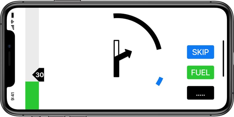
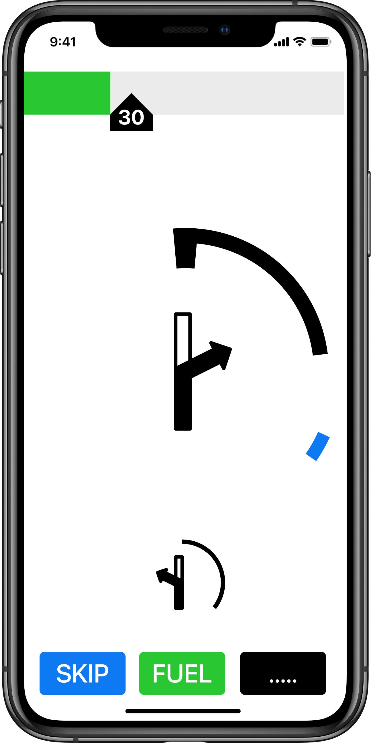
The primary screen when travelling is shown below (General Navigation Mode).
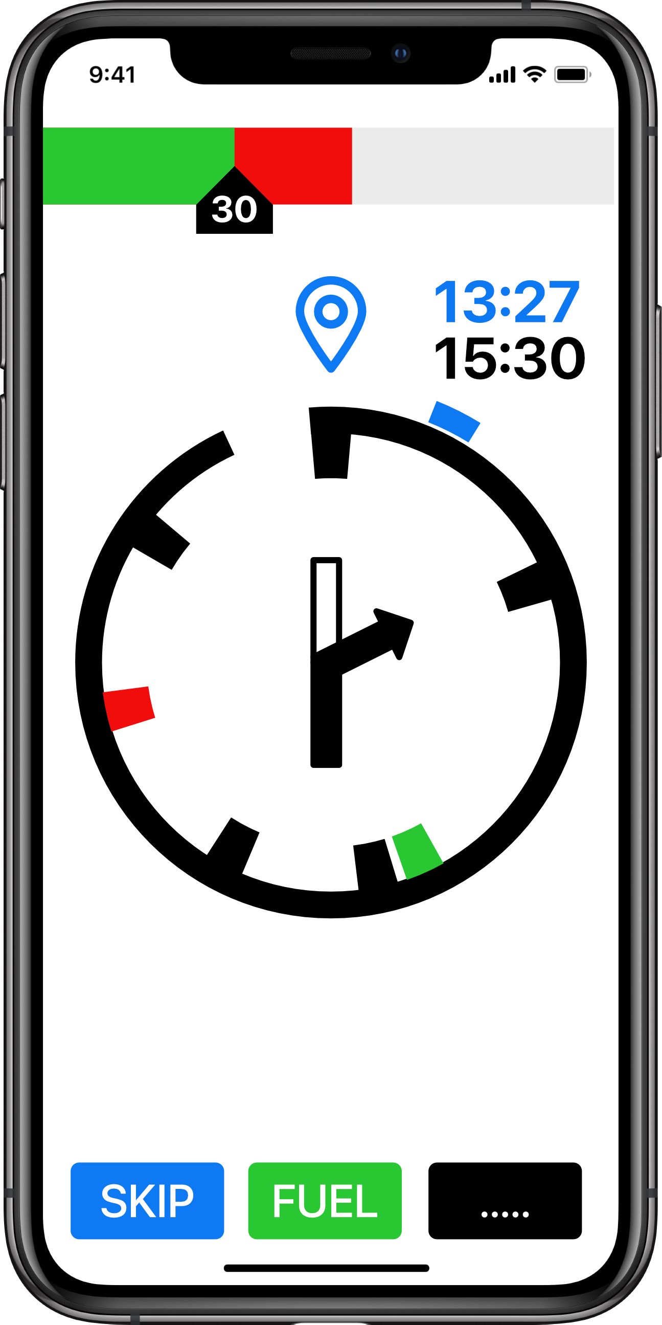
At the top is a speed strip showing the speed limit as carat with inset text. This user is traveling at approx 42mph and is therefore showing a red strip in excess of the speed limit.
The navigation display is a circular distance to go graphic (DTG). In this case showing a graphical representation of the distance to the next waypoint (hence the waypoint symbol). The blue time shows the time at the next waypoint. The black time is the time at the destination.
The check marks inside the circle show events (Black - Turns. Red - Hazards. Green - Fuel stops). The center of the circle is showing the next turn in graphic form. The Blue check mark on the outside of the circle is the relative direction (heading) to the next waypoint.
At the bottom are three buttons (skip next waypoint (route recalculation), fuel (direct navigation to nearest fuel station or fuel station along route (by submenu)) menu functions (stop nav, reroute etc)).
If the user wants more information they could swap to 'map' mode via the options button.
And in landscape:
And showing the final leg (to destination)
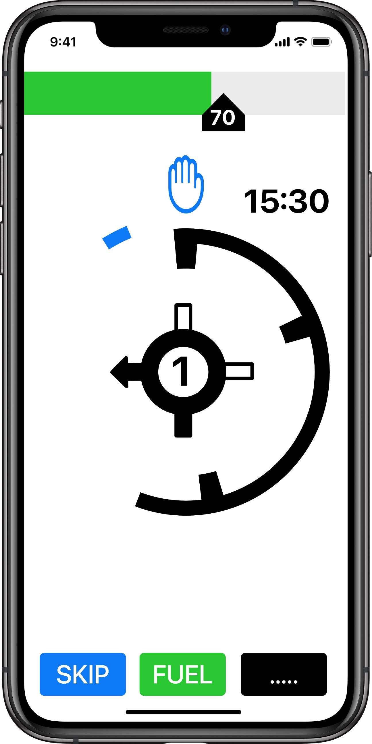
The DTG circle has unwound to display that the user is nearly half way between the last waypoint (or start point) and the destination. The circle will continue to 'unwind' and the rate of 'unwinding' will give a visual reference of how quickly the next event is approaching (see later for specific event navigation display).
Note: the waypoint time has disappeared and a final destination graphic is used. The speed tape is showing a 70mph limit with the user at approximately 65mph (in the green).
The next turn event is a roundabout exiting left (1st exit in the UK).
If approaching a hazard (speed camera) the display will show:
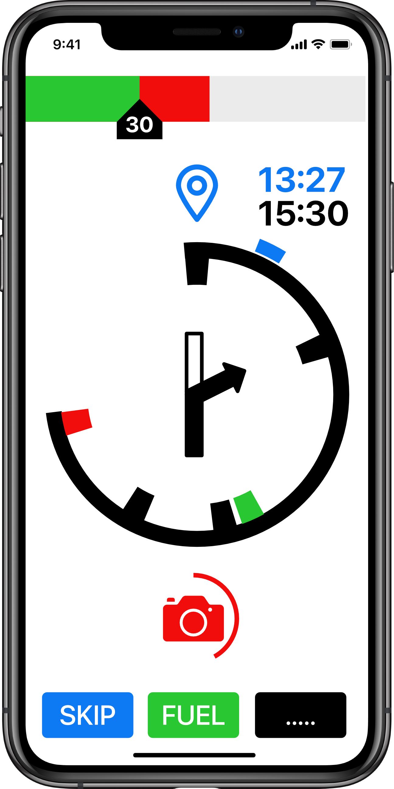
The circle around the camera symbol unwinds as the user approaches. The full circle is 1 minute. And therefore the circle is a speed dependent time to go indications (TTG). If travelling a 60mph the full circle is 1 mile. At 30mph the full circle is 1/2 mile. The advantage of a TTG is the user receives early notification (1 min) whatever speed he is travelling at. The rate the TTG circle unwinds makes if very easy to judge the rate of approach of the hazard.
Hazard display in landscape.

Approaching a turn event (at 1 minute to go) the display switches to a 'cleaner' display (Waypoint navigation). Again the display uses a TTG (time to go) circle which always give 1 minutes warning whatever speed the user is traveling. It unwinds giving a graphical indication of how fast the event is approaching. With 40 seconds to go to the turn.
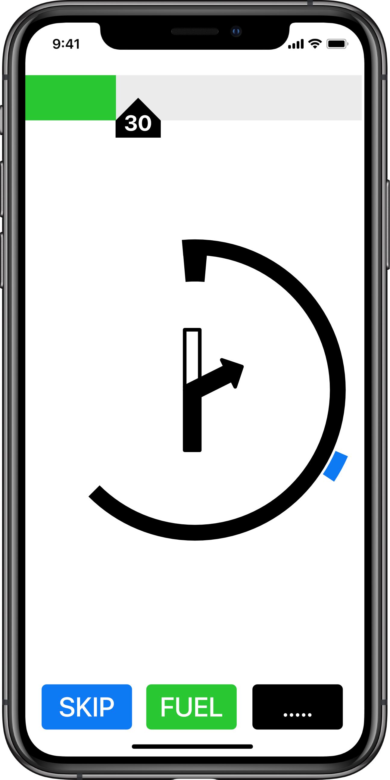
Note the relative heading of the next point is still shown. Speed is below 30mph in a 30 mph limit area.
With 14 seconds to go (landscape):
If there are turn events close together (less than 1 minute) then the second event would be shown with a TTG circle to indicate how close the event is to the first.
In this case a first turn to the right in 14 seconds. With a second turn to the left in in 22 seconds.
Note: that as you slow for the turn the TTG circle might actually wind out showing more time until the turn. As you then approach the turn at a constant but slower speed the TTG circle will then unwind again giving a visual rate of approach.
I hope this gives some food for thought. Having used this type of HUD navigation symbology for 30 years whilst flying military jets I would love to see it incorporated in a navigation app. None of the information required to make it work is new. It is simply a new UI that should make navigation information easily and quickly available to the user.
Regards.
@Jabp
I should have added that the display modes could be user configurable so that, at the 1 minute TTG to an event, the display could switch to a map for the turn and then revert to the DTG navigation mode after the turn is complete. It defeats the display rational of minimum information at the right time but………
Also I envisage the graphical representation of the the turn in the TTG circle approaching a turn would be of much better quality than I have mocked up.JP
-
@Jabp
I should have added that the display modes could be user configurable so that, at the 1 minute TTG to an event, the display could switch to a map for the turn and then revert to the DTG navigation mode after the turn is complete. It defeats the display rational of minimum information at the right time but………
Also I envisage the graphical representation of the the turn in the TTG circle approaching a turn would be of much better quality than I have mocked up.The problem I see with this is the fact that it is intrinsically designed as a HUD where the info is always in direct sight beamed onto the HUD.
A mobile phone however, for many, may be placed to the left or the right on handlebars.
As far as the TTG’s are concerned, are users really expected to watch that visual countdown rather than keeping their eyes on the road ahead.
When approaching a turn I have briefly checked the distance once and then my eyes are continuously on the road, on approach to the turn, through the turn and out of the turn.Generally when I glance at the phone (or my XT) I am looking for a single piece of information and I know exactly where that info is on the screen.
If this gets implemented, that’s fine, but it’s not something I would ever want to use.
You don’t stop riding when you get old, you get old when you stop riding.
-
Definitely a cool idea! For now my focus will be with the turn-by-turn map view but I can see why this is useful. Thanks for the awesome, detailed input. Much appreciated!
-
I don't mean to dismiss an idea, but for me the "realism" of a map that resembles the actual course of the road is much much preferred to the abstractness of signs that do not resemble the road.
But maybe there is a usefulness to this I didn't think of. Off-road routes maybe?
I am just an enthusiastic MRA user, and hope you will be one too!
Most motorcycle problems are caused by the nut that connects the handlebar to the saddle.
Check out RideSleepRepeat.eu, a biker community for sharing stays across Europe
-
I don't mean to dismiss an idea, but for me the "realism" of a map that resembles the actual course of the road is much much preferred to the abstractness of signs that do not resemble the road.
But maybe there is a usefulness to this I didn't think of. Off-road routes maybe?
For Off-Road MRA have already given us the ability to plot Off Road Routes using Route-Tracks in MyRoute-App Mobile.
It works exactly the same as on my Garmin XT.
There are no turn by turn notifications you just visually follow the track.Personally I would use the Map and the Track rather than the HUD style graphics.
My only request at a much later date in the Next cycle would be the ability to add multiple route-tracks onto the map.
The XT can handle that already with Collections. -
I don't mean to dismiss an idea, but for me the "realism" of a map that resembles the actual course of the road is much much preferred to the abstractness of signs that do not resemble the road.
But maybe there is a usefulness to this I didn't think of. Off-road routes maybe?
@Con-Hennekens One does not exclude the other
If sufficient screen estate available then we could have a map without any clutter and the HUD approach aside with all the other information?
But I am biased, I adore aircraft
")
It is not difficult, it is easy, it's a hobby
-
@Con-Hennekens One does not exclude the other
If sufficient screen estate available then we could have a map without any clutter and the HUD approach aside with all the other information?
But I am biased, I adore aircraft
As a lot of people seem keen on it, I do hope it is deployed.
-
@Con-Hennekens One does not exclude the other
If sufficient screen estate available then we could have a map without any clutter and the HUD approach aside with all the other information?
But I am biased, I adore aircraft
And I should probably declare that in my younger years I was a Microsoft Flight Simulator fanboy, but for me it was all about the helicopters.
I was obsessed with the Apache AH64 Longbow.You don’t stop riding when you get old, you get old when you stop riding.
-
@Con-Hennekens One does not exclude the other
If sufficient screen estate available then we could have a map without any clutter and the HUD approach aside with all the other information?
But I am biased, I adore aircraft
-
And I should probably declare that in my younger years I was a Microsoft Flight Simulator fanboy, but for me it was all about the helicopters.
I was obsessed with the Apache AH64 Longbow.@Steve-Lynch said in Innovative Motorcycle / Cycle UI:
I was obsessed with the Apache AH64 Longbow
Let's not get started, or this will become an aviation site
Could we use NExt to navigate in the air?
It is not difficult, it is easy, it's a hobby
-
@Steve-Lynch said in Innovative Motorcycle / Cycle UI:
I was obsessed with the Apache AH64 Longbow
Let's not get started, or this will become an aviation site
Could we use NExt to navigate in the air?
@Drabslab You can achieve this with Mobile. Simply create an offline route and follow the line while flying
Disclaimer: loopings are not supported
-
@Drabslab You can achieve this with Mobile. Simply create an offline route and follow the line while flying
Disclaimer: loopings are not supported
@Corjan-Meijerink said in Innovative Motorcycle / Cycle UI:
@Drabslab You can achieve this with Mobile. Simply create an offline route and follow the line while flying
Disclaimer: loopings are not supported
What an excruciating disappointment, I want my money back
-
The problem I see with this is the fact that it is intrinsically designed as a HUD where the info is always in direct sight beamed onto the HUD.
A mobile phone however, for many, may be placed to the left or the right on handlebars.
As far as the TTG’s are concerned, are users really expected to watch that visual countdown rather than keeping their eyes on the road ahead.
When approaching a turn I have briefly checked the distance once and then my eyes are continuously on the road, on approach to the turn, through the turn and out of the turn.Generally when I glance at the phone (or my XT) I am looking for a single piece of information and I know exactly where that info is on the screen.
If this gets implemented, that’s fine, but it’s not something I would ever want to use.
@Steve-Lynch. The are a few of well proven principles behind this type of display. Firstly the human brain is much better at assimilating information projected graphically (in a sweep or bar display) rather than digitally (ie a graph rather than numbers). Which is why most aircraft displays (despite changing from mechanical to projected displays) still display information in a graphical form. And why you find it easier to interpret a rev counter as a sweep / bar display than a set of numbers. Not only can you see the current value but you also get rate (of rev increase / decrease) allowing you to anticipate changing gear at the desired revs / avoiding the red line! Similarly with a TTG display - the brain is better at understanding time remaining and rate of approach. The human is brain is notoriously bad at judging distance (especially if it is round the corner).... 20 secs to turn is easier to understand (for most people) than 175m (if you can't see full distance).
That said it would be easy to have a DTG circle countdown (say starting at 400m to go) as an option (each quarter of the countdown circle being 100m). Either way a single glance at the circle would give you the information that it is 15s to the turn or (as the option) 100m. And (perhaps strangely) your brain assimilates that quicker that actually reading '15s' or '100m'. The human is not a digital number animal.
You are right that one of the major advantages of the HUD is the ability to present the information focused at infinity and within the eye-line so that the pilot doesn't have to 'look in'. But pilots don't (shouldn't be) staring into the HUD all the time. Trainee pilots have to be taught not to become 'HUD cripples'. Most of the time (as a fast jet pilot) your eyes are elsewhere and the HUD allows a quick peak to get the information you need, and even a very short glance (<1 sec) at a rate display allows you to anticipate the approach of an event. So, again, you are correct that this type of display would be even better in a HUD / windscreen projection, but that doesn't negate it as a good option for displaying information just because it is not focused at infinity or in your eye-line. It would still provide the minimum required information at a glance
And I'm not advocating that this is the default display. This is an option that you can choose if you wish.... I would. You might once you've tried it.
JP
-
@Steve-Lynch. The are a few of well proven principles behind this type of display. Firstly the human brain is much better at assimilating information projected graphically (in a sweep or bar display) rather than digitally (ie a graph rather than numbers). Which is why most aircraft displays (despite changing from mechanical to projected displays) still display information in a graphical form. And why you find it easier to interpret a rev counter as a sweep / bar display than a set of numbers. Not only can you see the current value but you also get rate (of rev increase / decrease) allowing you to anticipate changing gear at the desired revs / avoiding the red line! Similarly with a TTG display - the brain is better at understanding time remaining and rate of approach. The human is brain is notoriously bad at judging distance (especially if it is round the corner).... 20 secs to turn is easier to understand (for most people) than 175m (if you can't see full distance).
That said it would be easy to have a DTG circle countdown (say starting at 400m to go) as an option (each quarter of the countdown circle being 100m). Either way a single glance at the circle would give you the information that it is 15s to the turn or (as the option) 100m. And (perhaps strangely) your brain assimilates that quicker that actually reading '15s' or '100m'. The human is not a digital number animal.
You are right that one of the major advantages of the HUD is the ability to present the information focused at infinity and within the eye-line so that the pilot doesn't have to 'look in'. But pilots don't (shouldn't be) staring into the HUD all the time. Trainee pilots have to be taught not to become 'HUD cripples'. Most of the time (as a fast jet pilot) your eyes are elsewhere and the HUD allows a quick peak to get the information you need, and even a very short glance (<1 sec) at a rate display allows you to anticipate the approach of an event. So, again, you are correct that this type of display would be even better in a HUD / windscreen projection, but that doesn't negate it as a good option for displaying information just because it is not focused at infinity or in your eye-line. It would still provide the minimum required information at a glance
And I'm not advocating that this is the default display. This is an option that you can choose if you wish.... I would. You might once you've tried it.
I appreciate your detailed explanation and I do hope it is implemented, as many do seem keen on it.
95% of the roads I choose to travel on are Country Lanes, no pavements for walkers, these are generally very twisty and the only thing I am interested in seeing is the severity of the curves ahead which a standard map provides accurately in advance. -
I'm wondering in MRA Next is the opportunity to provide motorcyclists / cyclists with an innovative navigation display. I am a partial fan of the Beeline navigation device - except their UI is poor, unoptimised and the display graphics are too small for those whose eyesight is not perfect.
I flew military jets for many years and the graphical display of navigation information in a head up display was intuitive and quick to read at a glance. I have always wondered why navigation apps have not adopted some of the tricks used to present navigation information in an easily assimilated format. I think the Beeline device has the right idea but hasn't really hit the mark in achieving simple but clear navigation. Therefore I am wondering if MRA might be interested in the following..... I have mocked up a display that uses some of the HUD navigation display graphics as a demonstration.... And hopefully to provoke some discussion.
What I am proposing would be just an optional mode for MRA users. The primary mode would still use a map graphical display as current. But this mode would be of use to motorcyclist and cyclists who need navigation information at a glance and are not using audio (although audio would still be available). It is less distracting and easily assimilated than a map display.
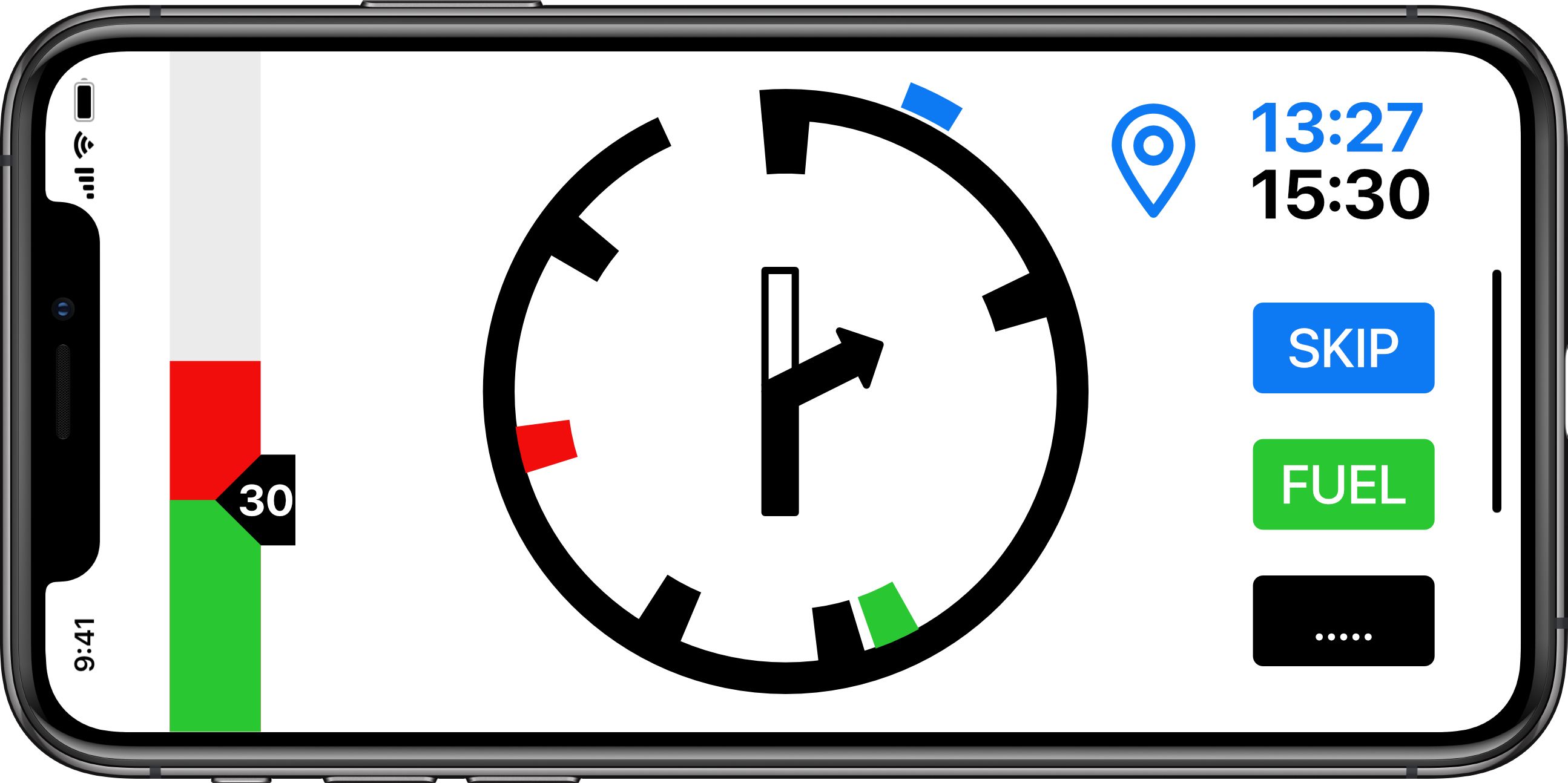
The primary screen when travelling is shown below (General Navigation Mode).
At the top is a speed strip showing the speed limit as carat with inset text. This user is traveling at approx 42mph and is therefore showing a red strip in excess of the speed limit.
The navigation display is a circular distance to go graphic (DTG). In this case showing a graphical representation of the distance to the next waypoint (hence the waypoint symbol). The blue time shows the time at the next waypoint. The black time is the time at the destination.
The check marks inside the circle show events (Black - Turns. Red - Hazards. Green - Fuel stops). The center of the circle is showing the next turn in graphic form. The Blue check mark on the outside of the circle is the relative direction (heading) to the next waypoint.
At the bottom are three buttons (skip next waypoint (route recalculation), fuel (direct navigation to nearest fuel station or fuel station along route (by submenu)) menu functions (stop nav, reroute etc)).
If the user wants more information they could swap to 'map' mode via the options button.
And in landscape:And showing the final leg (to destination)
The DTG circle has unwound to display that the user is nearly half way between the last waypoint (or start point) and the destination. The circle will continue to 'unwind' and the rate of 'unwinding' will give a visual reference of how quickly the next event is approaching (see later for specific event navigation display).
Note: the waypoint time has disappeared and a final destination graphic is used. The speed tape is showing a 70mph limit with the user at approximately 65mph (in the green).
The next turn event is a roundabout exiting left (1st exit in the UK).
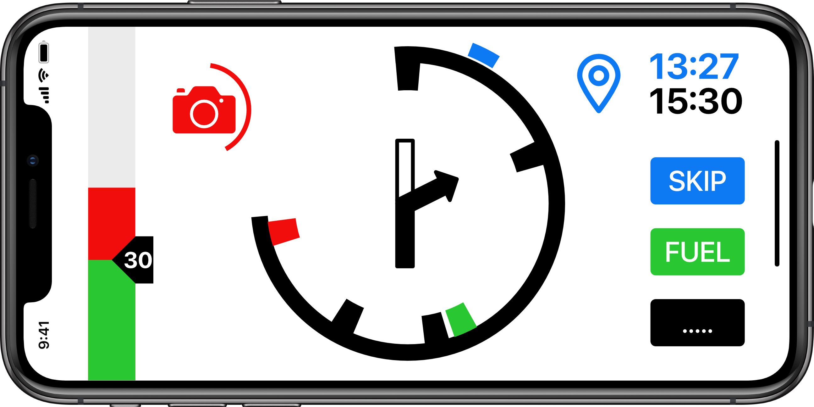
If approaching a hazard (speed camera) the display will show:
The circle around the camera symbol unwinds as the user approaches. The full circle is 1 minute. And therefore the circle is a speed dependent time to go indications (TTG). If travelling a 60mph the full circle is 1 mile. At 30mph the full circle is 1/2 mile. The advantage of a TTG is the user receives early notification (1 min) whatever speed he is travelling at. The rate the TTG circle unwinds makes if very easy to judge the rate of approach of the hazard.
Hazard display in landscape.
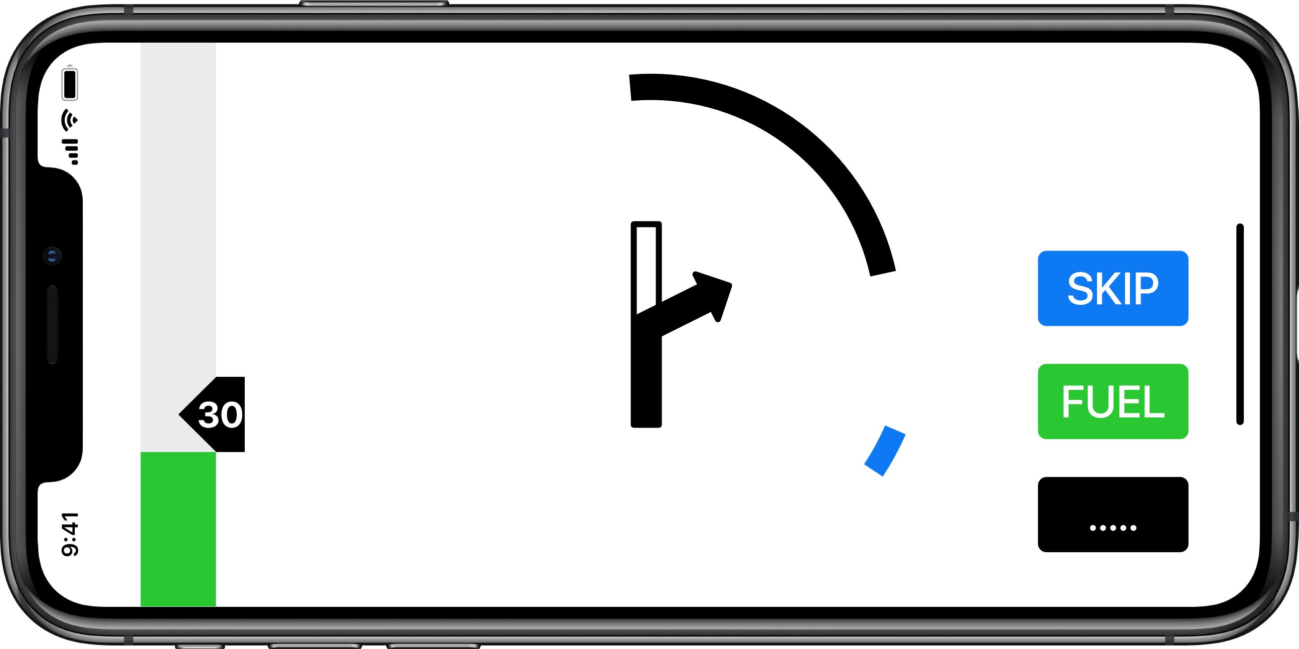
Approaching a turn event (at 1 minute to go) the display switches to a 'cleaner' display (Waypoint navigation). Again the display uses a TTG (time to go) circle which always give 1 minutes warning whatever speed the user is traveling. It unwinds giving a graphical indication of how fast the event is approaching. With 40 seconds to go to the turn.
Note the relative heading of the next point is still shown. Speed is below 30mph in a 30 mph limit area.
With 14 seconds to go (landscape):
If there are turn events close together (less than 1 minute) then the second event would be shown with a TTG circle to indicate how close the event is to the first.
In this case a first turn to the right in 14 seconds. With a second turn to the left in in 22 seconds.
Note: that as you slow for the turn the TTG circle might actually wind out showing more time until the turn. As you then approach the turn at a constant but slower speed the TTG circle will then unwind again giving a visual rate of approach.
I hope this gives some food for thought. Having used this type of HUD navigation symbology for 30 years whilst flying military jets I would love to see it incorporated in a navigation app. None of the information required to make it work is new. It is simply a new UI that should make navigation information easily and quickly available to the user.
Regards.
@Jabp wow - this is amazing - thanks for putting it together as an idea.
As a current Beeline user this is the type of Navigational Display that I would definitely want as the main display. While going around cities / busy areas I might want to swap to the map - that is where the beeline struggles. For longer, less busy areas I would certainly want this display as the primary.
-
I'm wondering in MRA Next is the opportunity to provide motorcyclists / cyclists with an innovative navigation display. I am a partial fan of the Beeline navigation device - except their UI is poor, unoptimised and the display graphics are too small for those whose eyesight is not perfect.
I flew military jets for many years and the graphical display of navigation information in a head up display was intuitive and quick to read at a glance. I have always wondered why navigation apps have not adopted some of the tricks used to present navigation information in an easily assimilated format. I think the Beeline device has the right idea but hasn't really hit the mark in achieving simple but clear navigation. Therefore I am wondering if MRA might be interested in the following..... I have mocked up a display that uses some of the HUD navigation display graphics as a demonstration.... And hopefully to provoke some discussion.
What I am proposing would be just an optional mode for MRA users. The primary mode would still use a map graphical display as current. But this mode would be of use to motorcyclist and cyclists who need navigation information at a glance and are not using audio (although audio would still be available). It is less distracting and easily assimilated than a map display.
The primary screen when travelling is shown below (General Navigation Mode).
At the top is a speed strip showing the speed limit as carat with inset text. This user is traveling at approx 42mph and is therefore showing a red strip in excess of the speed limit.
The navigation display is a circular distance to go graphic (DTG). In this case showing a graphical representation of the distance to the next waypoint (hence the waypoint symbol). The blue time shows the time at the next waypoint. The black time is the time at the destination.
The check marks inside the circle show events (Black - Turns. Red - Hazards. Green - Fuel stops). The center of the circle is showing the next turn in graphic form. The Blue check mark on the outside of the circle is the relative direction (heading) to the next waypoint.
At the bottom are three buttons (skip next waypoint (route recalculation), fuel (direct navigation to nearest fuel station or fuel station along route (by submenu)) menu functions (stop nav, reroute etc)).
If the user wants more information they could swap to 'map' mode via the options button.
And in landscape:And showing the final leg (to destination)
The DTG circle has unwound to display that the user is nearly half way between the last waypoint (or start point) and the destination. The circle will continue to 'unwind' and the rate of 'unwinding' will give a visual reference of how quickly the next event is approaching (see later for specific event navigation display).
Note: the waypoint time has disappeared and a final destination graphic is used. The speed tape is showing a 70mph limit with the user at approximately 65mph (in the green).
The next turn event is a roundabout exiting left (1st exit in the UK).
If approaching a hazard (speed camera) the display will show:
The circle around the camera symbol unwinds as the user approaches. The full circle is 1 minute. And therefore the circle is a speed dependent time to go indications (TTG). If travelling a 60mph the full circle is 1 mile. At 30mph the full circle is 1/2 mile. The advantage of a TTG is the user receives early notification (1 min) whatever speed he is travelling at. The rate the TTG circle unwinds makes if very easy to judge the rate of approach of the hazard.
Hazard display in landscape.
Approaching a turn event (at 1 minute to go) the display switches to a 'cleaner' display (Waypoint navigation). Again the display uses a TTG (time to go) circle which always give 1 minutes warning whatever speed the user is traveling. It unwinds giving a graphical indication of how fast the event is approaching. With 40 seconds to go to the turn.
Note the relative heading of the next point is still shown. Speed is below 30mph in a 30 mph limit area.
With 14 seconds to go (landscape):
If there are turn events close together (less than 1 minute) then the second event would be shown with a TTG circle to indicate how close the event is to the first.
In this case a first turn to the right in 14 seconds. With a second turn to the left in in 22 seconds.
Note: that as you slow for the turn the TTG circle might actually wind out showing more time until the turn. As you then approach the turn at a constant but slower speed the TTG circle will then unwind again giving a visual rate of approach.
I hope this gives some food for thought. Having used this type of HUD navigation symbology for 30 years whilst flying military jets I would love to see it incorporated in a navigation app. None of the information required to make it work is new. It is simply a new UI that should make navigation information easily and quickly available to the user.
Regards.
@Jabp
Personally, I am an advanced Tripy user. The principle is the same as what JABP describes. It is much more readable and secure. It's super efficient as a system. The user should have the choice between this system and the map view which is sometimes very useful. I agree 100% with his idea and I would be very happy if it could lead to an option in My Route Navigation Next. Contrary to what has been written, I know many users interested in this navigation information layout. -
@Jabp wow - this is amazing - thanks for putting it together as an idea.
As a current Beeline user this is the type of Navigational Display that I would definitely want as the main display. While going around cities / busy areas I might want to swap to the map - that is where the beeline struggles. For longer, less busy areas I would certainly want this display as the primary.
@Andrew-Ross
I agree with you -
@Jabp
Personally, I am an advanced Tripy user. The principle is the same as what JABP describes. It is much more readable and secure. It's super efficient as a system. The user should have the choice between this system and the map view which is sometimes very useful. I agree 100% with his idea and I would be very happy if it could lead to an option in My Route Navigation Next. Contrary to what has been written, I know many users interested in this navigation information layout.@Alain-Spronck Not heard of the Tripy before. I assume you mean this: https://www.tripy.eu/en/tripy-2-gps-road-book-motorcycle-road/digital-road-book/benefits
The website won't load at work so I'll have to wait till I get home!
-
@Jabp
Personally, I am an advanced Tripy user. The principle is the same as what JABP describes. It is much more readable and secure. It's super efficient as a system. The user should have the choice between this system and the map view which is sometimes very useful. I agree 100% with his idea and I would be very happy if it could lead to an option in My Route Navigation Next. Contrary to what has been written, I know many users interested in this navigation information layout.@Alain-Spronck said in Innovative Motorcycle / Cycle UI:
It's super efficient as a system.
Pfff, it doesn't even allow for loopings, never mind Immelman turns.
but, repeating myself, introducing the HUD idea does not exclude having a map view aside, certainly not on larger screens.
It is not difficult, it is easy, it's a hobby
-
I'm generally in favor of such a display. Can't say if it would work for me in the long run, but I like having options. Having such a display would certainly distinguish MRA amongst the competition.
Couple of things crossed my mind while looking at it. First, I'm not certain as to the usefulness of the blue heading bug. I can see it for flying, but info relating to navigating as the crow flys on a motorcycle may not be all that useful. Second, even though the scenario where you have turn events close together was addressed, lane assist arrows (the lack thereof) came to mind. Sure you can sort of infer it from the scenario presented. But, not all scenarios will meet the criteria for back to back turns, and even when they do, lane assist arrows seem handy. I guess that has to be weighed against the desire to keep the display simple.
")
Hello! It looks like you're interested in this conversation, but you don't have an account yet.
Getting fed up of having to scroll through the same posts each visit? When you register for an account, you'll always come back to exactly where you were before, and choose to be notified of new replies (either via email, or push notification). You'll also be able to save bookmarks and upvote posts to show your appreciation to other community members.
With your input, this post could be even better 💗
Register Login-
0389
-
0243
-
0280
-
017429
-
315512
-
0351.7k
-
010450