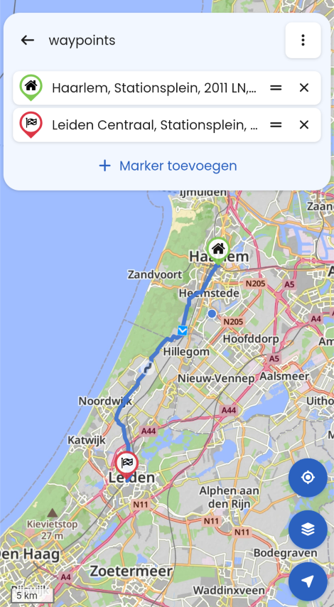
MRA V5.0.3 (449) The contrast is not sufficient
-
Hello,
Today I was irritated, the contrast on the map was already better or, that to recognize the different road types and courses when driving...
- Wong ( Goes like this )


- Dart ( Not better )

- vulf ( No, it doesn't work)
In Standard ..
If an improvement could not be sought here, why is this so difficult, with more sun it will not get better 🥴
- Wong ( Goes like this )
-
Okey? Since when has this become an issue? The maps are like this for a long time.
-
@Corjan-Meijerink ,
Just got back from the tour.I can't say exactly in the fall of 2025 with the V 4.x.x maybe it was better, or I drove in December 2025 but without the sun, today it was weird.... I checked everything and set the brightness of the IPhone Xr very high to max...
Feels like it was different, or is the spring sun to blame, but I don't think so!
-
@Corjan-Meijerink
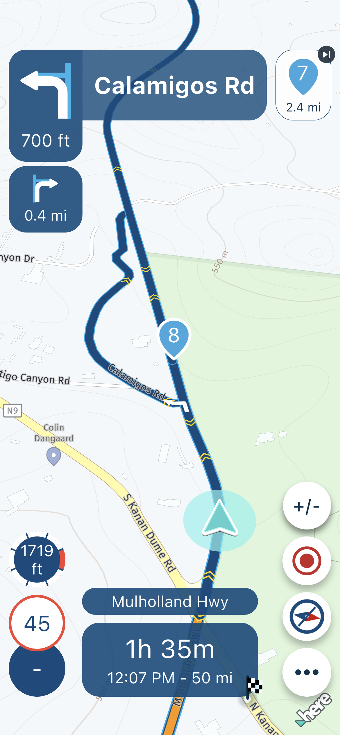
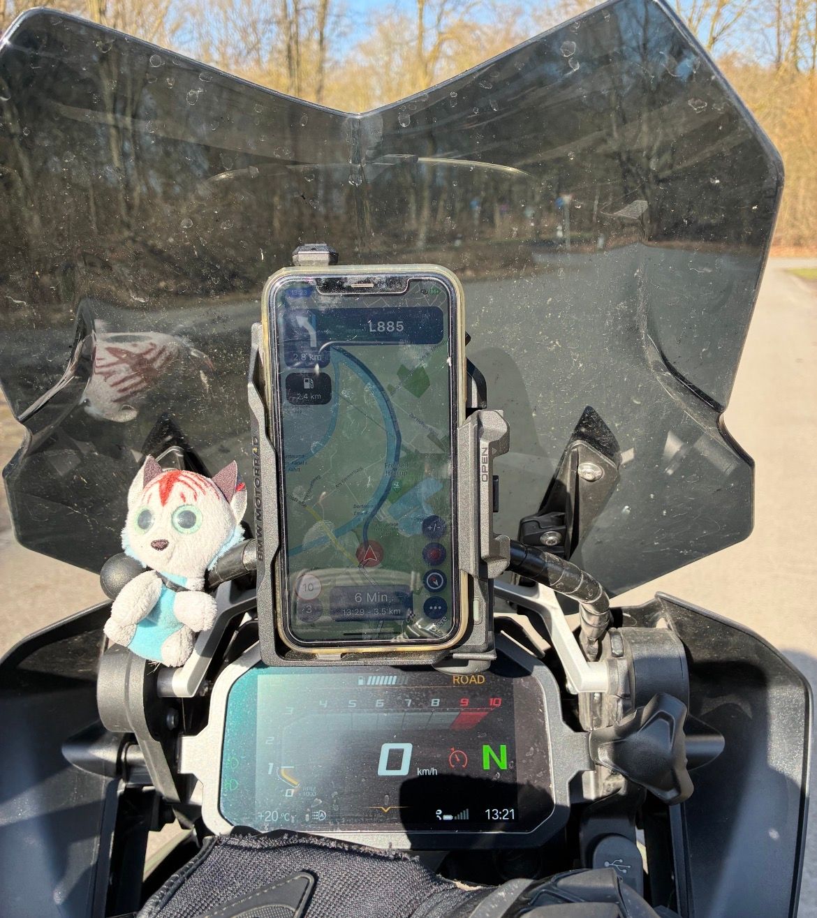
I tried to photograph it but with the sun etc. it was difficult and it doesn't really exist compared to the ride ... at the moment the sun is still low.- But is there perhaps a possibility of improvement in principle?
-
So your screen has a glare in the sun?
Cannot do much about that")
Reading the rpm on your bmw display is hard too with that lighting

-
Okay, so .. basically it would be good to be able to see the small roads better, it's about L and K and smaller roads
Bild … 🥴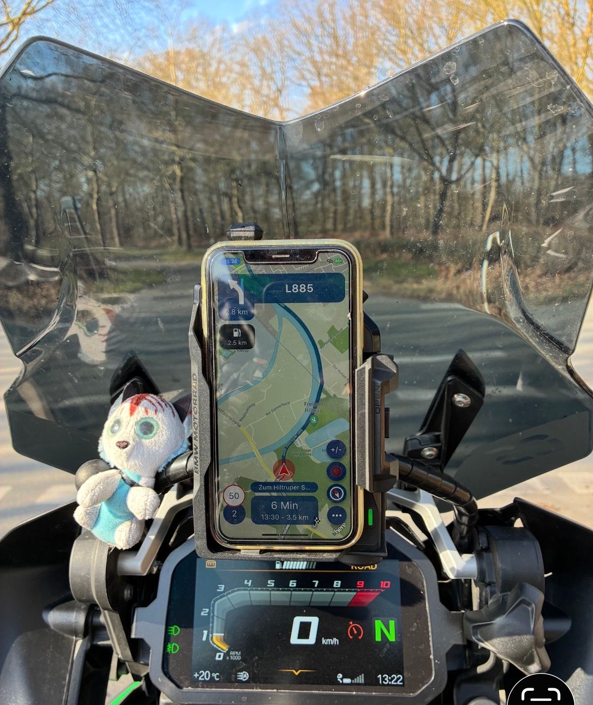
-
Yeah, still don’t see the problem
-
I will try again on the next tour to make a better picture of the topic to make it visible.
That's what it's about:
Small streets / very small streets
If you are on the road and have zoomed out further, it would be with more contrast or other colors for the small streets then perhaps to recognize them better so that there back, for example, on the right, a beautiful curvy road goes off ....
Even at the age (I 66) you need more higher contrast pictures which is not yet an issue for you as a young biker !!
But I am only one of many to many of the old users over 60 of the MRA app users.
VG and good luck

-
For me this has only been an issue on apple carplay devices, the largely white or grey roads when displayed on grey or white backgrounds like Vulf or Wong tend to lack contrast on these displays and make it harder to make out side roads for awareness. There have been posts about this in the past. The Dart colour scheme works better for me. The ideal solution would be to mark the edges of the road - something like a darker edge line.
Still the best app though and I like everything else
Looking forward to testing the CarPlay enhancements that are coming -
So, I avoid highways and main roads as much as possible, and these should be clearly visible on the display.
Regarding Dart: The major roads, like main roads and country roads, are barely distinguishable; they're both yellow...
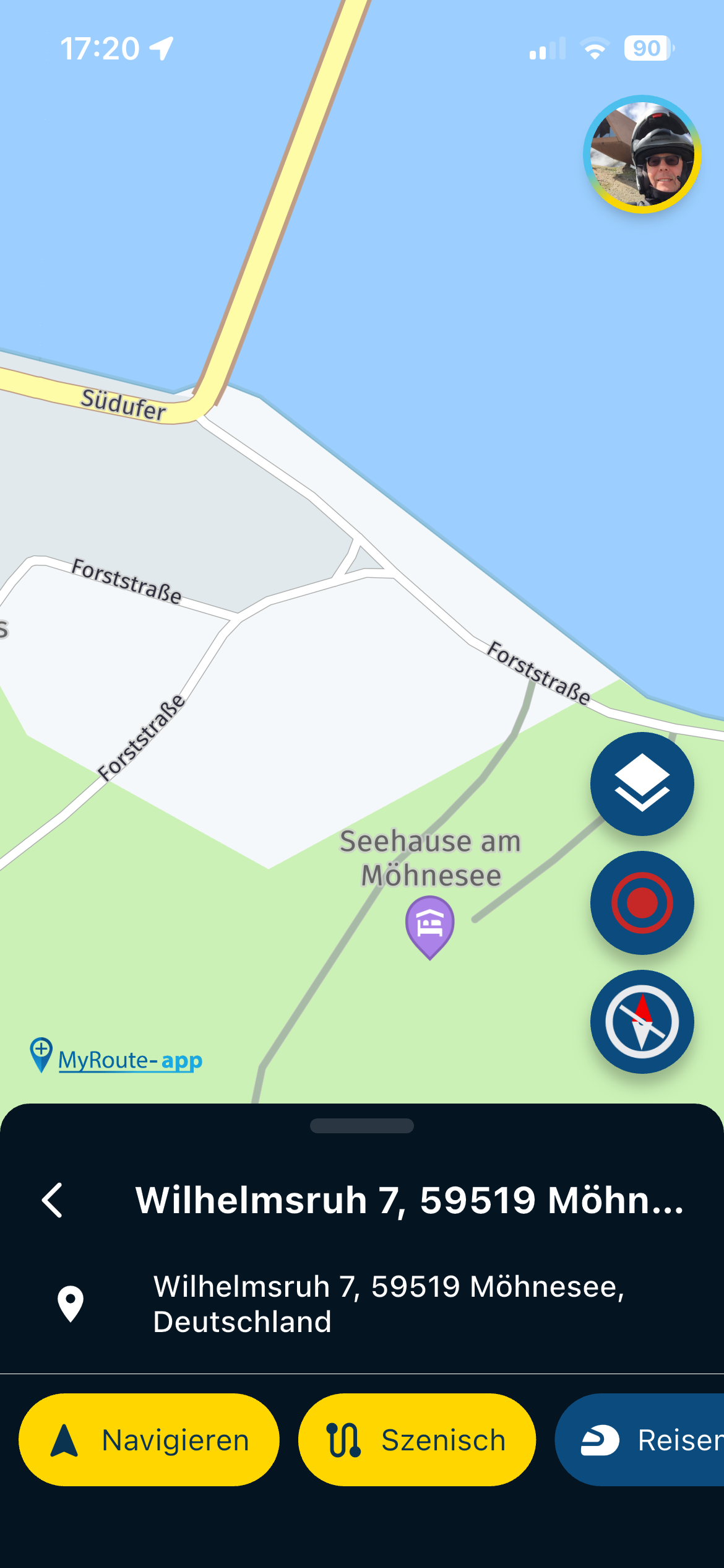
Regarding Wong: The distinction between highways (red, wider) and main roads (red, narrow) to country roads (yellow) and small roads (yellow, narrow) is definitely a good start. However, the very small roads (white) are barely visible. In rural areas, this makes navigating the beautiful little roads (white) very confusing. If you haven't planned ahead and want to make a spontaneous turn, the road layout (white) is difficult to discern.
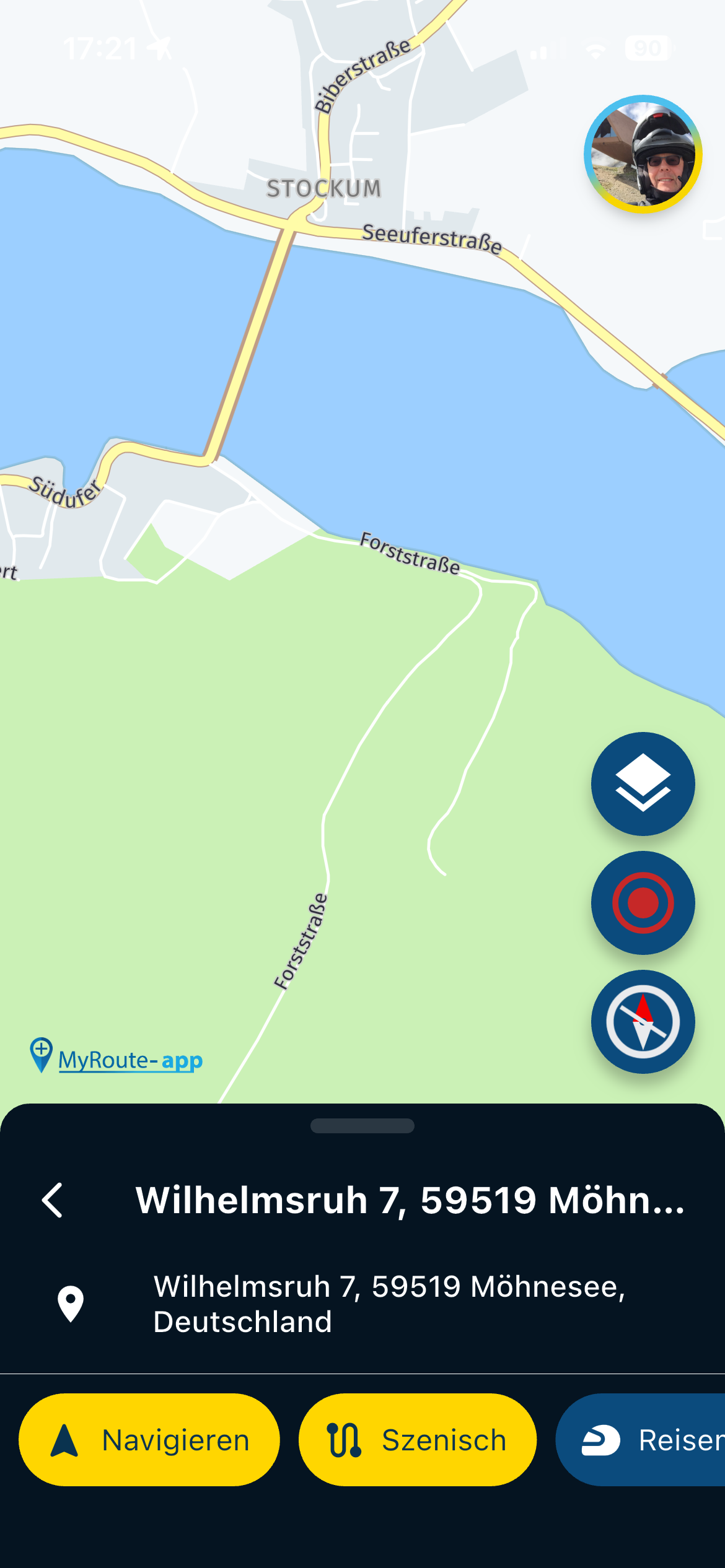
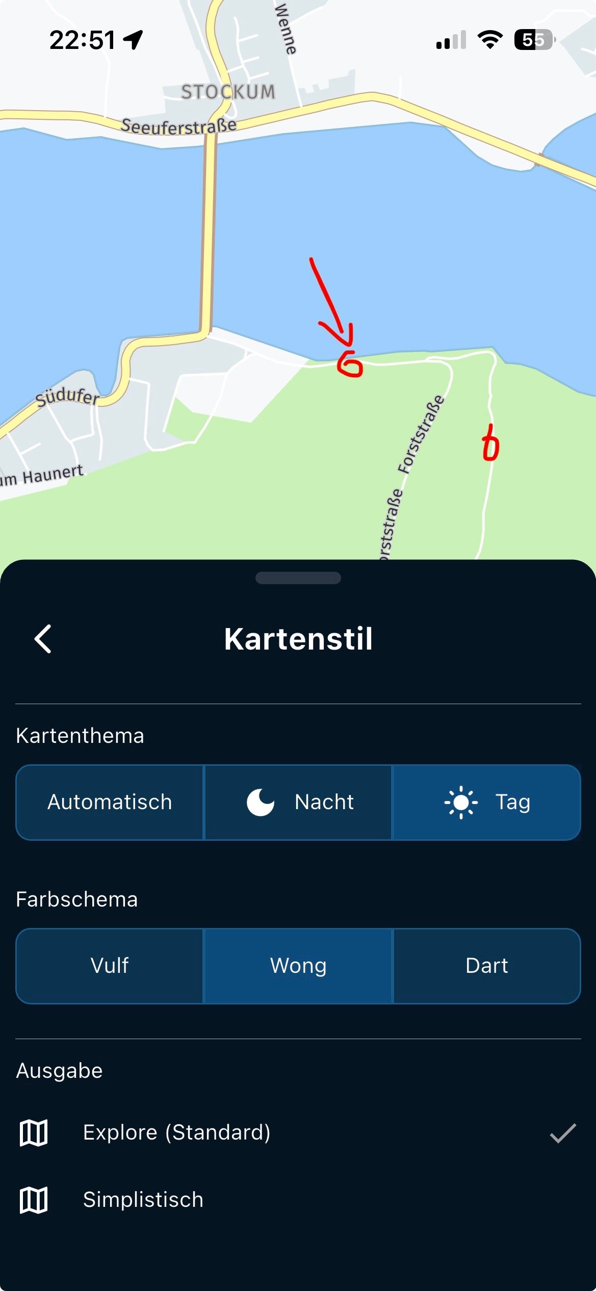
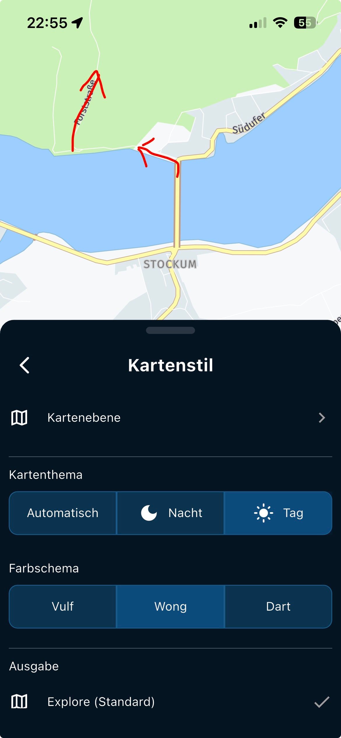
Example at Möhnesee: The forest road, which is "beautiful to drive," is barely noticeable when driving past. It leads to "Franki's Hut," which is highly recommended.
The turnoff from the south shore to the forest road is barely visible on the display!
That then with sunshine is then on the way on the mobile phone / motorcycle often difficult to recognize.!!
-
I understand your point but I can think of a lot of examples where it would be absolutely a terrible idea if those minor roads are shown on these low zoomlevels…
-
It would be nice if you could turn it on or off.
- Showing small streets more would be a solution if that would be against !!
With Google Maps such a road is shown better ..
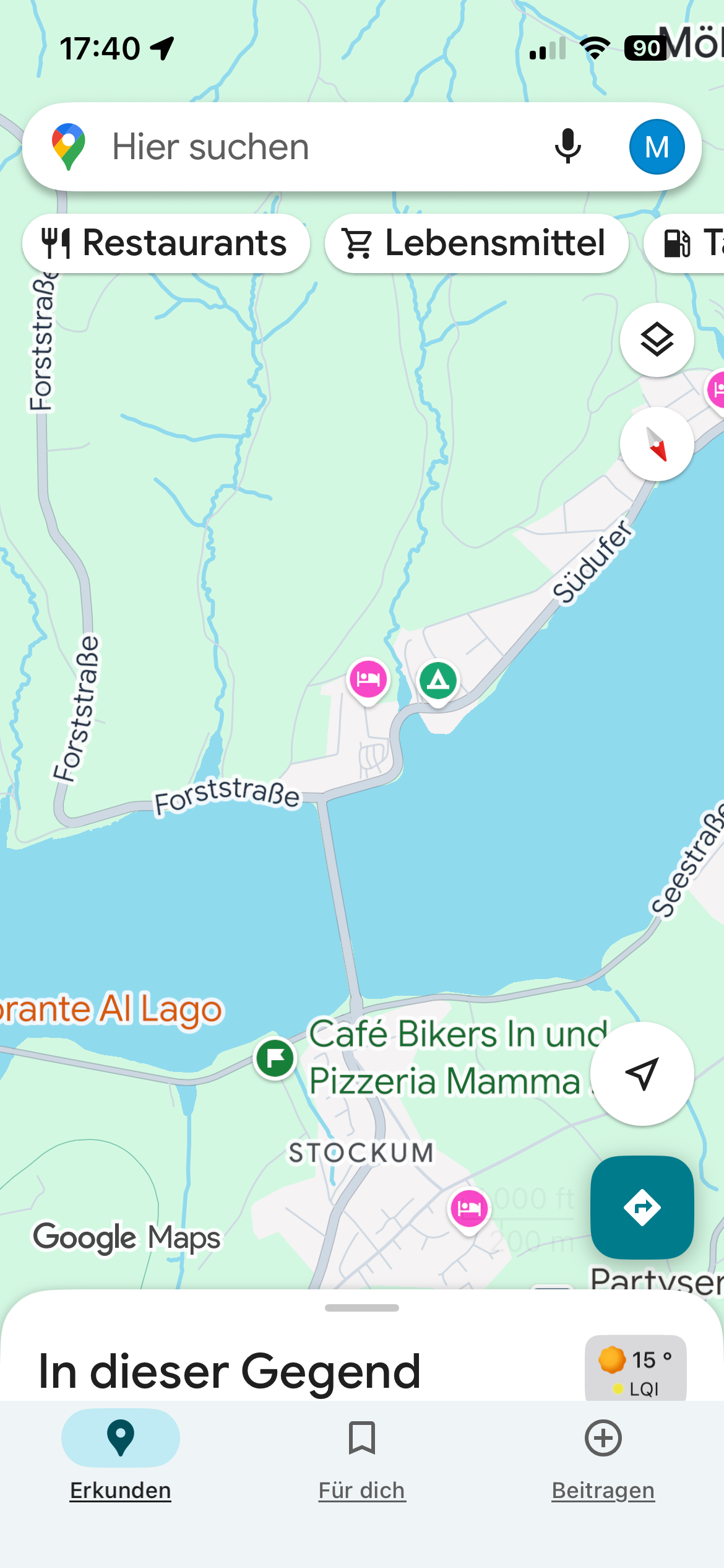
unten
 MRA
MRA
-
Ah, yes. Another setting!
-
Hi all,
If I can say something about maps and colors is when Traffic density is shown.
If highway is red (o near red) color, is too difficult when driving to know if a traffic jam is ahead. If highway is yellow, the same with medium density traffic.
And even this is worst when night colored maps are used.
The rest of visibility, is more about device contrast and screen light.
I don’t know how difficult is code this colors or change how traffic is presented on screen .
But perhaps an alternated two color layer (red and white for example) can add more contrast to see traffic jam in a fast view to navigation screen.
Thanks and regards
-
Yes, the missing contrast is really a pitty. About the different colours for streets: I love the "Michelin-Style" in paper maps, because in an overview (less zoom) it's easy to orientate.
Highway = red/orange
primary roads = yellow
local roads = whiteBut yes, in case of traffic overlay (red and yellow) it may not easy to identify.
-
I also would be very happy, if such option could be considered.
-
So your screen has a glare in the sun?
Cannot do much about thatReading the rpm on your bmw display is hard too with that lighting
@Corjan-Meijerink said in MRA V5.0.3 (449) The contrast is not sufficient:
So your screen has a glare in the sun?
Cannot do much about thatReading the rpm on your bmw display is hard too with that lighting
- Anti-glare film on the screen helps a lot. About 15 Euros.
- Wong + 'Roads only' option in Map Style is quite high contrast (yellow roads on light grey background in light mode)
-
-
The contrast is unfortunately chosen...
The small white streets are not really good to spontaneously conquer a beautiful little street unplanned...
Direction stretched by 180"
-
I also would like to add, as in comment #19 from Hubert, that those small white roads are really not very good to see. Maybe a litte bit different color could already help to make them see better.
Hello! It looks like you're interested in this conversation, but you don't have an account yet.
Getting fed up of having to scroll through the same posts each visit? When you register for an account, you'll always come back to exactly where you were before, and choose to be notified of new replies (either via email, or push notification). You'll also be able to save bookmarks and upvote posts to show your appreciation to other community members.
With your input, this post could be even better 💗
Register Login-
7281.7k
-
08116
-
0698
-
08173
-
0381
-
04164
-
0219
-
36204