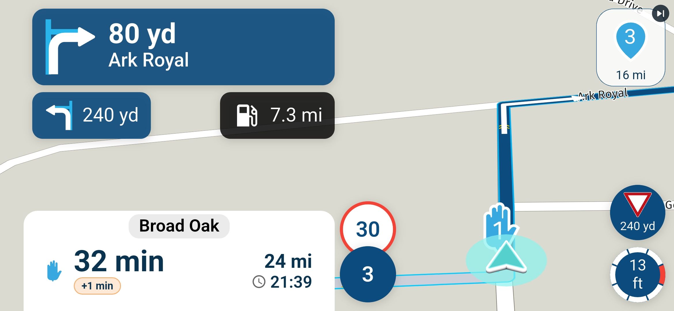
Icon and text size for the next waypoint
-

Would it be possible to increase the size of the text showing the distance to the next waypoint—located in the top-right corner—to make it easier to read?
And also, could the traffic sign in the bottom-right corner be made larger?
I don’t think either of these changes would interfere with the view of the rest of the screen. -
Would it be possible to increase the size of the text showing the distance to the next waypoint—located in the top-right corner—to make it easier to read?
And also, could the traffic sign in the bottom-right corner be made larger?
I don’t think either of these changes would interfere with the view of the rest of the screen.
@Torrealarcon if you want to see a larger version of the distance & time to the next waypoint, you can toggle through the waypoint displayed option on the bar at the bottom of the screen
tap the bottom bar & it cycles through next waypoint, next Via point or final destinationfor me in portrait mode increasing the size of the skip button & its text by any meaningful proportion can only be done if the size of the next direction box is reduced
for a long time, many many other people have asked for size of the Next & 2nd Next text & direction indicators to be increased, this has been achieved with V6
I agree it would be nice if the text for the distance to the next point could be larger but I think it is a compromise,
the next direction is a more vital piece of info so I would not like to see its size / prominence sacrificedagain with portrait mode & with dynamic view for V6, the current position indicator is now sandwiched between the traffic & speed signs
this limits the visible map directly to the sides of the current position compared to V5
trying to decypher which road to exit at a complex junction requires a clear maximal view of the area around the current position indication
the view area around current position indication is already compromised with the V6 sandwiching, increasing the traffic sign size would only further compromise the view area around the current position indication in portrait/dynamic modealso if the traffic sign roundel is increased then the roundels for the speed & speed limit should also be increased otherwise aesthetically the differing roundel sizes would look odd / jar as they are all related to traffic signs
further reducing the map area visible around the current position indicator would be a huge negative for methe actual layout of the V5 bottom bar including speed indication, menu button/compass/log button provided more map area around the current location indicator, as the location indicator was in a clear space above the bottom bar, not sandwiched
the new black bar does seem to be a huge piece of screen real estate used very inefficiently in either portrait or landscape mode, especially when compared to the old bottom bar
you don’t realise how good something was till its changed / gone
Hello! It looks like you're interested in this conversation, but you don't have an account yet.
Getting fed up of having to scroll through the same posts each visit? When you register for an account, you'll always come back to exactly where you were before, and choose to be notified of new replies (either via email, or push notification). You'll also be able to save bookmarks and upvote posts to show your appreciation to other community members.
With your input, this post could be even better 💗
Register Login-
01349
-
011226
-
 01061
-
114185
-
 0832
-
0646
-
 11077
-
 08253