Waypoint icon size
-
Today I tested the display of a viapoint with a note and a symbol. So first of all, congratulations to the developer for displaying the note in the upper left bubble. It's simply new I think!
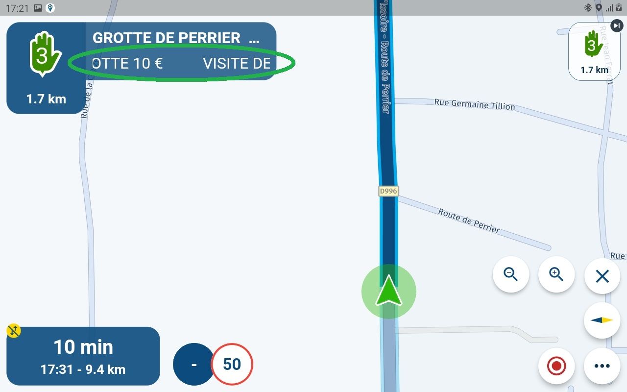
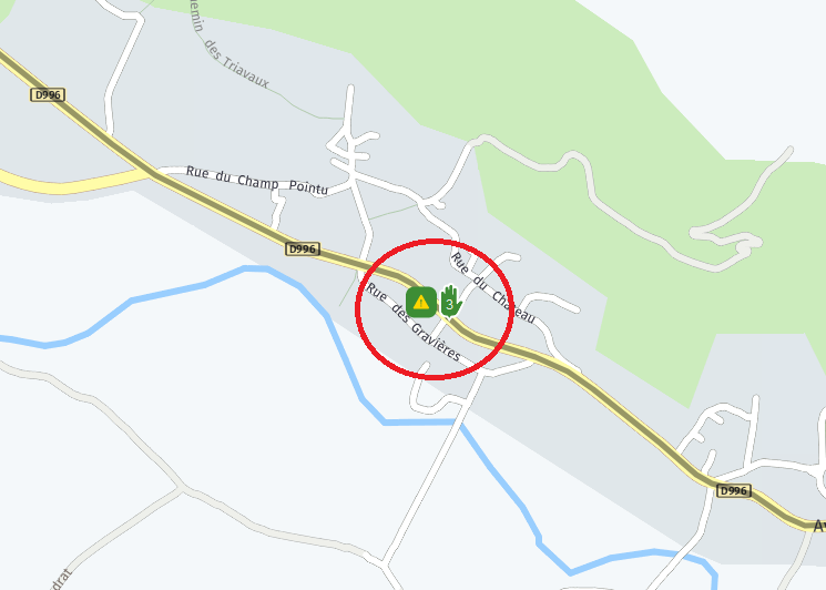
On the other hand, I had entered a point of view icon but I did not see it displayed, is this normal?
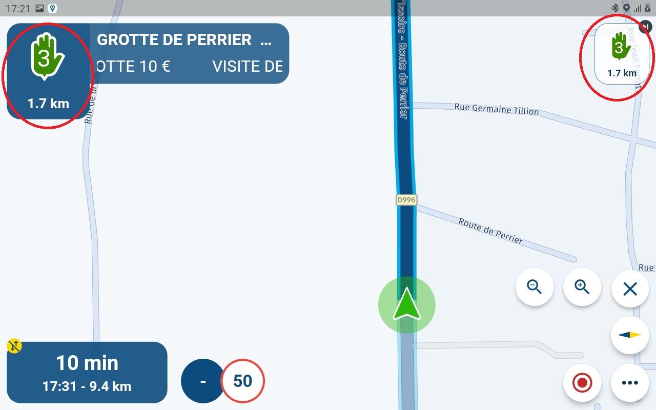
Then I repeat myself but for me the upper right bubble (ignore waypoint) is too small. While driving it is difficult to press this icon. It will have to be at least the size of the upper left display of the waypoint. Or configurable to everyone's taste
Otherwise no navigation problem on all my route except for the volume of the instructions which is very low compared to the level of sound with my passenger.
-
Today I tested the display of a viapoint with a note and a symbol. So first of all, congratulations to the developer for displaying the note in the upper left bubble. It's simply new I think!

On the other hand, I had entered a point of view icon but I did not see it displayed, is this normal?

Then I repeat myself but for me the upper right bubble (ignore waypoint) is too small. While driving it is difficult to press this icon. It will have to be at least the size of the upper left display of the waypoint. Or configurable to everyone's taste

Otherwise no navigation problem on all my route except for the volume of the instructions which is very low compared to the level of sound with my passenger.
@Calibos thanks for the feedback!
That meta icon is indeed not displayed. We do have the ambition to do so somewhere but layouts can be tough on all those different screens.The skip waypoint buttons indeed seems a bit small on tablets (and it could be bigger). On phones I believe it’s the perfect size (and we haven’t received any feedback about it anymore after increasing the size as the initial feedback indeed also was “it’s too small”)
