Update top, but ...
-
I had a more or less intensive look at the new Beta 3.2.9. and as mentioned before, "Well Done"

There are only a few little things i find worth talking about.
@Corjan-Meijerink said in New Beta! (v3.2.9):
Android stability improvements
Having problems wth crashes is most of the time a cache problem on my phone. (Having too much open Apps
 ) Here is an example from today:
Open MRA - Letzte Route - Öffne Route - Starten - crash.
My Phone said " blablabla clear cache? Yes, please!!
Open MRA - Letzte Route - Öffne Route - Starten - Starten -> OKOffline maps: great job, waiting for testing it..
Bluetooth Keyboard connectivity: still searching for some place on my handlebars
New menu: like this, is better than before. Some remarks: if you choose "Navigation stoppen" a small Button appears, half white, half blue or yellow. a reaction can only be triggered within the lower, blue part of the button. the white part is just information. After about 3 seconds the button disappears automatically.
Can't the white part of the button (= 50% of the button ) also be sensitive for triggering a function, in this case confirming that navigation should stop. Would be helpful when operating with gloves. (See also: After "skipping Waypoint" = white part approx. 70%)Waypoint list - I like this very much. Scrolling the Waypoints ist good, but why can't we use the total screen of the Smartphone? If I could drag this little button in the middle all the way up to the edge of the screen and see the waypoint list on the whole screen, that would be really cool.
And why does this little button disappear, when draggin it down to the lower end?Dark Mode / Day and Night mode
I would like a more luminous current position for both modes. The difference between the map and the current position is too small in both modes. I don't care if the current position is an arrow, a motorcycle or whatever. It just has to be easy to see.Sprachansage and Audio'
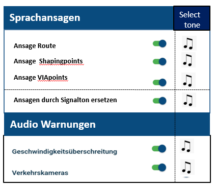
I had a little trouble with these two, cause i couldn't get them together with the individual settings possibilities. There I would resalize a new group, so that it fits to the new Menue List.In the Audio menu there are three items where the voice command can be changed:
voice prompts (route)
Voice prompts Shapingpoints and
Voice prompts Viapoints
I would put them directly below each other , because they belong together thematically (voice). And i changed the names/descriptions a little. Below these three, i would place " Ansagen durch Signalton ersetzen" and I would make a separate menu item."Sprachansagen". Now it becomes clear that for these three the announcements can be replaced by a warning tone..
The other two points "Geschwindigkeitsüberschreitung and Verkehrskameras" remain in the menu item "Audio", since there are no voice instructions here, only warning tones (beeps).
If you could then select the tones from a menu for each point (very good)
or even upload your own tones (extremely good) ...


See what i mean:Greetings
Ronni

-
I had a more or less intensive look at the new Beta 3.2.9. and as mentioned before, "Well Done"

There are only a few little things i find worth talking about.
@Corjan-Meijerink said in New Beta! (v3.2.9):
Android stability improvements
Having problems wth crashes is most of the time a cache problem on my phone. (Having too much open Apps
 ) Here is an example from today:
Open MRA - Letzte Route - Öffne Route - Starten - crash.
My Phone said " blablabla clear cache? Yes, please!!
Open MRA - Letzte Route - Öffne Route - Starten - Starten -> OKOffline maps: great job, waiting for testing it..
Bluetooth Keyboard connectivity: still searching for some place on my handlebars
New menu: like this, is better than before. Some remarks: if you choose "Navigation stoppen" a small Button appears, half white, half blue or yellow. a reaction can only be triggered within the lower, blue part of the button. the white part is just information. After about 3 seconds the button disappears automatically.
Can't the white part of the button (= 50% of the button ) also be sensitive for triggering a function, in this case confirming that navigation should stop. Would be helpful when operating with gloves. (See also: After "skipping Waypoint" = white part approx. 70%)Waypoint list - I like this very much. Scrolling the Waypoints ist good, but why can't we use the total screen of the Smartphone? If I could drag this little button in the middle all the way up to the edge of the screen and see the waypoint list on the whole screen, that would be really cool.
And why does this little button disappear, when draggin it down to the lower end?Dark Mode / Day and Night mode
I would like a more luminous current position for both modes. The difference between the map and the current position is too small in both modes. I don't care if the current position is an arrow, a motorcycle or whatever. It just has to be easy to see.Sprachansage and Audio'
I had a little trouble with these two, cause i couldn't get them together with the individual settings possibilities. There I would resalize a new group, so that it fits to the new Menue List.In the Audio menu there are three items where the voice command can be changed:
voice prompts (route)
Voice prompts Shapingpoints and
Voice prompts Viapoints
I would put them directly below each other , because they belong together thematically (voice). And i changed the names/descriptions a little. Below these three, i would place " Ansagen durch Signalton ersetzen" and I would make a separate menu item."Sprachansagen". Now it becomes clear that for these three the announcements can be replaced by a warning tone..
The other two points "Geschwindigkeitsüberschreitung and Verkehrskameras" remain in the menu item "Audio", since there are no voice instructions here, only warning tones (beeps).
If you could then select the tones from a menu for each point (very good)
or even upload your own tones (extremely good) ...


See what i mean:Greetings
Ronni

@Ronni Thanks again for the very elaborate feedback! Greatly appreciate it.
Crashes
We see some improvement in crash percentages but it's nowhere near where we want it to be! Definitely something we continue working on.New menu
Will consider making the white part clickableWaypoint list
Generally you wouldn't want to use the entire screen as this would block the map. Now you can view the list of waypoints while seeing where you are. Also, tapping on a waypoint shows where it is on the map - wouldn't be possible if the entire map was covered
Dark mode
This will be done!Audio
Thanks! I'll definitely move some settings around and update the German translations. The configuration of voice prompts / audio settings is something for later. Not sure if we're going to implement what you suggest but we will discuss it!Thanks again!

-
@Corjan-Meijerink thx for your replies, sounds good.

