double route info screen
-
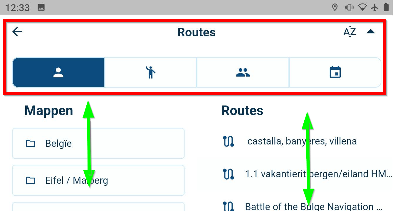
When loading a route, first you are presented with this screen (in landscape mode):

The green arrows:
The columns for folders and routes are separately scrollable which is really great! Kudos!The red box:
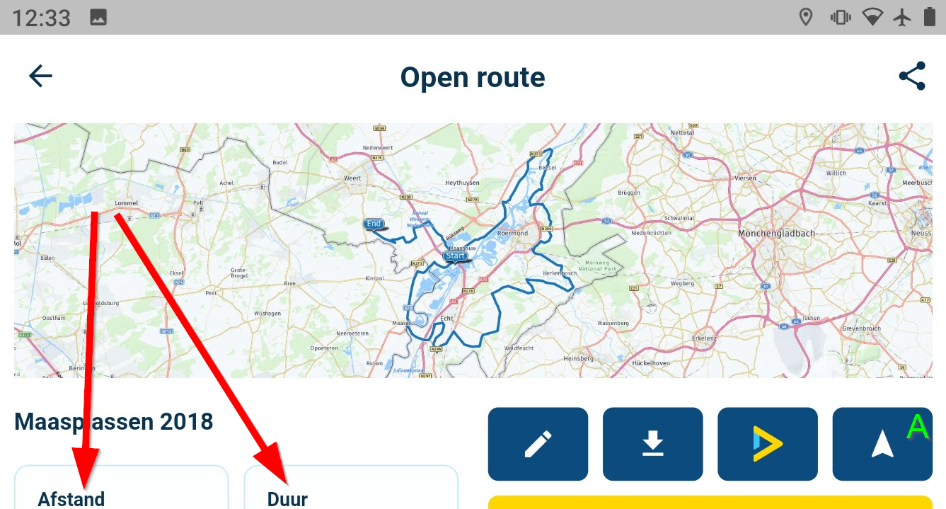
This area could be compacted A LOT to provide more space for the actual folders and routes. In my opinion the white-space between the individual folder and route names could also be a bit less, but I understand the reason for that (ticking them with gloves on).But then, if you tick a route you first get this:

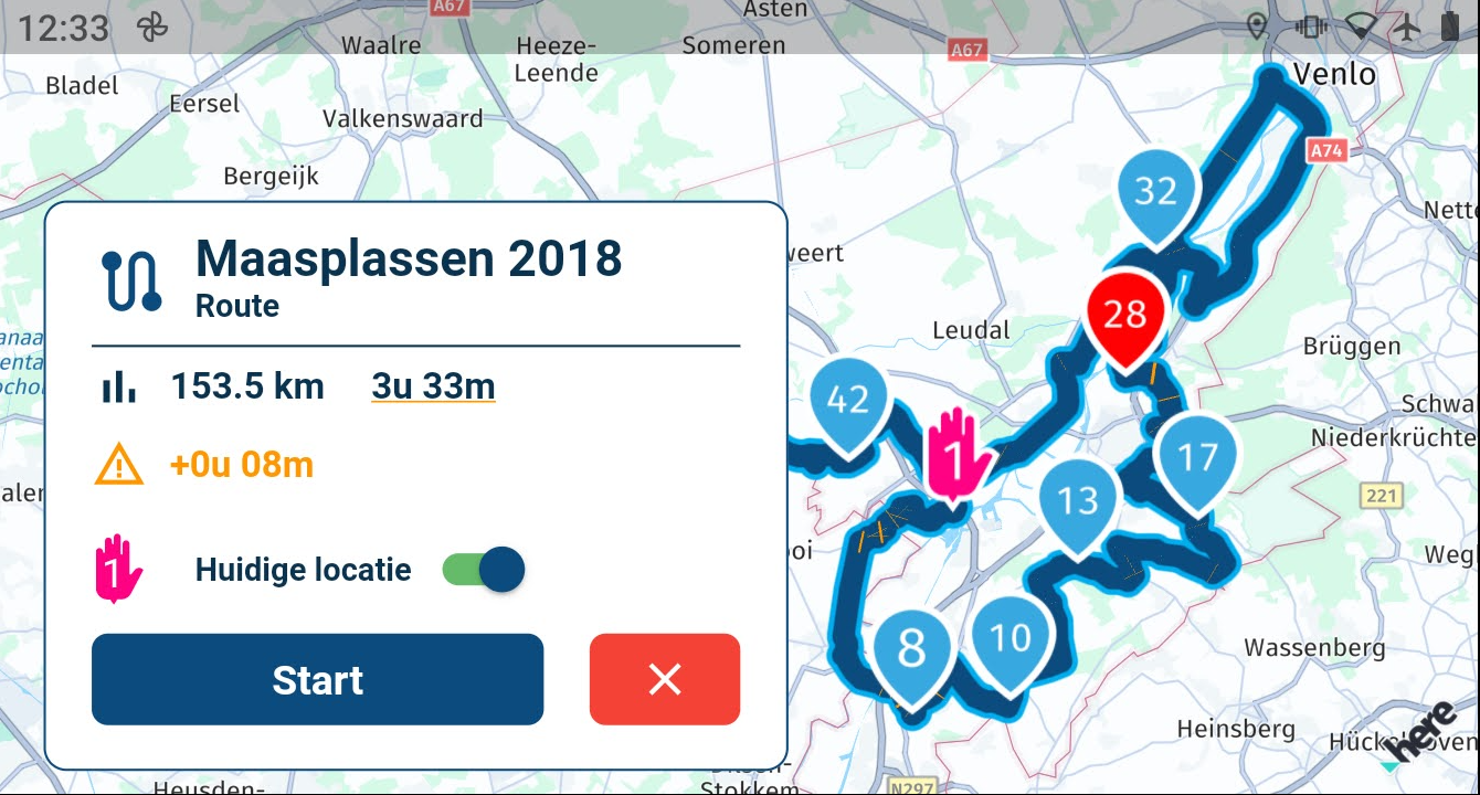
In this route overview you can't read the route info everyone obviously wants to see without swiping. Then if you press button A because you decided to navigate the route you get a second info overview:

Which shows essentially exactly the same information (but a lot more neatly!). Wouldn't it be nice to have the first info screen adapted to look like the second, and and then skip the second one? Or skip the first one completely? I understand the cause for lies in the navigation and non-navigation situation of members, but I think a neater solution would be nice.
Also the info-windows would make better use of real estate if it was adaptable to screen height and could then be less wide, so you can see more of the route itself.
-
You are correct. This is to differentiate between Mobile only users and Navigation users. I feel like this is something to fine tune a bit closer towards the release.
Also, the general landscape mode has already been greatly improved but can still be better. What type of device are you using?
-
You are correct. This is to differentiate between Mobile only users and Navigation users. I feel like this is something to fine tune a bit closer towards the release.
Also, the general landscape mode has already been greatly improved but can still be better. What type of device are you using?
@Corjan-Meijerink, I am using a CAT S52 mostly in the motorbike. In the car I use my daily phone which is a Huawei P30 Pro. In the car mostly in portrait, on the bike mostly in landscape mode.
