New User Observations
-
Over the years I have used just about all the different navigation apps for IOS and both Garmin and TomTom devices. Until recently I have used both Scenic and Calimoto. However both these have issues and so I'm trying MyRoute for a month. MyRoute-app web planner is great and I really like the integration with the app. The MyRoute app is also very good except for two issues.
Navigating.
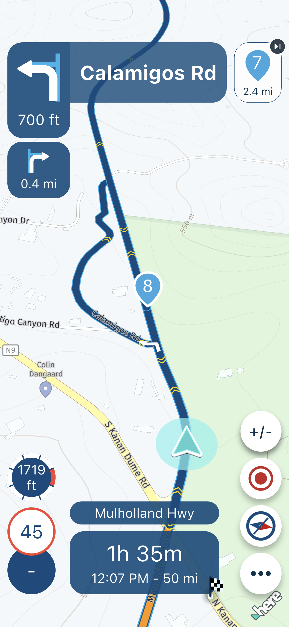
The navigation works well but the font size and roundabout symbol with exit number are far too small. This is primary navigation information which needs to be easily read. Sure sitting at home in my comfy chair I can read it but out on the bike at 60mph in the rain I cannot. I searched the forums and see this has been mentioned before, so why has this not been addressed. Its one thing Calimoto does right. I'm sure I am not alone that likes to navigate without voice commands and depends on visual navigation only. So please make this information bigger.Planning using the IOS app.
Whats the point of favorites ? If you select a favorite the app produces a route for you. Fine. You can adjust this by a selection of curve options and allowed roads but you cannot edit it. So I tried the apps MRA Routeplanner but no favorite menu button. So how can you use a favorite location and plan a route with waypoints ? If I want just a point and go app then I can use Google Maps or Waze.Please consider these observation seriously because they spoil what could just be the best motorcycle navigation app for those of us who like to plan our routes.
-
Over the years I have used just about all the different navigation apps for IOS and both Garmin and TomTom devices. Until recently I have used both Scenic and Calimoto. However both these have issues and so I'm trying MyRoute for a month. MyRoute-app web planner is great and I really like the integration with the app. The MyRoute app is also very good except for two issues.
Navigating.
The navigation works well but the font size and roundabout symbol with exit number are far too small. This is primary navigation information which needs to be easily read. Sure sitting at home in my comfy chair I can read it but out on the bike at 60mph in the rain I cannot. I searched the forums and see this has been mentioned before, so why has this not been addressed. Its one thing Calimoto does right. I'm sure I am not alone that likes to navigate without voice commands and depends on visual navigation only. So please make this information bigger.Planning using the IOS app.
Whats the point of favorites ? If you select a favorite the app produces a route for you. Fine. You can adjust this by a selection of curve options and allowed roads but you cannot edit it. So I tried the apps MRA Routeplanner but no favorite menu button. So how can you use a favorite location and plan a route with waypoints ? If I want just a point and go app then I can use Google Maps or Waze.Please consider these observation seriously because they spoil what could just be the best motorcycle navigation app for those of us who like to plan our routes.
@Peter-Levis said in New User Observations:
the font size and roundabout symbol with exit number are far too small.
Whether the roundabout symbol is readable or not is large dependent on your device you are running MRA on, and on the distance it is mounted. For me, on a 5.6" screen, the tile is readable just fine. The second instruction tile however is not, but I will see that when I get there, so it does not bother me. Also the screen aspect plays a role in this. phones tend to get more stretched only in height. That is not always a pro. Have you tried to navigate in landscape mode? That might improve readability. Besides all this, the app zooms in at each roundabout, so I tend to look at the route line rather then the instruction tiles.
So how can you use a favorite location and plan a route with waypoints ?
In the app's planner mode you can simply search for favorites in the search box. A Waypoint will be inserted at the spot of your favorite.
I am just an enthusiastic MRA user, and hope you will be one too!
Most motorcycle problems are caused by the nut that connects the handlebar to the saddle.
Check out RideSleepRepeat.eu, a biker community for sharing stays across Europe
-
@Peter-Levis said in New User Observations:
the font size and roundabout symbol with exit number are far too small.
Whether the roundabout symbol is readable or not is large dependent on your device you are running MRA on, and on the distance it is mounted. For me, on a 5.6" screen, the tile is readable just fine. The second instruction tile however is not, but I will see that when I get there, so it does not bother me. Also the screen aspect plays a role in this. phones tend to get more stretched only in height. That is not always a pro. Have you tried to navigate in landscape mode? That might improve readability. Besides all this, the app zooms in at each roundabout, so I tend to look at the route line rather then the instruction tiles.
So how can you use a favorite location and plan a route with waypoints ?
In the app's planner mode you can simply search for favorites in the search box. A Waypoint will be inserted at the spot of your favorite.
Thanks for your reply. I'm using an old iphone XR without sim card as my navigation device keeping my newer phone safely tucked away. I navigate in portrait mode and yes I did try landscape orientation and it makes no difference to font or symbol size. I appreciate with route zoom that as you approach a roundabout the map zooms and you can easily see the route. However I still think there is screen room to make the fonts bigger.
In the MRA routeplanner clicking in the search bar only shows my last searches. Typing in the name of one of my favorites does not show that stored favorite unless its been used before. The main map screen has a favorite button. If I select each favorite in turn creating a route and then cancelling the route ie I have used that favorite then sure in the search bar in the planner that favorite will be listed. However if not used they are not listed and typing the name does not bring them up. All the MRA routeplanner needs is a favorite button like the main map screen has.
To test this further I made a favorite using the web planner on my computer. Called it Cromer test. In the iphone app the favorite was listed under favorites. Excellent. Now in the routeplanner tap in the search bar and the favorite is not listed. Type the name Cromer test and still not listed. If I go back to the main map screen and select the favorite which creates a route then cancel route and now go back to the planner and tap in search bar, the favorite Cromer test is shown last one in the list.
Hope this all makes sense.
-
Thanks for your reply. I'm using an old iphone XR without sim card as my navigation device keeping my newer phone safely tucked away. I navigate in portrait mode and yes I did try landscape orientation and it makes no difference to font or symbol size. I appreciate with route zoom that as you approach a roundabout the map zooms and you can easily see the route. However I still think there is screen room to make the fonts bigger.
In the MRA routeplanner clicking in the search bar only shows my last searches. Typing in the name of one of my favorites does not show that stored favorite unless its been used before. The main map screen has a favorite button. If I select each favorite in turn creating a route and then cancelling the route ie I have used that favorite then sure in the search bar in the planner that favorite will be listed. However if not used they are not listed and typing the name does not bring them up. All the MRA routeplanner needs is a favorite button like the main map screen has.
To test this further I made a favorite using the web planner on my computer. Called it Cromer test. In the iphone app the favorite was listed under favorites. Excellent. Now in the routeplanner tap in the search bar and the favorite is not listed. Type the name Cromer test and still not listed. If I go back to the main map screen and select the favorite which creates a route then cancel route and now go back to the planner and tap in search bar, the favorite Cromer test is shown last one in the list.
Hope this all makes sense.
@Peter-Levis, Yes, I was able to reproduce this. It seems like a favorite in the in-app planner is only available once it has been used outside of the app planner first.
I am just an enthusiastic MRA user, and hope you will be one too!
Most motorcycle problems are caused by the nut that connects the handlebar to the saddle.
Check out RideSleepRepeat.eu, a biker community for sharing stays across Europe
-
@Peter-Levis, Yes, I was able to reproduce this. It seems like a favorite in the in-app planner is only available once it has been used outside of the app planner first.
Thanks for checking this. A favorite button on the routeplanner page I think would be very useful. I nearly always like to plan my routes with waypoints. From the main menu selecting a favorite creates a route but its not editable. What I call point and go route no planning required. No use to me.
Thanks. -
Over the years I have used just about all the different navigation apps for IOS and both Garmin and TomTom devices. Until recently I have used both Scenic and Calimoto. However both these have issues and so I'm trying MyRoute for a month. MyRoute-app web planner is great and I really like the integration with the app. The MyRoute app is also very good except for two issues.
Navigating.
The navigation works well but the font size and roundabout symbol with exit number are far too small. This is primary navigation information which needs to be easily read. Sure sitting at home in my comfy chair I can read it but out on the bike at 60mph in the rain I cannot. I searched the forums and see this has been mentioned before, so why has this not been addressed. Its one thing Calimoto does right. I'm sure I am not alone that likes to navigate without voice commands and depends on visual navigation only. So please make this information bigger.Planning using the IOS app.
Whats the point of favorites ? If you select a favorite the app produces a route for you. Fine. You can adjust this by a selection of curve options and allowed roads but you cannot edit it. So I tried the apps MRA Routeplanner but no favorite menu button. So how can you use a favorite location and plan a route with waypoints ? If I want just a point and go app then I can use Google Maps or Waze.Please consider these observation seriously because they spoil what could just be the best motorcycle navigation app for those of us who like to plan our routes.
Welcome @Peter-Levis
-
@Peter-Levis said in New User Observations:
Navigating.
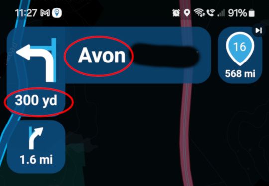
The navigation works well but the font size and roundabout symbol with exit number are far too small. This is primary navigation information which needs to be easily read. Sure sitting at home in my comfy chair I can read it but out on the bike at 60mph in the rain I cannot. I searched the forums and see this has been mentioned before, so why has this not been addressed. Its one thing Calimoto does right. I'm sure I am not alone that likes to navigate without voice commands and depends on visual navigation only. So please make this information bigger.I totally agree.
The 'next instruction' (top left information) is the real value of any satnav system. The map is great for an overview of shape, but what really matters at any point on a journey is the next instruction!In particular, the distance information ('300m') needs to be as large a font as the destination/road name font to it's right. It's considerably smaller even though it's more important as you arrive at the junction.
Please give us an option to change the font size of the next instruction:
-
@Peter-Levis said in New User Observations:
Navigating.
The navigation works well but the font size and roundabout symbol with exit number are far too small. This is primary navigation information which needs to be easily read. Sure sitting at home in my comfy chair I can read it but out on the bike at 60mph in the rain I cannot. I searched the forums and see this has been mentioned before, so why has this not been addressed. Its one thing Calimoto does right. I'm sure I am not alone that likes to navigate without voice commands and depends on visual navigation only. So please make this information bigger.I totally agree.
The 'next instruction' (top left information) is the real value of any satnav system. The map is great for an overview of shape, but what really matters at any point on a journey is the next instruction!In particular, the distance information ('300m') needs to be as large a font as the destination/road name font to it's right. It's considerably smaller even though it's more important as you arrive at the junction.
Please give us an option to change the font size of the next instruction:
This post is deleted! -
@Peter-Levis said in New User Observations:
Navigating.
The navigation works well but the font size and roundabout symbol with exit number are far too small. This is primary navigation information which needs to be easily read. Sure sitting at home in my comfy chair I can read it but out on the bike at 60mph in the rain I cannot. I searched the forums and see this has been mentioned before, so why has this not been addressed. Its one thing Calimoto does right. I'm sure I am not alone that likes to navigate without voice commands and depends on visual navigation only. So please make this information bigger.I totally agree.
The 'next instruction' (top left information) is the real value of any satnav system. The map is great for an overview of shape, but what really matters at any point on a journey is the next instruction!In particular, the distance information ('300m') needs to be as large a font as the destination/road name font to it's right. It's considerably smaller even though it's more important as you arrive at the junction.
Please give us an option to change the font size of the next instruction:
Good to see I'm not the only one who see this as poor design. Information that is primary to navigating should be very easy to read even in the worse conditions. A simple UI change could solve the problem. Move the next waypoint icon (top right) to bottom left above speed icons. Then use all of the top to show the turn information and just increase the font size.
I don't have Apple Carplay or Android Auto but I see in pictures the information is displayed in a bigger font.
I am really loving this app and web route planner. I have spent hours playing and testing and overall it is a very good navigation solution for those that like to plan. So far my only complaints are font size and lack of logical support for favorites in the phone app. It is not easy to add a favorite using the phone app unless you are actually at the place in which case there is a *current location button under favorites main menu.
Favorites needs a button in the app route planner.
The waypoint popup dialog box needs a favorites add button same as the web planner so you can easily make a waypoint a favorite.Then I think it would be one awesome app.
-
Good to see I'm not the only one who see this as poor design. Information that is primary to navigating should be very easy to read even in the worse conditions. A simple UI change could solve the problem. Move the next waypoint icon (top right) to bottom left above speed icons. Then use all of the top to show the turn information and just increase the font size.
I don't have Apple Carplay or Android Auto but I see in pictures the information is displayed in a bigger font.
I am really loving this app and web route planner. I have spent hours playing and testing and overall it is a very good navigation solution for those that like to plan. So far my only complaints are font size and lack of logical support for favorites in the phone app. It is not easy to add a favorite using the phone app unless you are actually at the place in which case there is a *current location button under favorites main menu.
Favorites needs a button in the app route planner.
The waypoint popup dialog box needs a favorites add button same as the web planner so you can easily make a waypoint a favorite.Then I think it would be one awesome app.
@Peter-Levis said in New User Observations:
A simple UI change could solve the problem.
There is nothing easy about an interface that must be readable at a plethora of different sizes, aspects and resolutions. And that multiplied by two, because many prefer either landscape or portrait... During the start phase of this project MANY fonts have changed MANY times, and there are always some complaining it should be bigger or it should be smaller. At current time I think it is what it is.
important factors for readability are:
- the stiffness of the arm. Often the engine vibrations make the text unclear
- the distance to your eyes
- the size of your display, along with the resolution
I am just an enthusiastic MRA user, and hope you will be one too!
Most motorcycle problems are caused by the nut that connects the handlebar to the saddle.
Check out RideSleepRepeat.eu, a biker community for sharing stays across Europe
-
@Peter-Levis said in New User Observations:
A simple UI change could solve the problem.
There is nothing easy about an interface that must be readable at a plethora of different sizes, aspects and resolutions. And that multiplied by two, because many prefer either landscape or portrait... During the start phase of this project MANY fonts have changed MANY times, and there are always some complaining it should be bigger or it should be smaller. At current time I think it is what it is.
important factors for readability are:
- the stiffness of the arm. Often the engine vibrations make the text unclear
- the distance to your eyes
- the size of your display, along with the resolution
Yes I understand what you are saying and appreciate you cannot please everyone. However I'm using an iphone XR mounted directly in front of me up high inline of sight. The layout design and colours look great but for me the size of the distance to go to turn is just too small. The other small fonts are OK as they are not primary to my navigation. The font style is very clear. I guess most users are using comms and so this is all irrelevant. However it does not put me off the app because there are so many good things to like.
To use favorites in the app route planner I have found a workaround. This maybe of interest to someone.
- Open app to default map page.
- Click on search icon top right.
- In pop up dialog box delete all recent searches.
- Now select favorite button to see all favorites listed.
- Select the one you want to use.
- Close the resulting route.
- If you want to use more than one favorite just repeat.
- Open main menu and select app route planner
- Tap in search bar and the favorites will be listed.
You now have them to use. You do not strictly have to delete the search history but it just makes it easier to see your selected favorites you want to use without scrolling to the end of the list.
Sounds a faff but is simple enough to do.
-
@Peter-Levis said in New User Observations:
A simple UI change could solve the problem.
There is nothing easy about an interface that must be readable at a plethora of different sizes, aspects and resolutions. And that multiplied by two, because many prefer either landscape or portrait... During the start phase of this project MANY fonts have changed MANY times, and there are always some complaining it should be bigger or it should be smaller. At current time I think it is what it is.
important factors for readability are:
- the stiffness of the arm. Often the engine vibrations make the text unclear
- the distance to your eyes
- the size of your display, along with the resolution
@Con-Hennekens said in New User Observations:
There is nothing easy about an interface that must be readable at a plethora of different sizes, aspects and resolutions. And that multiplied by two, because many prefer either landscape or portrait...
Changing the font size dynamically within a widget in Flutter is easy - maybe 50 lines to set a default size, add a new 'Instruction Font Size' user setting, listen for display/view changes, find the size of the widget, and then adjust the font size to the equivalent of small/medium/large for the widget size. Testing is a pain across devices, as ever. That's what beta testers are for, though.
That probably represents half a day of work - less if someone is 'in the flow'.
It's just a question of priorities - there may well be more important changes required, like battery, stability, etc.
there are always some complaining it should be bigger or it should be smaller. At current time I think it is what it is.
I fully understand that, but unless users like Peter say what works for them and what doesn't the product quality won't improve. I've upvoted him.
-
@Con-Hennekens said in New User Observations:
There is nothing easy about an interface that must be readable at a plethora of different sizes, aspects and resolutions. And that multiplied by two, because many prefer either landscape or portrait...
Changing the font size dynamically within a widget in Flutter is easy - maybe 50 lines to set a default size, add a new 'Instruction Font Size' user setting, listen for display/view changes, find the size of the widget, and then adjust the font size to the equivalent of small/medium/large for the widget size. Testing is a pain across devices, as ever. That's what beta testers are for, though.
That probably represents half a day of work - less if someone is 'in the flow'.
It's just a question of priorities - there may well be more important changes required, like battery, stability, etc.
there are always some complaining it should be bigger or it should be smaller. At current time I think it is what it is.
I fully understand that, but unless users like Peter say what works for them and what doesn't the product quality won't improve. I've upvoted him.
@richtea999 said in New User Observations:
unless users like Peter say what works for them and what doesn't the product quality won't improve.
Yes, by no means I meant to discharge @Peter-Levis his input. If the screen-estate can be found to enlarge the font, I am all for it. I just wanted to refute the comment on how easy it is
") . There are so many parameters to factor in. And even then some people will want an even bigger font
. There are so many parameters to factor in. And even then some people will want an even bigger font I am just an enthusiastic MRA user, and hope you will be one too!
Most motorcycle problems are caused by the nut that connects the handlebar to the saddle.
Check out RideSleepRepeat.eu, a biker community for sharing stays across Europe
-
@richtea999 said in New User Observations:
unless users like Peter say what works for them and what doesn't the product quality won't improve.
Yes, by no means I meant to discharge @Peter-Levis his input. If the screen-estate can be found to enlarge the font, I am all for it. I just wanted to refute the comment on how easy it is
. There are so many parameters to factor in. And even then some people will want an even bigger font @Con-Hennekens said in New User Observations:
@richtea999 said in New User Observations:
unless users like Peter say what works for them and what doesn't the product quality won't improve.
Yes, by no means I meant to discharge @Peter-Levis his input. If the screen-estate can be found to enlarge the font, I am all for it. I just wanted to refute the comment on how easy it is
. There are so many parameters to factor in. And even then some people will want an even bigger font No offence taken. I totally get that all devices have to be taken into account but I'm sure the developers have a bank of test devices. I am presuming that the app is written in a modern object language where the UI is separate from the engine. I have an interest in programming and have dabbled in languages such as Flutter and in the past Basic, C, C++ Delphi and even Pythonista on my phone. In those languages it is indeed very easy to test an increase in font size. It does not have to be as large as the road text but maybe just one or two font sizes up. It just needs a tweak.
I'm sure the developers are busy on many other projects but I hope they keep their eye on the main objective that the app is used for navigating on a motorcycle with or without voice commands.
As you say it is what it is. Just an observation from someone who is interested in UI design.
Hello! It looks like you're interested in this conversation, but you don't have an account yet.
Getting fed up of having to scroll through the same posts each visit? When you register for an account, you'll always come back to exactly where you were before, and choose to be notified of new replies (either via email, or push notification). You'll also be able to save bookmarks and upvote posts to show your appreciation to other community members.
With your input, this post could be even better 💗
Register Login-
0421.9k
-
1845.3k
-
013240
-
0460
-
0327
-
0361
-
0247
-
02114