UX DESIGN & INTEGRATION
-
new paid up navigation next user here. Sadly , I’m not impressed. I was hoping this product would rival Calimoto , but sadly it’s miles off the mark . What pains me the most is the way the new Nav Next is integrated into the older app for route creation . It’s confusing , the UX design is so different and some of the user flows just don’t make sense .
I’ll start to add examples here -- The UX interface looks different when you select round trip or new route .
- When selecting new route , why are always displaying a box telling me about your website . Stop it .
- When I select new route , and closed the box (above) , you then ask be to complete a new route box . Stop it. If I want to save the route then let me chose to, or do so automatically. Stop putting up boxes .
- Select new route , then cancel the boxes, then hit generator. It sends you to a screen that makes no sense , looks nothing like nav next. UX….
Finally , the one feature I’m looking for , round trip…. Yes it produces a round trip , but it’s random ! No control of time , distance or direction. Bonkers . Makes the main feature unusable . If I want to ride for an hour on my bike, what am I suppose to do? Hit the round trip button a million times until something useful appears ? Bonkers .
Does anyone else feel the same way? It pains me so much I want to ask for a refund .
@Fifield-Nick
Hi @Fifield-Nick ,
Too bad you have this experience, maybe your thinking is wrong because MRA is a different product than Calimoto.
Many users think otherwise. Or maybe you need to get to know the App better, you've only been using it for 2 days.
Do you also create your routes in the planner (website) of MRA?If you want to cancel your purchase, you can do so, create a ticket via the website.
-
@Fifield-Nick
Hi @Fifield-Nick ,
Too bad you have this experience, maybe your thinking is wrong because MRA is a different product than Calimoto.
Many users think otherwise. Or maybe you need to get to know the App better, you've only been using it for 2 days.
Do you also create your routes in the planner (website) of MRA?If you want to cancel your purchase, you can do so, create a ticket via the website.
@Hans-van-de-Ven-MRA-Master
Thanks I will
-
new paid up navigation next user here. Sadly , I’m not impressed. I was hoping this product would rival Calimoto , but sadly it’s miles off the mark . What pains me the most is the way the new Nav Next is integrated into the older app for route creation . It’s confusing , the UX design is so different and some of the user flows just don’t make sense .
I’ll start to add examples here -- The UX interface looks different when you select round trip or new route .
- When selecting new route , why are always displaying a box telling me about your website . Stop it .
- When I select new route , and closed the box (above) , you then ask be to complete a new route box . Stop it. If I want to save the route then let me chose to, or do so automatically. Stop putting up boxes .
- Select new route , then cancel the boxes, then hit generator. It sends you to a screen that makes no sense , looks nothing like nav next. UX….
Finally , the one feature I’m looking for , round trip…. Yes it produces a round trip , but it’s random ! No control of time , distance or direction. Bonkers . Makes the main feature unusable . If I want to ride for an hour on my bike, what am I suppose to do? Hit the round trip button a million times until something useful appears ? Bonkers .
Does anyone else feel the same way? It pains me so much I want to ask for a refund .
@Fifield-Nick
- True, New route is a function in an embedded view on the website. This will be taken on later in development. The roundtour though is native too the app and very powerful!
- The MRA service is not only an App. I think it is good letting people know about that. The popup showing up each time is unintentional and already fixed in the upcoming update
- Is inherent to the service. It makes no sense making routes and throw them away immediately, does it? It's just how MyRoute-App works.
- No if you cancel making a route you get back to the main menu. It actually does make sense. If you want to make a route, don't cancel it...
- (I'll make your last point 5
 ). I think you should be less dogmatized by Calimoto and let the powerfulness of the roundtour generator sink in...

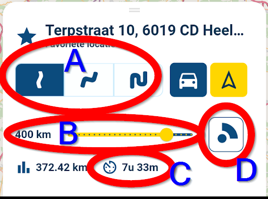
A = curvyness
B = Length in distance
C = Length in Time
D = Direction of the roundtripAnd if you scroll down in that window:

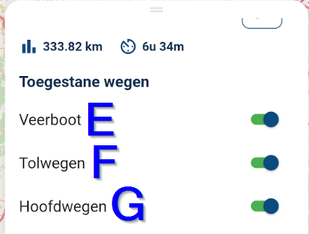
E = avoid Ferries
F = Avoid Toll roads
G = Avoid main roadsI cannot think of anything you may wish for...
I don't think the intention of the developers was to make a Calimoto clone.
If you give it a chance instead of dismissing it without knowing how it works, you might actually like it. Many do. -
@Fifield-Nick
- True, New route is a function in an embedded view on the website. This will be taken on later in development. The roundtour though is native too the app and very powerful!
- The MRA service is not only an App. I think it is good letting people know about that. The popup showing up each time is unintentional and already fixed in the upcoming update
- Is inherent to the service. It makes no sense making routes and throw them away immediately, does it? It's just how MyRoute-App works.
- No if you cancel making a route you get back to the main menu. It actually does make sense. If you want to make a route, don't cancel it...
- (I'll make your last point 5
 ). I think you should be less dogmatized by Calimoto and let the powerfulness of the roundtour generator sink in...

A = curvyness
B = Length in distance
C = Length in Time
D = Direction of the roundtripAnd if you scroll down in that window:

E = avoid Ferries
F = Avoid Toll roads
G = Avoid main roadsI cannot think of anything you may wish for...
I don't think the intention of the developers was to make a Calimoto clone.
If you give it a chance instead of dismissing it without knowing how it works, you might actually like it. Many do.@Con-Hennekens said in UX DESIGN & INTEGRATION:
C = Length in Time
Cannot agree with you more, except for the fact that one might like the Length in Time to be an input as well. Now only trip distance can be changed and the duration is calculated accordingly.
If one wants to drive for a certain duration, say 2h, now one needs to update the distance slider to match the duration of 2h. Making these two inputs possible, makes the generator even more powerful!

-
@Con-Hennekens said in UX DESIGN & INTEGRATION:
C = Length in Time
Cannot agree with you more, except for the fact that one might like the Length in Time to be an input as well. Now only trip distance can be changed and the duration is calculated accordingly.
If one wants to drive for a certain duration, say 2h, now one needs to update the distance slider to match the duration of 2h. Making these two inputs possible, makes the generator even more powerful!

@StefanHummelink, True, but sliding that slider and watch the duration change gets you in the ballpark quite easily.
