Some new suggestions
-

Just a few "little" suggestions, all concerning smartphone usage.
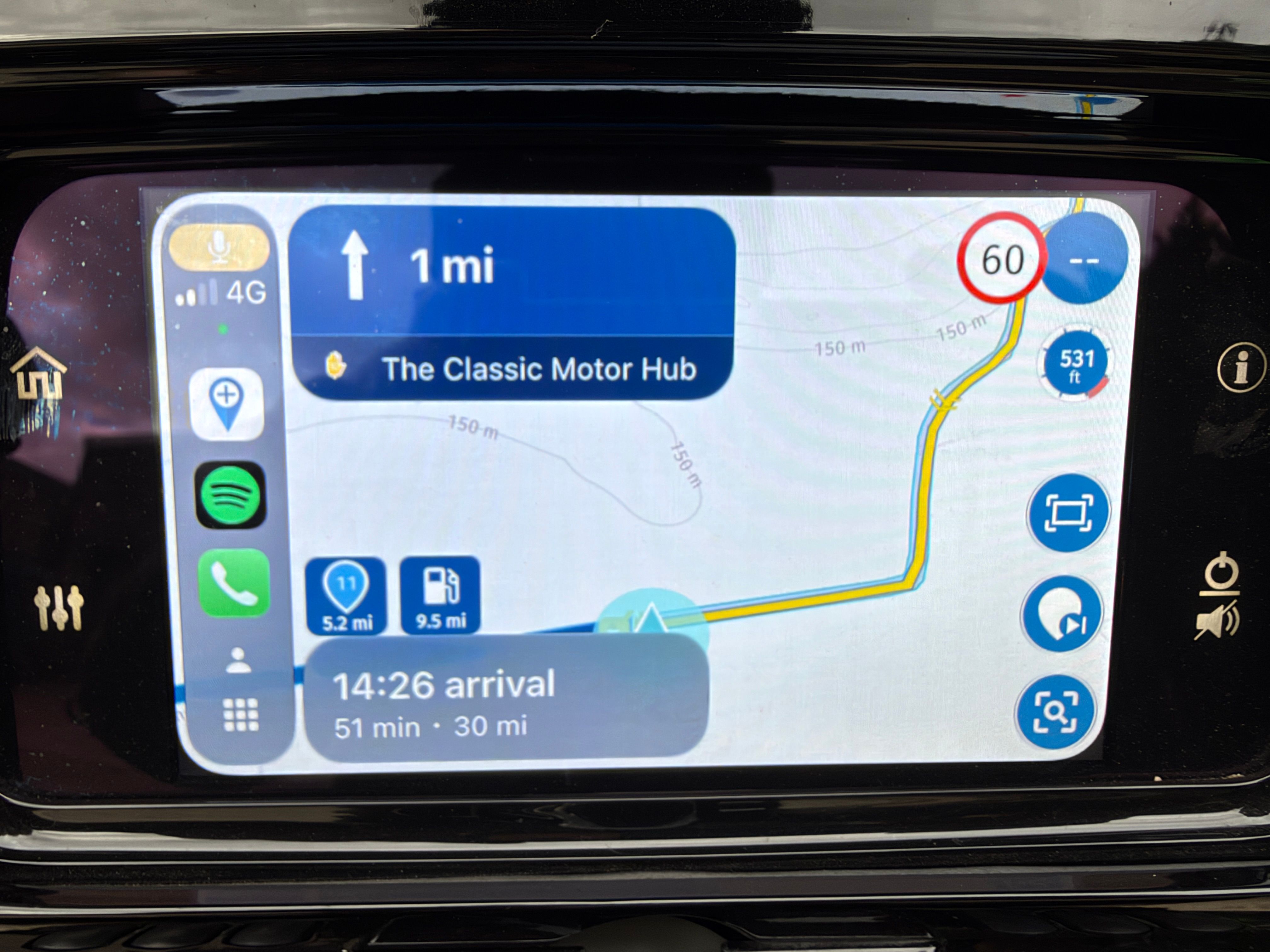
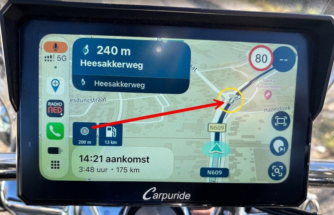
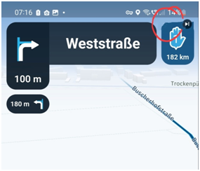
Greetings, Ronni- I would place the button that indicates the waypoint to be skipped on the right side of the hand. The symbol shows a right edge and that fits better on the right side of the hand. Overall, only a design point, not so important .
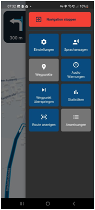
- I can't remember exactly, but has it always been the case that the settings block only took up part of the screen and not the whole screen?
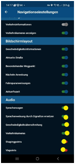
- As already mentioned in another post, the switch positions can hardly be seen in sunny light. The whole picture is kept very dark. Maybe you can replace the blue circle with a lighter one (e.g. yellow here)?
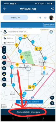
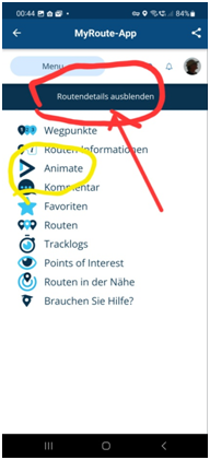
- Another design point: If you want to show "Routendetails anzeigen", the button is placed below, If you now want to go back and want to click "Routendetals ausblenden", the button is at the top. Can't you leave it in the same place like a switch? It doesn't matter if it's up or down.
Samsung Galaxy A56 5G
Android 16
One UI Vers. 8.0
Carpuride W712D
Silverfox BT Cntroller H1+ -
Just a few "little" suggestions, all concerning smartphone usage.
Greetings, Ronni- I would place the button that indicates the waypoint to be skipped on the right side of the hand. The symbol shows a right edge and that fits better on the right side of the hand. Overall, only a design point, not so important .
- I can't remember exactly, but has it always been the case that the settings block only took up part of the screen and not the whole screen?
- As already mentioned in another post, the switch positions can hardly be seen in sunny light. The whole picture is kept very dark. Maybe you can replace the blue circle with a lighter one (e.g. yellow here)?
- Another design point: If you want to show "Routendetails anzeigen", the button is placed below, If you now want to go back and want to click "Routendetals ausblenden", the button is at the top. Can't you leave it in the same place like a switch? It doesn't matter if it's up or down.

@Ronni Thanks for the feedback!
1: We'll see what we can do. It was placed on the left side intentionally as we believed the right side would be a bit too close to the edge of the screen.
2: This was always the case

3: We'll check and improve the styling!
4: I don't think this is something we can change easily but thanks for suggesting anyway!
Cheers

Hello! It looks like you're interested in this conversation, but you don't have an account yet.
Getting fed up of having to scroll through the same posts each visit? When you register for an account, you'll always come back to exactly where you were before, and choose to be notified of new replies (either via email, or push notification). You'll also be able to save bookmarks and upvote posts to show your appreciation to other community members.
With your input, this post could be even better 💗
Register Login-
 0714
0714
-
0527
-
 0584
0584
-
 2424
2424
-
16145
-
 0427
0427
-
 0417
0417
-
0332