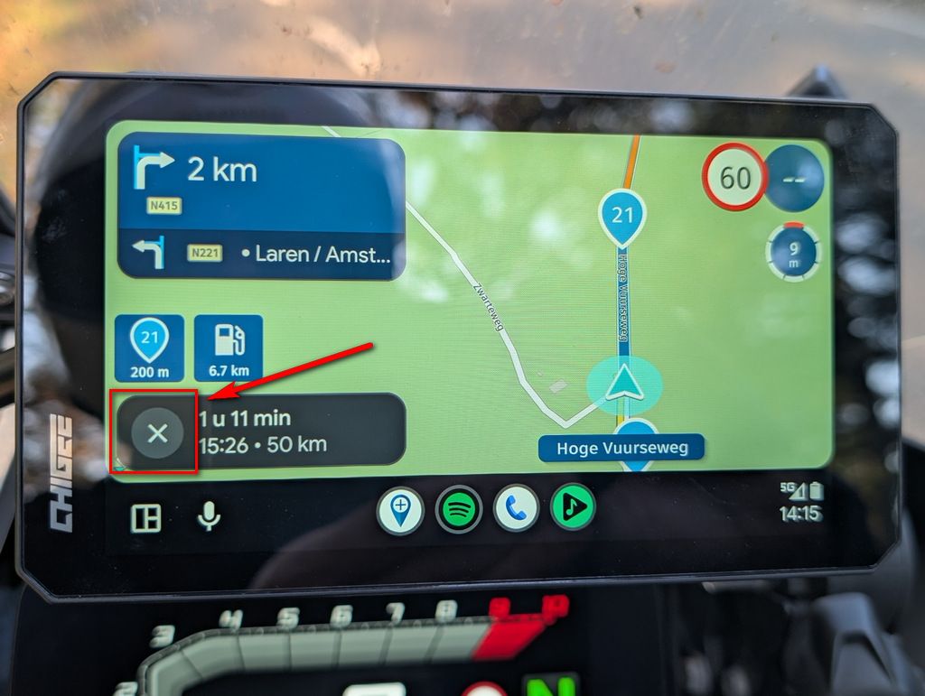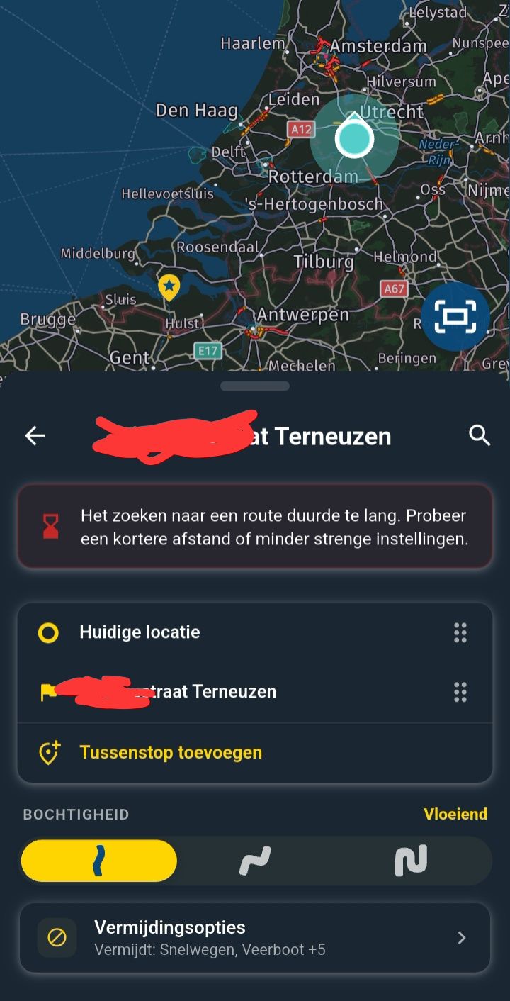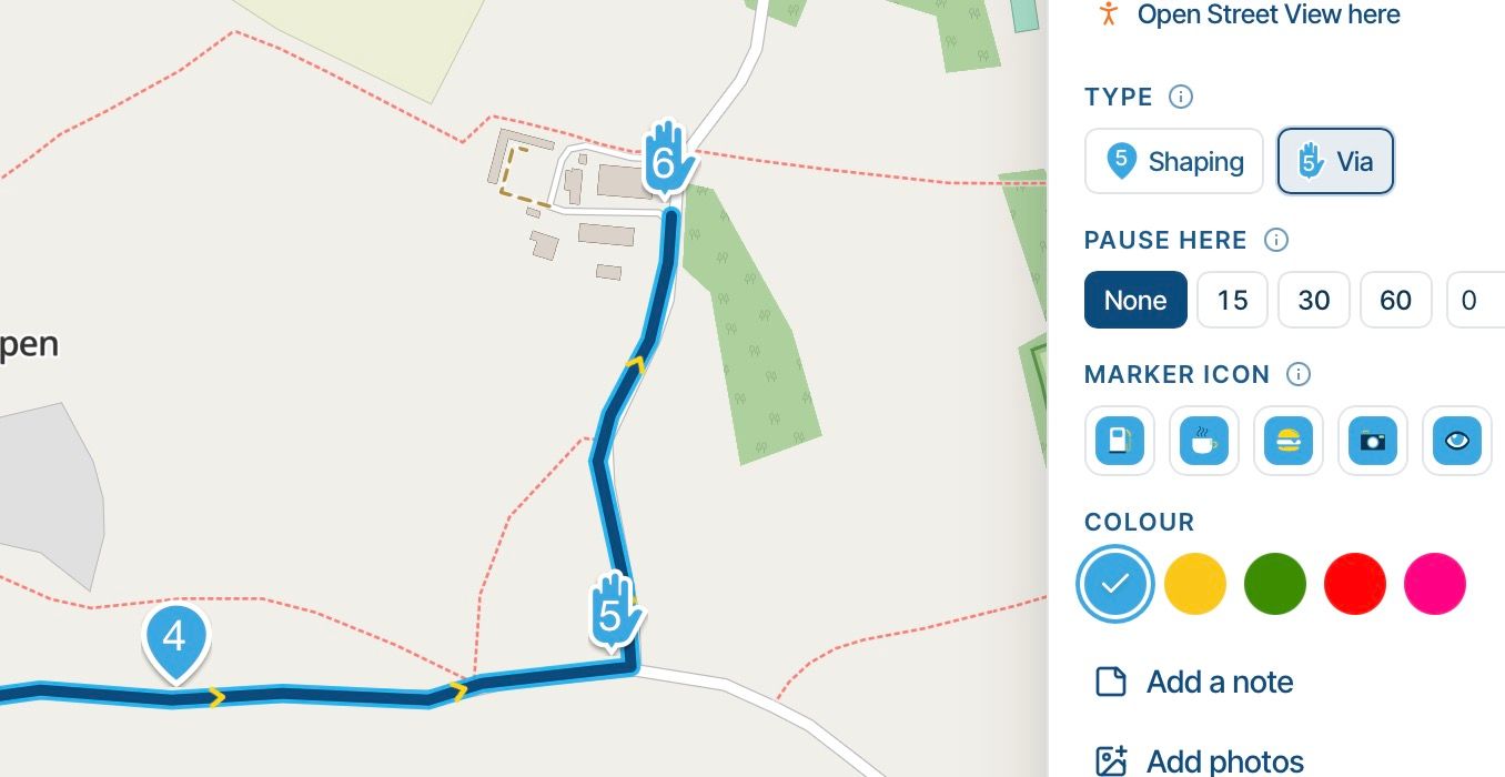
Icons - hard to read
-

I am testing on several displays - from a 65" 8K screen down to iphone and android phones.
I'm having difficulty seeing these on some displays:
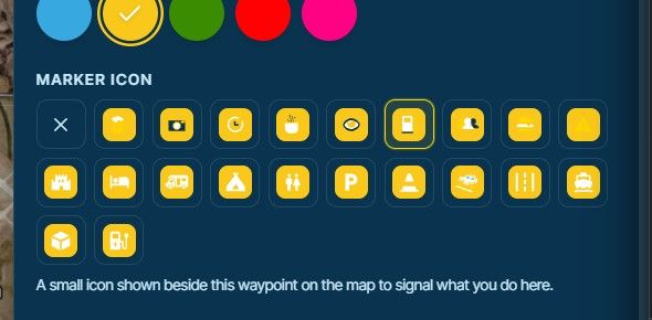
I love the color selector above and how easy it is to use.
Two suggestions:
- a second color bar (including black) for the color of the graphic on the box. Being able to toggle to black -or other colors - on yellow would make it much easier to see.
Example: POI for fuel is blue on yellow - so much easier to read than my white on yellow fuel waypoint:
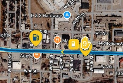
- More colors!

Working in dark mode vs light mode... more color options would be appreciated.
p.s. I don't know if it was on purpose or incidental, but thank you for fixing the refresh issues on an 8K display when resizing the map window! In the old MRA a reload of the page is required to get the tiling to work correctly.

-

Yeah, agree. I've changed the color a bit

-
Corjan Meijerink locked this topic
Hello! It looks like you're interested in this conversation, but you don't have an account yet.
Getting fed up of having to scroll through the same posts each visit? When you register for an account, you'll always come back to exactly where you were before, and choose to be notified of new replies (either via email, or push notification). You'll also be able to save bookmarks and upvote posts to show your appreciation to other community members.
With your input, this post could be even better 💗
Register Login-
 022331
-
01358
-
 2221.5k
-
011174
-
 01156
-
0842
-
 112147
-
 0739