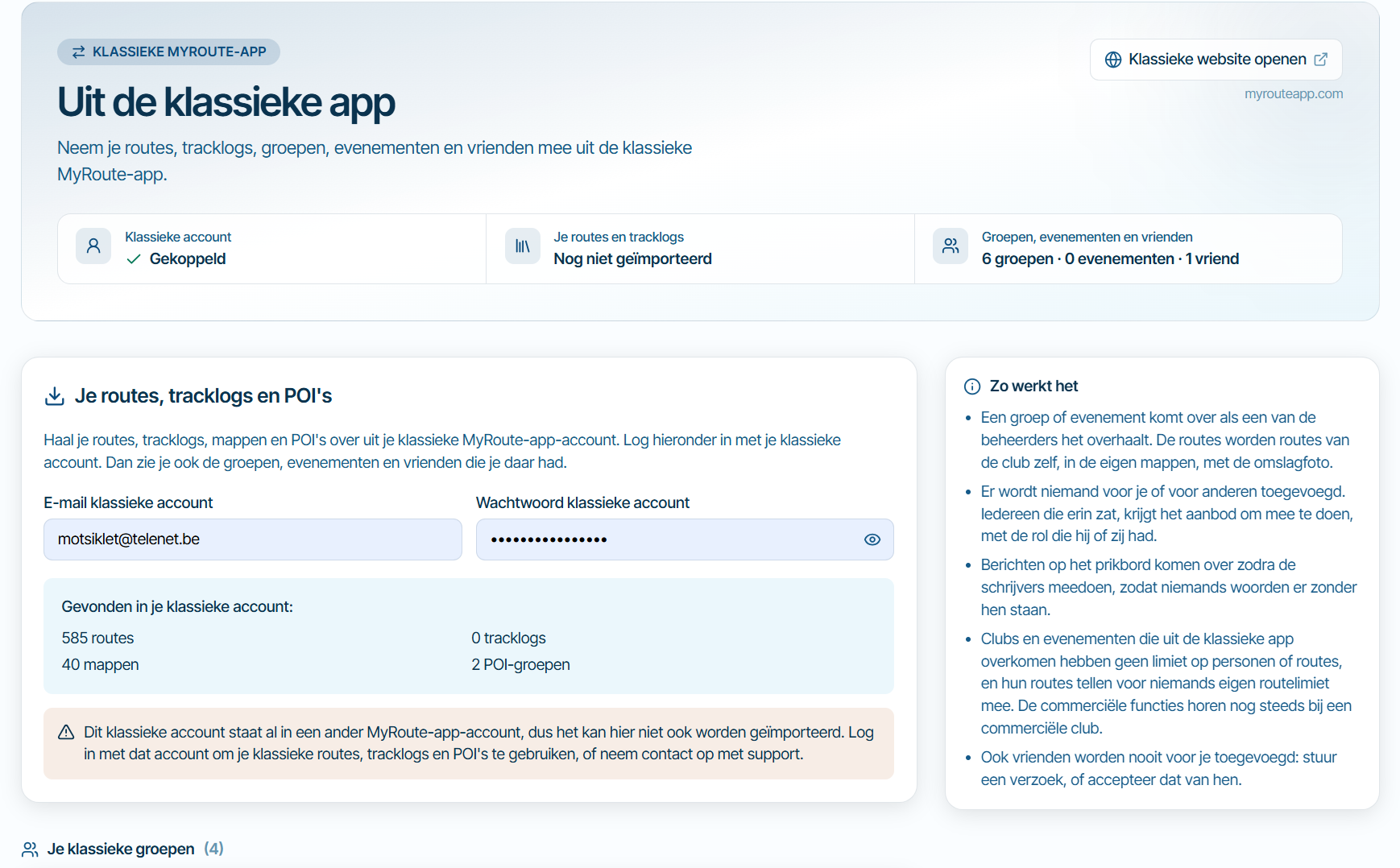
Improving readability of the planner menu
-

To make the menu easier to read, I suggest distinguishing or highlighting section headings—such as "Toolkit," "POI," "Routing settings," etc.—from the sub-menu items.
Currently, everything uses the same font and size, which makes it less intuitive to quickly identify a heading and use the adjacent arrow to expand or collapse it.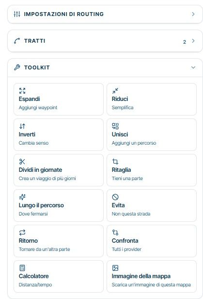
Thanks a lot
Hello! It looks like you're interested in this conversation, but you don't have an account yet.
Getting fed up of having to scroll through the same posts each visit? When you register for an account, you'll always come back to exactly where you were before, and choose to be notified of new replies (either via email, or push notification). You'll also be able to save bookmarks and upvote posts to show your appreciation to other community members.
With your input, this post could be even better 💗
Register Login-
 01898
-
 117131
-
015107
-
 01186
-
 2756
-
 0769
-
0751
-
0750