Suggestions - Route display, Settings & Home screen icon
-
I have been using the Navigation Next latest release 3.2.8 in the car for a few journeys. Generally, I think this version is an excellent progression from 3.2.7 and it is stable in use provided the phone signal is good. Hopefully, offline maps will cure any problems with recalculating the route.
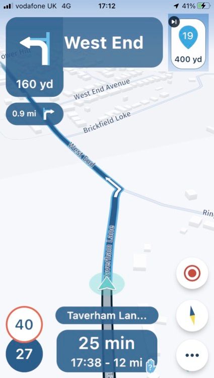
I only have one major criticism, which is that displaying waypoints in the directions window is still masking the more important information of what to do at the next turning, roundabout etc - see photo. And it is not possible to turn this feature off. I do not really see the benefit of this feature, but in any event this information can optionally be displayed by selecting ‘show upcoming waypoints’ in the Settings menu.
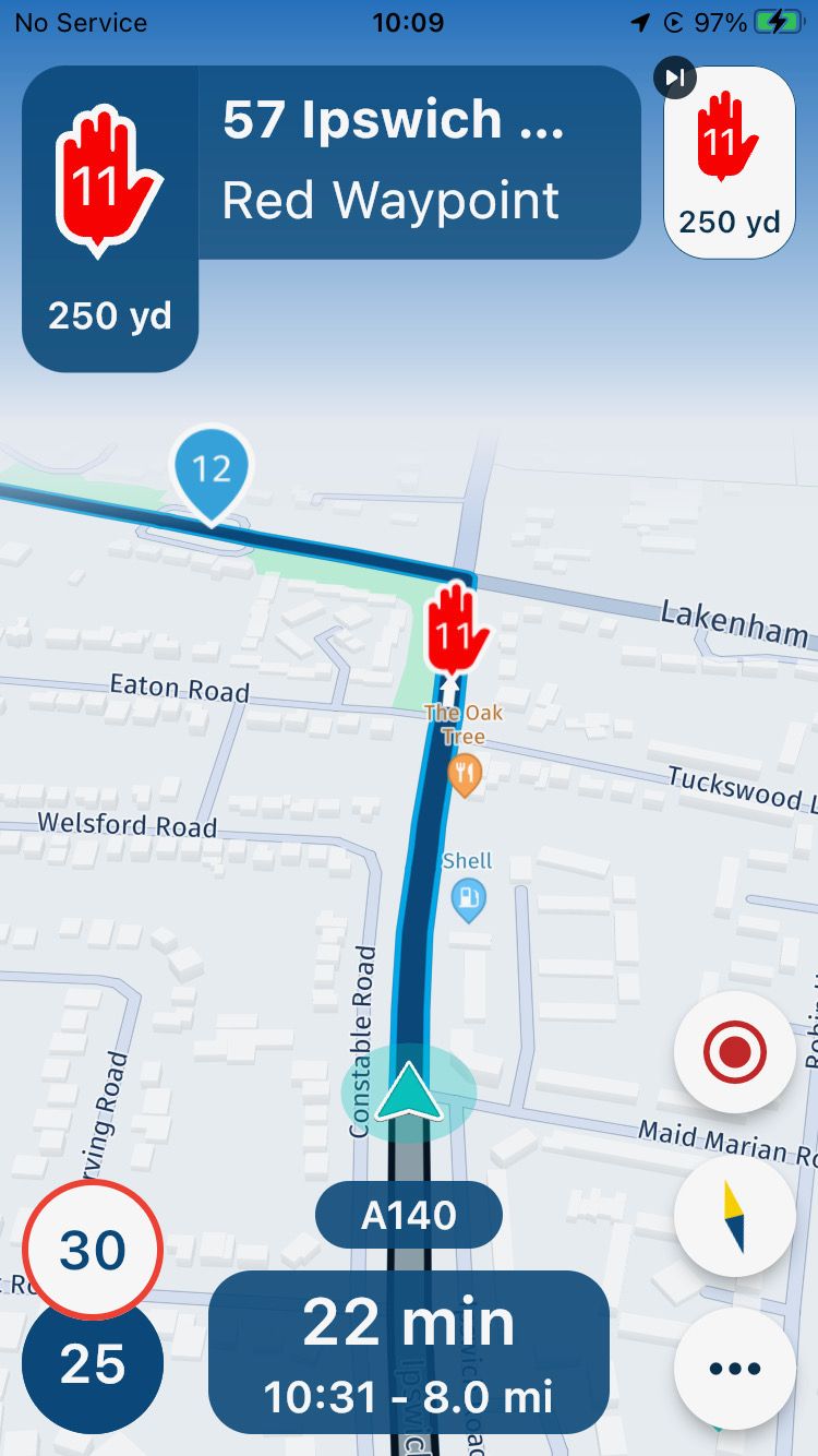
My other comments and suggestions are -
Route display
-
I am very glad to see the ‘skip waypoint’ feature back on the main screen! This is essential in my opinion.
-
There is little benefit in showing the distance/time to every waypoint. I suggest this feature be limited (or is an option) to waypoints or POI’s that can be set up to be viewed when planning the route. This way the distance/time to a coffee stop, POI etc could displayed on screen. Possibly this could be done by toggling the display button - press once to display total distance/time, press again to display distance/time to designated waypoints, press again to display distance/time to all waypoints. Btw is the distance/time to next waypoint duplicated at present? Pressing twice seems to display the same information.
-
Displaying the waypoint note at the top of the screen is a great feature! I will use this to give information about the waypoint, such as name of cafe, poi etc.
-
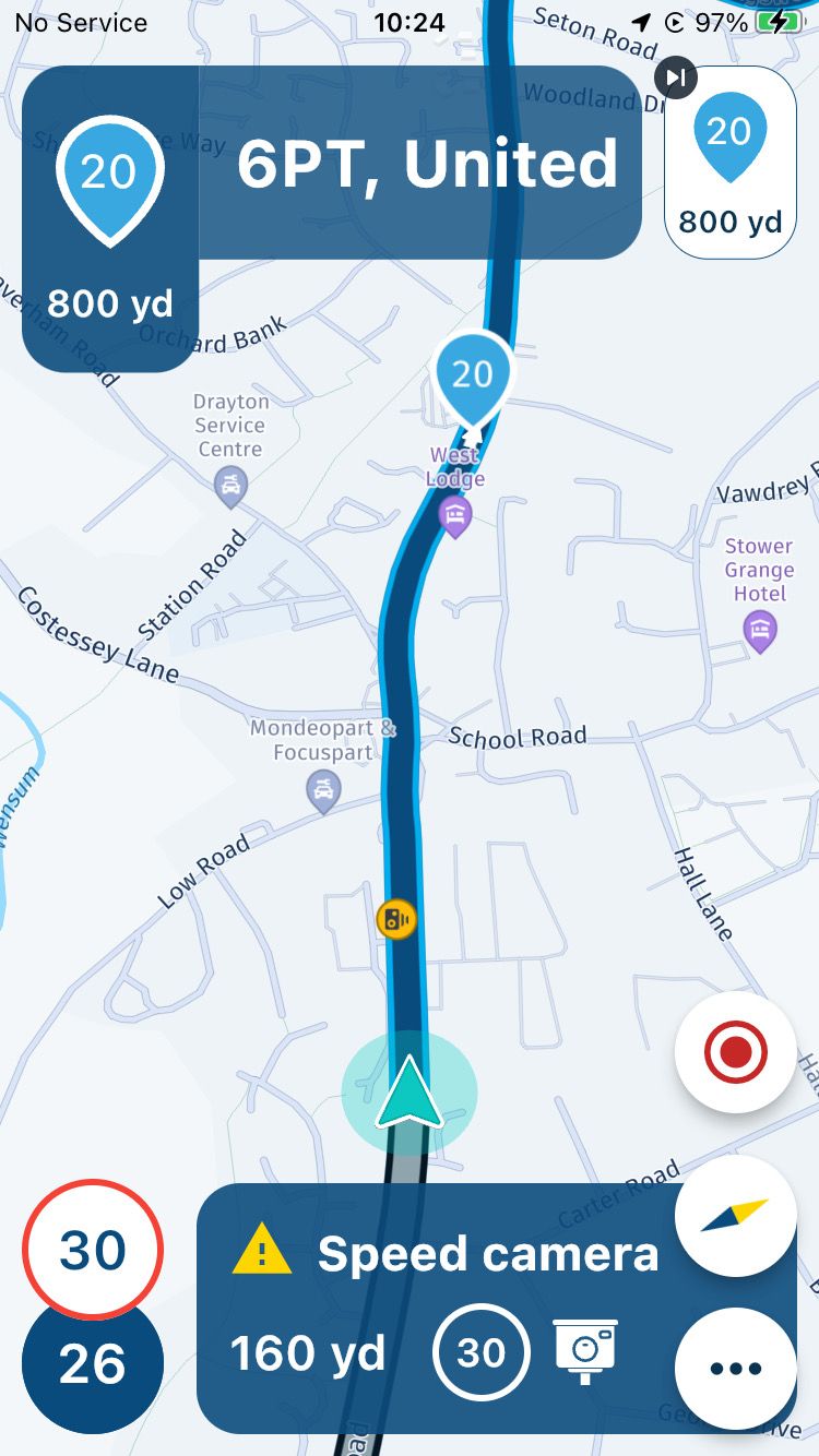
A small point regarding how an address is displayed, which includes the full address including postcode and even the country! This makes the display too lengthy to fit in the screen - see photo. Could addresses be abbreviated to fit the screen better?
Settings menu
-
What does ‘Next Instruction’ do?
-
In the audio menu the slider button for toggling on & off announcement of shaping & via points does not work.
-
Most navigation apps have an option to display upcoming petrol stations. The previous MRA Navigation would only show the nearest petrol station, and annoyingly this would be even if it is earlier in the route, which resulted in the distance to the petrol station actually increasing with distance travelled! So the petrol stations displayed should be AHEAD and ON THE ROUTE. Perhaps an option to amend the route to go via to the selected petrol station too?
-
As I have suggested before, an option to customise voice guidance should be a ‘must have’ before general release. The current voice is awful!
-
Also, a submenu to customise warning sounds would be useful - I would have a loud siren to warn of speed cameras!
Home screen icon
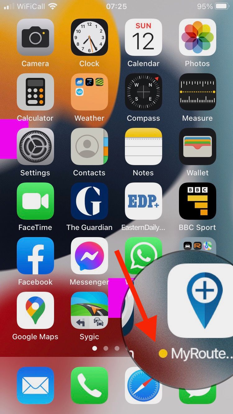
- The MyRoute app icon on my home screen has an orange dot by it, meaning the mic is in use - see photo. It is not possible to turn this off in privacy settings of the phone.
I hope these comments are of use.
The new app is shaping up very well and I am sure it will be a winner. I am looking forward to trying out on my motorbike later on this week, weather permitting - my first time out since 1st December!
-
-
I have been using the Navigation Next latest release 3.2.8 in the car for a few journeys. Generally, I think this version is an excellent progression from 3.2.7 and it is stable in use provided the phone signal is good. Hopefully, offline maps will cure any problems with recalculating the route.
I only have one major criticism, which is that displaying waypoints in the directions window is still masking the more important information of what to do at the next turning, roundabout etc - see photo. And it is not possible to turn this feature off. I do not really see the benefit of this feature, but in any event this information can optionally be displayed by selecting ‘show upcoming waypoints’ in the Settings menu.

My other comments and suggestions are -
Route display
-
I am very glad to see the ‘skip waypoint’ feature back on the main screen! This is essential in my opinion.
-
There is little benefit in showing the distance/time to every waypoint. I suggest this feature be limited (or is an option) to waypoints or POI’s that can be set up to be viewed when planning the route. This way the distance/time to a coffee stop, POI etc could displayed on screen. Possibly this could be done by toggling the display button - press once to display total distance/time, press again to display distance/time to designated waypoints, press again to display distance/time to all waypoints. Btw is the distance/time to next waypoint duplicated at present? Pressing twice seems to display the same information.
-
Displaying the waypoint note at the top of the screen is a great feature! I will use this to give information about the waypoint, such as name of cafe, poi etc.
-
A small point regarding how an address is displayed, which includes the full address including postcode and even the country! This makes the display too lengthy to fit in the screen - see photo. Could addresses be abbreviated to fit the screen better?

Settings menu
-
What does ‘Next Instruction’ do?
-
In the audio menu the slider button for toggling on & off announcement of shaping & via points does not work.
-
Most navigation apps have an option to display upcoming petrol stations. The previous MRA Navigation would only show the nearest petrol station, and annoyingly this would be even if it is earlier in the route, which resulted in the distance to the petrol station actually increasing with distance travelled! So the petrol stations displayed should be AHEAD and ON THE ROUTE. Perhaps an option to amend the route to go via to the selected petrol station too?
-
As I have suggested before, an option to customise voice guidance should be a ‘must have’ before general release. The current voice is awful!
-
Also, a submenu to customise warning sounds would be useful - I would have a loud siren to warn of speed cameras!
Home screen icon
- The MyRoute app icon on my home screen has an orange dot by it, meaning the mic is in use - see photo. It is not possible to turn this off in privacy settings of the phone.

I hope these comments are of use.
The new app is shaping up very well and I am sure it will be a winner. I am looking forward to trying out on my motorbike later on this week, weather permitting - my first time out since 1st December!
@David-Bonner The orange dot next to the app icon does not mean the mic is on, it means it's a TestFlight beta app instead of a regular app. See this document from Apple: https://testflight.apple.com
An orange dot appears in the status bar at the top of the screen if an app is using the microphone (which MRA Mobile/Navigation Next beta doesn't do). See this Apple support document about that.
-
-
Thanks, I did not know that.
-
I have been using the Navigation Next latest release 3.2.8 in the car for a few journeys. Generally, I think this version is an excellent progression from 3.2.7 and it is stable in use provided the phone signal is good. Hopefully, offline maps will cure any problems with recalculating the route.
I only have one major criticism, which is that displaying waypoints in the directions window is still masking the more important information of what to do at the next turning, roundabout etc - see photo. And it is not possible to turn this feature off. I do not really see the benefit of this feature, but in any event this information can optionally be displayed by selecting ‘show upcoming waypoints’ in the Settings menu.

My other comments and suggestions are -
Route display
-
I am very glad to see the ‘skip waypoint’ feature back on the main screen! This is essential in my opinion.
-
There is little benefit in showing the distance/time to every waypoint. I suggest this feature be limited (or is an option) to waypoints or POI’s that can be set up to be viewed when planning the route. This way the distance/time to a coffee stop, POI etc could displayed on screen. Possibly this could be done by toggling the display button - press once to display total distance/time, press again to display distance/time to designated waypoints, press again to display distance/time to all waypoints. Btw is the distance/time to next waypoint duplicated at present? Pressing twice seems to display the same information.
-
Displaying the waypoint note at the top of the screen is a great feature! I will use this to give information about the waypoint, such as name of cafe, poi etc.
-
A small point regarding how an address is displayed, which includes the full address including postcode and even the country! This makes the display too lengthy to fit in the screen - see photo. Could addresses be abbreviated to fit the screen better?

Settings menu
-
What does ‘Next Instruction’ do?
-
In the audio menu the slider button for toggling on & off announcement of shaping & via points does not work.
-
Most navigation apps have an option to display upcoming petrol stations. The previous MRA Navigation would only show the nearest petrol station, and annoyingly this would be even if it is earlier in the route, which resulted in the distance to the petrol station actually increasing with distance travelled! So the petrol stations displayed should be AHEAD and ON THE ROUTE. Perhaps an option to amend the route to go via to the selected petrol station too?
-
As I have suggested before, an option to customise voice guidance should be a ‘must have’ before general release. The current voice is awful!
-
Also, a submenu to customise warning sounds would be useful - I would have a loud siren to warn of speed cameras!
Home screen icon
- The MyRoute app icon on my home screen has an orange dot by it, meaning the mic is in use - see photo. It is not possible to turn this off in privacy settings of the phone.

I hope these comments are of use.
The new app is shaping up very well and I am sure it will be a winner. I am looking forward to trying out on my motorbike later on this week, weather permitting - my first time out since 1st December!
@David-Bonner Thank you so much for the elaborate feedback!

Offline maps will be implemented in one of the next updates so that is something to definitely look forwards too!

Regarding the waypoint being shown top left, they have fundamentally different meanings. This allows you to see the title you added and any further information. I see that you understand that and I like the idea of adding a user preference for that. Unfortunately it's rather annoying to technically get this implemented (due to the nature of waypoint navigation) but we will take a look at it!
Route display
- Definitely nice this is back! Unfortunately something broke in the 3.2.7 update, it was never intentionally removed
- Thanks for the idea
- We like it too

- The address matches what is entered in the routeplanner, this is determined automatically (unless turned off in the toolkit) and can indeed include the country.
Settings
- Next instruction shows the subsequent instruction. I'm a bit lazy (forgive me), see this forum post about a discussion about it: https://forum.myrouteapp.com/topic/3313/trial-run-today-3-2-8-151
- That's weird, we would need to investigate that. We actually received confirmation that these settings worked again in this update.
- This will definitely be implemented in a future update!
- Same as above

- Might do that
Home screen icon
- Thanks @Herko-ter-Horst, you are absolutely right!

@David-Bonner appreciate your feedback

-
-
@David-Bonner Thank you so much for the elaborate feedback!

Offline maps will be implemented in one of the next updates so that is something to definitely look forwards too!

Regarding the waypoint being shown top left, they have fundamentally different meanings. This allows you to see the title you added and any further information. I see that you understand that and I like the idea of adding a user preference for that. Unfortunately it's rather annoying to technically get this implemented (due to the nature of waypoint navigation) but we will take a look at it!
Route display
- Definitely nice this is back! Unfortunately something broke in the 3.2.7 update, it was never intentionally removed
- Thanks for the idea
- We like it too

- The address matches what is entered in the routeplanner, this is determined automatically (unless turned off in the toolkit) and can indeed include the country.
Settings
- Next instruction shows the subsequent instruction. I'm a bit lazy (forgive me), see this forum post about a discussion about it: https://forum.myrouteapp.com/topic/3313/trial-run-today-3-2-8-151
- That's weird, we would need to investigate that. We actually received confirmation that these settings worked again in this update.
- This will definitely be implemented in a future update!
- Same as above

- Might do that
Home screen icon
- Thanks @Herko-ter-Horst, you are absolutely right!

@David-Bonner appreciate your feedback

Thanks for the quick reply Corjan, and for your clear explanations.
I used the app again today and the slider button for toggling on & off announcement of shaping & via points is functioning correctly. So no need to investigate this - I must have got that wrong last week, apologies.
I used the ‘Next Instruction’ option on a simple A to B route today, ie no waypoints. It worked well, showing both the next turning and the subsequent one. However, on a preplanned route, ie with waypoints, the waypoints display (top left) over-rides the instruction for the upcoming turning which, as I said before, I believe is a significant issue. It also prevents subsequent turnings being displayed.
I have attached photo montage of how I think the layout should be for a preplanned route - ie same as an ‘A to B’ route but with Waypoint information (and delete waypoint) displayed top right.
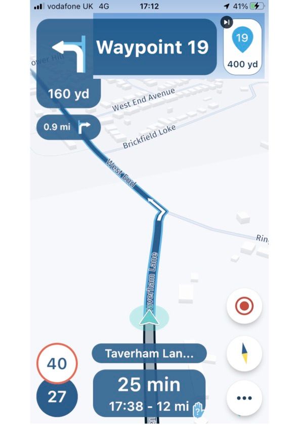
I am sure you will sort out this glitch in due course and really you are to be congratulated on the amazing job you have done!
-
Thanks for the quick reply Corjan, and for your clear explanations.
I used the app again today and the slider button for toggling on & off announcement of shaping & via points is functioning correctly. So no need to investigate this - I must have got that wrong last week, apologies.
I used the ‘Next Instruction’ option on a simple A to B route today, ie no waypoints. It worked well, showing both the next turning and the subsequent one. However, on a preplanned route, ie with waypoints, the waypoints display (top left) over-rides the instruction for the upcoming turning which, as I said before, I believe is a significant issue. It also prevents subsequent turnings being displayed.
I have attached photo montage of how I think the layout should be for a preplanned route - ie same as an ‘A to B’ route but with Waypoint information (and delete waypoint) displayed top right.

I am sure you will sort out this glitch in due course and really you are to be congratulated on the amazing job you have done!
@David-Bonner Happy to hear that the preference issue does not exist anymore! Also, thanks for the kind words, we will keep up the great work!

Regarding the waypoint information, love your input and edited screenshot. We’ll see what we can do with it.
If other Beta testers like this and feel the importance of it: do respond!
-
@David-Bonner Happy to hear that the preference issue does not exist anymore! Also, thanks for the kind words, we will keep up the great work!

Regarding the waypoint information, love your input and edited screenshot. We’ll see what we can do with it.
If other Beta testers like this and feel the importance of it: do respond!
Amended photo montage - the direction box (top, middle) should of course show the road, not the waypoint...
-
@Corjan-Meijerink I agree with @David-Bonner in that I want to see the road name and not ‘waypoint x’ in the text box for shaping points. If the point is a via marker however, then I would like the text for the via to be displayed I.e coffee break, meet group, left turn option etc. The colours are really useful but I miss having a text prompt as a reminder when the waypoint shows in the top left indicator box. More so when on multi day trips in areas/countries that are new. I believe we will have a settings’ configuration for the voice option to say the waypoint text but not sure whether this is the title text for the point or the notes.
@Dave-J-0 This would be a more general “waypoint on left” notification as announced by HERE. A voice message with the waypoint title / description will be added later

-
@Dave-J-0 This would be a more general “waypoint on left” notification as announced by HERE. A voice message with the waypoint title / description will be added later

@Corjan-Meijerink And what about this BRILLIANT IDEA ? So the petrol stations displayed should be AHEAD and ON THE ROUTE. Perhaps an option to amend the route to go via to the selected petrol station too?
-
@Corjan-Meijerink And what about this BRILLIANT IDEA ? So the petrol stations displayed should be AHEAD and ON THE ROUTE. Perhaps an option to amend the route to go via to the selected petrol station too?
@MarcM Fun idea! Please post such great ideas as nee suggestions so they are easy to find for us

-
@David-Bonner Happy to hear that the preference issue does not exist anymore! Also, thanks for the kind words, we will keep up the great work!

Regarding the waypoint information, love your input and edited screenshot. We’ll see what we can do with it.
If other Beta testers like this and feel the importance of it: do respond!
@Corjan-Meijerink said in Suggestions - Route display, Settings & Home screen icon:
If other Beta testers like this and feel the importance of it: do respond!
I like both ideas, showing waypoint(s) and showing street name(s). Sorry Corjan
 and, of course, most important are the route points which you can name by yourself, whose color you can choose and where you can write entire novels in the notes. (I deviated but this is just awesome)
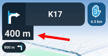
Back to the topic: Driving through an unfamiliar city, I definitely need the street names to find my way around. But street names don't help me when I'm driving on a scenic tour, waypoints would make more sense here. So, now it's your turn again Corjan: can't we get a switch (show waypoints / show street names) in the settings please?But while we're on the subject, for me it's also very important in both variants that the distance to the next instruction can be better recognized. The digits should be bigger, this would help a lot. I drew a little picture too. Greetings Ronni
-
@Corjan-Meijerink said in Suggestions - Route display, Settings & Home screen icon:
If other Beta testers like this and feel the importance of it: do respond!
I like both ideas, showing waypoint(s) and showing street name(s). Sorry Corjan
 and, of course, most important are the route points which you can name by yourself, whose color you can choose and where you can write entire novels in the notes. (I deviated but this is just awesome)
Back to the topic: Driving through an unfamiliar city, I definitely need the street names to find my way around. But street names don't help me when I'm driving on a scenic tour, waypoints would make more sense here. So, now it's your turn again Corjan: can't we get a switch (show waypoints / show street names) in the settings please?But while we're on the subject, for me it's also very important in both variants that the distance to the next instruction can be better recognized. The digits should be bigger, this would help a lot. I drew a little picture too. Greetings Ronni

@Ronni Bigger text is something we will continuously look at. Currently we are pretty satisfied with the accessibility but increasing size even more causes quite some layout issues on smaller devices. We need to update our UI to be way more responsive to make this a scalable solution. This is something we aim to do before the release

Streetnames cannot be hidden at this point but it has been suggested before to make this possible: https://forum.myrouteapp.com/topic/3125/hide-streetname-in-direction. At this point we still see is as quite a fundamental part of the navigation so therefore it cannot be hidden (yet). I guess this will be implemented as it is quite easy to do

The upcoming waypoint can already be turned on / off in the settings!
