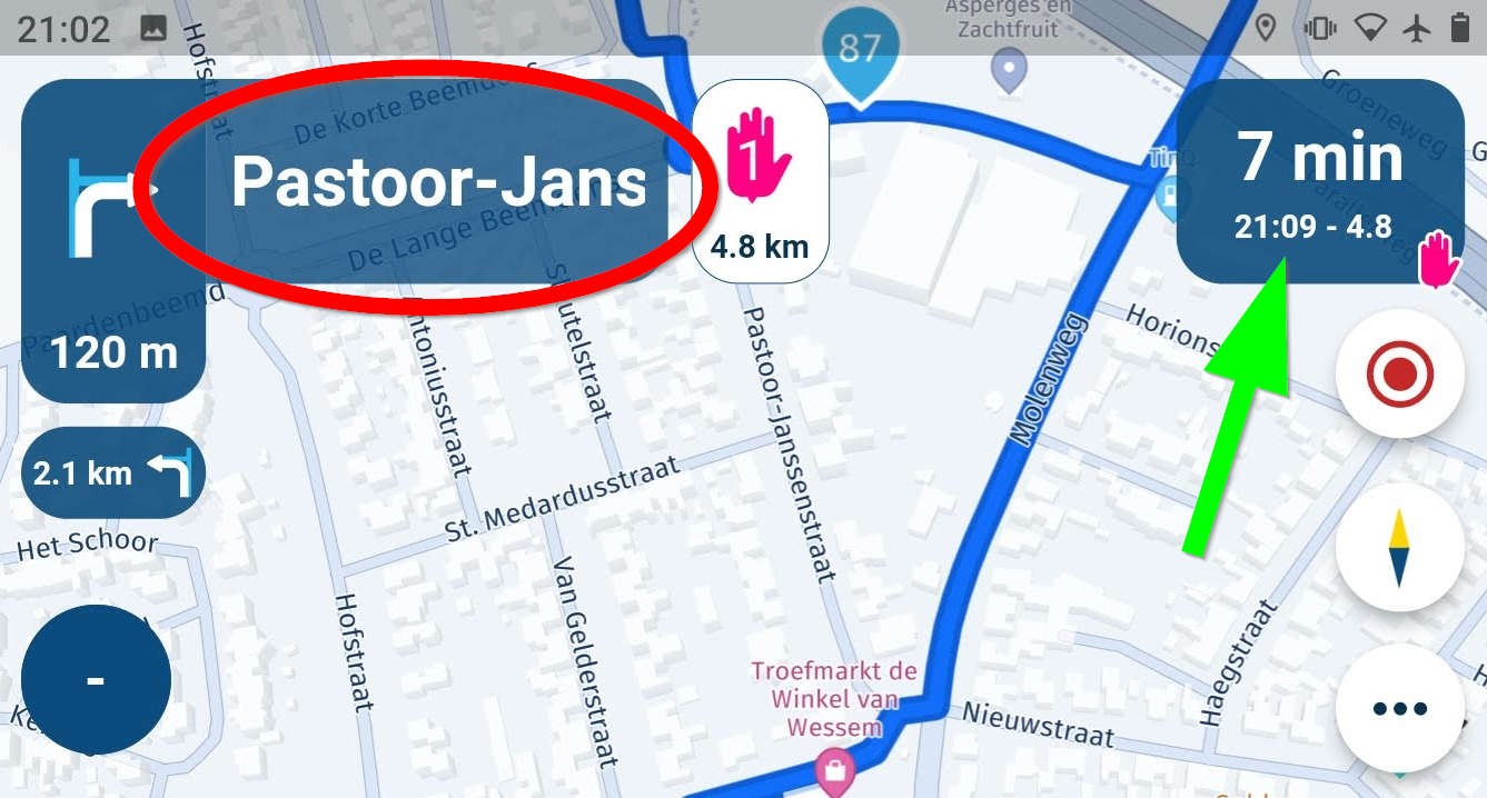
Hide streetname in direction
-
I think this is discussed very early in the beta phase, but I will re-drop it


I really love the tap-functionality of the ETA info (green arrow) where you can change from ETA to finish, to next shaping point or to next waypoint. An extra would be to be able to hide it completely.
For the streetname in the direction info (red oval) it would also be nice to be able to make it smaller, or completely hide it. It takes an unreasonable amount of real-estate on screen, and most of the time, when riding motorbike, streetnames cannot be read or even found in the real world at all. In A to B or urban navigation it could indeed be helpful. So being able to hide it seems a reasonable feature to me.
The same goes for the streetname you actually are on, at the bottom of the screen. I know it can be hidden by a slider in the settings screen, perhaps hiding it per tap is a good idea?
-
I think this is discussed very early in the beta phase, but I will re-drop it


I really love the tap-functionality of the ETA info (green arrow) where you can change from ETA to finish, to next shaping point or to next waypoint. An extra would be to be able to hide it completely.
For the streetname in the direction info (red oval) it would also be nice to be able to make it smaller, or completely hide it. It takes an unreasonable amount of real-estate on screen, and most of the time, when riding motorbike, streetnames cannot be read or even found in the real world at all. In A to B or urban navigation it could indeed be helpful. So being able to hide it seems a reasonable feature to me.
The same goes for the streetname you actually are on, at the bottom of the screen. I know it can be hidden by a slider in the settings screen, perhaps hiding it per tap is a good idea?
@Con-Hennekens I like the idea of allowing users to hide more and more. Especially because it is not really difficult to implement

If you want to hide everything and simply follow the line: that can be done with merely the Mobile app
 So there is a minimum that will always be shown.
If we for instance allow the hiding of the streetname you will automatically miss: junction information / lane instructions / highway heading etc. A simple “turn left” icon is very unclear without the text “A12 - heading to Utrecht” for example. That is only one of the examples I can give to object against such features.
But I do applaud the idea of more configurability.
-
@Con-Hennekens I like the idea of allowing users to hide more and more. Especially because it is not really difficult to implement

If you want to hide everything and simply follow the line: that can be done with merely the Mobile app
 So there is a minimum that will always be shown.
If we for instance allow the hiding of the streetname you will automatically miss: junction information / lane instructions / highway heading etc. A simple “turn left” icon is very unclear without the text “A12 - heading to Utrecht” for example. That is only one of the examples I can give to object against such features.
But I do applaud the idea of more configurability.
@Corjan-Meijerink, I understand what you are saying, but I disagree on the unclarity when no streetname is available at the junction information. Of course I am not suggesting to disable the junction information, but merely the (too?) large streetname information. When riding motorbike tours the streetname is really irrelevant, and most of the time not even visible in real life, so it is not very usable for deciding which way to go. That's different in urban surroundings when you are looking for a specific address. So it has value, but often not much and the map-info it takes would sometimes be more valuable. From my perspective that is

-
@Corjan-Meijerink, I understand what you are saying, but I disagree on the unclarity when no streetname is available at the junction information. Of course I am not suggesting to disable the junction information, but merely the (too?) large streetname information. When riding motorbike tours the streetname is really irrelevant, and most of the time not even visible in real life, so it is not very usable for deciding which way to go. That's different in urban surroundings when you are looking for a specific address. So it has value, but often not much and the map-info it takes would sometimes be more valuable. From my perspective that is

I agree with Con, why can't you also deselect the street name, like the other information for the screen. Also because the street name takes up the most space on the screen. give the rider the decision what he wants to see.
-
I think this is discussed very early in the beta phase, but I will re-drop it


I really love the tap-functionality of the ETA info (green arrow) where you can change from ETA to finish, to next shaping point or to next waypoint. An extra would be to be able to hide it completely.
For the streetname in the direction info (red oval) it would also be nice to be able to make it smaller, or completely hide it. It takes an unreasonable amount of real-estate on screen, and most of the time, when riding motorbike, streetnames cannot be read or even found in the real world at all. In A to B or urban navigation it could indeed be helpful. So being able to hide it seems a reasonable feature to me.
The same goes for the streetname you actually are on, at the bottom of the screen. I know it can be hidden by a slider in the settings screen, perhaps hiding it per tap is a good idea?
@Con-Hennekens While I agree being able to add and remove items from the screen is nice to have.
I really like having the street name so that when I am on a group ride I learn about the area or having review of the ride.
I like have the ETA as a way of judging if I am gaining or losing time. Say I ride faster, take what I think is a quicker route, stop to help someone, how much time did I gain or loose. -
 undefined Corjan Meijerink referenced this topic on
-
 undefined Corjan Meijerink referenced this topic on
-
 undefined Tom Wilmot referenced this topic on
