Time to Next Wapoint (Suggestion)
-
Hi, I've really found the next waypoint and ability to skip from etc really useful.
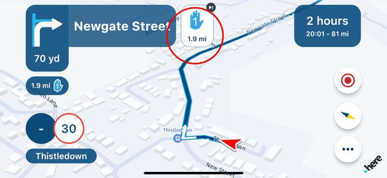
I also like the fact it shows distance to the next waypoint underneath it, but as a feature suggestion, I think it would be super useful to see the time to next waypoint underneath it too.
I know you can get this information by scrolling through the time to destination info, but that of course requires rider input. I do like that feature and feel it's really useful to be able to scroll through time to next shaping point and time to next waypoint, but adding the time to next waypoint (whether it's shaping or waypoint) under the symbol at the top of the page (see ringed area of picture below) would be super useful at a glance with no rider input.

-
If you click on the right button (where 2 hour is) you get time and distance to the next waypoint.
-
Hi, I've really found the next waypoint and ability to skip from etc really useful.
I also like the fact it shows distance to the next waypoint underneath it, but as a feature suggestion, I think it would be super useful to see the time to next waypoint underneath it too.
I know you can get this information by scrolling through the time to destination info, but that of course requires rider input. I do like that feature and feel it's really useful to be able to scroll through time to next shaping point and time to next waypoint, but adding the time to next waypoint (whether it's shaping or waypoint) under the symbol at the top of the page (see ringed area of picture below) would be super useful at a glance with no rider input.

@Frappawotsit how nice if a feature request is already there!

We’re working on an onboarding to make sure that all these features are explained.
-
If you click on the right button (where 2 hour is) you get time and distance to the next waypoint.
@Jörgen said in Time to Next Wapoint (Suggestion):
If you click on the right button (where 2 hour is) you get time and distance to the next waypoint.
I'm aware of that, I even referenced that in my post. The point being that requires user input whilst riding, in gloves.... whereas a small addition of it under the existing distance to next waypoint, would mean at a glance you can see time to next waypoint and time to destination separately.
I can't speak for others, but that would be super useful in my opinion.
-
@Jörgen said in Time to Next Wapoint (Suggestion):
If you click on the right button (where 2 hour is) you get time and distance to the next waypoint.
I'm aware of that, I even referenced that in my post. The point being that requires user input whilst riding, in gloves.... whereas a small addition of it under the existing distance to next waypoint, would mean at a glance you can see time to next waypoint and time to destination separately.
I can't speak for others, but that would be super useful in my opinion.
I like the way it’s done in Scenic. You can choose time/distance to next waypoint or destination, but I use their third option where it alternates between the two every 5 seconds or so. Contrary to what you may think, it’s not distracting and also means there’s no interaction required to see multiple pieces of information and no extra screen real estate is taken up.
-
@Jörgen said in Time to Next Wapoint (Suggestion):
If you click on the right button (where 2 hour is) you get time and distance to the next waypoint.
I'm aware of that, I even referenced that in my post. The point being that requires user input whilst riding, in gloves.... whereas a small addition of it under the existing distance to next waypoint, would mean at a glance you can see time to next waypoint and time to destination separately.
I can't speak for others, but that would be super useful in my opinion.
@Frappawotsit A lot of people complained about redundant information presented on the screen; distance to the shaping point below the maneuver display, another distance to shaping point to the right of the street display... This would be a good opportunity to rectify this. The via icon to the right of the street name can display time instead of distance.
-
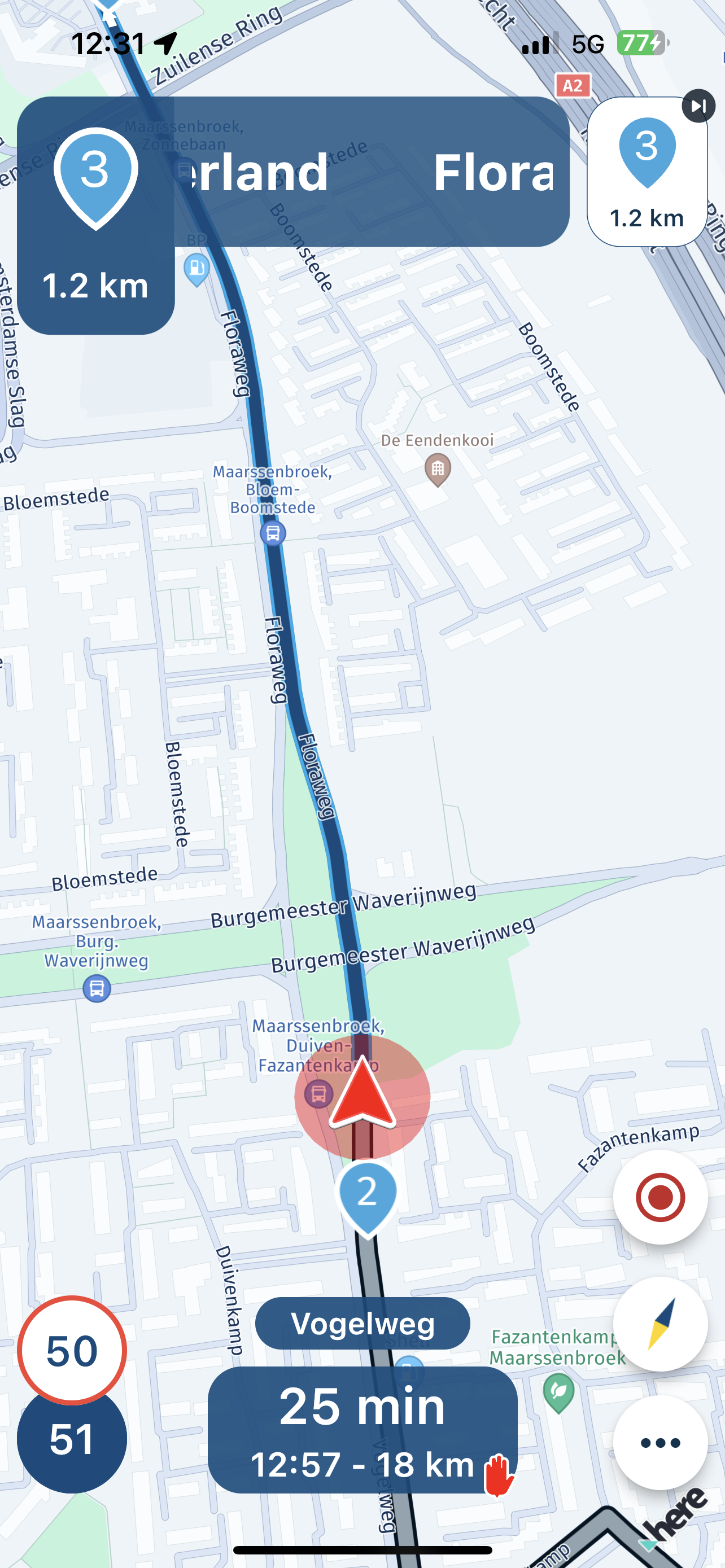
To see the distance to the next shaping point during navigation is for me very anoying. No big problem if the shaping points are visible on the map (selectable on/off).
I would prefer to see only the distance to the next roundabout/exit/direction that I have to take.
For example: if you are on a highway it is more important to know that you have to leave the highway over 13 km than to see the distance to all the next waypoints before you have to exit.
See this example that shows the distance to a shaping point (nr. 3) instead of the next left/right exit.

@JoBro , Absolute a good idea. So same request for me. Not the distance to the next shaping point, but (only) the indication for the next turn

-
I agree. Displaying (shaping) waypoints in the top left information screen is not a good idea, principally as it prevents junction information being shown at the appropriate time. I can understand it may be useful to know the distance to Via points, as these may be stops or poi’s etc, and this information can be displayed in the bottom screen. I use this feature a lot. But surely a countdown to the shaping points is pointless (pardon the pun!) and it is also confusing?
-
I fully agree that the information for the next waypoint is unnecessary and disturbing. I have disabled it on the screen layout, but it still shows up by the instructions.
