Just a little tweak
-
I love the app, it has become my always use nav with Google Maps as a back up. The couple of change request are could be trivial, but that goes to show how much work you have put into the nav and planning that you now get things like these .
The little tweak I would like to see is in the route planning.The via and way points use a white font, it would be easier if it was a black font, especially when yellow is used on color points.
The other tweak would be taking one of the red pallet colors and change to something different maybe gray. I use different colors when plotting out routes.
Thanks again for all the effort your team has put in. -
I love the app, it has become my always use nav with Google Maps as a back up. The couple of change request are could be trivial, but that goes to show how much work you have put into the nav and planning that you now get things like these .
The little tweak I would like to see is in the route planning.The via and way points use a white font, it would be easier if it was a black font, especially when yellow is used on color points.
The other tweak would be taking one of the red pallet colors and change to something different maybe gray. I use different colors when plotting out routes.
Thanks again for all the effort your team has put in.@Ed-Van-Auken
Hi, in the web planning app it’s already like that: they are black on yellow waypoints and white on all the others.
On the mobile app, instead, they are all white, but I don’t have any visibility issues. Try changing the app’s base theme colors or the map style — you might find it works better for you.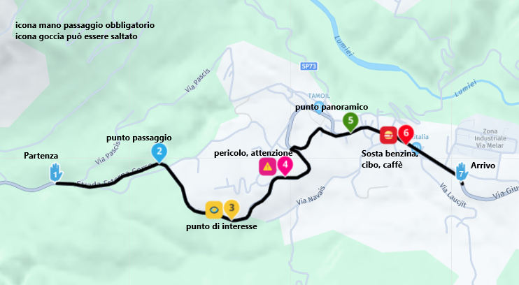
-
-
I agree.
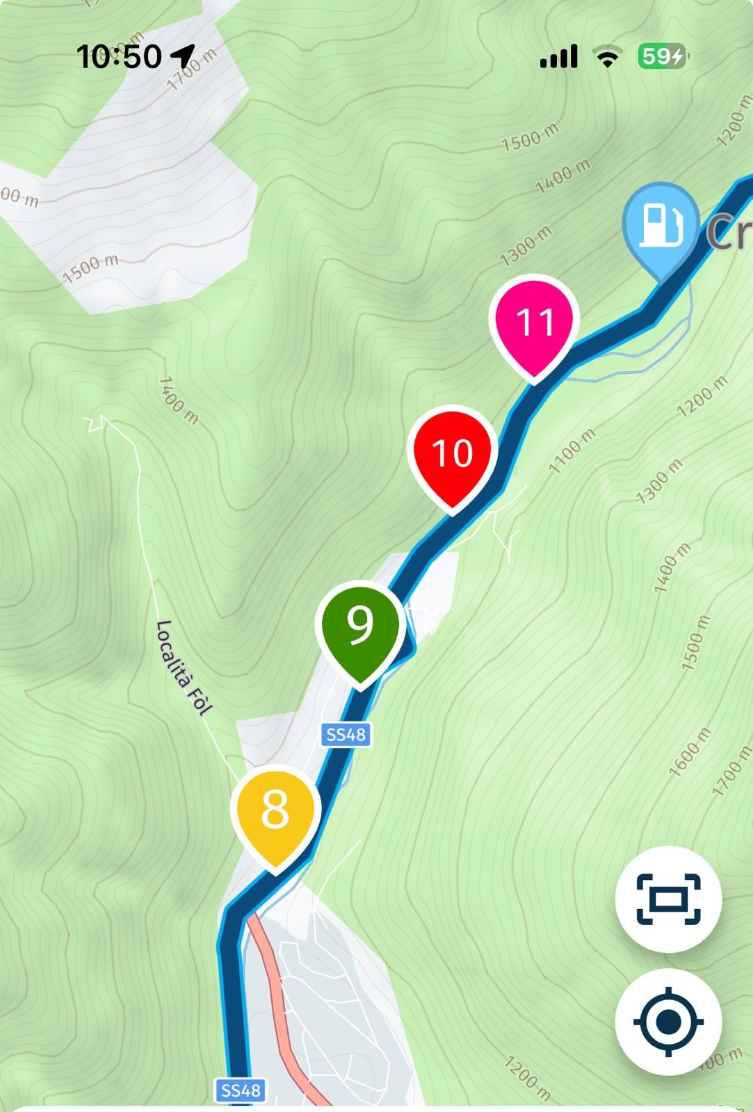
It would be good to change the colour of the ‘pink’ point 11 in the sample picture to say, grey. I have always thought the ‘pink’ too close to red.
Even better, if were possible for the user to chose the colour.
Hello! It looks like you're interested in this conversation, but you don't have an account yet.
Getting fed up of having to scroll through the same posts each visit? When you register for an account, you'll always come back to exactly where you were before, and choose to be notified of new replies (either via email, or push notification). You'll also be able to save bookmarks and upvote posts to show your appreciation to other community members.
With your input, this post could be even better 💗
Register Login-
012151
-
011171
-
313358
-
05107
-
24164
-
0321.4k
-
08333
-
0346