Awful lettertype?
-
Am I the only one who experiences a new lettertype and small updated layout on the forum... and finds it difficult to read, and just plain ugly?
It is not difficult, it is easy, it's a hobby
-
Am I the only one who experiences a new lettertype and small updated layout on the forum... and finds it difficult to read, and just plain ugly?
-
@Drabslab sorry, but I do not have any issues with the fonts whatsoever.

@StefanHummelink No need to apologise
but this is what I get:
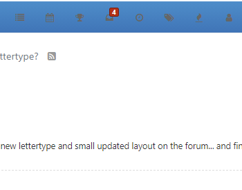
the menu has become much harder to see and the letters seem scetchy... or my eyesight has deteriorated enourmously the last month or so.
It is not difficult, it is easy, it's a hobby
-
@StefanHummelink No need to apologise
but this is what I get:
the menu has become much harder to see and the letters seem scetchy... or my eyesight has deteriorated enourmously the last month or so.
@Drabslab Oh ya, I get the same layout and indeed it is not an improvement imho.
Manks bu'j te bange.
-
@Drabslab Oh ya, I get the same layout and indeed it is not an improvement imho.
@StefanHummelink
The complete design colors and letter type has a lot of room for improvements.
https://forum.myrouteapp.com/topic/1434/forum-update/2 -
@StefanHummelink No need to apologise
but this is what I get:
the menu has become much harder to see and the letters seem scetchy... or my eyesight has deteriorated enourmously the last month or so.
@Drabslab said in Awful lettertype?:
@StefanHummelink No need to apologise
but this is what I get:
the menu has become much harder to see and the letters seem scetchy... or my eyesight has deteriorated enourmously the last month or so.
I have asked Timo if the icons in the header can be made more visible, he's going to look at it. On the whole I think the forum has a cleaner look, just my opinion though.
-
Agree..
Not readable icons.
Wrong colors. Zero contrast.Change icon colors from gray to white...
-
I can support the criticism 100 percent!
-
Fairly light grey font colour on a white background… Never a good choice. And the grey icons on a blue background is awful. Why do it???
-
Fairly light grey font colour on a white background… Never a good choice. And the grey icons on a blue background is awful. Why do it???
@PAD-0 In fairness to Timo, I believe there was a bug that changed the icon colour. He’s enjoying a well earned rest at the moment but I’m sure that he will correct it on his return.
Hello! It looks like you're interested in this conversation, but you don't have an account yet.
Getting fed up of having to scroll through the same posts each visit? When you register for an account, you'll always come back to exactly where you were before, and choose to be notified of new replies (either via email, or push notification). You'll also be able to save bookmarks and upvote posts to show your appreciation to other community members.
With your input, this post could be even better 💗
Register Login-
7663.1k
-
019511
-
09112
-
05155
-
314881
-
115752
-
0116